Kinect Bodyscanner
User Interface
Summary
For the purpose of creating a lo-fi user interface, we chose to focus our ideas for deployment in clothing stores. Users would therefore undergo the scanning process from within a private room/pod, receiving their body measurements as output for them to view and use when shopping for clothes. As the UI will be used by people from all ages and backgrounds, we prioritised a minimalist design during our initial brainstorm. Additionally, since scanning the body is a very sensitive task, privacy and transparency concerns also needed to be addressed. We came up with various designs, but we chose two for evaluation, leading to a third, final and improved UI.
Prototype Design 1
In this design, the required touchscreen interaction from users is kept to a minimum. This is because the user will spend most of the time aligning with the camera, making frequent interaction obstructive.

This is the first Screen that users see. The view shows the live camera feed with a body silhouette overlaid on top. The silhouette provides motion feedback and encrouages proper alignment with the silhouette- thus incorporating affordance (Norman Design Principles).
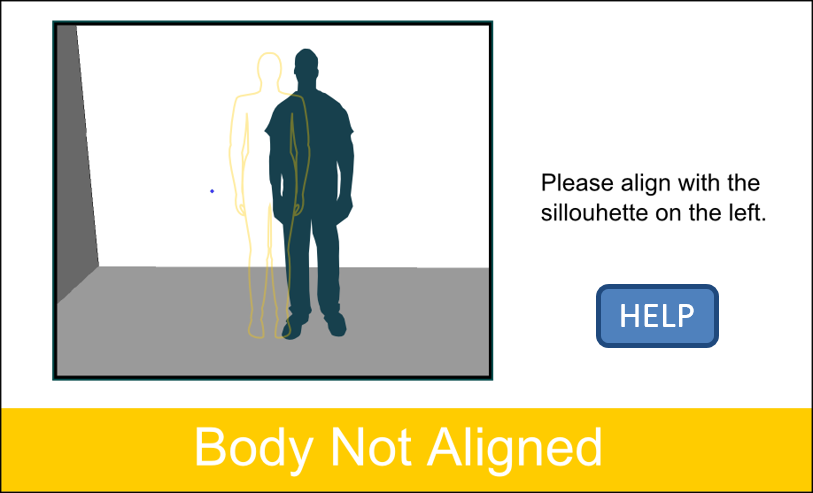
The Help button also incorporates affordance, as it has a thick border implying depth as a visual que. The status of the system is always shown in large font, as the user might be further from screen, trying to align with silhouette. The status of the system is colour coded with traffic light colours along with the silhouette. This helps with mapping the movements of the user and its effect on the system.

The camera feed, instruction text, system status bar are always located in the same location. This provides consistency for the user. The Help Button disappears as it does not make sense to go to help screen while the system is scanning. This puts an appropriate constraint on what the user can do at times. A countdown timer provides feedback, indicating how long the user has to wait.

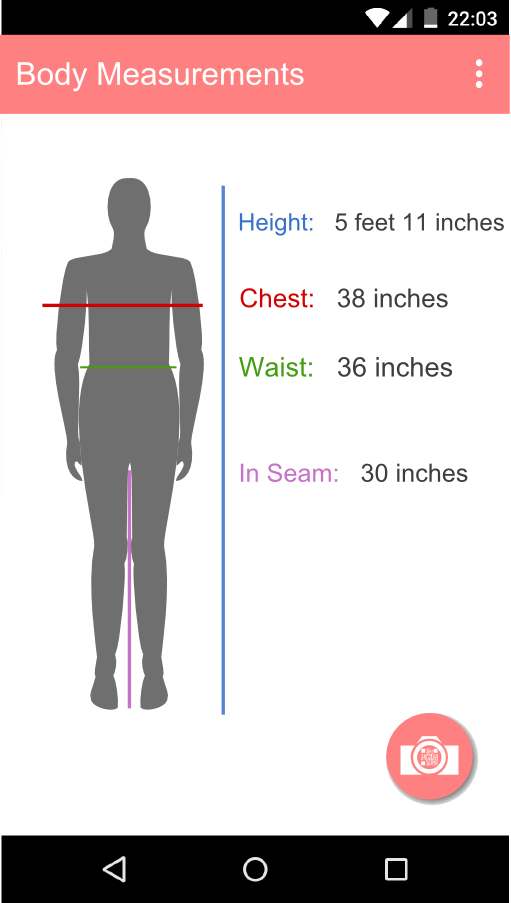
The various measurements are colour coded with the lines on the silhouette suggesting which measurement each jargon refers to. The Done button aids visibility, indicating what to do next. It is also coloured green to for mapping purposes. The Privacy Policy button is situated in the top right and is smaller than Done button, this is to preserve the minimalist design while also offering easy access to privacy information.
-
Pros
- Intuitive and clean
- The colours aid the user in understanding the system status
- Results screen is intuitive and the measurements can be easily related to the body
- Buttons are large and clear in their actions
- Minimal required user interaction
-
Cons
- Live feedback from camera can be a sensitive issue
- No way to review privacy policy before getting scanned
- Silhouette risks imposing an expectation of bodyshape on users
- Scanner always on may be disconcerting for some users
Prototype Design 2
Our second design has some required touchscreen interaction from users and risks appearing more cluttered. However, it respects user privacy and provides detailed feedback at each stage.
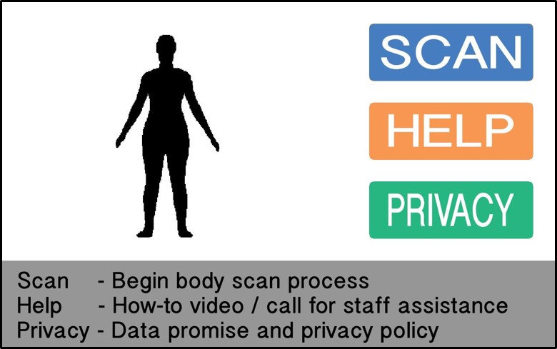
When taking detailed measurements of the body, the primary concern must be privacy and transparency. Therefore, the UI design has to appear non-convoluted and minimalist, with privacy information readily available to the user. Using a touchscreen or mouse, the user will navigate the UI with button presses. The interface is comprised of three parts, each with a function implied by its title.

For consistency, the UI layout should remain the same as much as possible. Therefore, the three interface parts never shuffle or resize, changing notably only once scanning has finished. The console, supported by the prompt (which shows number of steps), provides readable and up-to-date feedback to the user.
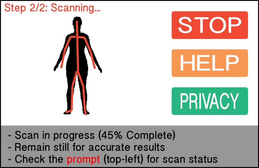
Upon scanning, the user position is reflected by red skeletal lines. This remains inoffensive but useful to the user for mapping movement to the effect it has on the scanner input. Red is used to colour the STOP function for user recognition System displays % completion during scanning.
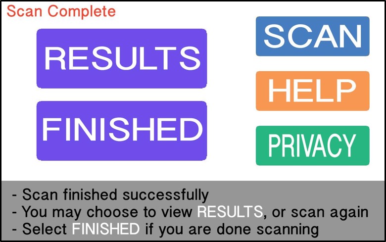
By matching the design of the normal buttons, the user may find it intuitive that they serve the same purpose The rounded rectangular shaped buttons incorporate affordance as their size indicates they are more than just informative, supported by established patterns in button design.

Having the privacy policy and data promises readily available is an intrinsic requirement of this system Other decisions made to accommodate the user are to avoid displaying a live feed of the scan, so as to avoid offending users or appearing invasive. The console never displays more than three lines of text, in order to avoid cluttering.
-
Pros
- Use of skeleton rather than silhouette, hence not suggesting any body shape
- No live camera feed
- All screens can be accessed from any screen including the privacy policy
- All instructions are provided clearly on screen
-
Cons
- Redundancy issues with some buttons
- Too verbose and distracting at times
- Awkward use of colouring
Final Design
Following evaluation and feedback, we found the following notable issues:
- Showing a QR code (or using a similar mechanism) to be scanned by an accompanying app would provide increased utility for users
- By incorporating users' own hardware, they may feel more in control of their own data
- Only showing the measurements might not be beneficial to the users, instead showing the size of clothes or even recommendation of clothes might be more helpful
- There is no screen giving feedback after the scan has been taken, or for when an error occurs, which could cause confusion and highlights a lack of feedback in our prototyped interfaces

User input is reduced to simply selecting start or privacy policy at this stage. Privacy conscious users are given the opportunity to review the privacy policy early on.
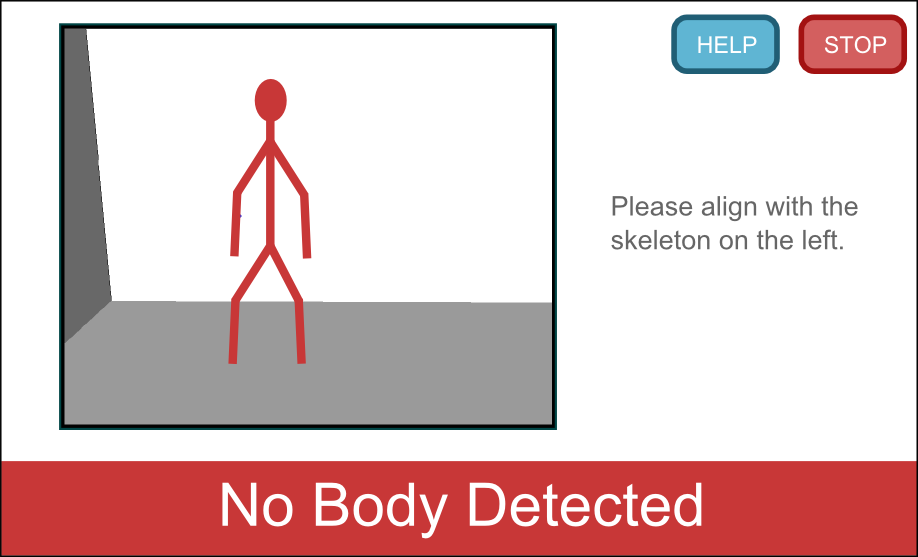
Help and Stop buttons are available for the user to select. Skeletal guidelines do not impose a shape expectation but preserve the pose information. In the interest of liveness, a live feed was chosen in spite of previous concerns.
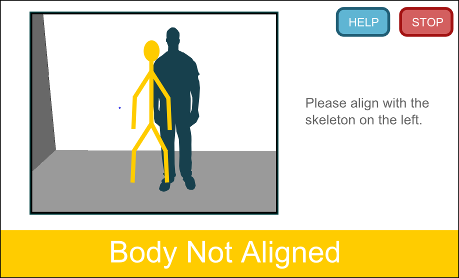
Minimalist design preserved throughout the interface. Button and text prompt positioning remain consistent. System status always reported to the user.
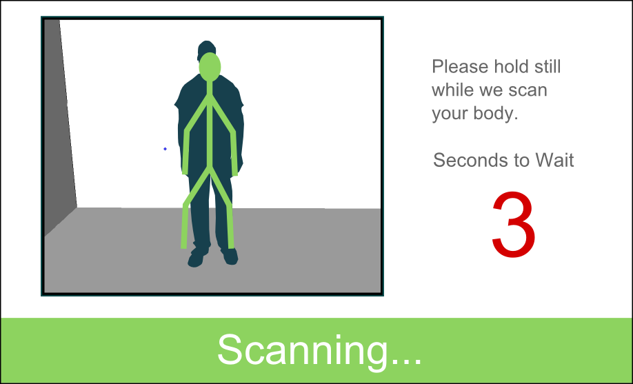
Feedback during scanning helps assure users that the scanner is functioning properly. In the interest of error prevention and reduced user confusion- buttons removed at this point as scan is to be performed remotely, freeing users to leave.
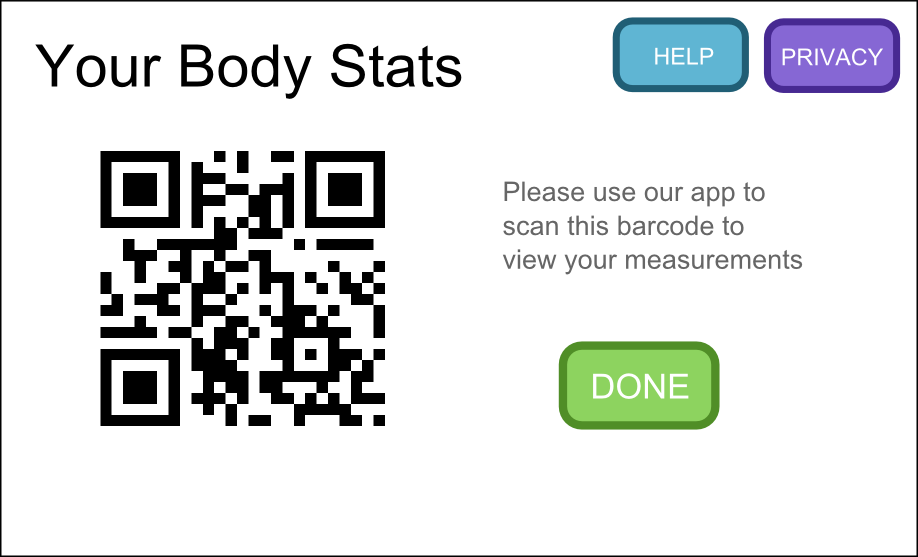
Button input capabilities restored. QR Code also displayed for accompanying app to scan. Done button available for users to finish the session.
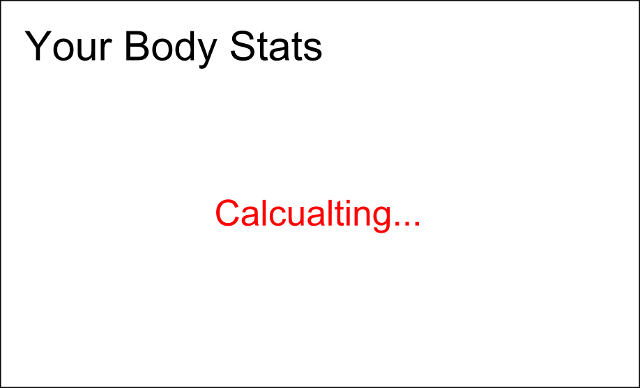
A lo-fi example of the accompanying app's interface upon scanning. Measurement information available on user's device controlled solely by them.
Final Evaluation
We performed a heurisitc evaluation on our third design. The results can be viewed here: Heuristic Evaluation
As a result of the evaluaiton we added a feedback screen to inform users of the system's current state while calculating measurements.
We also added an error screen as a precaution in case our system encounters a problem.
