User Acceptance Testing
To get a better understanding of the quality of human computer interaction and user experience for people who were new to our project and haven't seen it before, we asked 3 students from our cohort to act as psuedo users for our system. We split these test cases between them and asked them to complete the task while giving feedback and their thoughts for each page. We did this three weeks before the deadline so we had time to implement the suggestions given.
Test case 1 - Logging in:
We asked the user to login, and assess the quality of the experience.
| Page | Feedback |
|---|---|
| Login page |
Doesn’t know what he’s signing into, too generic (FIXED) Good validation of login data |
Test case 2 - Downloading datasets:
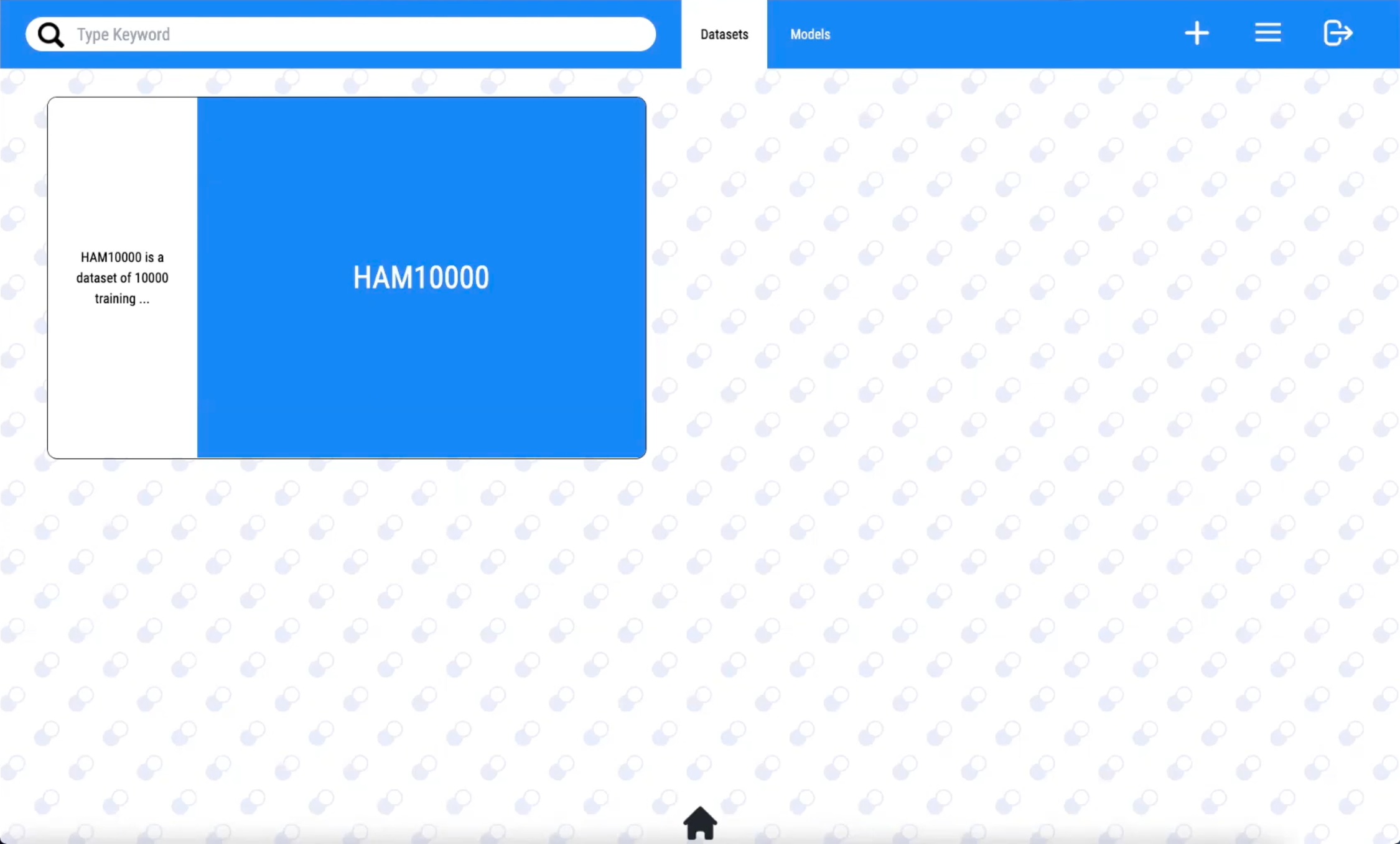
We asked the user to view the datasets on the home page, locate 'Test dataset 1' and download it.
| Page | Feedback |
|---|---|
| Home page |
Really like the design of the pills for the loading screen and for the assets
(CHANGED DESIGN) Hard to see the button in the bottom left to go to the next page of datasets (FIXED) Poor responsiveness for small screens (FIXED) |
| Dataset page |
No need for dataset to take up entire screen Downloading is intuitive Too colourful (FIXED) |
Test case 3 - Uploading datasets:
Setting the user up on the home page, we asked them to navigate to the dataset upload page and upload a dataset
| Page | Feedback |
|---|---|
| Dataset upload page |
Good handling of data validation Progress bar and loading screens are a nice touch |
Test case 4 - Model Upload:
We asked the user to upload a model using the provided information and set up their own requirements, and config files. We would provide the user with the required model zip and pickle files. After uploading, we ask the user to navigate to the dashboard and verify model has been uploaded.
| Page | Feedback |
|---|---|
| Home page |
Thoughtful design, but not appropriate for use (CHANGED DESIGN) Too many colours (FIXED) hard to find model upload as its difficult understand what the buttons in top right mean (FIXED) Searching not case sensitive |
| Model upload page |
going to 'need help configuring' clears your input Say upload requirements.txt instead of just requirements (FIXED) Have a loading bar which returns output from backend so users know what's happening (FIXED) Takes you to the help page when you finish uploading (FIXED) |
| Clarity of upload instructions |
Second set of instructions should be the first step of instructions, The steps
should come first, then the config tutorial afterwards. (FIXED) Specify the config file needs to be a JSON file (FIXED) Going split screen messes up scaling (FIXED) The shapes the text is in are unnecessary (FIXED) Images are too small (FIXED) |
Test case 5 - Model Download:
We asked the user to search for a model called 'Test Model 1' and view the model. Then we asked them to download the model, run it with the instructions from the readme, test it, and then give feedback by navigating to the dashboard.
| Page | Feedback |
|---|---|
| Viewing the model |
Boxes are too big, have to scroll a lot to see text (FIXED) No need to display ID at the top (FIXED) Why is the feedback in a pill but the category and type isn't? (FIXED) |
| Downloading the model | No information on what to do when its downloaded |
| Model readme |
Inform users to cd into the directory (FIXED) Inform users to run docker desktop (FIXED) Inform users on how to stop the service (FIXED) |
| Model frontend | Nice frontend, but too many colours! (FIXED) |
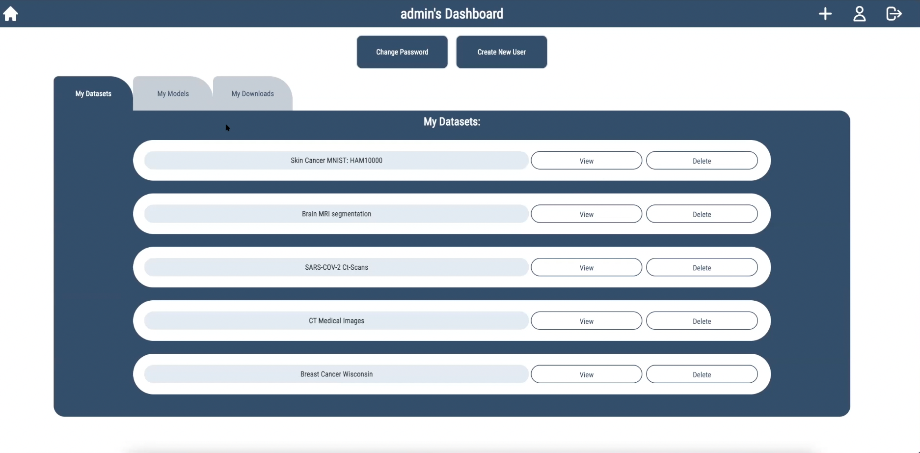
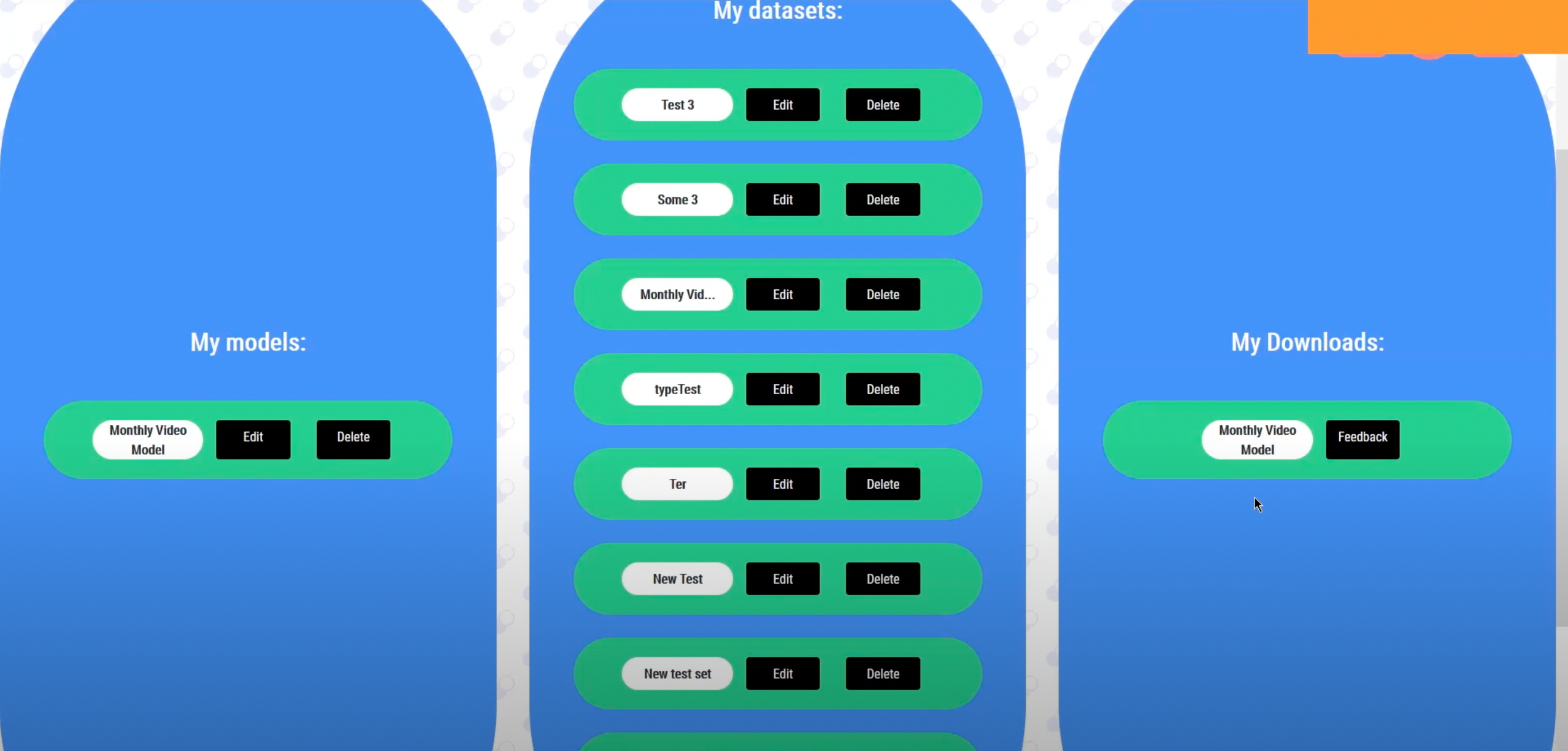
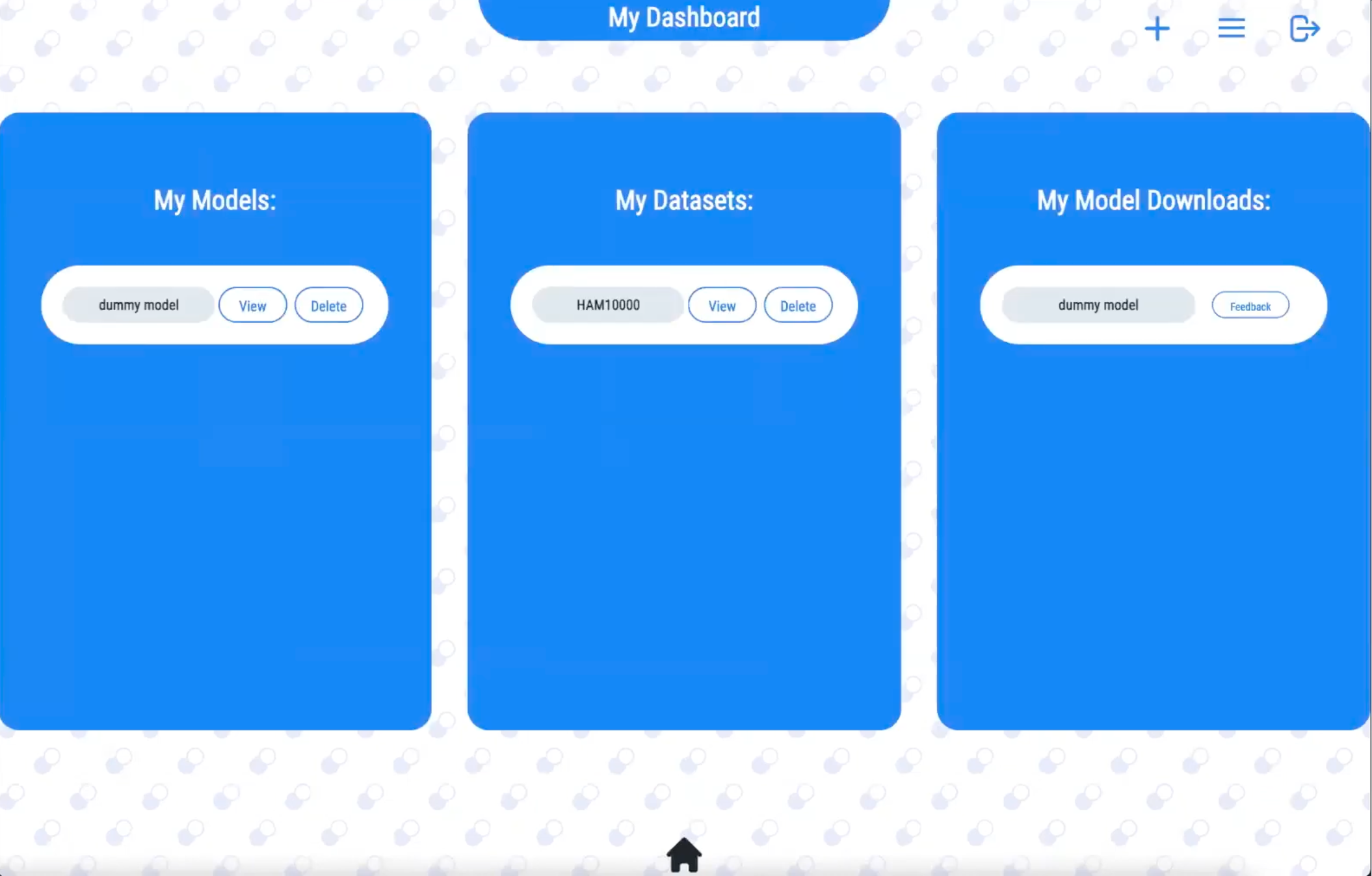
Test case 6 - Navigating the dashboard:
We asked the user to navigate to the dashboard, delete an uploaded dataset, and submit feedback on one of there downloads
| Page | Feedback |
|---|---|
| Dashboard page |
Each column overlaps on small screens (FIXED) Too many colours (FIXED) Home button is not centered (FIXED) When deleting a model, the user should be promted with an 'are you sure?' message box (FIXED) |
From these test cases, we actually learnt a huge amount about what people did and didn't like about our system, and we managed to fix a large amount of these problems. We changes the overly colourful UI design and made our site responsive for those with smaller screens.
Feedback from project partners
After asking for feedback from our client, he said the functionality is there, but the UI was not so intuitive. To fix this, we set up a meeting with Yun Fu who gave us a list of improvements for the UI design which we then implemented to hopefully make our system more intuitive for new users. We also had a meeting with Dean, who suggested we should use image thumbnails for datasets.
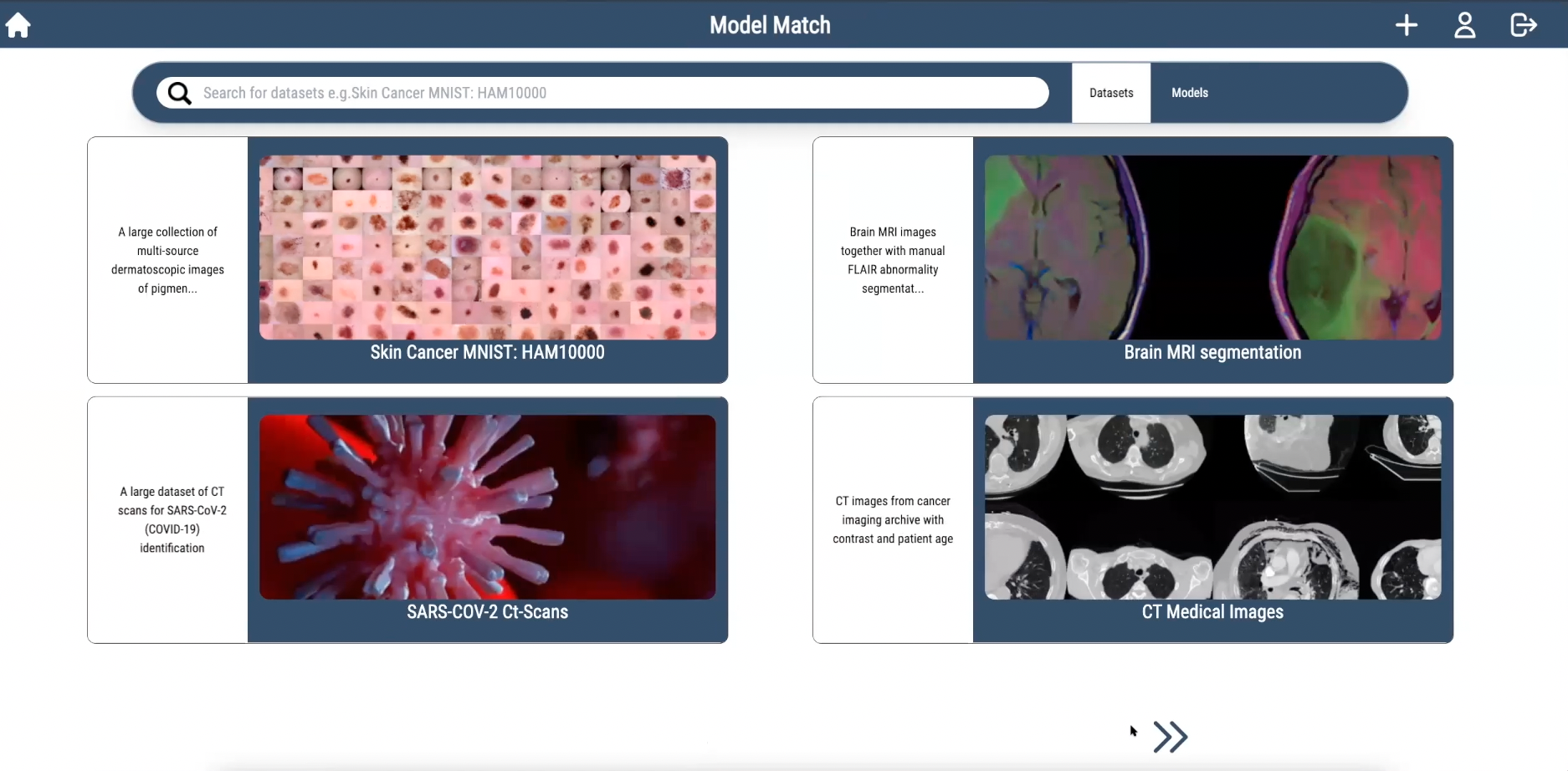
Frontend progression thanks to user testing and feedback
First Iteration
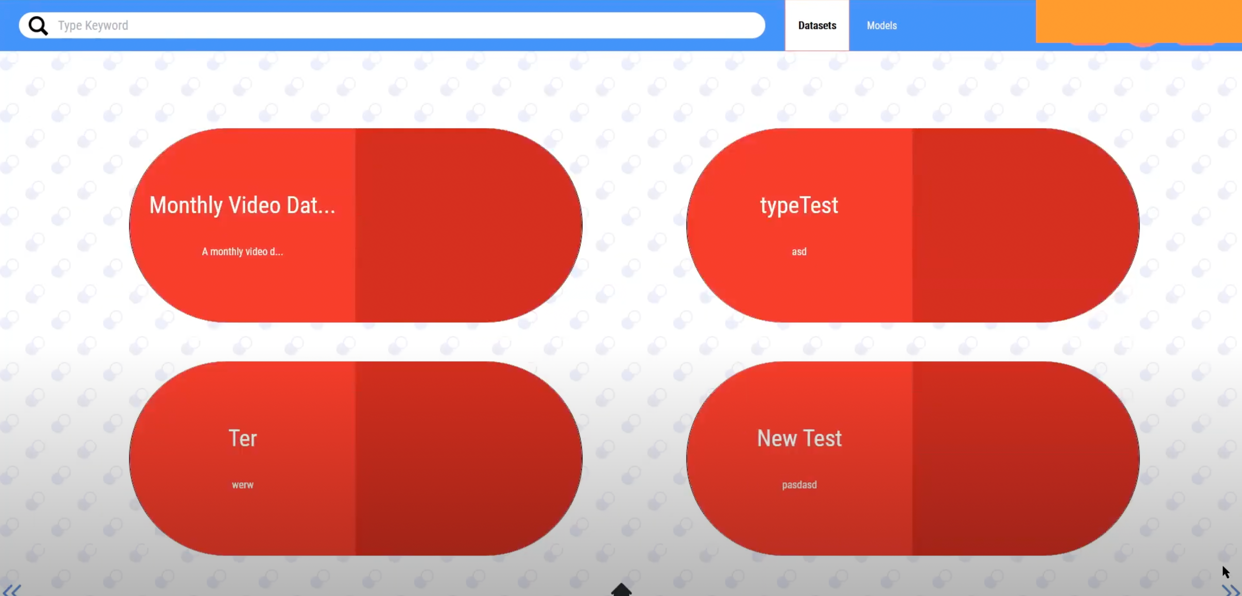
Second Iteration
Third Iteration