Design Principles

Providing a good UX(User Experience) was one of the key requirement given to us, hence we relied to a user-centered approach throughout the whole develpment of the platform. After thorough research on HCI(Human Computer Interactions) design principles resulting in the following principles being used as the backbone of many UI(User Interface) design decisions:

  • Visibility:
    • We made sure that users know all the options are available to them and how they can access it. All the elements in the platform are obvious with the builtin Softr iconography being intuitive and also with the use of CTA(call-to-action) buttons when needed.
  • Feedback:
    • We made sure that actions taken by the users are given a visible reaction in different ways such as buttons changing colours when actions were successful, page change or display messages. There is use of loading animations throughout the pages and also in buttons for tasks that may take longer to process.
  • Affordance:
    • All the core UI elements give a clear idea of their purpose so that the user know what each element is supposed to do. From having clear and specific texts on buttons to having a sensible colour increasing the CTA conversion rate.
  • Consistency:
    • We opted with the use of a horizontal navigation bar like most modern websites have. The navigation menu will have more/less menu buttons depending on the user however their order stays uniform. Like other popular websites User settings and login/logout buttons are situated at the top right of the page

Sketches

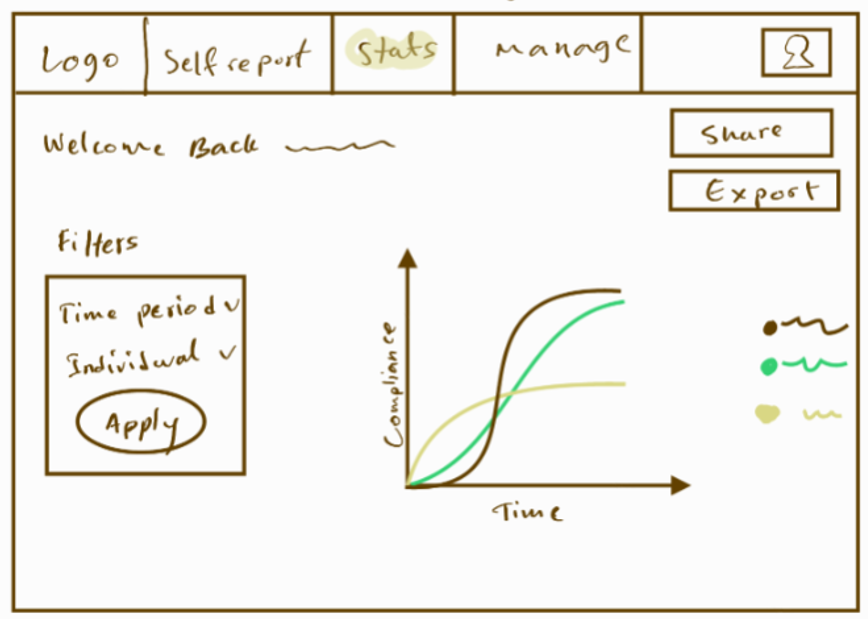
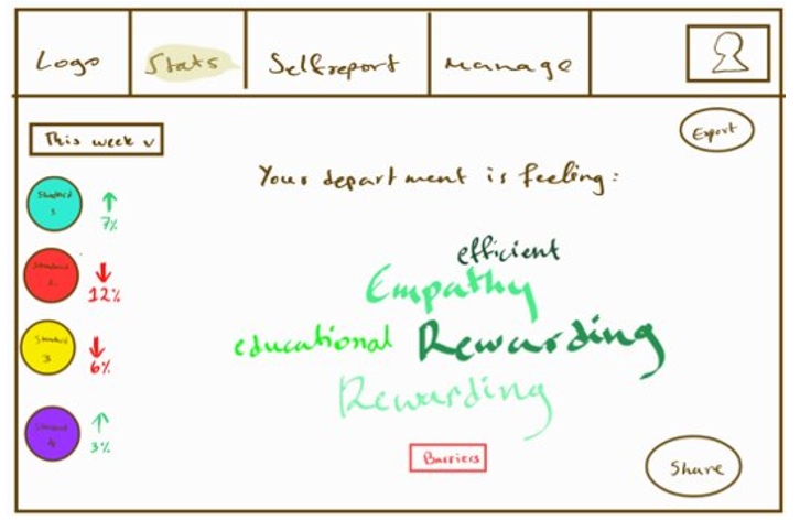
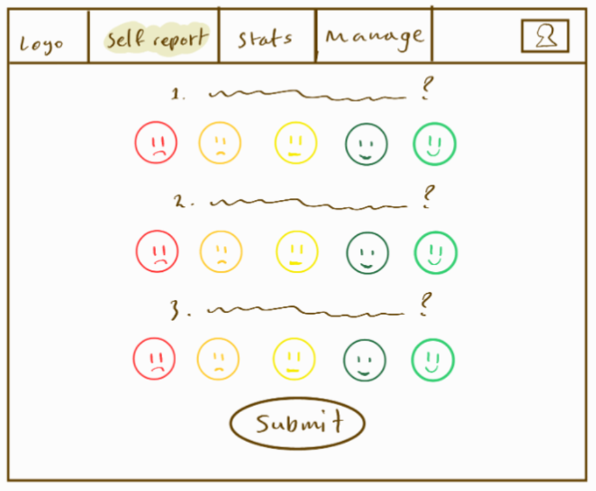
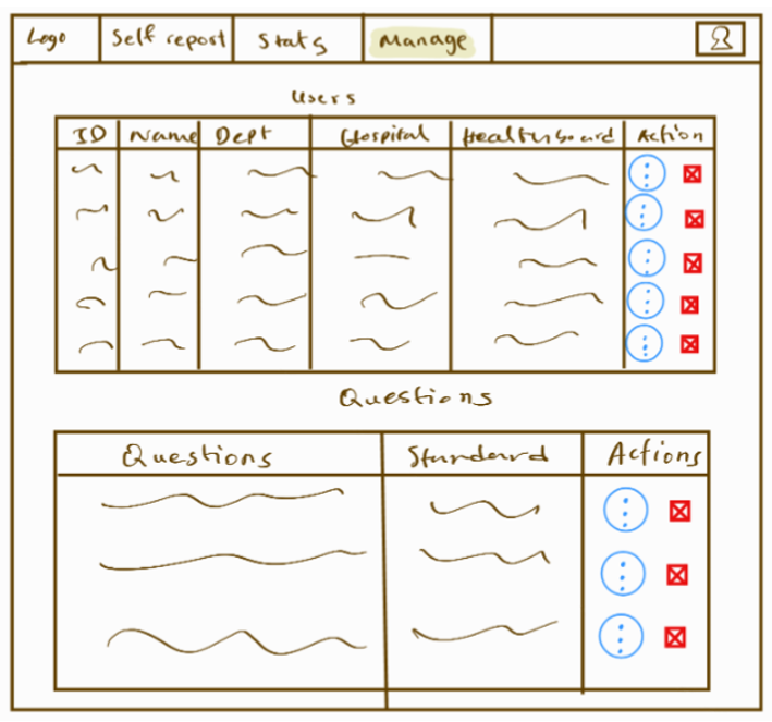
We created the sketches using the digital art tool sketchbook. We brainstormed and created sketches of what the main pages would look like with focus on the self report page and statistics page which also has an alternate sketch

Self-Report page

Self report page image

Manage page

manage page image

Statistics page

statistics page image

Statistics page (alternate)

statistics page (alternate) image

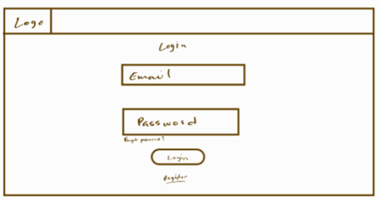
Login page

login page image

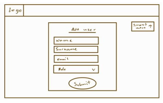
Register page

register page image

Revised Sketches

Feedback

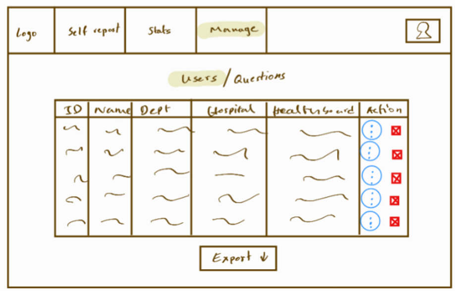
  • Users suggested the management page was quite overwhelming, without a clear distinction between user & question management. They also mentioned how a search functionality, as well as data import/export would be useful.
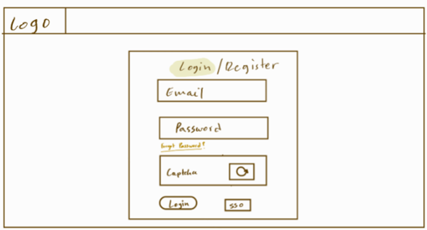
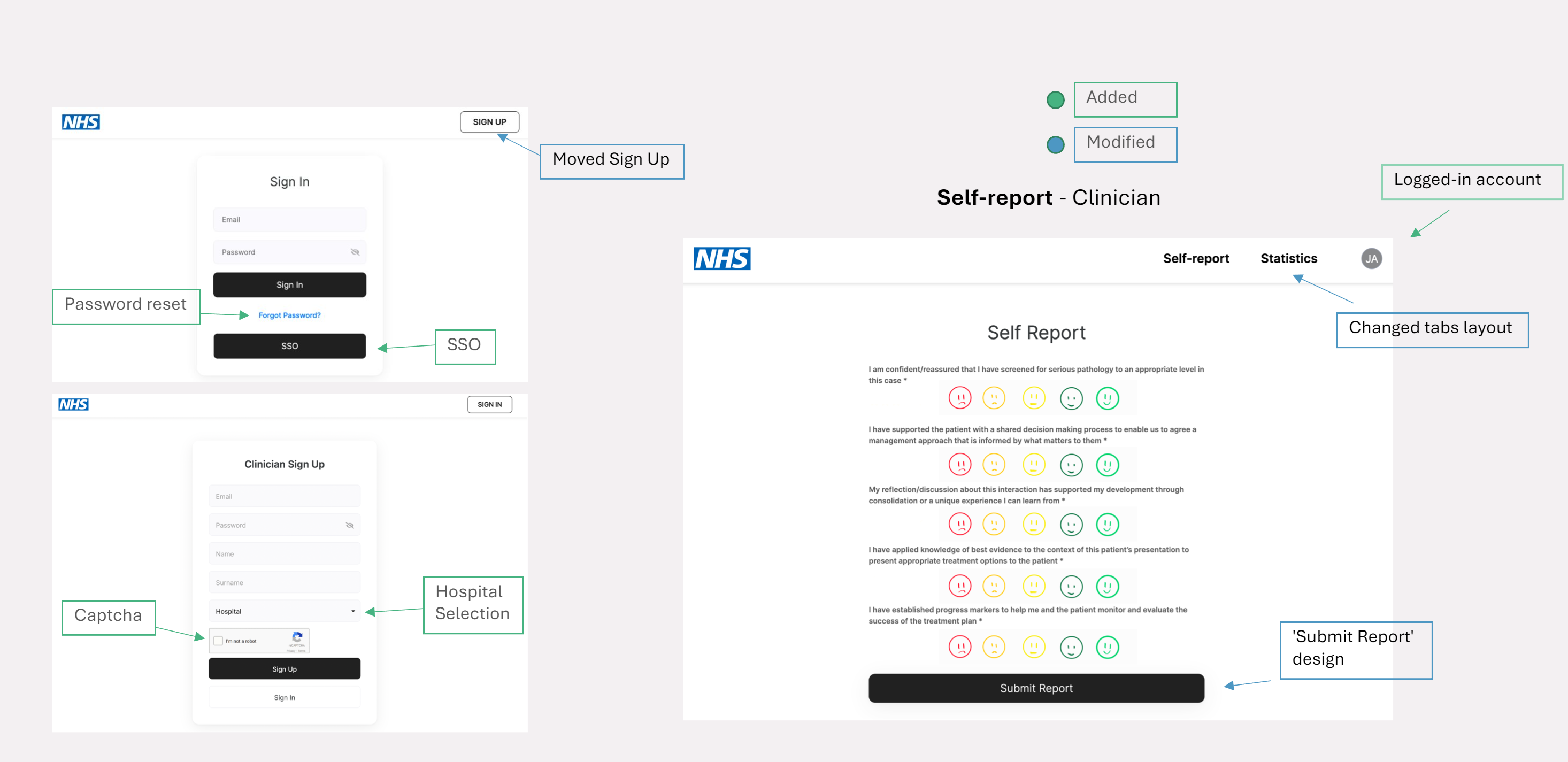
  • They suggested the need for SSO and a captcha as well as a clearer 'Register' functionality in the login page.
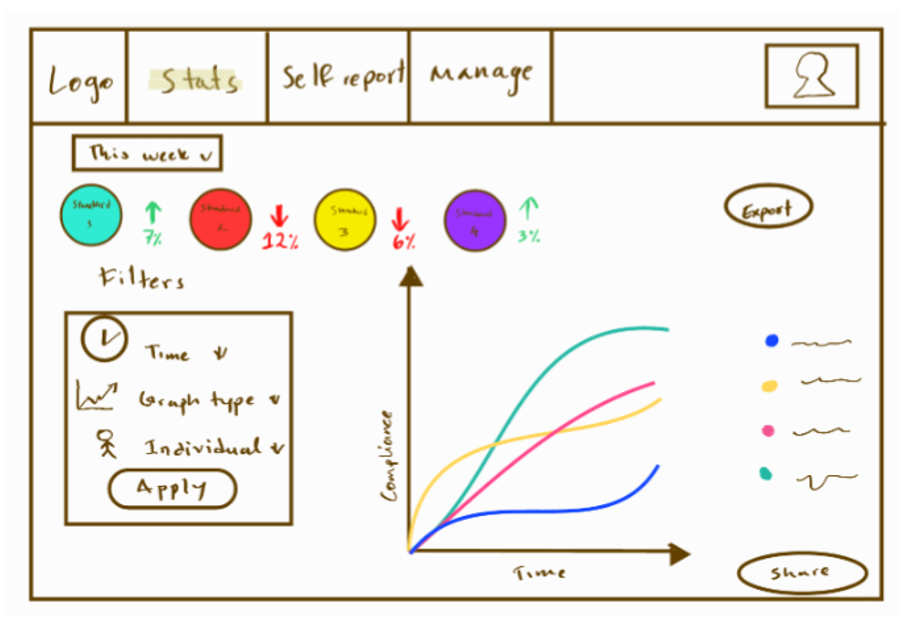
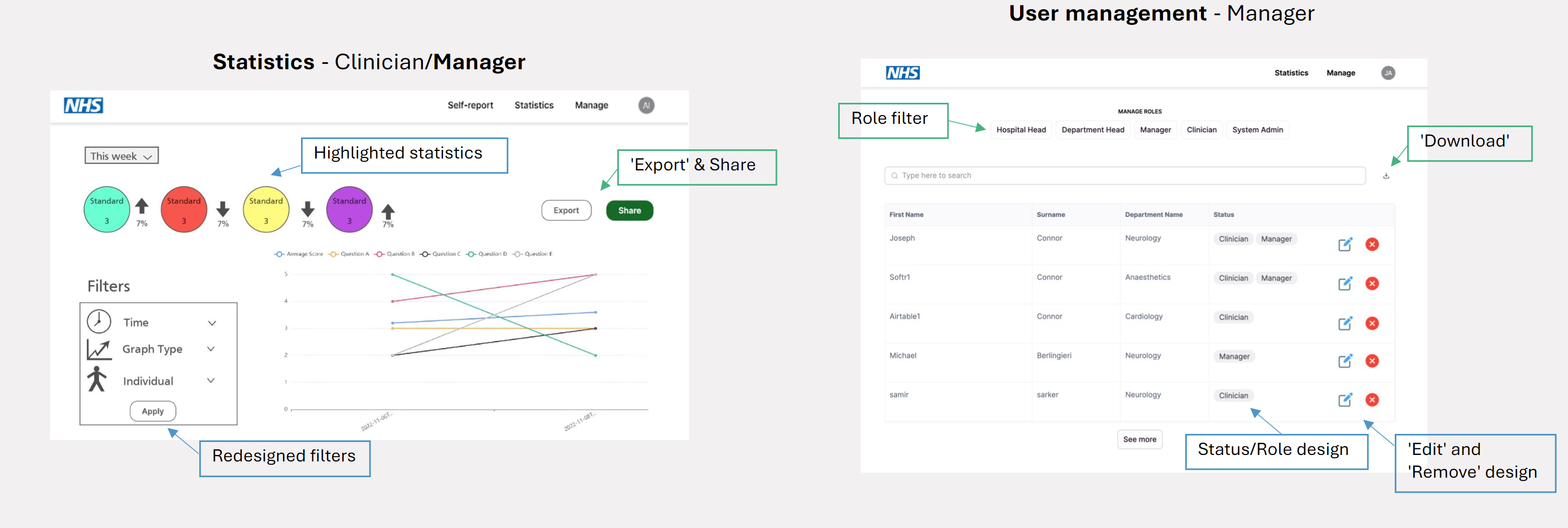
  • The client mentioned how the statistics page would benefit from multiple graph types, as well as a clearer metric highlighting feature.
Login page

  • Implemented captcha
  • Added SSO
  • Improved login and register functions
  • Highlighted password reset
revised login page image

Manage page

  • Split user and questions management into separate pages.
  • Added search bar.
  • Added data import/export button.
revised maanage page image

Statistics page

  • Multiple graph types
  • Quick highlights, comparing past and present results
  • Improved login and register functions
  • Clear share and export functionality
revised login page image

Prototype

After having finalised the sketches, we prototyped them using Softr for designing the UI and Airtable to mock the flow of data. At first the user (manager or clinician) needs to either log in or register after which is redirected to the home page. There they can choose to either self-report or (manager only option) edit the questions, department, hospital teams members. Users can as well access their own statistics (managers can also see their department/hospital statistics) over a selected time period with different types of visualizations.

prototype image
prototype image

Prototype Evaluation

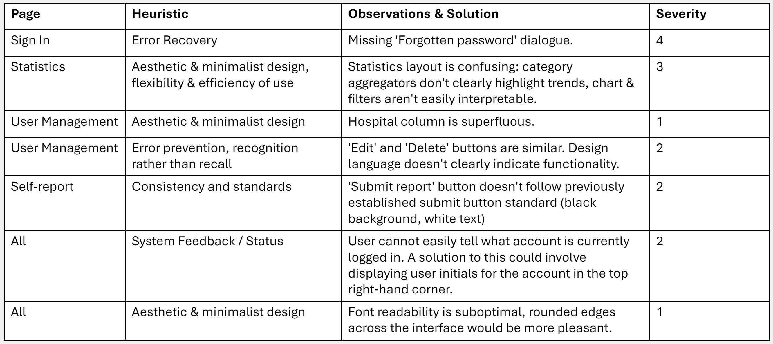
Evaluation was carried out according to Nielsen's standard heuristic principles for design1

prototype image

Revised Prototype

After evaluating the protype we revised it and came up with the following changes:

prototype image
prototype image

References

    [1] Nielsen, J., 2005. Ten usability heuristics.