UI Design
Design Principles
The following are design principles which our user interface should ideally follow in practice.
Initial Sketches
We began by sketching our initial concepts, guided by the user requirements we gathered, the design considerations we outlined, and the personas we created. Using an iterative design approach, we refined each sketch based on the previous version, continuously incorporating necessary improvements.
After gathering user requirements and considering our personas' needs, one of our first ideas was to use a mobile application to allow users to select the computer that they want to connect to. This functions as an initial system that would meet the basic requirements outlined by the users.
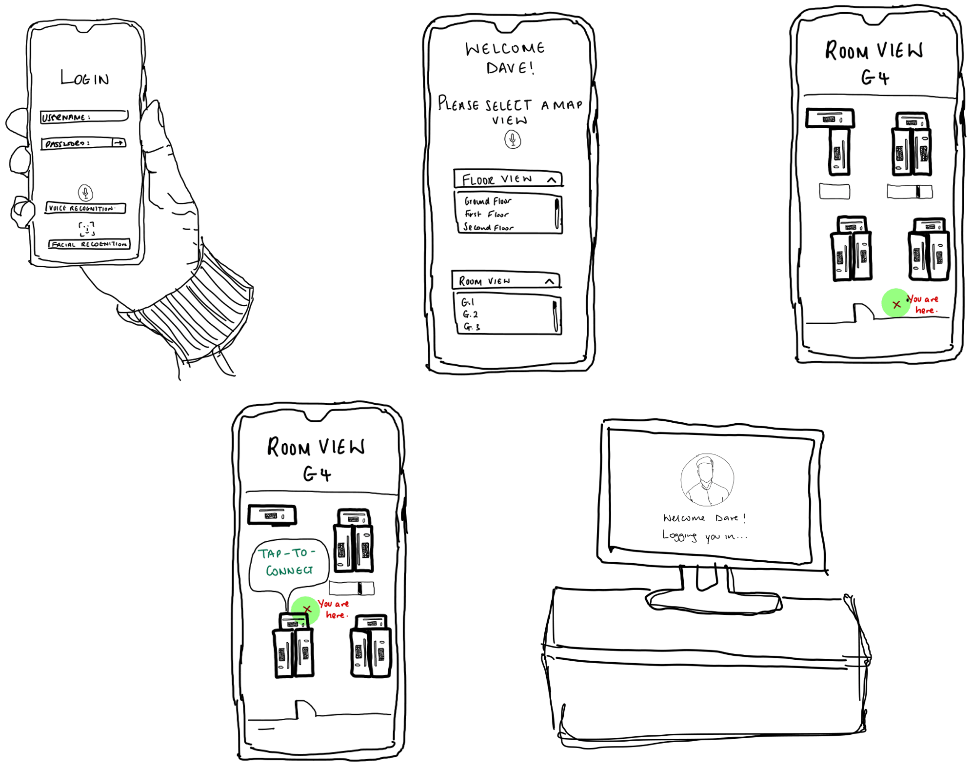
This sketch had generally negative reception.
| Responses |
|---|
| "It would be quite inconvenient to have to always open the app and manually choose the computer I want to connect to." |
| "This could be quite hard to use for someone with accessibility needs as they would have to first log in to their phone and then select the device." |
Evaluation of Sketches
Taking into account the feedback from both sketches, we believe Sketch 2 was more aligned with our original proposal as it allows for more users to easily connect to their devices without external help. However, it seems like some users are finding Sketch 2 quite confusing due to unfamiliar technologies being used in it. In later iterations we will explain how these technologies work.
Digital Prototypes
Prototype 1
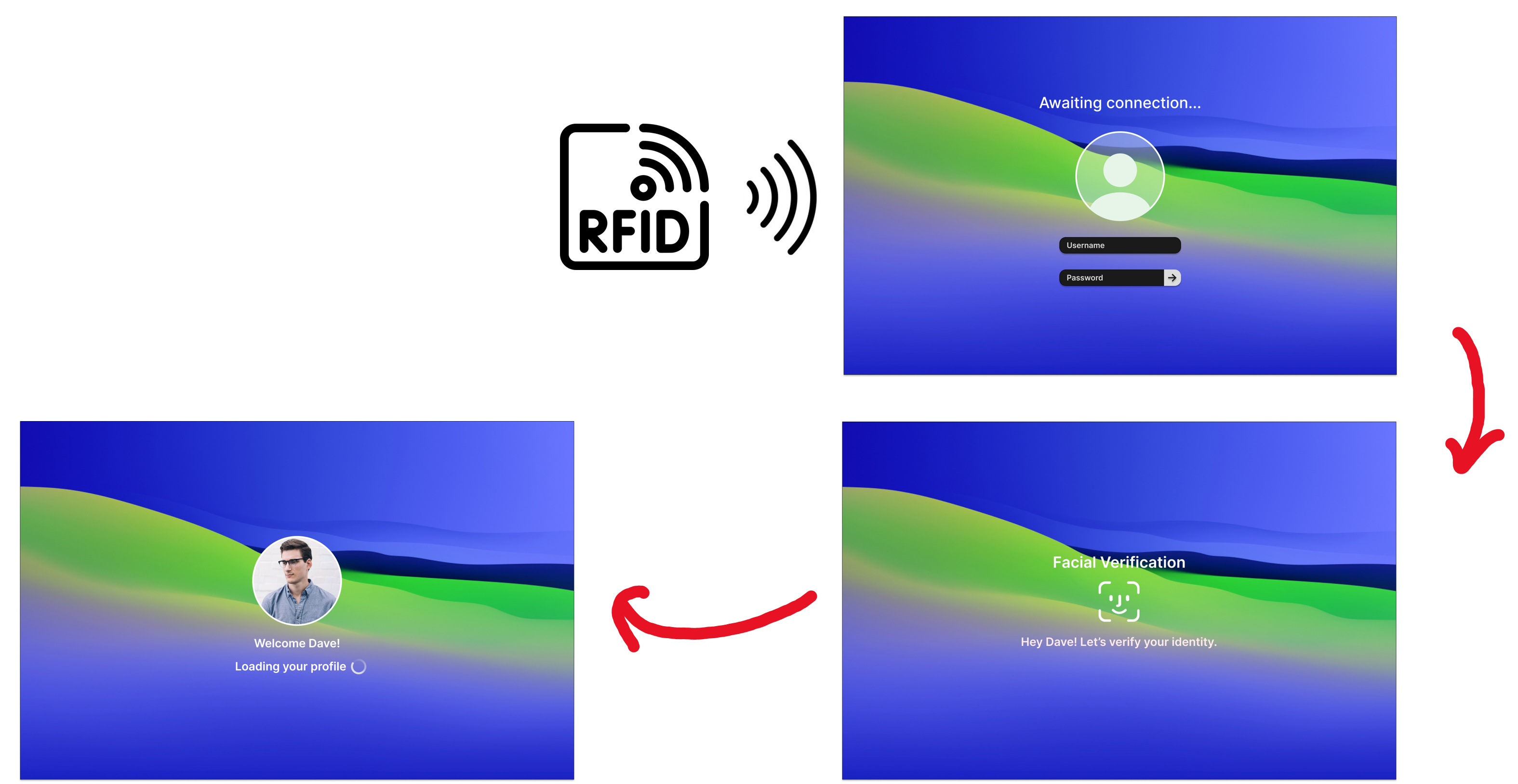
Based on our evaluation, we decided that Sketch 2 would better suit our vision for a more accessible system, so we added a few more details and created a prototype using Figma to make our idea come to life.
Evaluation of Prototype 1
We met with our client over at IBM, who gave us feedback about our first prototype. They listed some problems they had with the prototype, as well as potential fixes we could make.
| ❌ Problem | 💡 Solution |
|---|---|
| Colour Choice. The background colours are not suitable for visually impaired individuals. | Research and implement more visual impairment friendly UI designs. |
| Ambiguity of System Usage. The current prototype does not convey well how the system is meant to be used. | Add a more detailed explanation about the connections between devices. |
| Lack of Security. Users may be concerned about their data not being safely stored in the current prototype. | Specify that all data will be encrypted utilising post-quantum encryption algorithms. |
Prototype 2
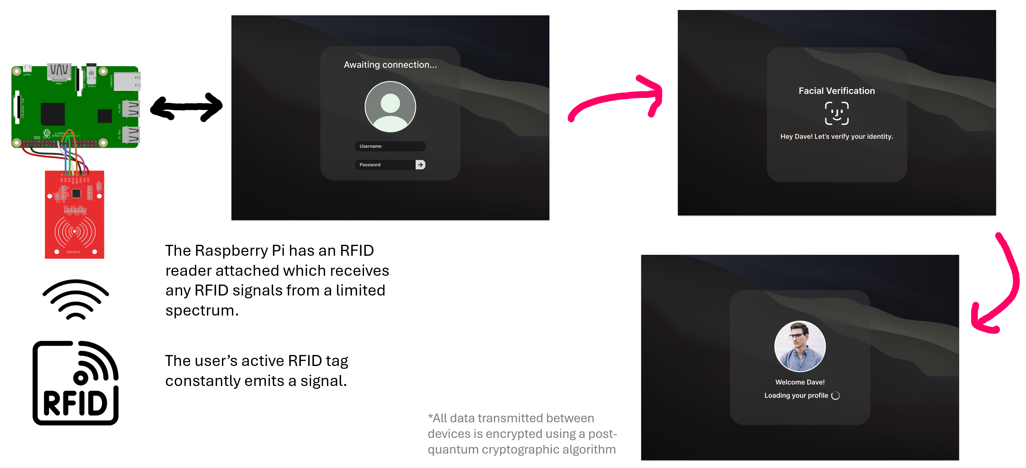
We arrive at our finalised prototype version, utilising all of the feedback we have received from our users and clients throughout the entire process.
Production Design
In practice, we were unfortunately unable to put these design choices into practice. Due to other priorities, we did not get around to redesigning the login interface used in the linux distribution we were developing with, and did not manage to display facial verification hints. Furthermore, the technologies used in these prototypes have become outdated, as we have since made the decision to use BLE over RFID.
As the project went on, we shifted our attention towards designing and developing the user interfaces for our AI Agent desktop app and user registration site. So, in terms of the production design of the login interface, it unfortunately remains the same as the default login interface of the linux distribution being used.
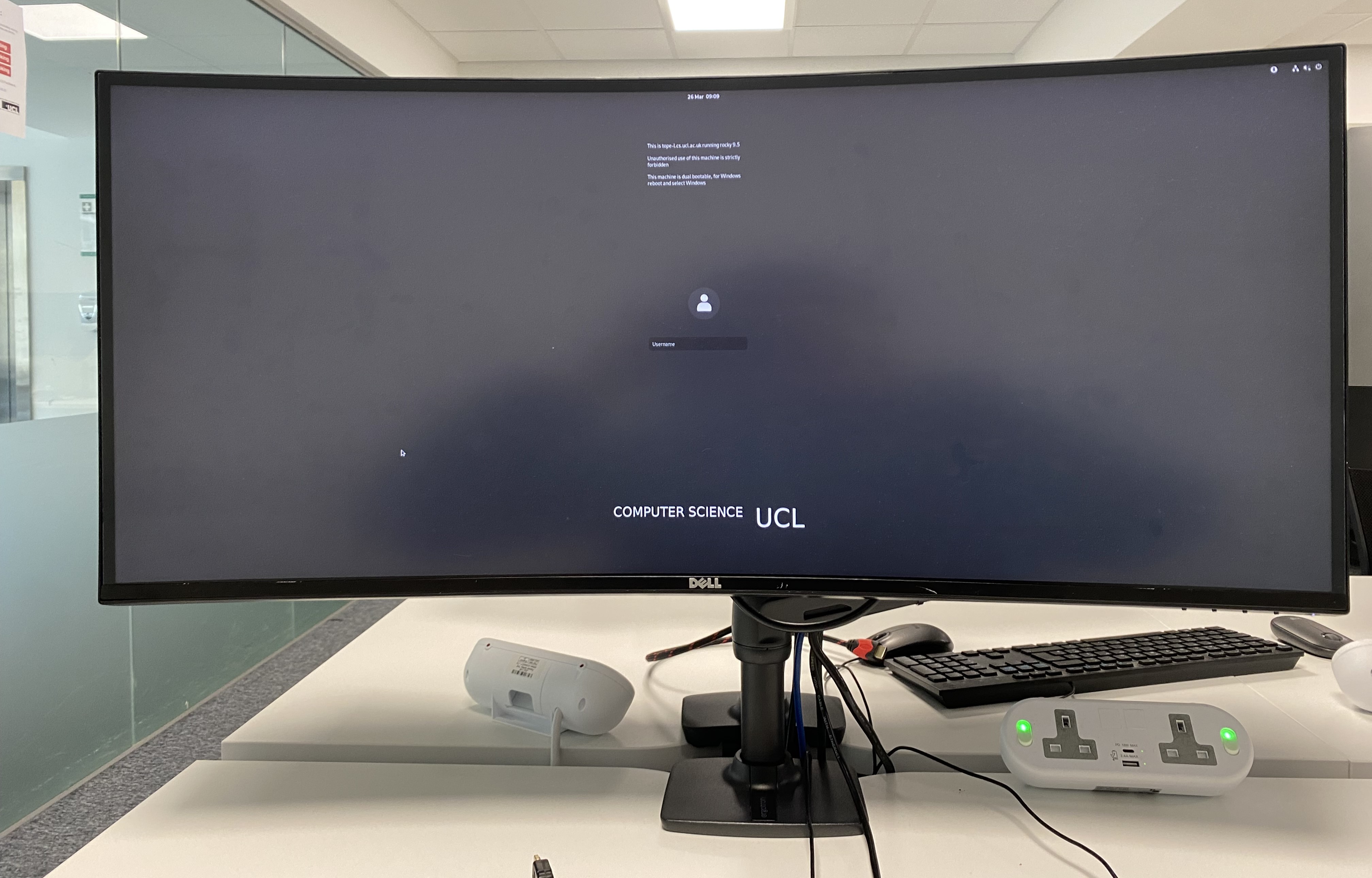
The default login interface is already somewhat user friendly with the contrasting gray background, and the white text. One key area for improvement is the font size, since it is quite small. Furthermore, the interface itself is quite bland, and could be improved by having more interesting images in the background.
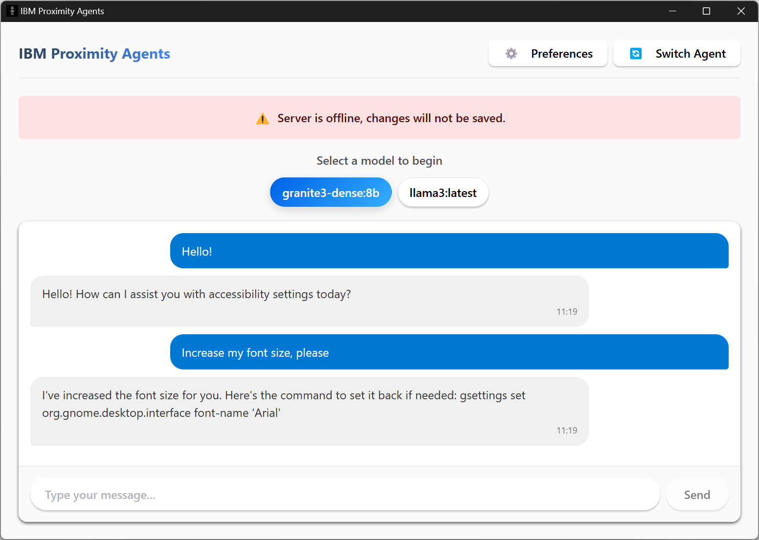
The desktop app follows our design principles quite well. The app has good visibility, and affordance. It is also simple in its design, making it suitable for people of all ages and capabilities. Furthermore, the colours used provide an interesting interface, whithout being too overwhelming for neurodivergent users for eaxmple.
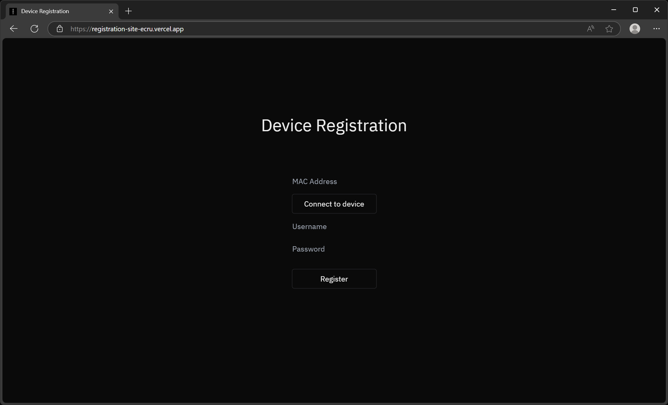
The registration site provides a sleek, dark interface. The purposes of the website are very clearly defined, with no unnecessary elements added that would otherwise distract from the main goal.