UI Design
Application Icon
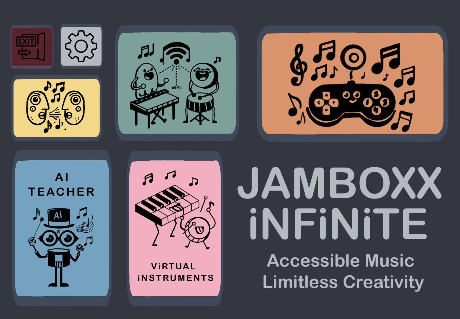
To set the visual tone for the entire product, we designed a custom application icon that embodies the spirit of Jamboxx Infinite — playful, accessible, and music-centered. The infinity symbol reflects the idea of limitless creativity, while the bright colors and friendly character style make the app immediately recognisable and appealing to children.
Image: Official app icon of Jamboxx Infinite
Design Principles
The design of the Jamboxx Infinite application was guided by several core user interface principles:
- Simplicity: The UI is intentionally minimal and easy to navigate, reducing cognitive load for users of all ages.
- Consistency: We established a unified design language across all screens, including consistent icon styles, button shapes, and layout structures.
- Visibility of System Status: Users receive immediate feedback for every interaction, such as recording, switching instruments, or changing settings.
- Feedback: Visual and auditory cues confirm user actions to reinforce interaction outcomes.
- Tolerance and Accessibility: The application includes error prevention mechanisms and flexible interaction methods such as motion input and customizable layouts.
- User Freedom and Control: A special “Move Mode” allows users to rearrange buttons and instruments to better suit their physical needs—particularly important for users navigating with facial movement.
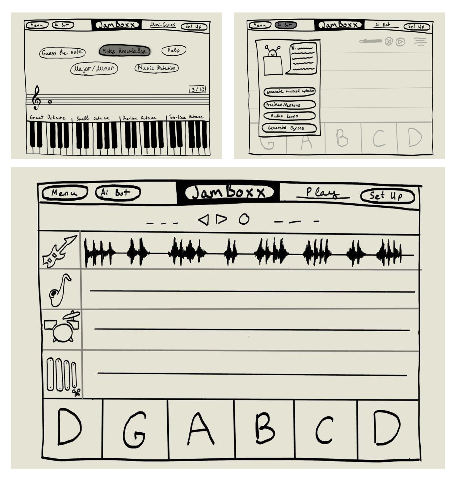
Hand Drawn Sketches
Initial Wireframes
Our early design stage involved sketching out different screens of the application, including the music AI teacher view, mini-games, and multiplayer scene. This process helped our team conceptualise core functionality before proceeding with high-fidelity wireframes.
Image: Initial hand-drawn wireframes of the core screens
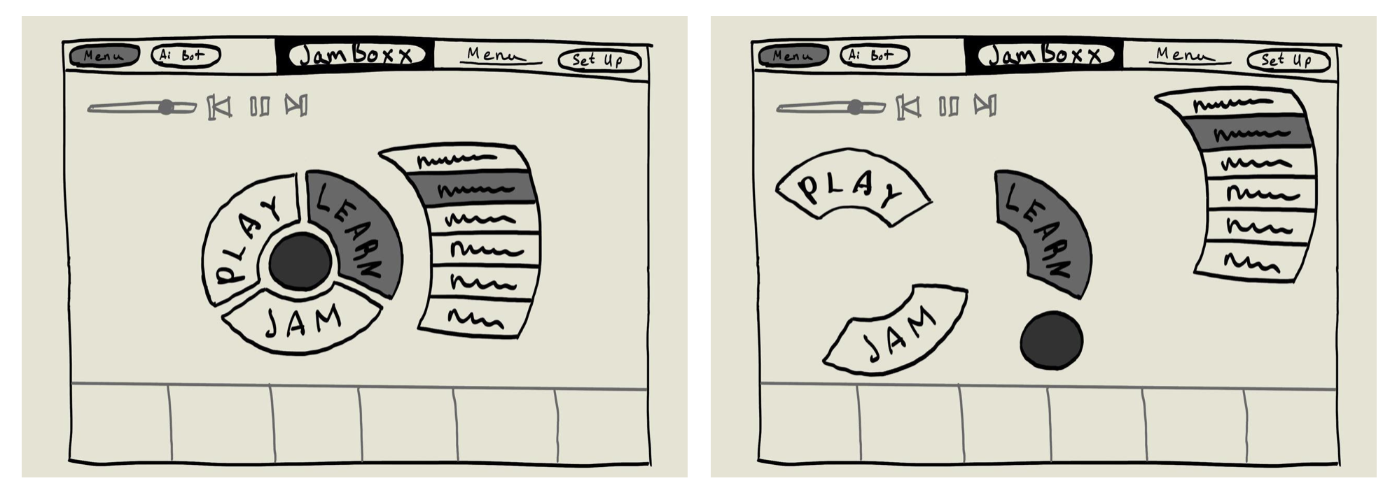
Layout Flexibility Concept
After meeting with the client, we discovered the importance of allowing users to reposition UI elements. Since our application supports face navigation, each user may have different preferences and comfort zones on screen. This led to the concept of a circular or free-positioned layout for key elements such as instrument keys and control buttons.
Image: Concept for draggable and circular interface layouts
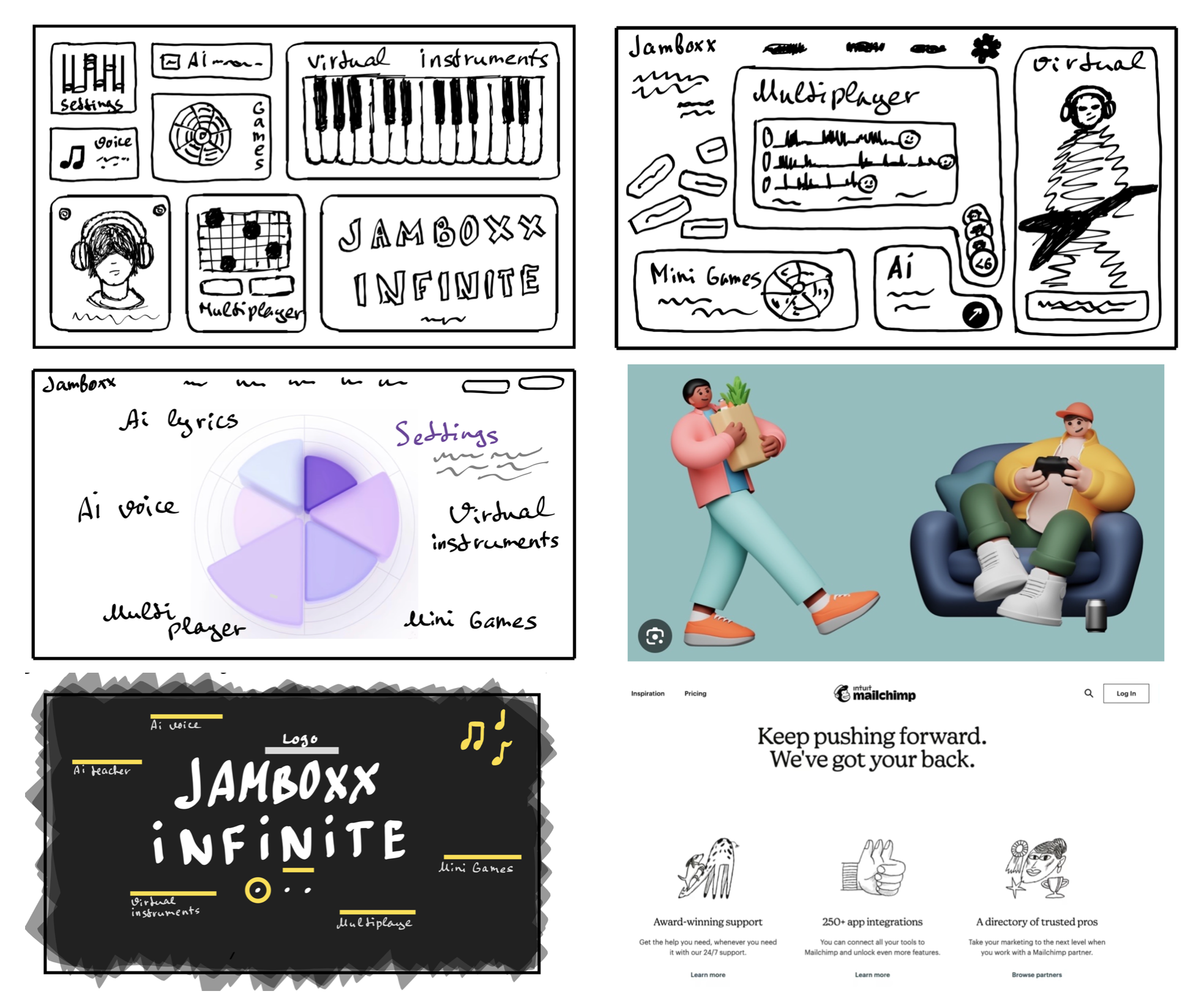
Exploration of Visual Styles
We explored five visual directions for the dashboard, including:
- Bento-style UI
- Claymorphism with minimalism
- Claymorphism/Morphism
- Big Typography
- 2D Illustration Style
After client feedback and internal evaluation, we selected a hybrid approach combining Bento layout and 2D illustrations, with small Claymorphism details to add depth and personality.
Image: Six proposed dashboard styles for visual experimentation
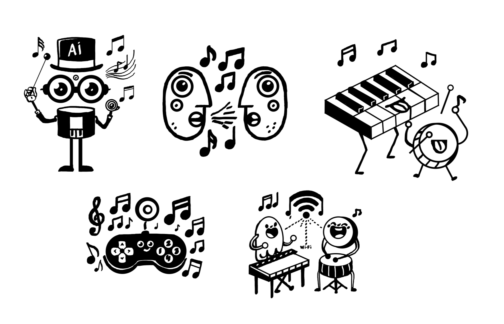
Icon Development
We developed a set of custom icons to represent the five core sections of the application: Virtual Instruments, AI Teacher, Voice Cloning, Multiplayer, and Mini-Games. The illustrations were kept playful and cartoon-like to match the application’s tone and to be appealing to our young target audience. The icons were positively received by users and included in the final version.
Image: Finalised icon set for primary navigation
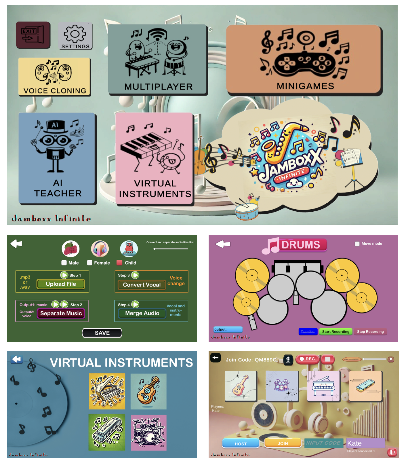
High Fidelity Wireframes
Dashboard Prototype
The first dashboard prototype implemented the chosen Bento layout and the 2D illustration iconography. During internal reviews and presentations to stakeholders, we received feedback to enhance the visual brightness and contrast to improve clarity and engagement—especially for children.
Image: High-fidelity dashboard prototype
Final Design
The final visual design applied all feedback and optimisations. It includes bright, high-contrast sections, animated icons, motion input compatibility, and scalable layouts. Multiple screens were finalised, including the virtual instruments interface, multiplayer lobby, voice conversion tool, and mini-games.
Image: Final polished UI screens of the application
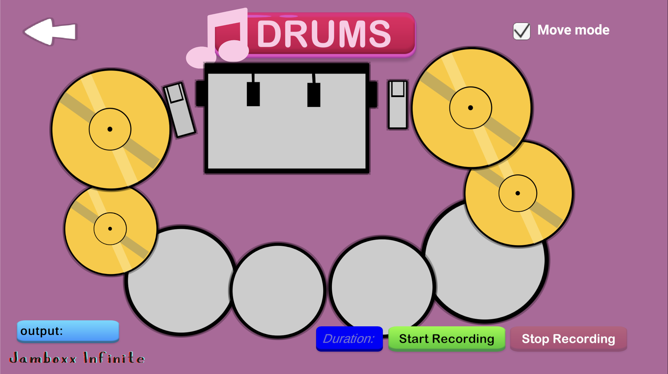
Reaffirming Accessibility: Move Mode Implementation
After presenting our application to a school for children with disabilities, we received direct feedback requesting the ability to reposition on-screen elements. This confirmed the importance of our early “Move Mode” concept (see second sketch), and we ensured full implementation in our final design. Now users can move buttons, keys, or pads freely—allowing for comfortable interaction using only facial gestures.
Image: Drum interface with custom circular layout using Move Mode
From Sketches to Reality
Our team focused on turning sketches directly into interactive designs within the application environment. All decisions were shaped by real feedback from the target audience. As a result, the final UI is fully integrated into the product and tailored to the needs of users with disabilities.