UI Design
Design choices for clarity, consistency, and elegance
UI Design Principles
The design of FinSync adheres to key user interface principles to deliver an intuitive and seamless experience tailored for Chanel Media’s internal stakeholders. Our primary objective was to simplify complex financial workflows by establishing a clear visual hierarchy, minimizing cognitive load, and ensuring that users always feel in control of the system.
Simplicity and Consistency
FinSync embraces a minimalist black-and-white theme that reflects Chanel’s timeless brand identity, ensuring visual elegance and clarity. Typography, iconography, and spacing are applied consistently across all pages. A persistent navigation bar and unified grid layout provide structural familiarity, while repeated actions such as file uploads follow identical interaction patterns. This reduces the learning curve and promotes ease of use.
Visibility and Feedback
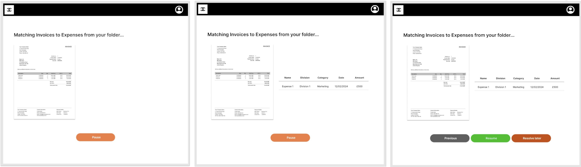
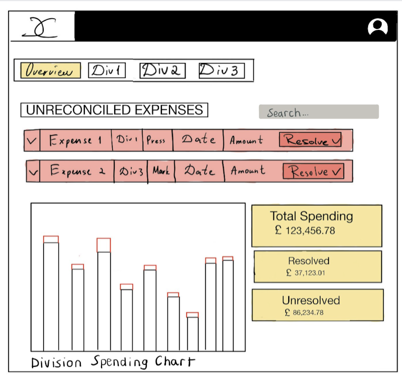
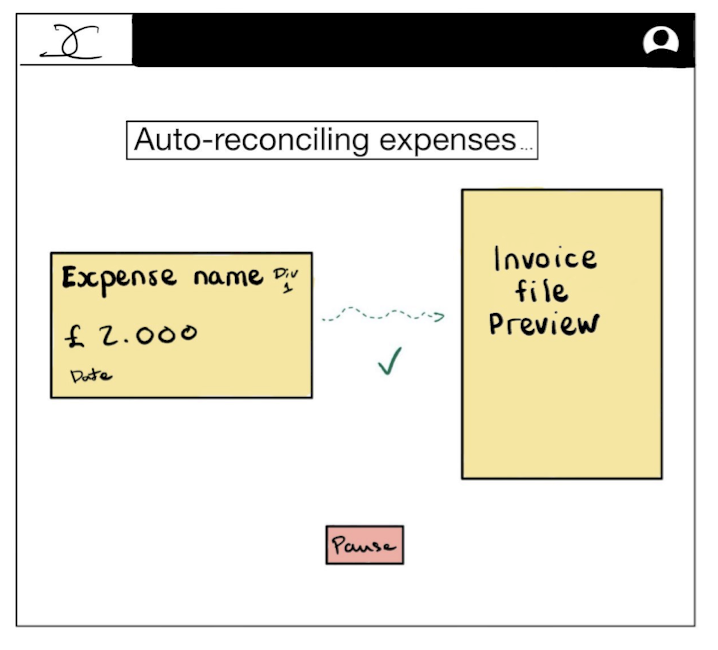
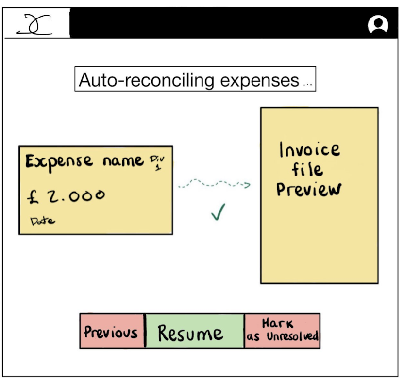
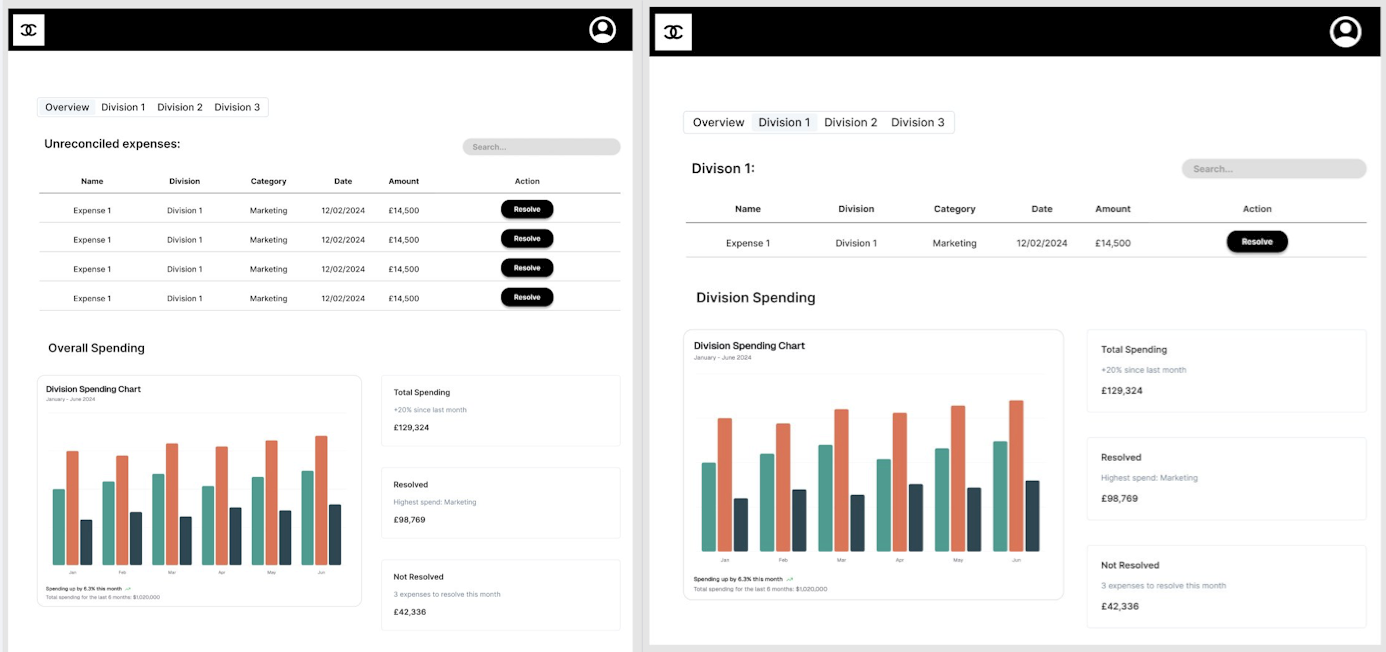
Crucial insights such as budget and spends through advanced visualizations are prioritized within the interface. Users benefit from real-time graph updates, Excel sheet previews embedded directly in the platform. During file uploads, a system notification prompts users to remain on the page for a few moments, clearly communicating the ongoing process and preventing premature interruptions. These feedback mechanisms foster trust and smooth navigation.
Tolerance and Error Prevention
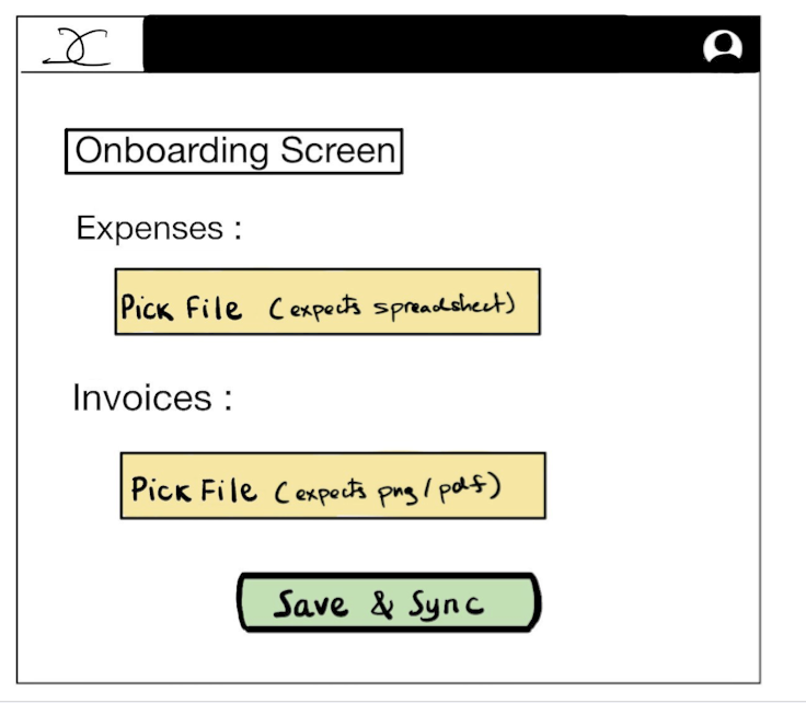
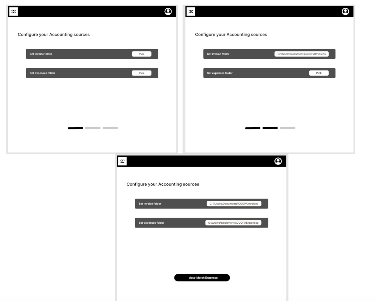
To support a forgiving and user-focused experience, FinSync enables users to reupload files as many times as necessary without overwriting or losing data.
By applying these principles, FinSync delivers a refined, branded interface that aligns with Chanel’s standards while empowering internal teams to navigate financial processes with clarity, speed, and confidence.
Sketches
Dashboard
File Configuration
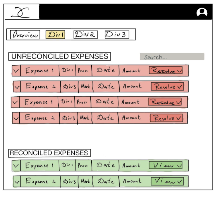
Invoice Matching
Wireframes
Dashboard
File Configuration
Invoice Matching