HoloLens UI development
During development of User Interface (UI) for the HoloLens application our main focus was to make sure that the user experience is consistent and all of the interactions are as reliable as they possibly could be considering HoloLens voice and gesture recognition capabilities.
The standard gestures supported by HoloLens are Gaze, Air tap, Navigation. Manipulation and Bloom. Gaze and Air tap are analogous to moving a cursor using a mouse and clicking the left mouse button, respectively. Navigation gesture is achieved by making a pinching gesture with your hand and moving your hand along either X or Y axis. Manipulation gesture is similar but the movement is not constrained to a single axis and HoloLens tracks hands' movements in all 3 directions. Bloom gesture is used to open the start menu. For example of what each gesture looks like, check [1].
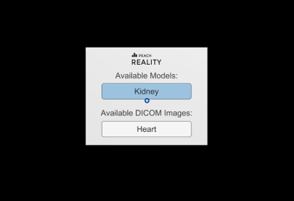
First of all, the main menu. It is a tagalong menu, meaning that it will follow user around trying to stay in their field of view; it is also a billboard, meaning that it will rotate around the Y axis to make sure that its front face is always facing the user. We gave our menu these 2 properties to make sure that when it's on, the menu is always visible and easily accessible.
Considering how different Bloom gesture is from other gestures and how well HoloLens recognises it, it would make a lot of sense to use it for menu toggling in our app. Unfortunately, Bloom is reserved by Windows Holographic for dismissing applications and toggling the Start menu, so in our app, for the lack of a reliable, distinct gesture we decided to use voice commands "Show Menu" and "Hide Menu" to reveal and dismiss the menu respectively.
As seen on the picture above, at the moment the menu itself is rather simple. Users can hover their Gaze over certain buttons and "click" them using either the Air tap gesture or HoloLens clicker[2]. We've added hover effects to buttons to make it easier for the user to understand which element they're currently interacting with. In fact, we've incorporated some kind of feedback to every user interaction in our app, which should make it easier for our users to tell when their gestures have been recognised correctly and which haven't.
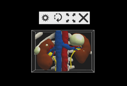
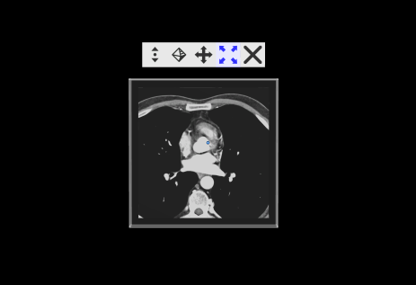
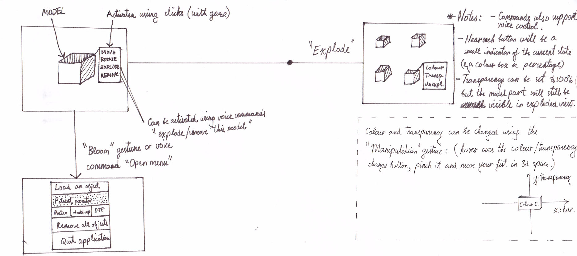
Apart from using the 2D UI like the one in the main menu, our app also involves a lot of manipulations with 3D objects, such as rotation, scrolling through DICOM images, translations, scaling, placement of data markers on meshes and some others. We tried to develop a simple system that would allow these actions to be conducted without introducing too much complexity into the UI. This lead to us developing the concept of context menus, as seen above (HoloLens emulator preview) and below (screenshot from the actual device).
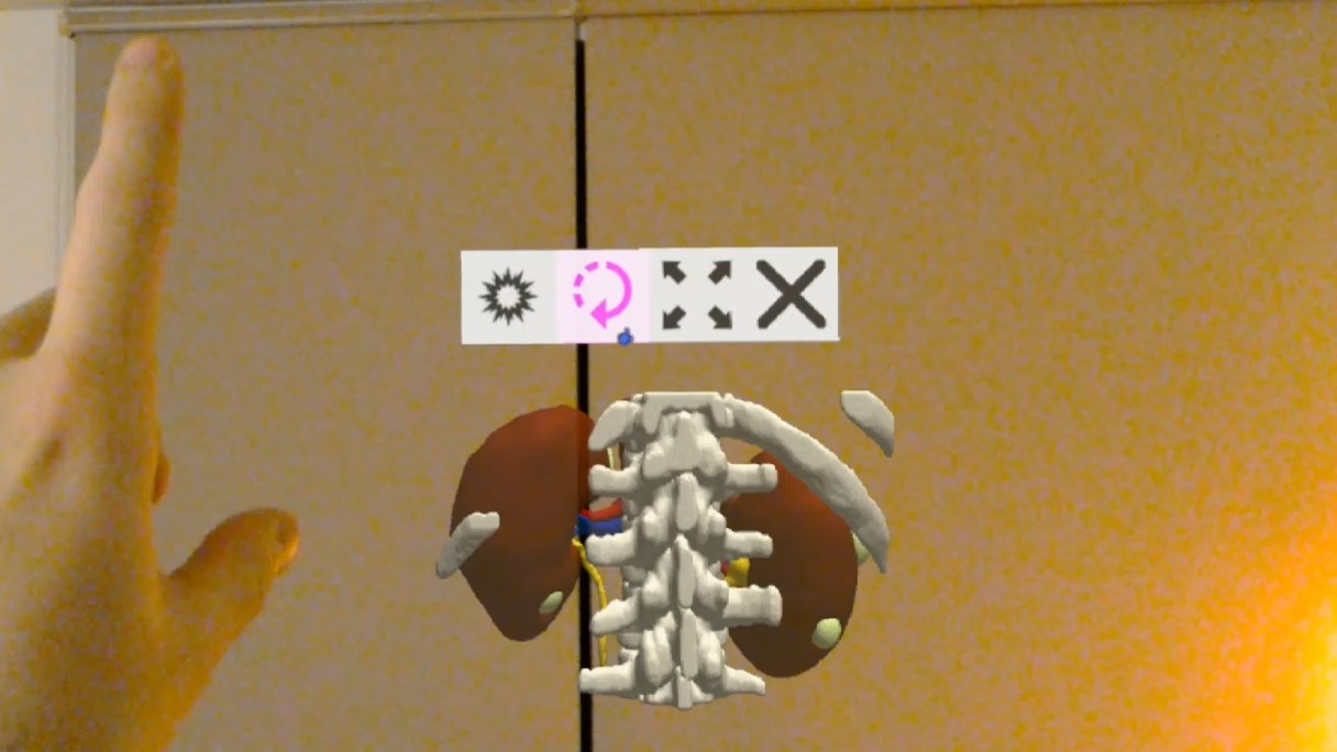
By default, air tapping or grabbing models or DICOM images ("objects" from now on) doesn't affect them at all and doesn't trigger any manipulation modes. Only when the user activates one of the manipulation modes from the context menu do the gestures begin affecting objects. For example, user can switch to the scrolling mode on a DICOM image, then point their Gaze at the image, "pinch" it and drag it downwards (so called navigation/manipulation gesture) to scroll through it. The button used to toggle the scrolling mode on DICOM images is the left most button on the context menu seen below.
The concept of manipulation is pretty much similar for all of the manipulation: user initiates a manipulation gesture and then moves their hand along either X, Y or Z axis, what affects the object in same way, for example by rotating, scaling or translating it. We came up with this concept early during the development process, and how we planned to use it for colour and transparency manipulation can be seen in the bottom right on the picture below. It must be noted that since this diagram was produced, the feature of changing colour of objects was abandoned as it was deemed not feasible by our client and the menu structure has been changed, since live patient data feed is no longer a must have but is a could have requirement.
The last major point to cover are data markers, which have only been introduced recently and we did not have the time to conduct proper evaluation of the feature. That said, we've agreed on the basic concept with the client and decided that data markers will hold various multimedia files, voice recordings, written notes and SNOMED CT scans. The very first sketch we produced can be seen below.
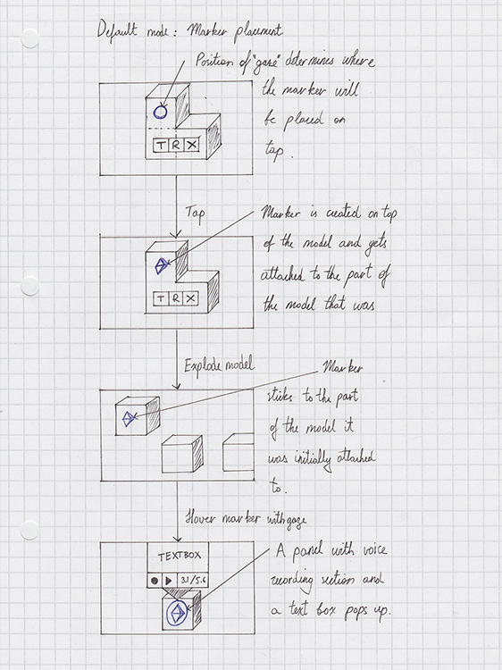
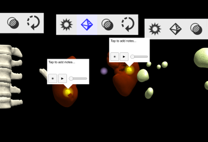
In the most recent prototype, this feature appears almost exactly as described on the diagram above. Below you can find the video demonstrating it in action (data markers appear around 2:50) and also a screenshot of some data markers as seen in the emulator.
In conclusion, I'd say we've done a good job at keeping the interface user-friendly and reliable as our client requested. We've achieved it by incorporating user feedback for various events, for example when HoloLens' sensors pick up user's hand a small hand icon appears indicating that HoloLens is take gesture input. Additionally, we tried to design our interface in such a way that all user actions are explicit, e.g. through toggleable manipulation modes we know exactly when the user is trying to perform a certain manipulation, hence we know explicitly which gestures and voice commands to look out for and hence can increase the accuracy of recognition by ignoring irrelevant gestures.