Personae
Because of the nature of our project, we really took the HCI aspect of the project seriously. This is because we are ultimately creating a website, which means that we need to design a simple and intuitive UI in order to make sure the user has a positive experience. Thankfully, we had done plenty of research during the actual HCI project, so we reused a lot of the material that we created then, such as the initial prototype sketches. We also consulted a lot with pseudo users, at multiple points in our project development cycle. For more details about how we conducted our user research, please press on the RESEARCH option in the NAV bar above.
Our first step of HCI was to try and understand the scope and requirements set by our client. In order to do this, we read through our project brief, and based on this we had a semi structured interview with the client. This means that we had prepared some questions to ask our client, but during the interview we also asked some questions that we did not plan in advance. We chose this interview style, as we felt like the planned questions gave us a good structure and direction, while the freedom of asking extra questions would allow us to probe and really explore the depth of the problem at hand.
Once we had grasped the scope of what our client wanted, we then went to collect information from current students in the IHE, as we felt like they were the best representation of actual users, as they would have faced the same problem of choosing a course within the IHE previously. We understood that there were a lot of potential students that we could obtain data from, so we chose to create a questionnaire to gather data. This is because it could easily scale and allow us to obtain data about plenty of students simultaneously. This method did have disadvantages however, as choosing questionnaires caused us to lose the ability to probe the students for more information. Also, there was not a great response rate, as students felt less incentivized to respond to a questionnaire in comparison with a face to face interview.
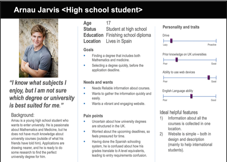
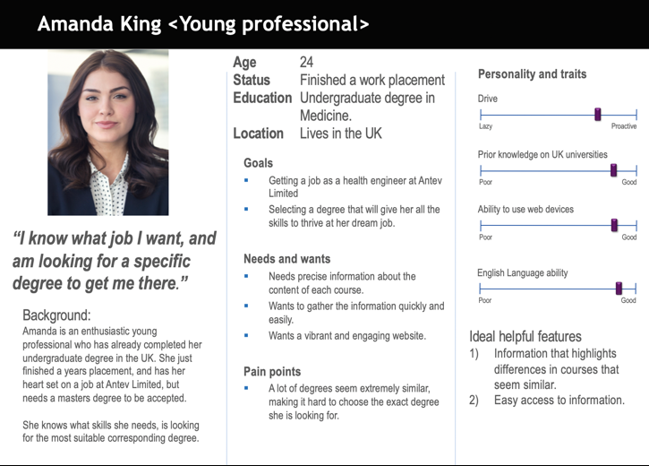
Based on all the data we gathered, we tried to create two personas in order to really consolidate our understanding about the future users of the project. These personas are shown below. We created them to represent two separate groups. The first group, represented by Arnau are students who have some interest in health care engineering, but have very little information about university or specific courses. The other group, represented by Amanda, represents students who know quite a bit about what they want to study and have clear career goals, and wants to find out very specific information about each degree. These personas were very effective in developing our course decision tool, as it allowed us to code a solution that would be helpful to both groups of people – those with plenty of prior knowledge of degree information, and those without much knowledge.
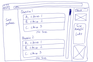
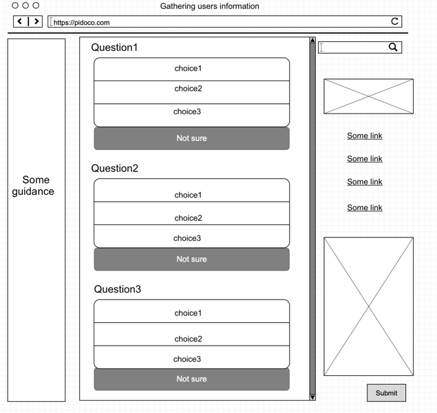
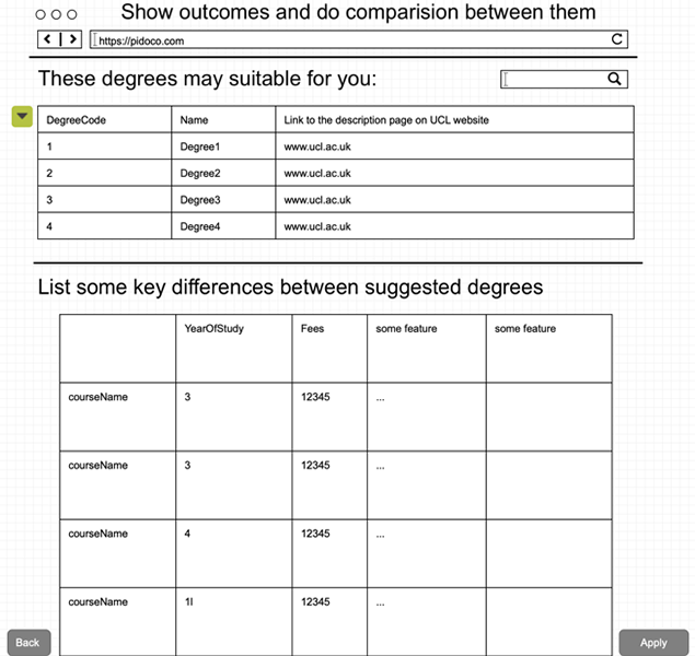
After creating the personas, we then moved on to work on creating our first few sketches to try and figure out the best way to lay out the user interface. Our sketches can be shown below. When we were satisfied with our sketches, we made sure to present them to pseudousers (our own class mates) in order to get feedback on anything we should change to make them more effective. We then moved on to create a high-fidelity prototype using pidoco, which was useful as it gave us an interactive basic version of the layout of our website, and we again chose to evaluate this with our classmates. The reason why we chose to our class mates to evaluate the prototype is because we had specific lessons and training on usability. This allowed them to evaluate our work as pseudo-experts, and highlight any issues that violated Nelson Normals 10 usability heuristics. This allowed us to modify our prototype, as we initially did not provide a back button to allow users to resubmit answers to the questions, which broke the user control and freedom heuristic.