Sketches
First revision
With our interviews and personas providing a better understanding of the core functionalities of our application, we proceeded to draw several sketches that would help us explore and concretely visualize what our mobile and desktop applications would look like.
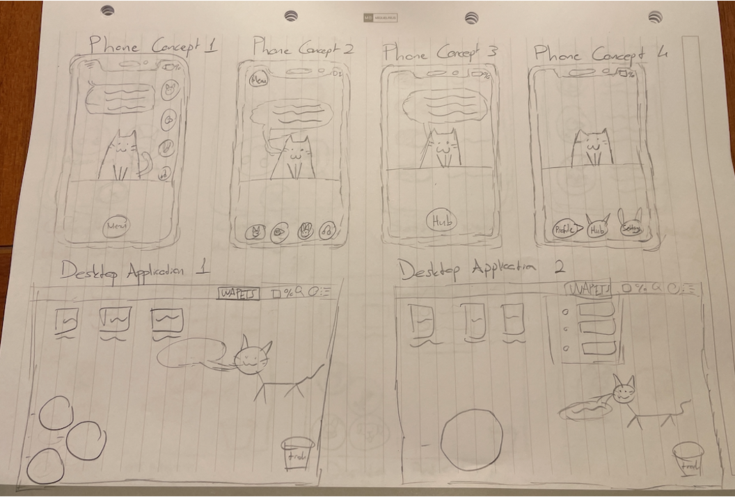
Our users gave feedback that they prefer a mixture of Phone Concepts 2 and 3 over the other mobile phone concepts. They separately stated that they preferred the screen to be as "tidy" and "visible" as possible, given that they were to interact with the pets on screen – something they would have difficulty with the more the buttons took up screen space. This also applied for Desktop Applications 1 and 2, where they preferred a mixture of the two sketches - a central "Hub" button surrounded by several smaller supporting buttons to visualize the different menus.
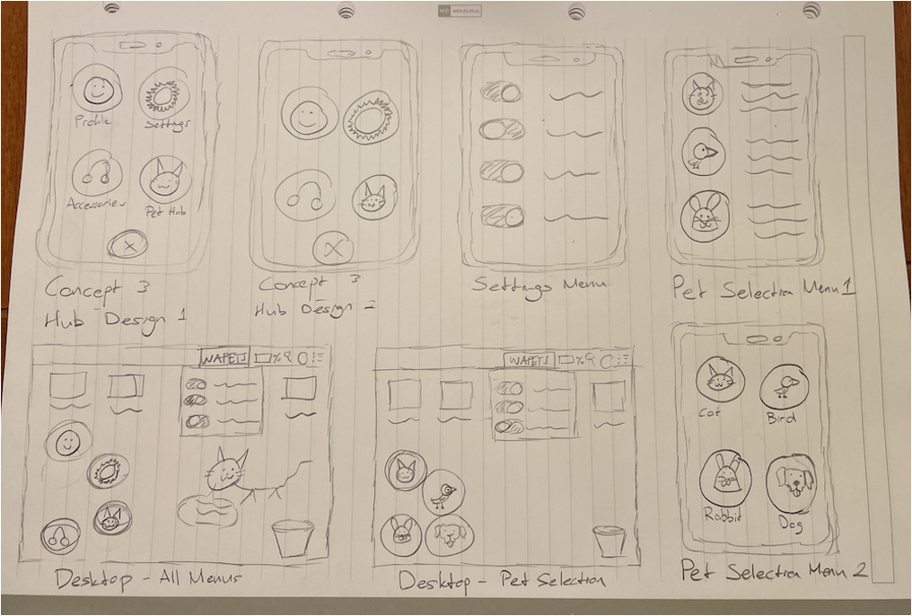
Second revision
With our interviews and personas providing a better understanding of the core functionalities of our application, we proceeded to draw several sketches that would help us explore and concretely visualize what our mobile and desktop applications would look like.
Based on our sketches, we designed several prototypes in Balsamiq which allowed us to explore and see the utility of our sketches.
Prototypes
First revision
Our prototype provides a visualization of how each menu is connected to the other. The arrows signify the direction between interactive menus.
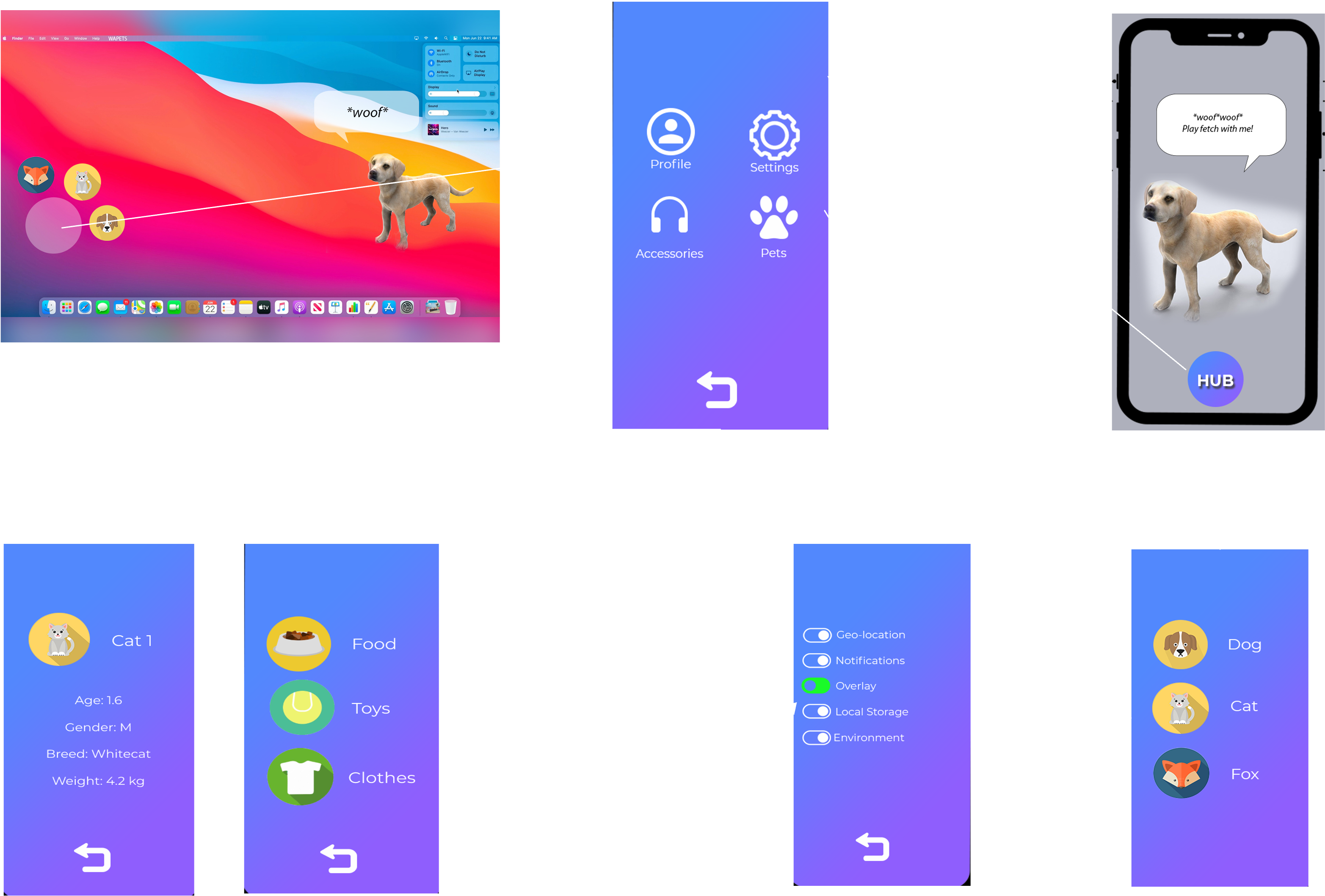
The desktop version is connected to the mobile app layout as we envisioned the menus on the mobile and desktop version to be similar, so that our users would a feel a sense of familiarity even between different platforms.
Second revision
Based on user feedback, we improved the desktop prototype.
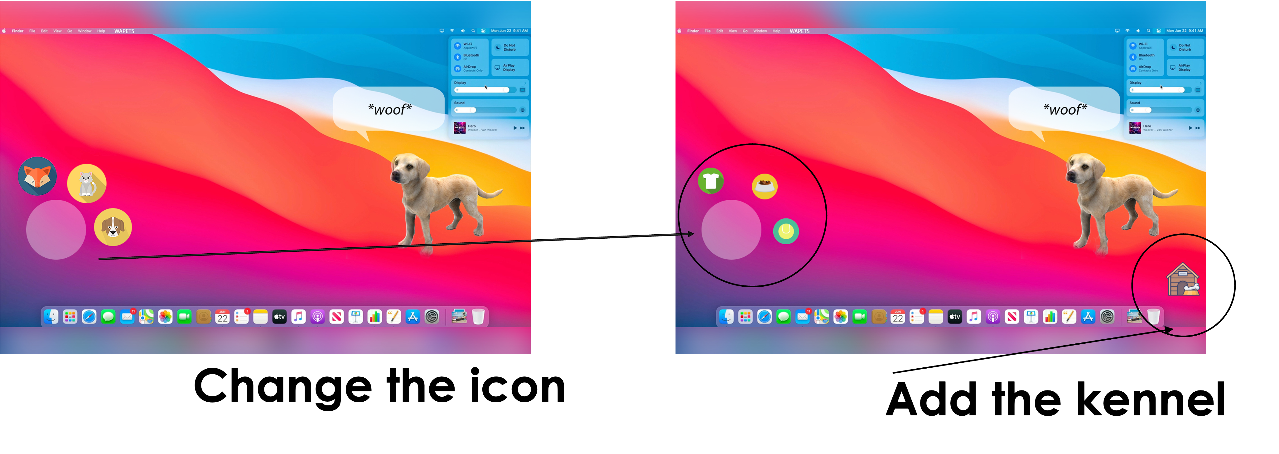
We also improved the mobile prototype.
Evaluation
We then carried out a heuristics evaluation of our prototype as it neatly lays out the necessary changes to our prototype to provide a better user experience. This allowed us to review our designs, iterate over them and improve upon our existing feedback from potential users.
| # | Location & description | Heuristic | Solution | Severity (0-4) |
|---|---|---|---|---|
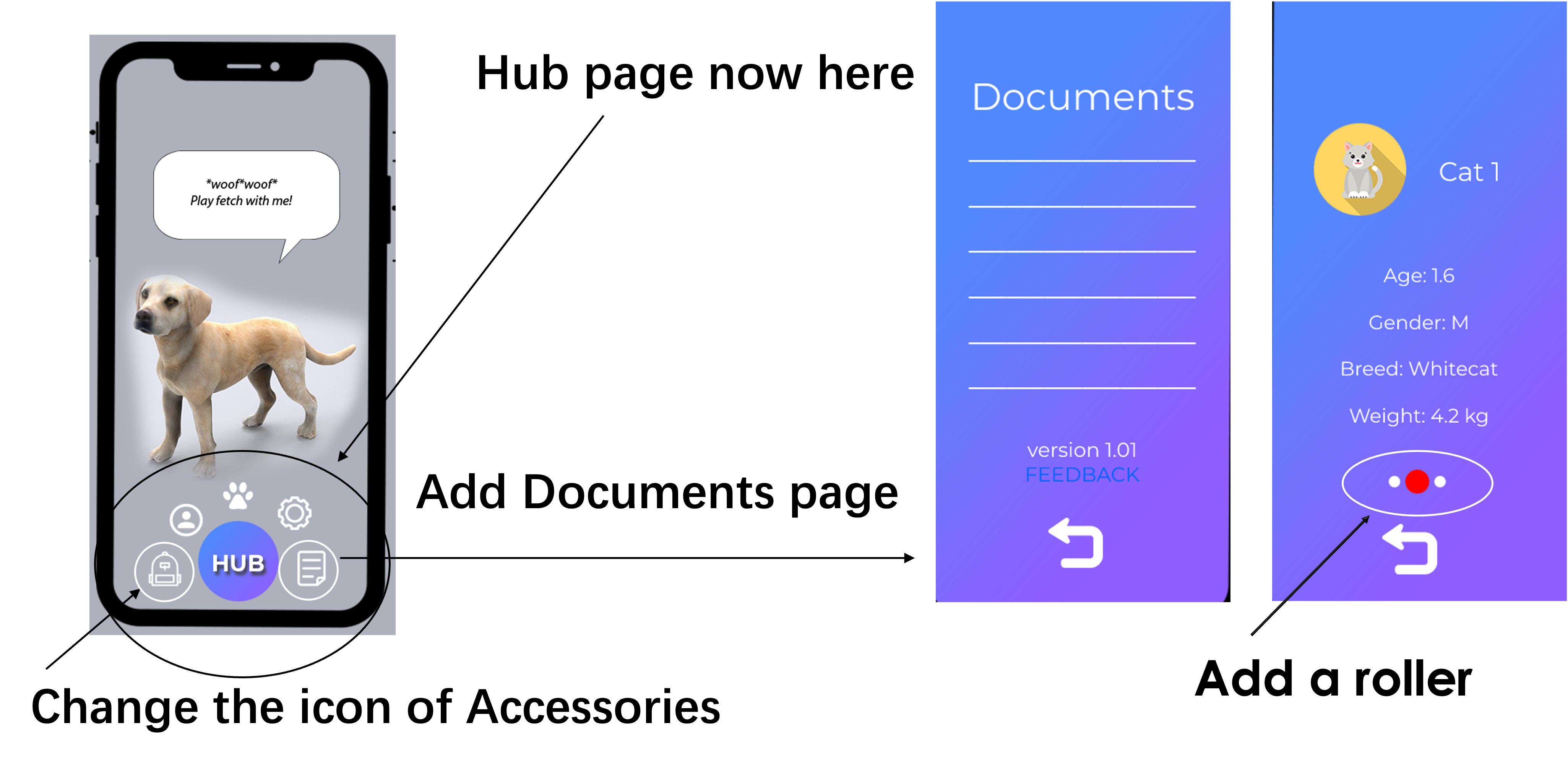
| 1 | There should be an interface for displaying help documents, software version / copyright information and submitting feedback. | Help and documentation | Add a page that provide such information. | 4 |
| 2 | After clicking HUB button, it navigates to another page, so users are not able to observe their pets’ behavior, unless clicking BACK button. | Visibility of system status | Change the HUB button, now the options are displayed at same page by long-pressing. | 2 |
| 3 | The desktop interface should add interaction options, such as feeding, playing with pets, and so on. | Flexibility and efficiency of use | Change the options on the left to interaction buttons. | 3 |
| 4 | If it is not during AR interaction, one possible setting is that the dog is resting in its kennel, so that the dog can walk out when it needs to interact. | Match between system and the real world | A kennel can be added to the screen. | 1 |
| 5 | In desktop UI, icons and virtual pet images occupy a large space, which will lead to inadvertent operation. | Aesthetic and minimalist design | Only when the mouse cursor moves over the virtual pet, other options’ icon pops up. | 1 |
| 6 | In the Profile page, if there are more than 1 pets to choose, there should have a roller or page number. | Flexibility and efficiency of use | Add a roller. | 2 |
| 7 | In the Hub page, the icon of “accessories” makes me confused, it seems the “earphone” icon is not really related to any items in the next page, especially accessories for pets. | Recognition rather than recall | Change the icon. | 1 |