Testing#
Compilation and Automation testing#
Part of our team’s work included developing a set of self-made automation and compilation scripts. We have successfully developed an automatic documentation website deployment scripts that would use Sphinx to generate the docs from the python source code. In addition to that we have also set up a remote compilation script via github actions. These scripts have been thoroughly tested by all Motion Input v3 teams that were using similar dependencies.
Preprocessing benchmark Testing#
As was mentioned in the Algorithms section of our website. One of the most compuationally expensive steps that our software does is preprocessing.
We have conducted a suite of benchmark test to undertand how acceptable is our current implementation, and what limitations does it impose.
Our preprocessing step takes in a video and returns a processed, and smoothed out angles JSON.
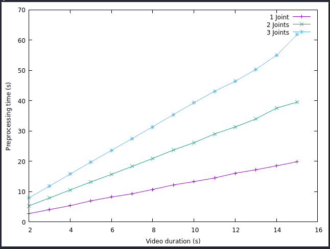
Hence, our test data consisted of 14 videos of varying duration. We have done 3 test runs over the testing data, each run increasing the number of joints, angles at which are being calculated.

As can be seen from the figure above, when we are talking aboout a 2-4s of video, the amount of processing time varies from 2 to 15 seconds total. However, for larger duration values, the processing time follows linear growth, with a peak value of processing a 15 second video with a 3 joint consideration for a bit more than a minute.
We consider the following results as acceptable for our PoC. Generally speaking our accuracy model is supposed to only handle short videos, since the total video is supposed to represent a single repetition of an exercise. Any repetition that lasts more than 6 seconds of time will be problematic to preprocess, yet it can still be consider acceptable since we only have to do it once.
The following test has brought us to implement 2 more features in our design.
Addition of a video trimmer in an exercise creation page, to allow specify the duration of the video in place.
implementation of background preprocessing in a separate thread after creation of the exercise to avoid screen freezing.
User acceptance testing (UAT)#
Why we did this test
This test is mainly used to test our UI. This is because ‘usability’ is our main priority. Therefore, we need feedback from users (and potential users) themselves to know how the app works for them. The most straightforward way to achieve this is through UAT.
Test tools used
The only tool needed to run the tests was our app. We also prepared some tasks (test scenarios) for users to work through during the test.
ID |
Task description |
|---|---|
1 |
Start an exercise |
2 |
Maintain a good accuracy score (white line) for 3 seconds |
3 |
End an exercise |
4 |
View list of attempts |
5 |
Export a single attempt |
6 |
Export all attempts |
How we conducted the test
We started running the app for our users and gave them the test scenarios to go through. We encouraged them to ‘think out loud’, so that we are able to know their thought process as they navigate through the app.
A member of our team would ask the user questions as they go through the tasks to prompt them to think further, or give guidance while needed. Another member of the team would observe the test run, recording the interactions and noting any interesting findings.
Results we got
ID |
Description |
|---|---|
1 |
No quick overview of all attempts |
2 |
Quick walkthrough of all features would be preferred |
3 |
No landing page to properly launch app |
4 |
Colour scheme is not ‘professional’ |
5 |
User’s camera is too small during exercise sessions |
ID |
Description |
|---|---|
1 |
Sample video present during exercise |
2 |
Accuracy live graph & colour coding feature helps with motivation |
3 |
‘My Exercises’ tag feature to allowing pinning |
4 |
Analysis page is detailed & easy to understand |
Analysis and conclusion to the results
We made the following changes to address the complaints:
ID |
Complaint Description |
Solution |
|---|---|---|
1 |
No quick overview of all attempts |
Progress chart |
2 |
Quick walkthrough of all features would be preferred |
Pop-up tutorial |
3 |
No landing page to properly launch app |
Created landing page |
4 |
Colour scheme is not ‘professional’ |
Changed colour theme to muted blue |
5 |
User’s camera is too small during exercise sessions |
Changed layout of Exercise page to maximise user’s camera |
We did a second round of UAT after making these changes to our UI, and there were much fewer issues detected. Users were generally able to work through the test scenarios with ease. Therefore, we are confident that the ‘usability’ aspect has been achieved.