UI Design
Using the requirements gathered from the users, we were able to create a desktop and mobile design for the power app
Using the requirements gathered from the users, we were able to create a desktop and mobile design for the power app
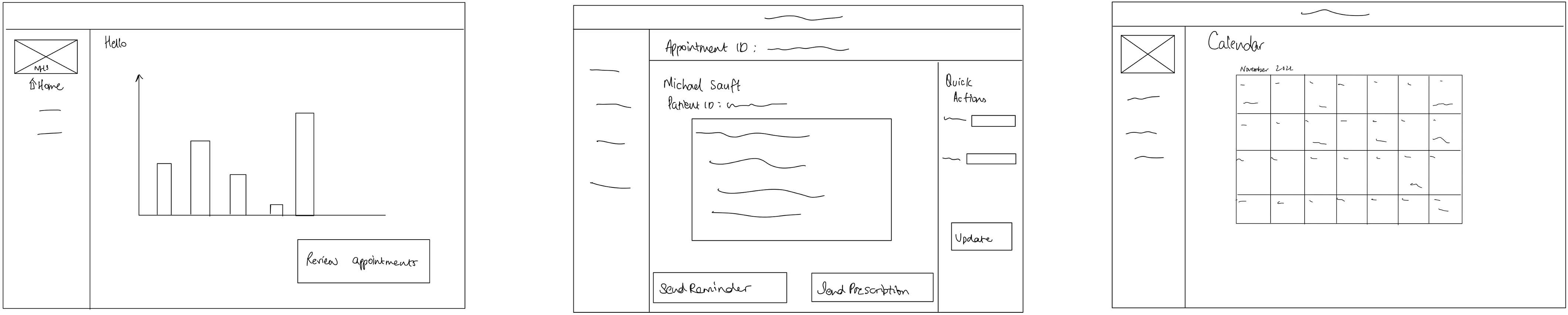
Having gathered the user requirements and illustrated them using personas and scenarios, we moved on to the sketching stage to consider ideas of how our Connector could be used on the Power Platform, using a power app. These were the first sketches that we made and we wanted to consider alternatives so we made a second set of sketches. Such sketches int
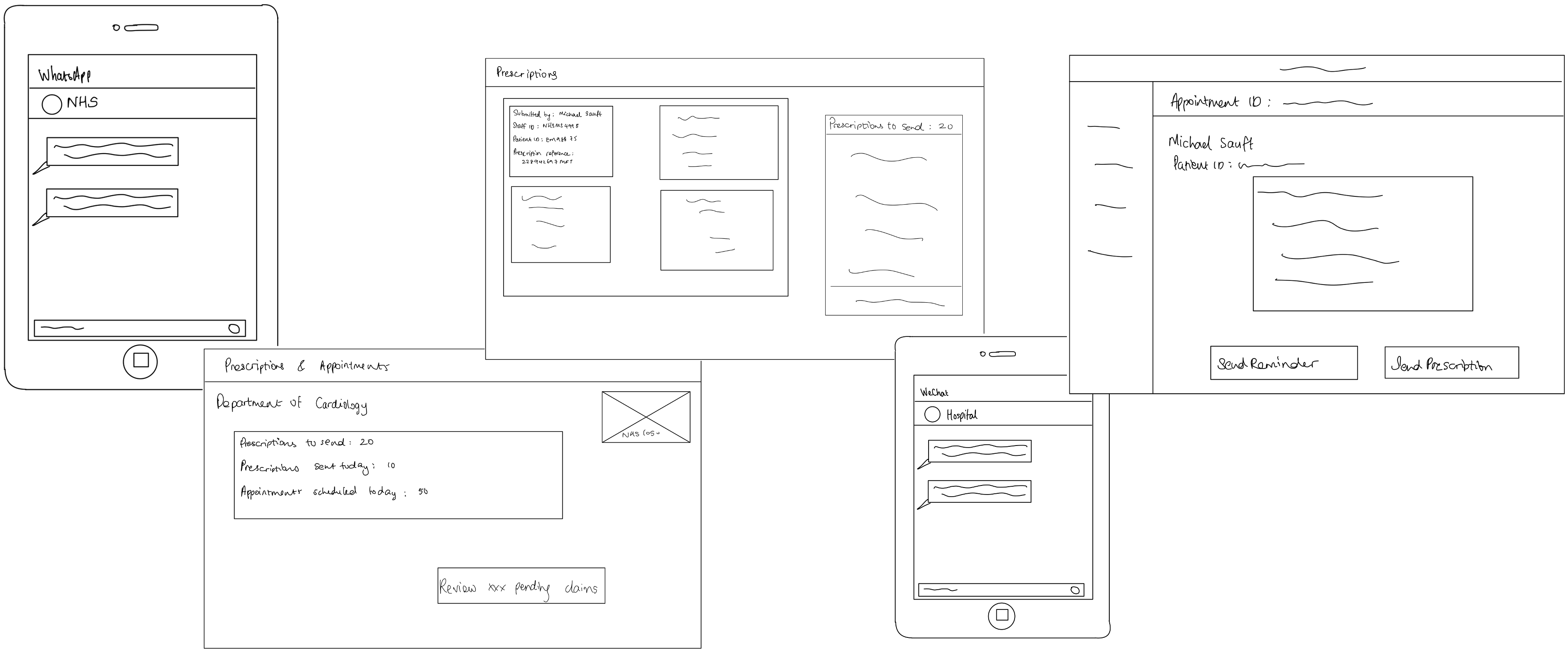
Through the design funnel process, we produced this second set of sketches. We presented the 2 versions to the users, and the latter unanimously preferred the second version. They claimed that the second set of sketches looked much more user-friendly, and they greatly appreciated the sidebar that we added. They also appreciated the new calendar view feature which helps them better keep track of time and dates. They also acknowledge the update feature, adding that this is a very good way of rectifying errors and automatically informing patients.
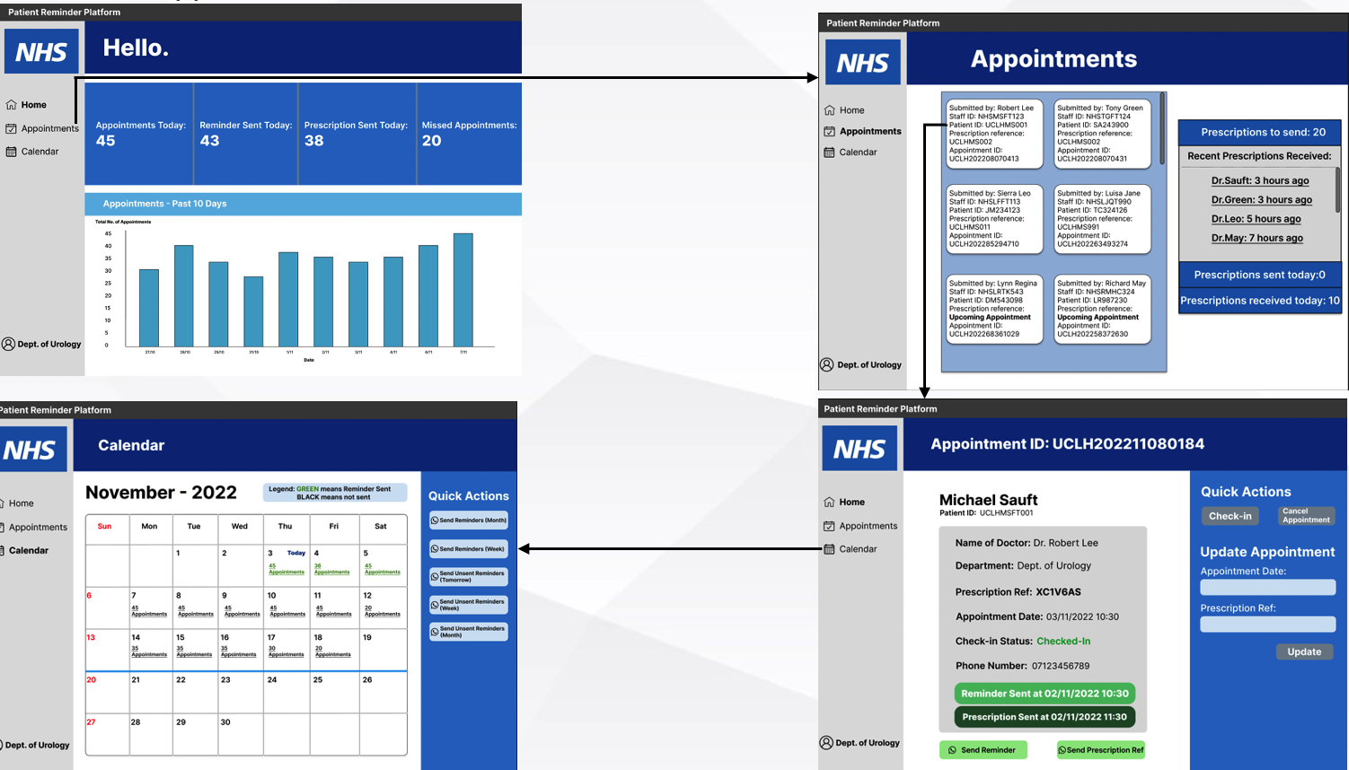
We designed the prototype using Figma. The NHS nurse makes use of this very easy-to-use platform to automatically send reminders for upcoming appointments or to send the prescription reference to be used at the pharmacy. Using our ‘Quick Actions’ feature, they can batch send all reminders on one click. Arrows indicate what happens when the item on the screen is clicked.
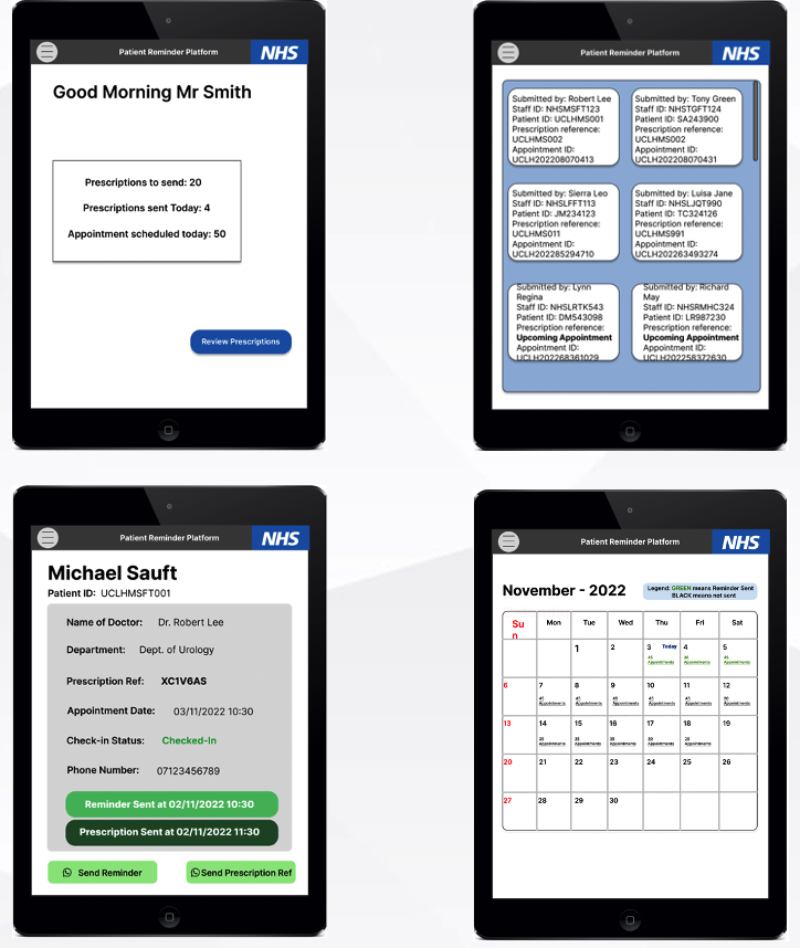
We developed a mobile version to highliht the versatility of Power Platform as it is able to automatically detect if you are on a mobile device and will alter the UI accordingly
We proceeded to evaluate the prototype and curated the following table of concerns with their descriptions, their heuristic, how we can develop a solution and the problems' severity
| ID | Description | Heuristic | Solution | Severity |
|---|---|---|---|---|
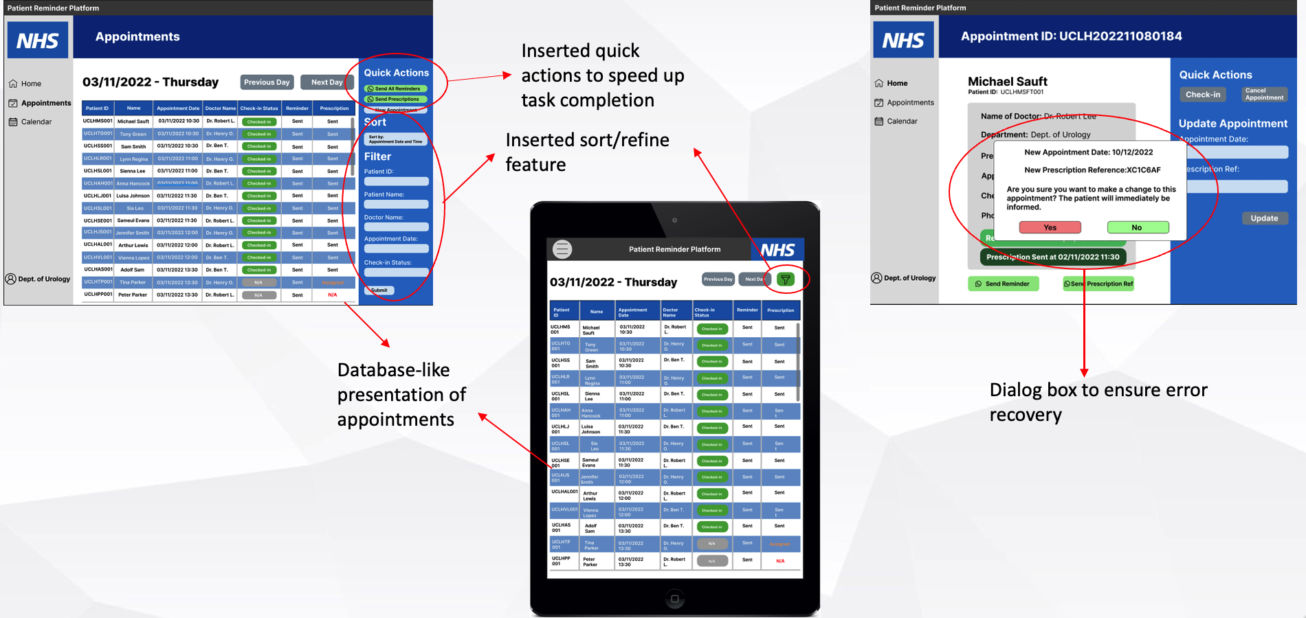
| 1 | Absence of the Sort feature. Users of the NHS Appointments platform pointed out they would like to sort and refine data on the appointments page which would speed up completion of their tasks | Flexibility and Efficiency of use | Added the sort feature to right of the appointments table allowing users to refine by various characteristics | 4 |
| 2 | Appointment section does not portray current patient information clearly. It is not readable | Aesthetic and Minimalist design | Switched to presenting data in a table rather than tile format making data and fields easier to understand, read and follow | 2 |
| 3 | Absence of confirmation message before updating messages before user updates them incase of a mistake while updating them | Help users recognise, diagnose and recover from errors | Added confirmation dialogue box to allow users to check their edits and cancel such changes in case of a mistake. | 2 |
Following the users’ suggestions, we carried out an iteration of the design life cycle and made sure to address their queries, to follow user-centred design. We produced the following improved prototype which highlighted the implemetation of the improvements: