UI Design
Website Landing Page
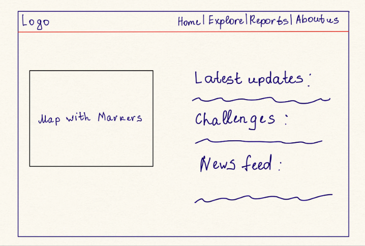
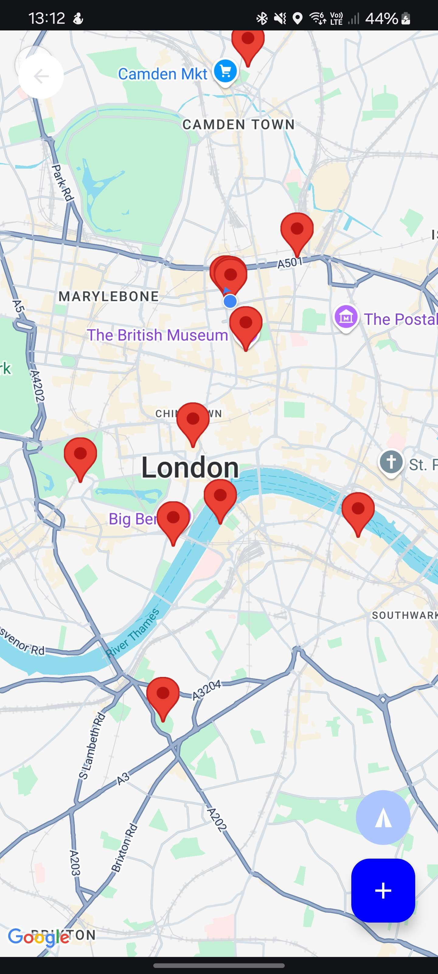
Initial Idea
Initial Idea 2
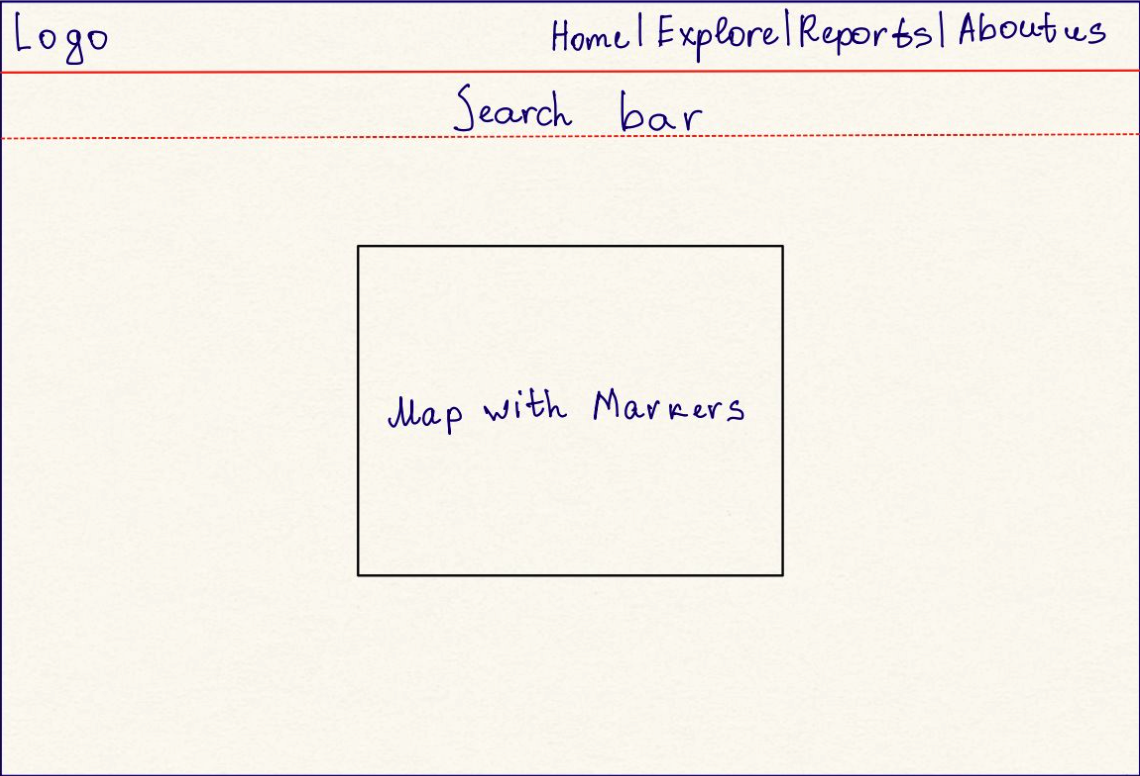
Low Fidelity Design
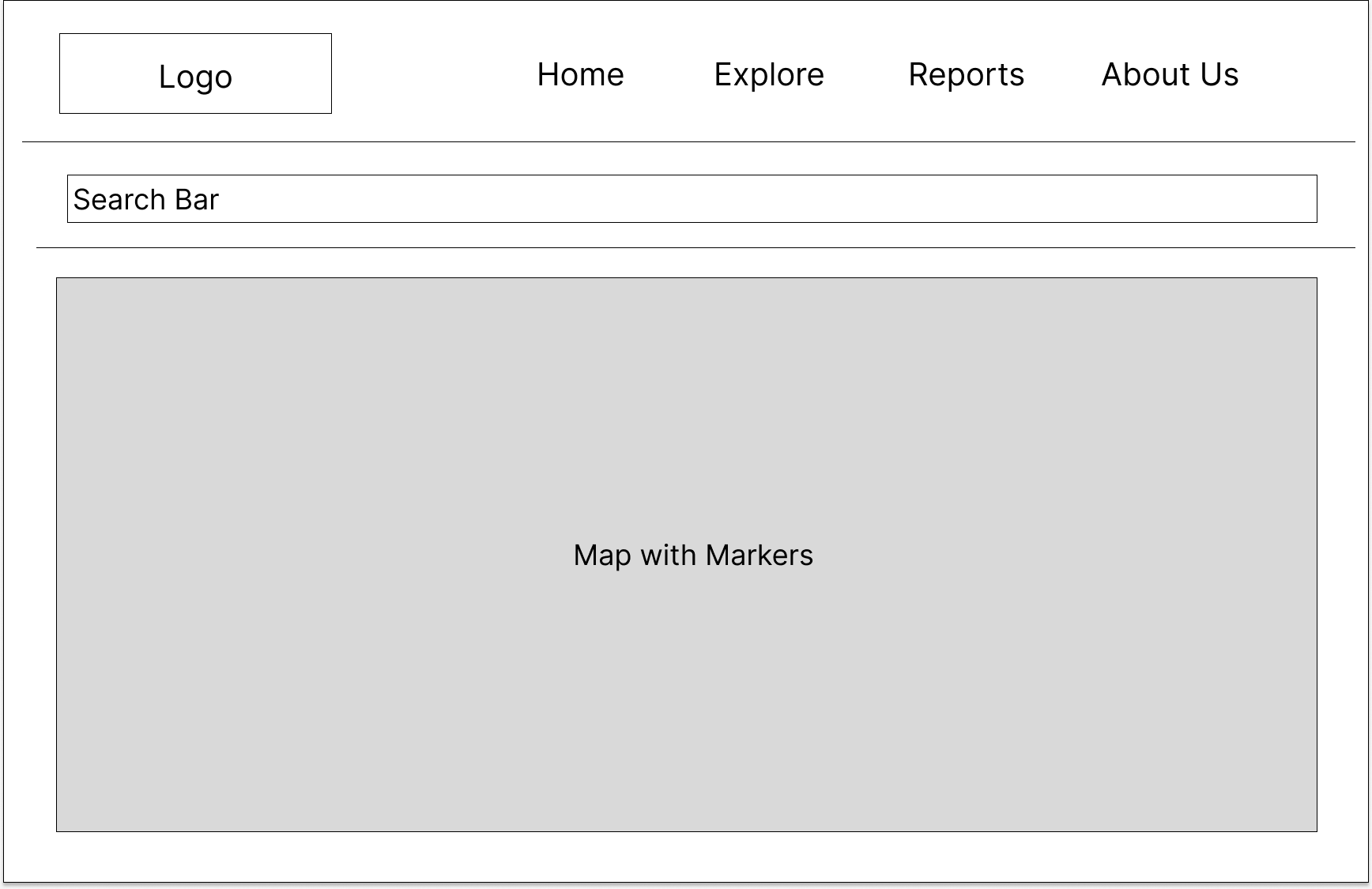
Prototype 1
Prototype 2
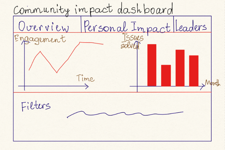
Dashbord Concept (Scrapped Idea)
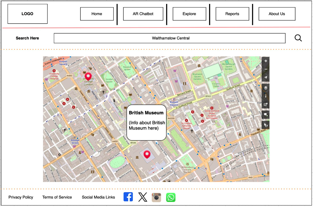
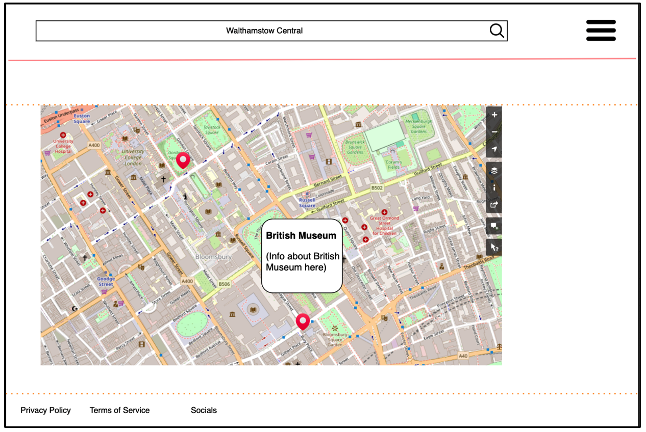
Implemented Design 1/2
Fullscreen ViewThe design process for the Website Landing Page began with an Initial Idea, which focused on creating a simple and user-friendly interface. This concept included a map with markers, a navigation bar, and sections for updates, challenges, and news feeds. The goal was to provide users with quick access to essential features while maintaining a clean and intuitive layout.
As the design progressed, the Low Fidelity Design introduced a more structured layout, incorporating a search bar and a refined map section. Feedback from early testing led to the development of Prototype 1, which added interactive elements like tooltips and a polished navigation bar. Prototype 2 further enhanced the design with improved map functionality and a responsive layout. Finally, the Dashboard Concept, though scrapped, explored additional features like data visualization and filters, showcasing the team's commitment to innovation. The final design successfully balances functionality and aesthetics, delivering a seamless user experience.
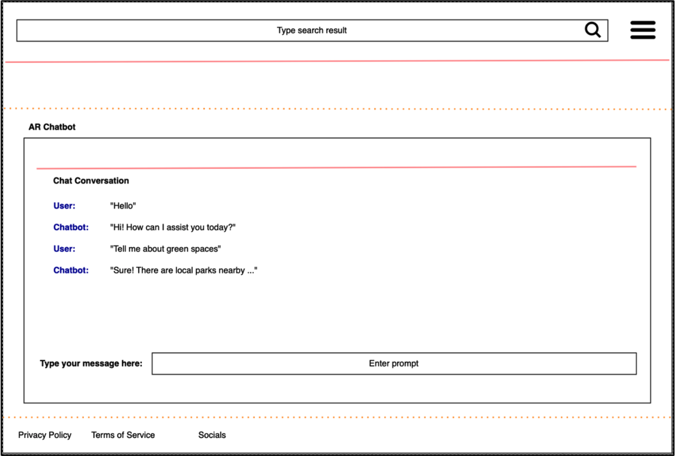
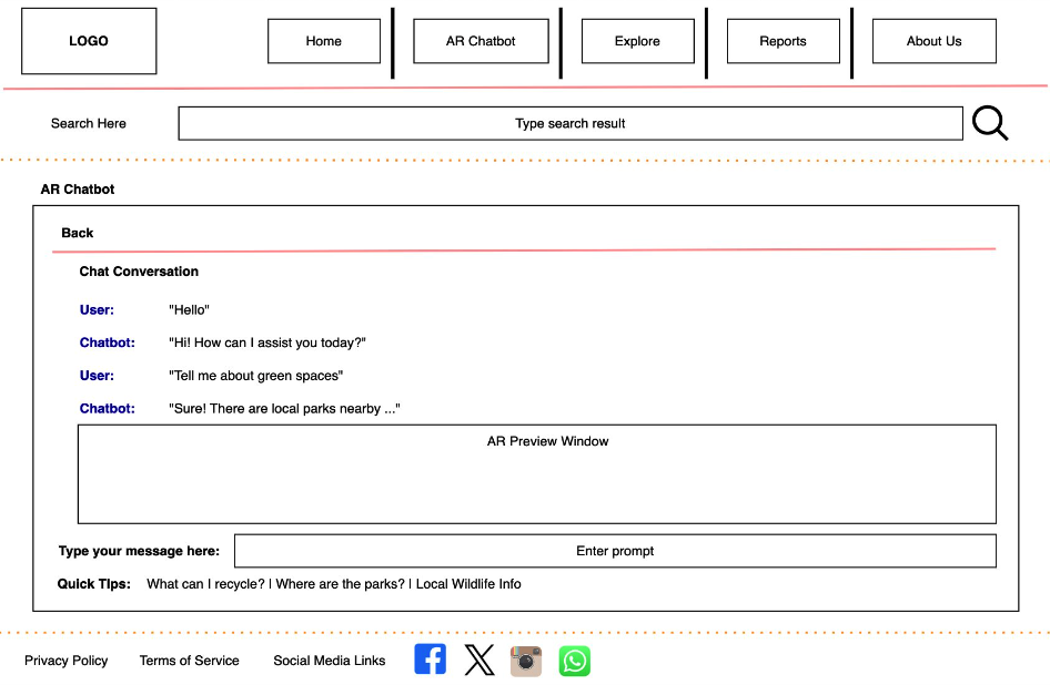
Website Chatbot
Initial Idea
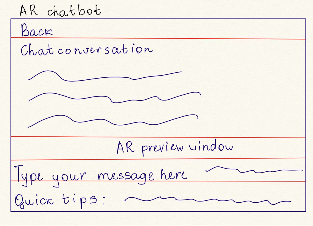
Low Fidelity Design
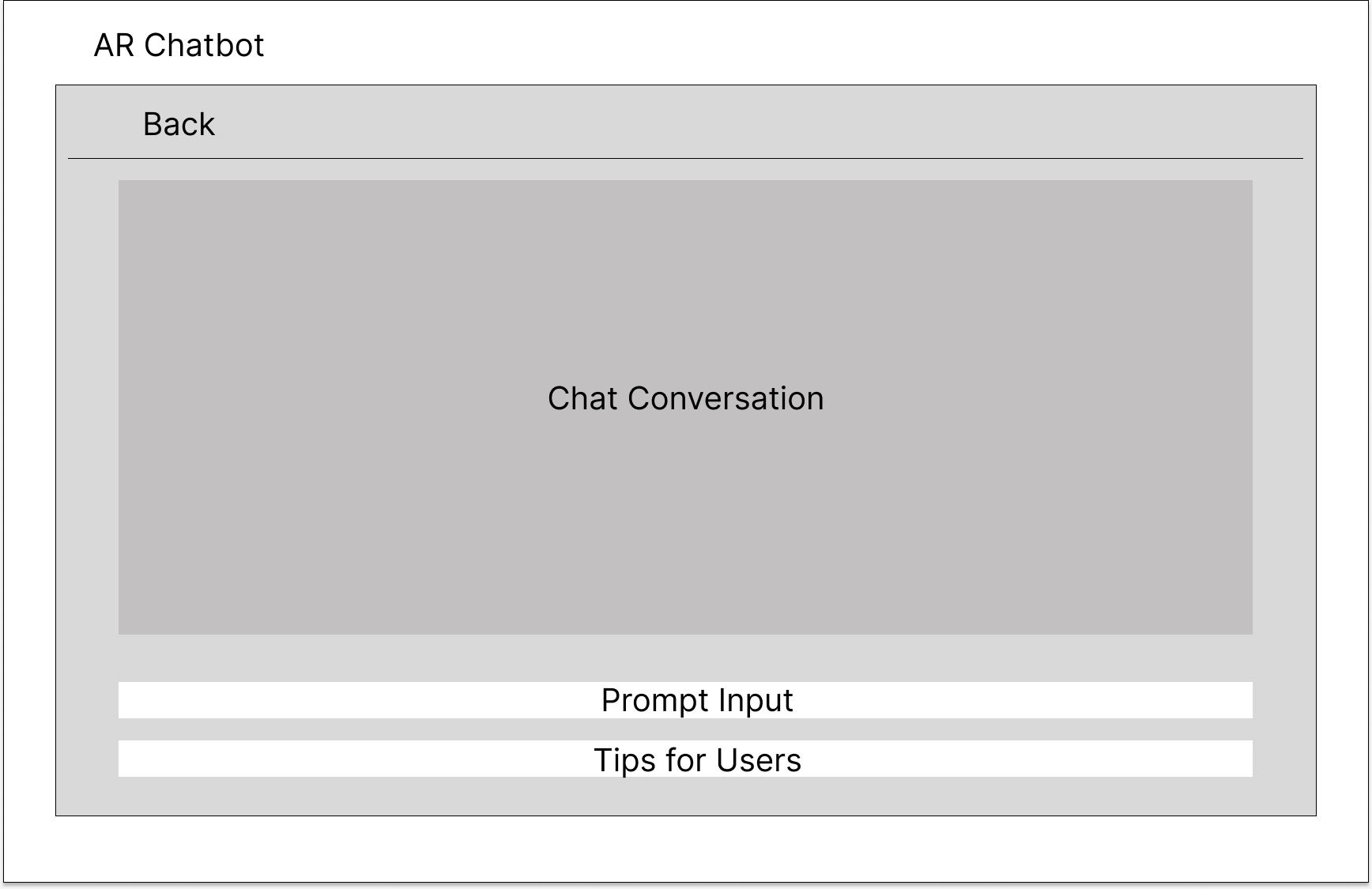
First Prototype
Final Prototype
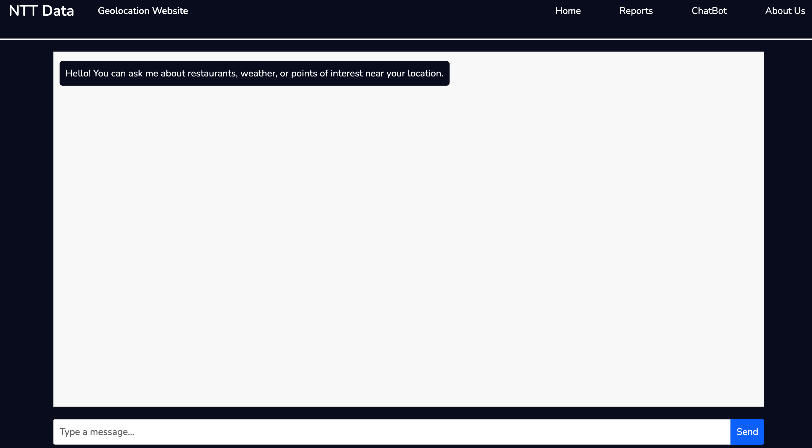
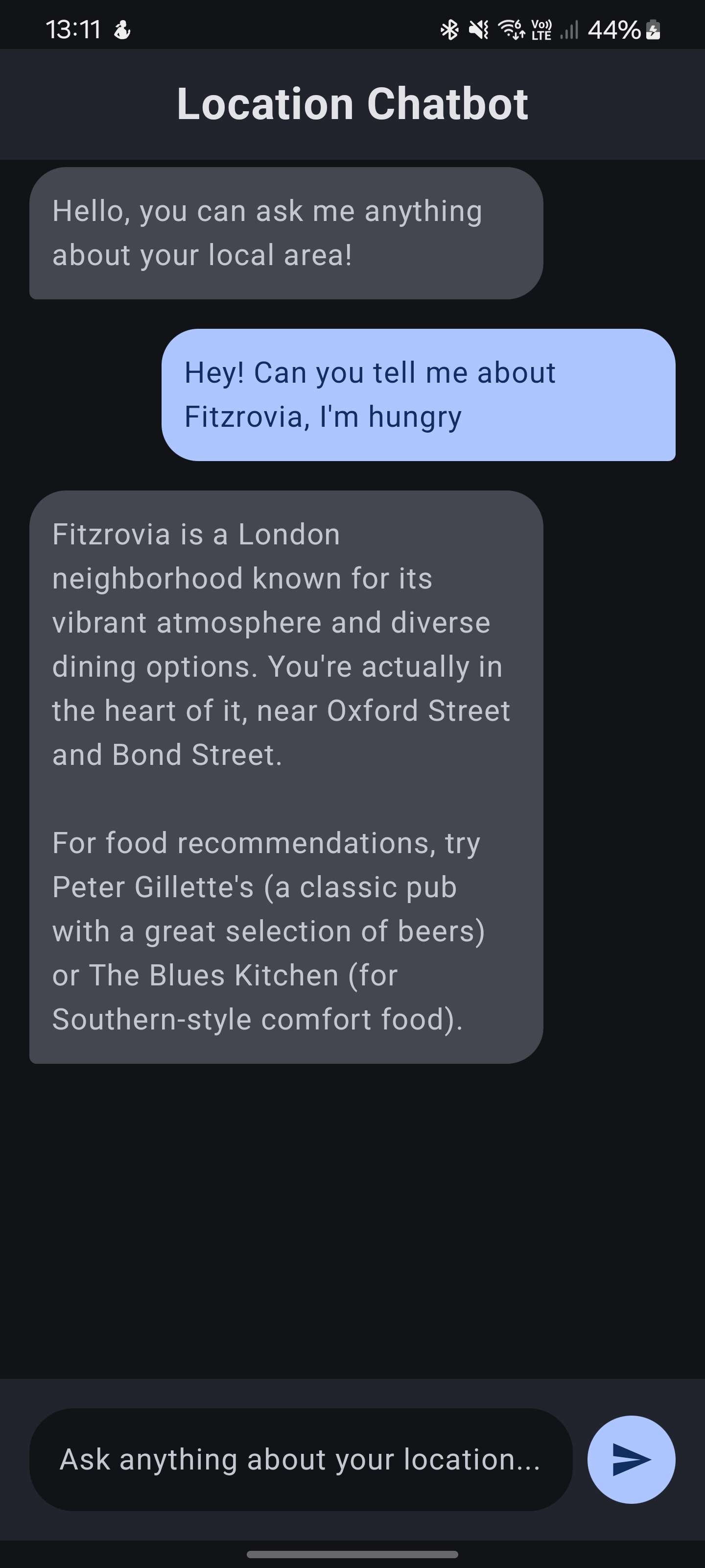
Implemented Design
The design process for the website chatbot began with an Initial Idea, which focused on creating a simple and intuitive layout. This early concept included a basic structure with sections for the chat conversation, an AR preview window, and a message input area. The goal was to ensure that users could easily interact with the chatbot while having access to AR features. This stage emphasized functionality over aesthetics, allowing the team to focus on the core user experience and flow.
As the design evolved, a Low Fidelity Design was created to refine the layout and improve usability. This version introduced a more structured interface, with clearly defined areas for chat conversations, user prompts, and tips for guidance. Subsequent prototypes incorporated feedback from testing, leading to the First Prototype, which added navigation elements and a more polished design. The Final Prototype further enhanced the interface with a clean and professional look, ensuring consistency with the overall website theme. Finally, the Implemented Design brought the chatbot to life, combining functionality and aesthetics to deliver a seamless user experience.
Application Home Page
Low Fidelity Design
Final Design
The design process for the Application Home Page began with a Low Fidelity Design, which focused on creating a simple and functional layout. This initial concept included a live camera feed with AR, a compass, and a location button. The goal was to provide users with an intuitive interface for exploring their surroundings using augmented reality. This stage emphasized usability and clarity, ensuring that the core features were accessible and easy to use.
As the design progressed, the Final Design introduced a polished and professional interface. This version featured an interactive map with markers for points of interest, a clean layout, and responsive controls. The AR functionality was seamlessly integrated into the design, allowing users to explore their environment with ease. The final design successfully combines functionality and aesthetics, delivering an engaging and user-friendly experience for navigating and interacting with the application.
Application Report Page
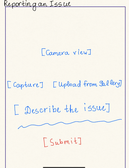
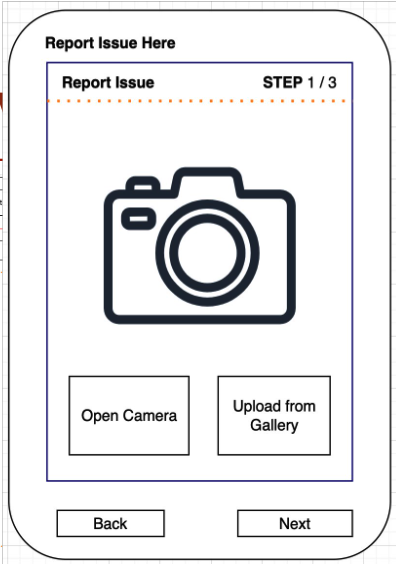
Initial Idea
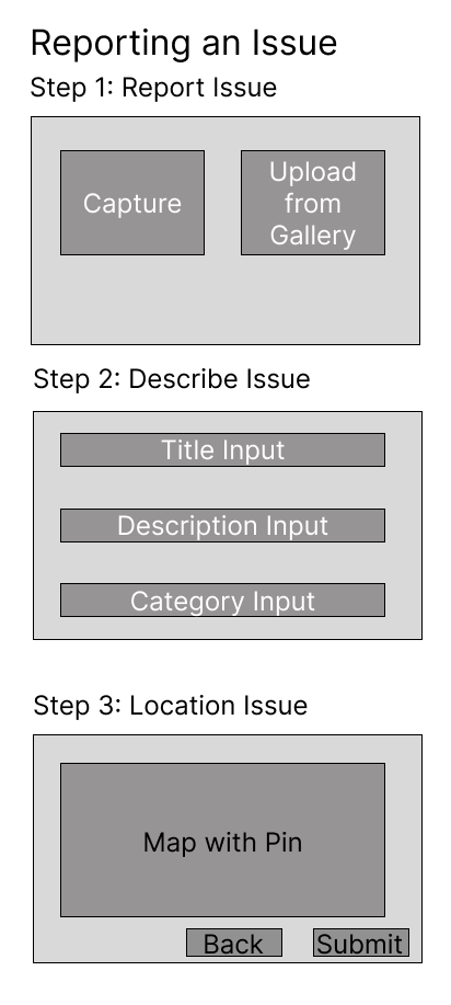
Low Fidelity Design
Alternative Idea
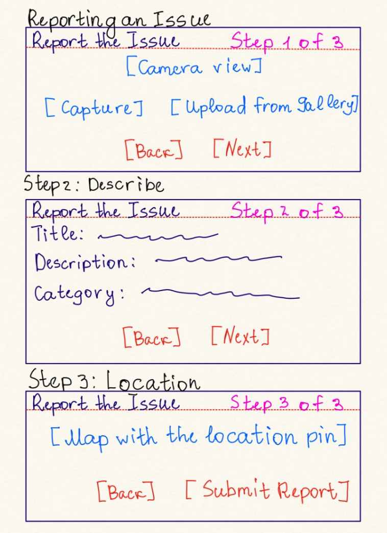
Prototype 1
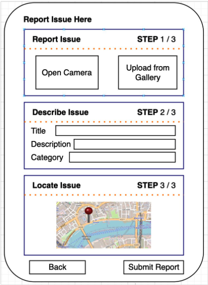
Final Design
The design process for the Application Report Page began with an Initial Idea, which focused on creating a simple and intuitive interface for reporting issues. This concept included basic features such as capturing or uploading images, describing the issue, and submitting the report. The goal was to ensure that users could easily report issues with minimal effort.
As the design evolved, the Low Fidelity Design introduced a more structured layout, breaking the reporting process into three steps: capturing/uploading images, describing the issue, and pinpointing the location on a map. Feedback from testing led to the development of Prototype 1, which added visual elements like icons and a cleaner layout. The Final Design further refined the interface with a polished look, responsive controls, and a step-by-step process to guide users through reporting. This iterative process ensured that the final design was both functional and user-friendly, making it easy for users to report issues effectively.
Application Chatbot Page
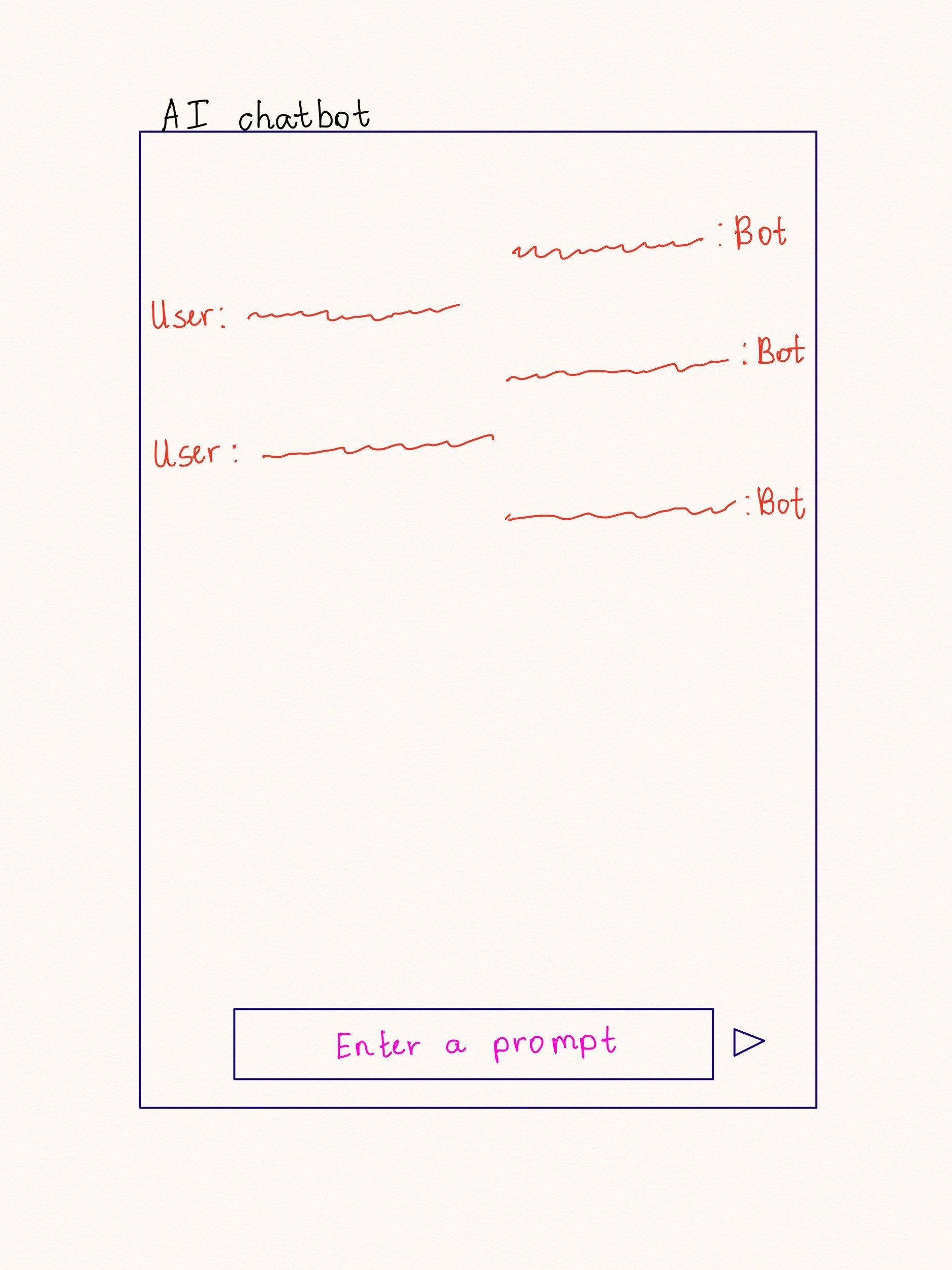
Initial Idea
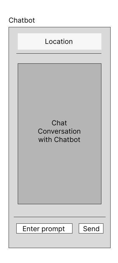
Low Fidelity Design
Implemented Design
The design process for the Android Chatbot Page began with a Low Fidelity Design, which focused on creating a simple and functional layout. This initial concept included a chat conversation area, a location button, and an input field for user prompts. The goal was to ensure that users could easily interact with the chatbot while accessing location-based features. This stage prioritized usability and clarity, laying the foundation for the chatbot's core functionality.
As the design progressed, the Implemented Design introduced a polished and professional interface. This version featured a dark theme for better readability and a modern look. The chat interface was enhanced with user-friendly elements, such as speech bubbles for conversations and a clear input area for prompts. The final design successfully combines functionality and aesthetics, providing users with an intuitive and engaging experience for interacting with the chatbot.
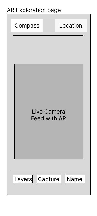
Application AR Page
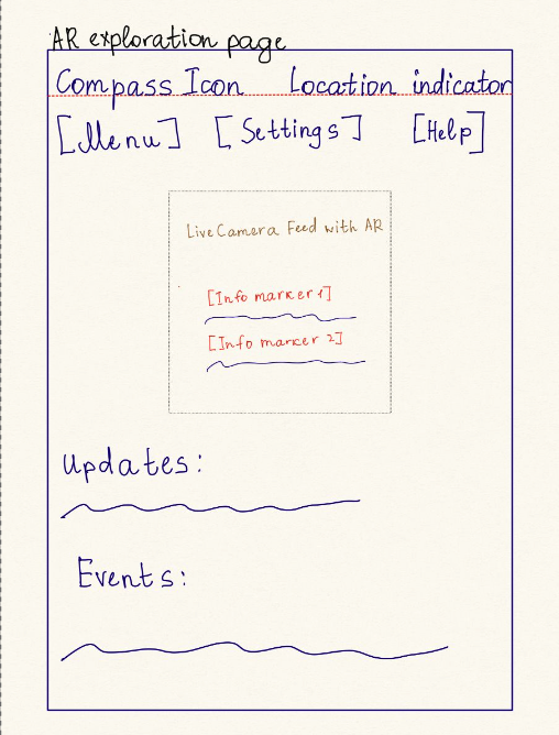
Initial Idea
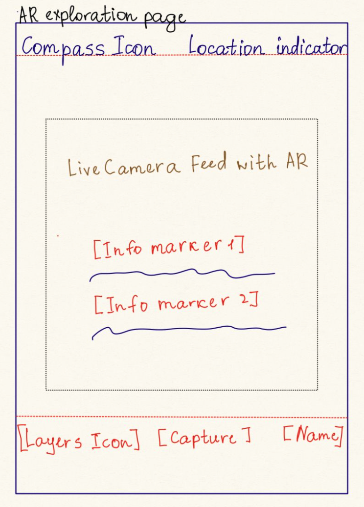
Developed Idea
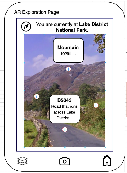
Final Design
The design process for the Application AR Page began with an Initial Idea, which focused on creating a simple and functional interface for augmented reality exploration. This concept included a live camera feed with AR markers, a compass icon, and a location indicator. The goal was to provide users with an intuitive way to explore their surroundings while accessing relevant information through AR markers.
As the design progressed, the Developed Idea introduced a more structured layout, adding features like layers, capture functionality, and a name display for identified locations. Feedback from testing led to the creation of the Final Design, which refined the interface with a polished look and responsive controls. The final version seamlessly integrates AR functionality, allowing users to view detailed information about their surroundings in real-time. This iterative process ensured that the design was both visually appealing and highly functional, delivering an engaging user experience.
Application Feed Page
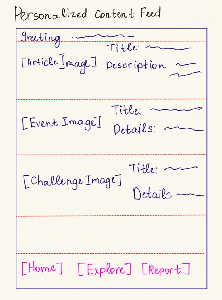
Initial Idea
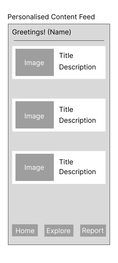
Low Fidelity Design
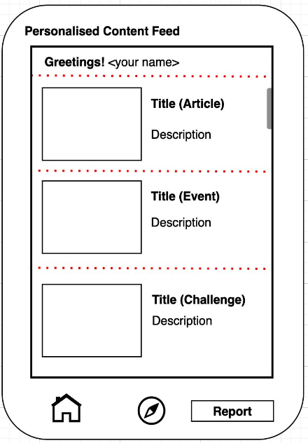
Final Design
The design process for the Application Feed Page began with an Initial Idea, which focused on creating a personalized content feed for users. This concept included sections for articles, events, and challenges, each with an image, title, and description. The goal was to provide users with relevant and engaging content in a clean and organized layout.
As the design progressed, the Low Fidelity Design introduced a more structured layout, with clearly defined sections for different types of content. Navigation elements, such as a bottom navigation bar, were added to improve usability. The Final Design further refined the interface with a polished look, responsive controls, and a scrollable feed. This version successfully combines functionality and aesthetics, delivering a seamless and engaging user experience for browsing personalized content.
Application Mockup
Implemented Design 2/2
Fullscreen ViewHeuristic Evaluation
| Heuristic | Issue | Solution | Severity | |
|---|---|---|---|---|
| Android App | Aesthetic and minimalist design | Too much content/AR content all together | Reduced information presented to users when using the AR camera | 2 |
| Aesthetic and minimalist design | Too many tabs at once when reporting issues | Separated with pagination | 1 | |
| Website | Flexibility and efficiency of use | Options are inaccessible - hidden in hamburger button | Included options within top navigation bar | 2 |
| Flexibility and efficiency of use | Social links cannot be immediately accessed | Added icons that redirect users to social links once clicked | 1 |