User Interface Design
The design approach for our doctor documentation app was driven by the need to save time and reduce cognitive load for busy medical professionals. We chose a plain and simple style that prioritizes clarity and ease of use, ensuring that every element is intuitive and self-explanatory. This minimalist design allows doctors to navigate quickly without distractions, streamlining documentation and increasing overall efficiency during hectic schedules.
Initial Design (Pre Idea) - First Sketches
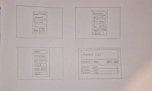
Initially we were exploring possible use cases for the glasses in a medical environment. For our first sketches we prioritized getting the potentially key features we wanted at the time on the page which included being able to see doctor and patient information and transferring the information between the glasses and the phone.
 - First sketches 1.png)
 - First sketches 2.png)
We initially chose to design for a mobile app as that would allow the glasses to remain connected to the device via Bluetooth even if they were walking around. The main features we included in the design were a list of doctors and patients as this would be key information that would need to be accessed.
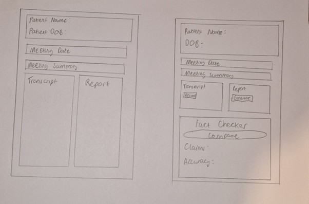
Initial Design (Pre Idea) - Second Sketches
Our second sketches were focused more on what information was required by the user and where it would be positioned. This included:
-
Profile page:
- Name
- Image of doctor
- Phone number
- Type
- Ability to contact
- 2 factor password system with face recognition
-
Patient information:
- Patient meetings
- Date
- Summary
- Reports
- Upload reports button
- Current treatments
- Referral to other doctors
- Search bar
- List of all patients
 - Second Sketches 1.jpg)
 - Second Sketches 2.jpg)
 - Second Sketches 3.jpg)
 - Second Sketches 4.jpg)
We did not want the page to be overly cluttered and we included a sidebar navigation for ease of access to the different pages.
Initial Design - Wire Frame
We then developed a wireframe of the app. This included ideas for the colour theme we wanted to use. We chose blue and white to be the primary colours because they match the theme for the NHS. We decided to move the navigation bar to the top and make the app look more professional.
 - Wire frame.png)
Change in Idea
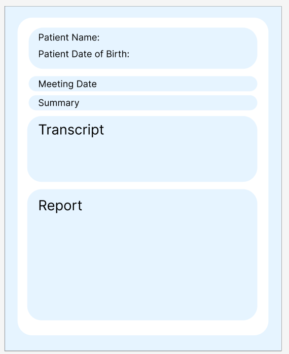
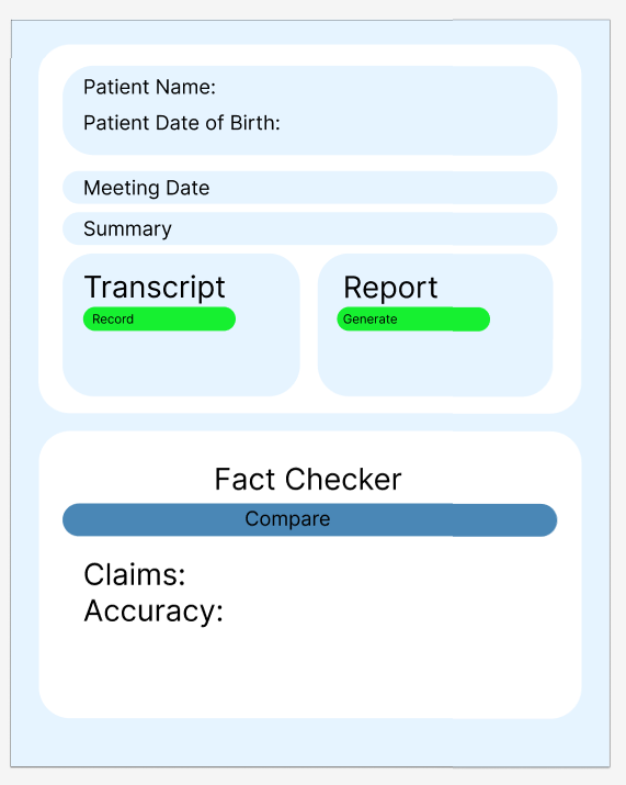
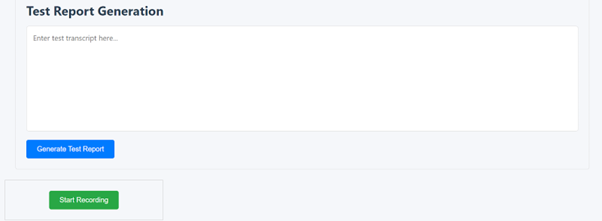
After meeting with our client and discussing the project in more detail, we gained clarity on their expectations and priorities. The client emphasized the need for a documentation tool specifically designed for doctors, shifting our initial direction away from a mobile app toward a desktop or laptop-based application. As a result, many of our original designs had to be reconsidered and reworked to suit a larger screen interface and the new use case. With a clearer understanding of the project's focus, we refined our features to better align with documentation needs—particularly around generating and viewing transcripts and medical reports. We also began planning for key user interface elements such as a secure login page and a centralized dashboard for accessing patient information and past consultations.
New Sketches
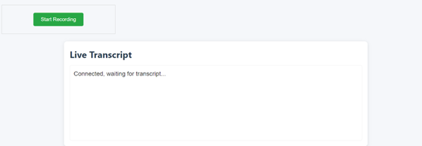
Our project's primary goal shifted toward saving time for doctors by leveraging AI to assist with patient documentation. This focus necessitated a UI design that was both intuitive and fast. Here’s a detailed explanation of our design choices:
-
Prioritizing Efficiency and Speed:
- Quick Navigation: In a clinical setting, every second counts. A simplified UI minimizes the steps required to complete tasks, allowing doctors to swiftly document patient information without navigating through complex menus. This speed is essential in a fast-paced environment where time is a critical resource.
- Minimal Cognitive Load: A clutter-free interface reduces cognitive strain. When doctors can quickly understand where to find the necessary functions, they can concentrate on patient care rather than spending time deciphering an intricate UI. This simplicity directly translates to fewer errors and more accurate documentation.
-
Enhancing Usability in a High-Stakes Environment:
- User-Centered Design: Our approach reflects core user-centered design principles. By tailoring the interface to the needs of medical professionals, we ensure that the technology adapts to their workflow rather than forcing them to adapt to the technology.
- Rapid Adoption and Reduced Training Time: A simple, intuitive UI minimizes the learning curve. Doctors and staff can begin using the system effectively almost immediately, which is crucial in environments where extensive training sessions are impractical due to time constraints.
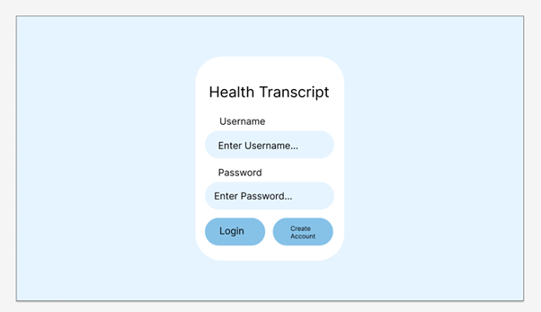
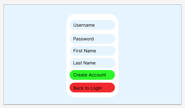
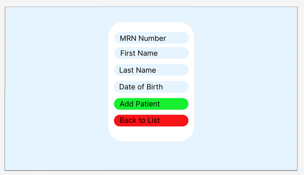
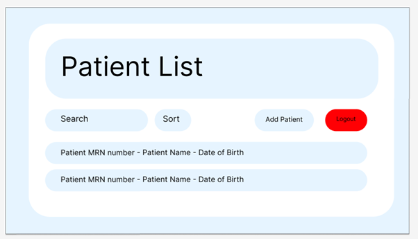
Updated Design - Wire Frames
We then created wire frames for the new design. We made small design changes such as rounding corners to make it look cleaner and more professional. We decided to stick with the light blue and white as it looked professional and matched the NHS colours and made some of the more important buttons red or green to help them stand out.
Here is a link to the designs on Figma: Figma Designs
Screen shots are also provided:
First Attempt
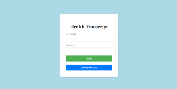
With the idea for our project set, we decided to go for a simple design for our app. We focused on getting the relevant information on screen and tested out different colours for the buttons. We also tested out a white background which would later be changed since it looked too plain as you can see in the login page.
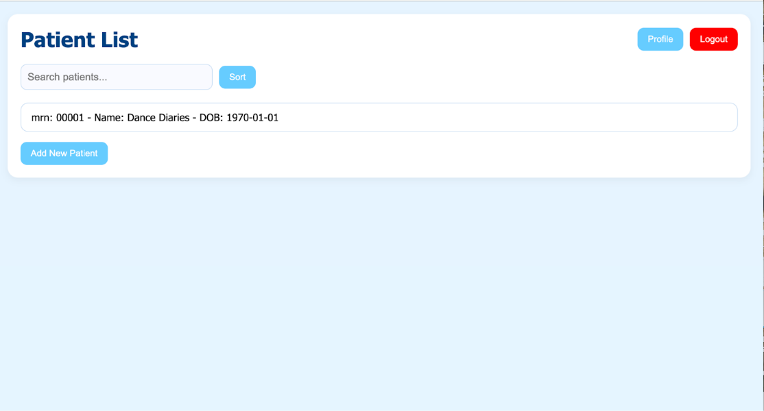
This is the home page for the users. It provides the patients' names and dates of birth, which is the relevant information in order for the doctor to identify a patient. A search bar allows the doctor to find a patient by name. There is a profile page which allows the doctor to change their password as well as a logout button, both of which are easily accessible in the top right of the page. There is also a button to add a patient which is easily accessible.
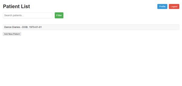
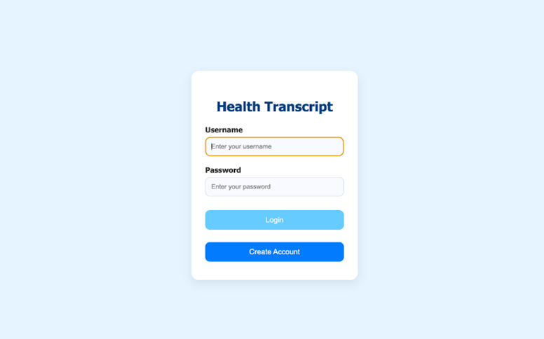
Regarding our colour choices, we adopted a palette that reinforces calmness and professionalism. The use of a light, airy background (#f0f8ff) in the global container creates a clean and welcoming canvas, while the deep blue (#004080) in the header signals reliability and focus. Accent colours in buttons, such as the refreshing blue shades for the profile and dropdown elements and the bold red for the logout button, are carefully selected to provide clear visual cues for different actions.
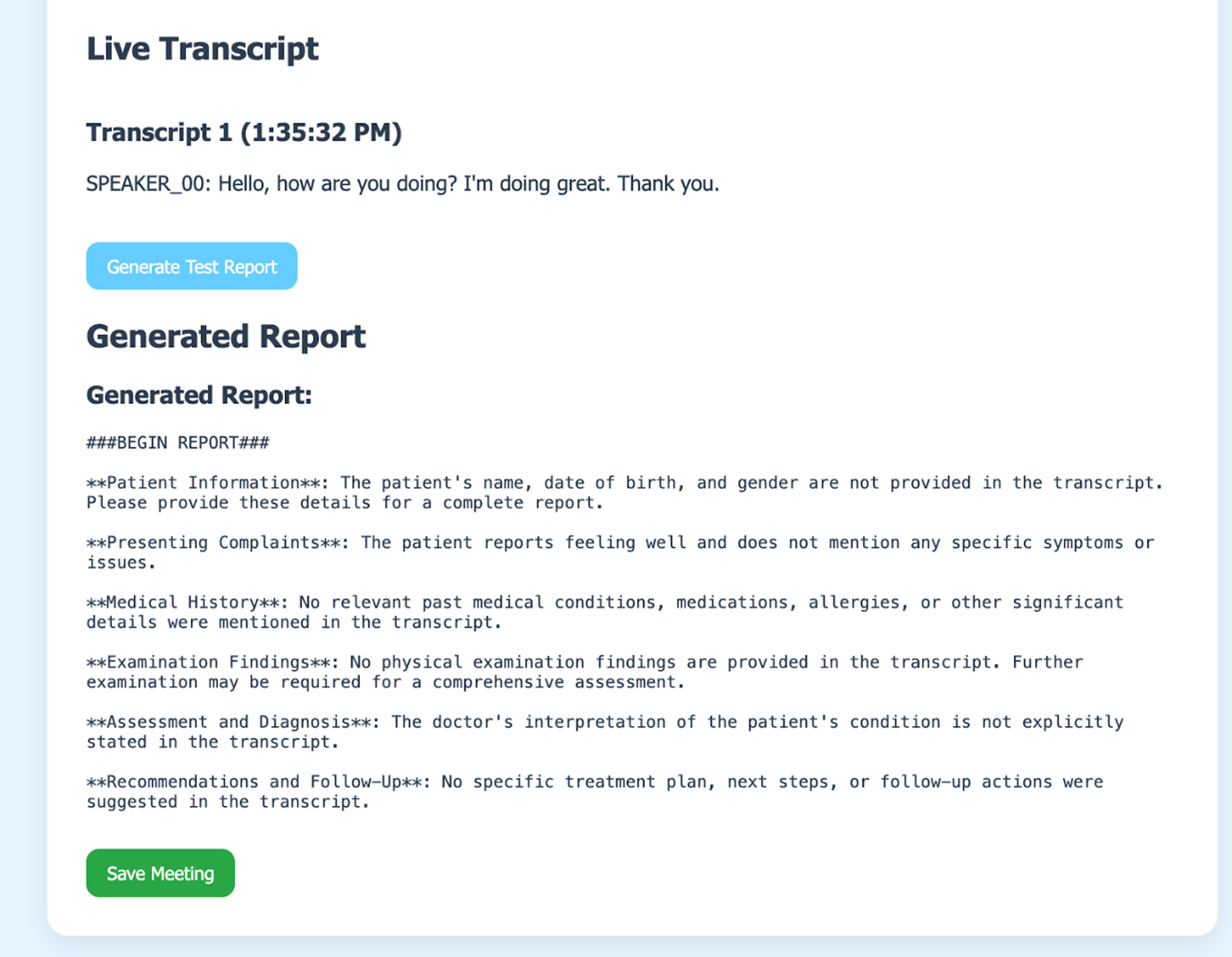
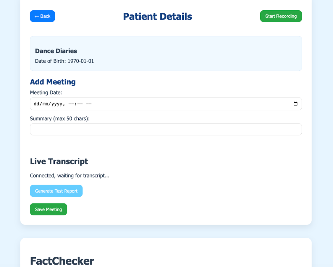
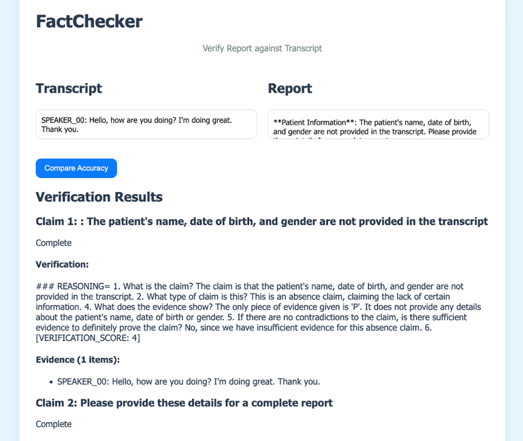
Final Design
Regarding our colour choices, we adopted a palette that reinforces calmness and professionalism. The use of a light, airy background in the global container creates a clean and welcoming canvas, while the deep blue in the header signals reliability and focus. Accent colours in buttons, such as the refreshing blue shades for the profile and dropdown elements and the bold red for the logout button, are carefully selected to provide clear visual cues for different actions.
Login Page
Home Page

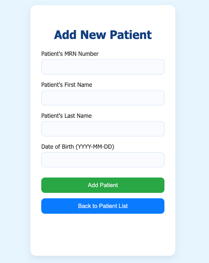
Add Patient Page
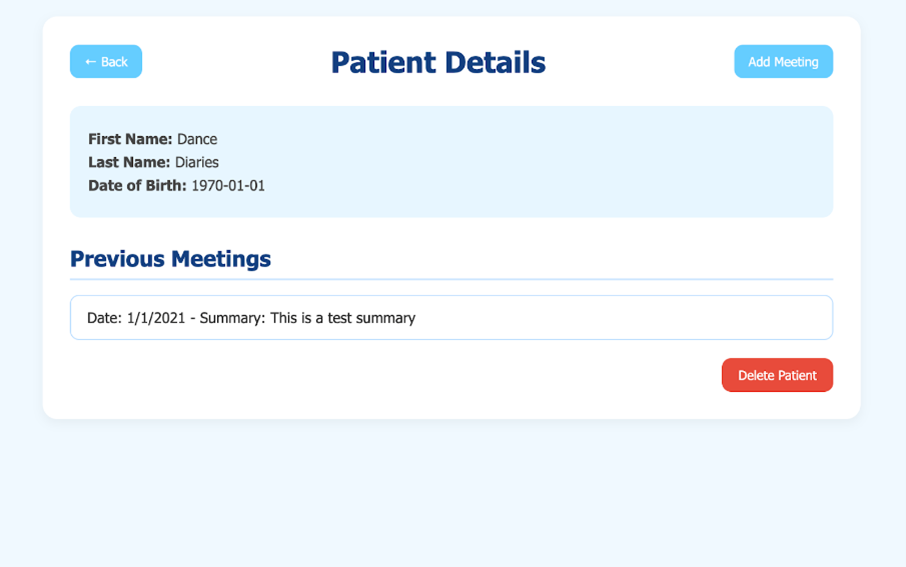
Patient Profile
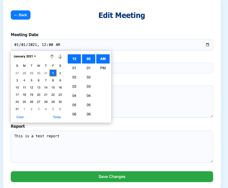
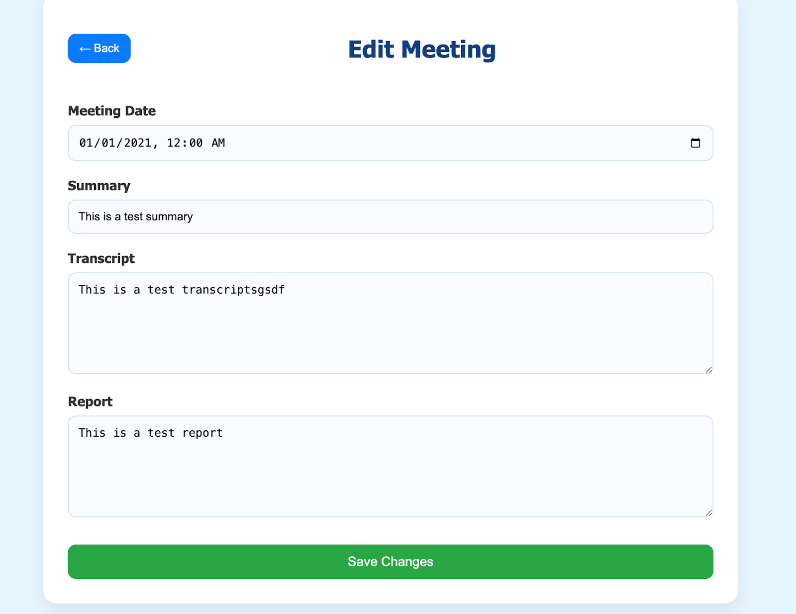
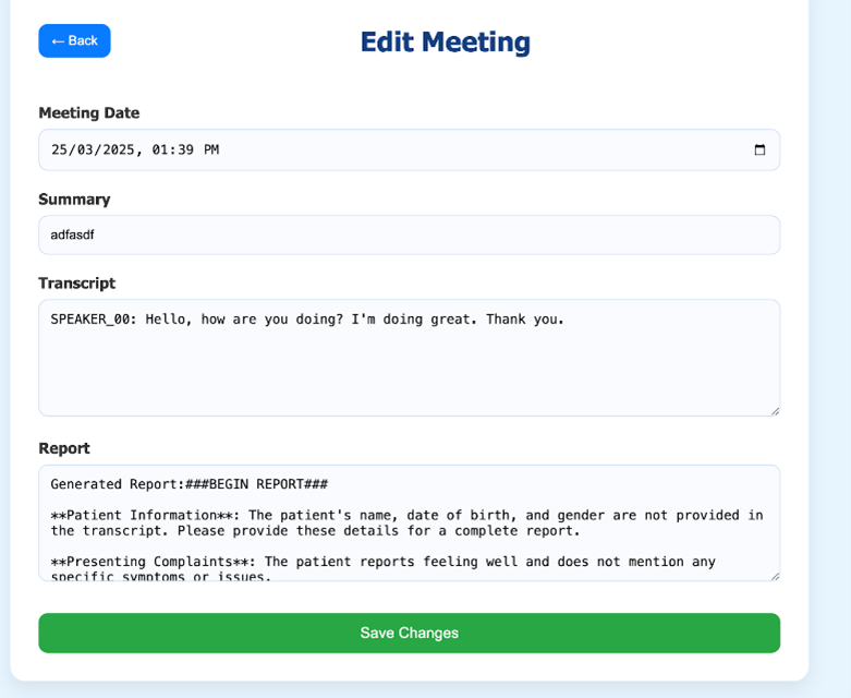
Editing Meetimg
Add Meeting Page