Design Principles
Core principles guiding our UI/UX design
Simplicity
ReadingStar features a clean, minimal interface with large buttons and intuitive icons. It avoids unnecessary complexity, making it easy for children—especially neurodivergent users—to interact without needing instructions. Only essential options are shown: song selection, setting, focus mode.
Consistency
ReadingStar maintains consistent layouts, buttons, and visual cues (star) across all modes. In addition, familiar icons and predictable behavior make navigation easy for young users. This repetition builds confidence and reduces confusion.
Visibility
Key elements like lyrics, embedded, current difficulty, and score are always visible in the main mode. These elements are hidden only during focus mode, where it might be distracting to the user. In addition, highlighted lyrics guide users in real time, and controls are easy to find, keeping users aware of what's happening without needing to explore.
Feedback
ReadingStar responds immediately to user actions. Visual cue (star) will be displayed when lyrics are sung correctly, and song selections should be instantaneous. This allows users to confirm that their input has been received and processed.
Tolerance
ReadingStar handles user errors and provides information to revert or provide steps to handle mistakes. This includes features built in React Native to display error messages and advice to manage the error.
Hand-drawn Sketches
We began the design process by sketching the main interface of the product. This helped us to understand the layout and the placement of the elements, and how they would interact with the user.
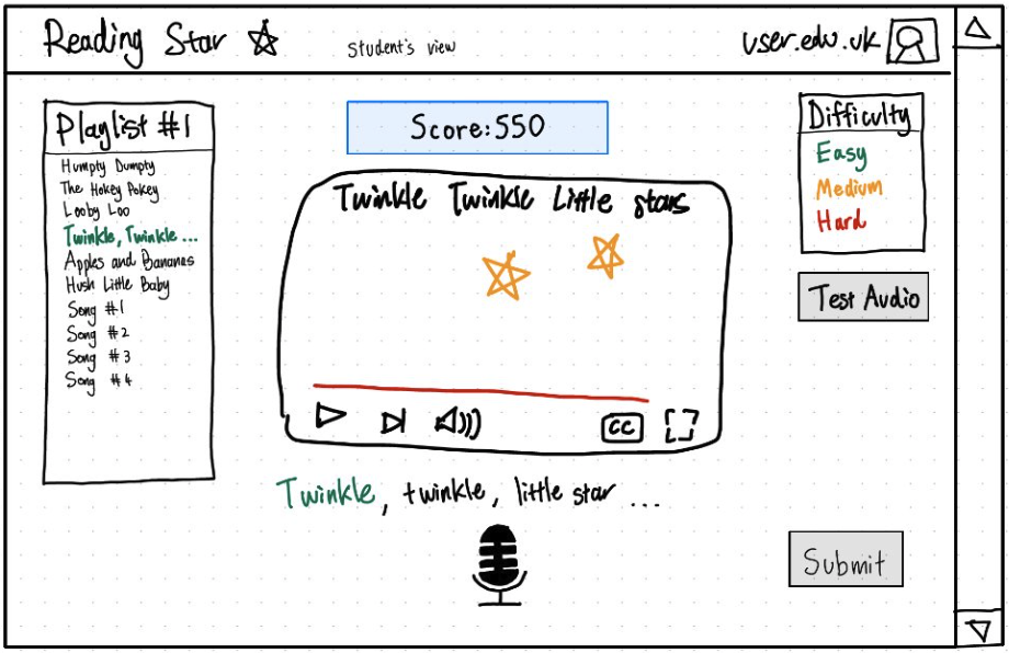
Student Interface Sketch
Initial sketch showing the student view with playlist, video player, microphone input, and difficulty settings. The layout emphasizes simplicity and clear organization of elements.
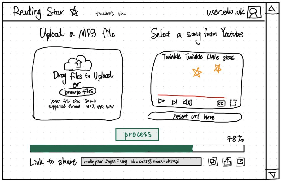
Teacher Interface Sketch
Teacher view sketch showing content management features including MP3 upload, YouTube video selection, and sharing options. Includes progress tracking and file format specifications.
Initial Prototype
First iteration of the design concept, where we used Figma to create a prototype of the main practice interface. This prototype gives us a rough idea of how the final product may look like.
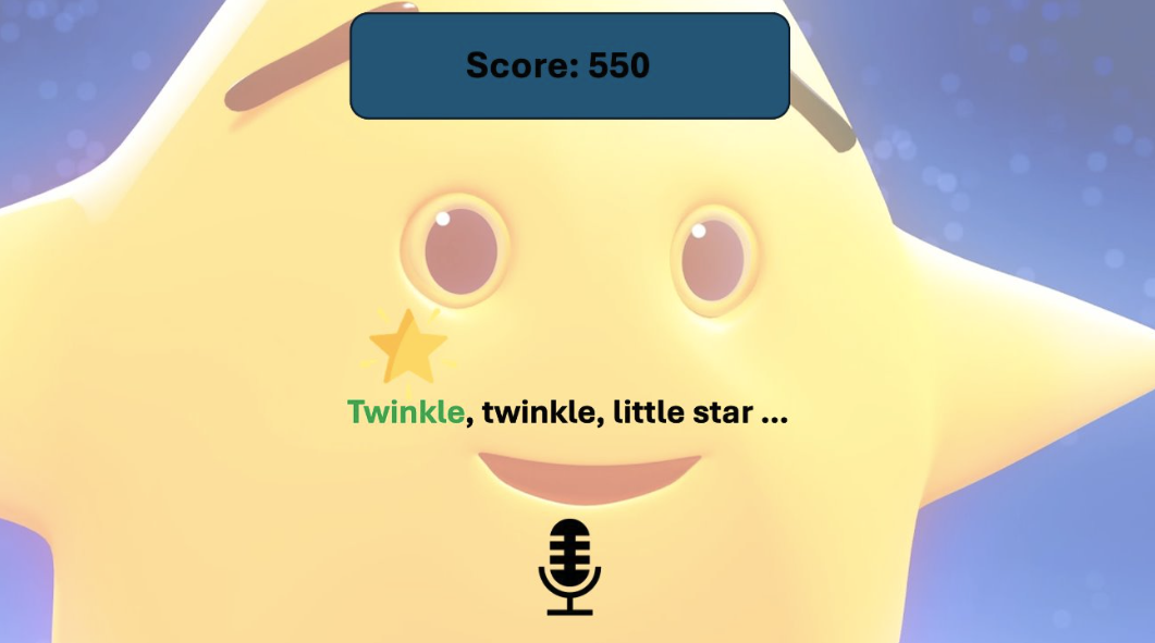
Prototype 1
Initial prototype of the main practice interface featuring score display, animated star character, and real-time lyrics display with microphone input visualization.
Prototype Evaluation
To evaluate the first prototype, we conducted a heuristic analysis. Where we used some of the heuristics from Nielsen's 10 Usability Heuristics as guidance, essentially visualizing the product in different stakeholders' perspectives, and understanding struggles or inconveniences that may arise.
| Heuristic | Problem | Solution | Severity /4 |
|---|---|---|---|
| Match Between the System and the Real World | Jargon phrases: Pre-processing, specially formatted link. | Avoid using technical terms for these processes within the UI. | 1 |
| User Control and Freedom | Prototype forgot to consider the exit button which should be visible and obvious at all times. | Add an unchanging exit 'X' to one of the corners. | 4 |
| Help Users Recognize, Diagnose, and Recover from Errors | There is no prototype of an error box which may need to pop up from time to time. | Add a brief error message for any technical problems that may arise like "incorrect link." | 3 |
| Consistency and Standards | The options on the home page are not 'boxes' which is the standard for clickable buttons, making it unclear they are options. | Make anything clickable have a box outline. | 2 |
Final Prototype
After a heuristic analysis of design solutions, we refined the prototype.
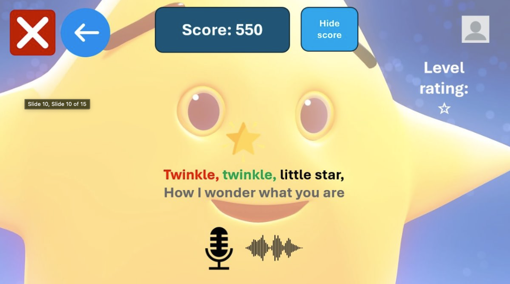
Final Design
Refined prototype incorporating evaluation feedback, featuring improved navigation controls, score hiding option, and level rating system. The design addresses the identified issues with clearer button styling, error handling, and consistent UI patterns. Features color-coded lyrics for better readability and enhanced user interaction elements.
Final UI Implementation
The implemented user interface incorporating all design principles and heuristic evaluation feedback
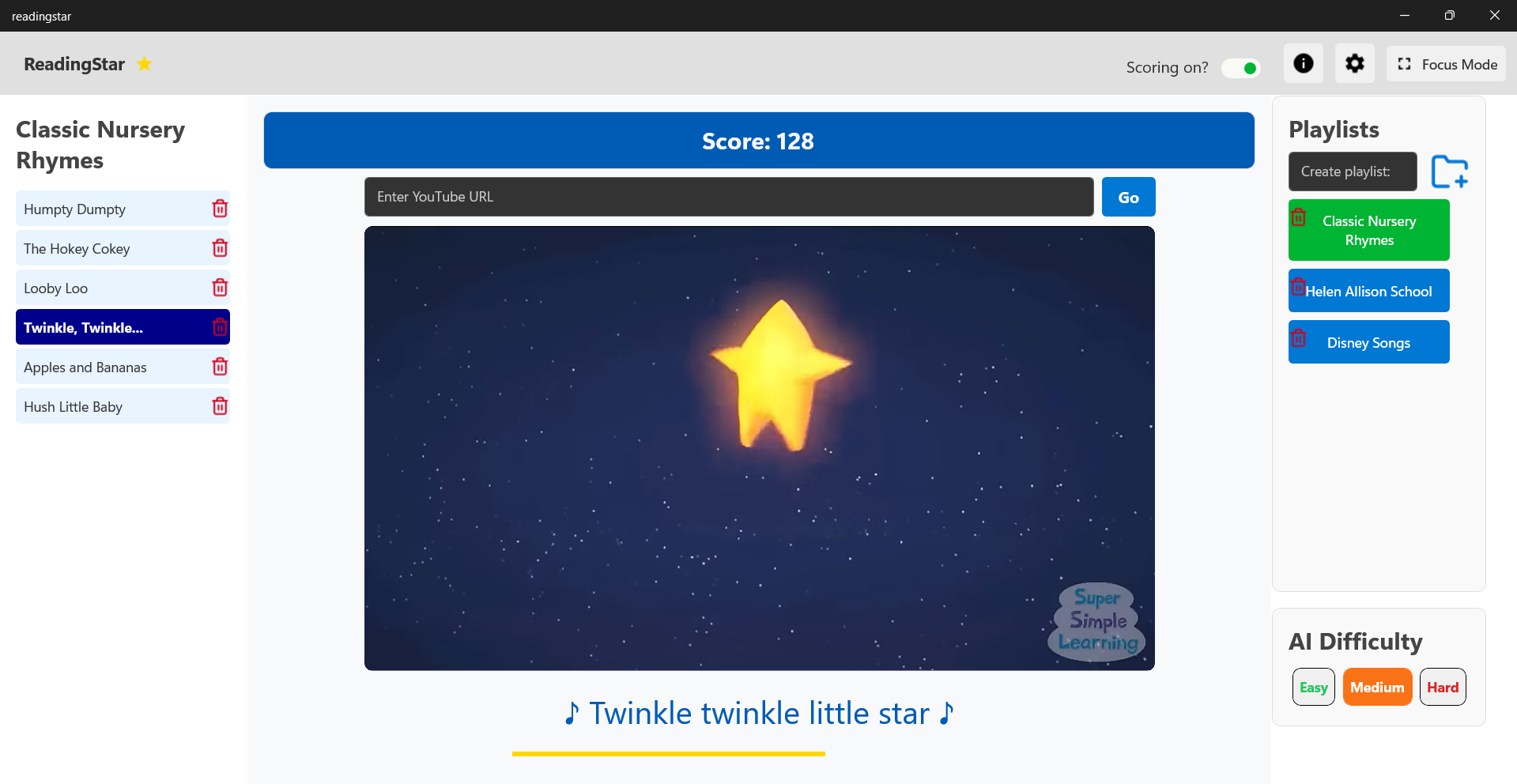
Main Interface
The main interface features clear navigation, playlist organization, and immediate visual feedback. Following heuristic principles, it implements consistent button styling, visible system status through score display, and clear error prevention through guided input fields. The interface maintains a match between system and real world with familiar video player controls. There is also a clear switch in the top right, which allows for toggling the scoring mode.
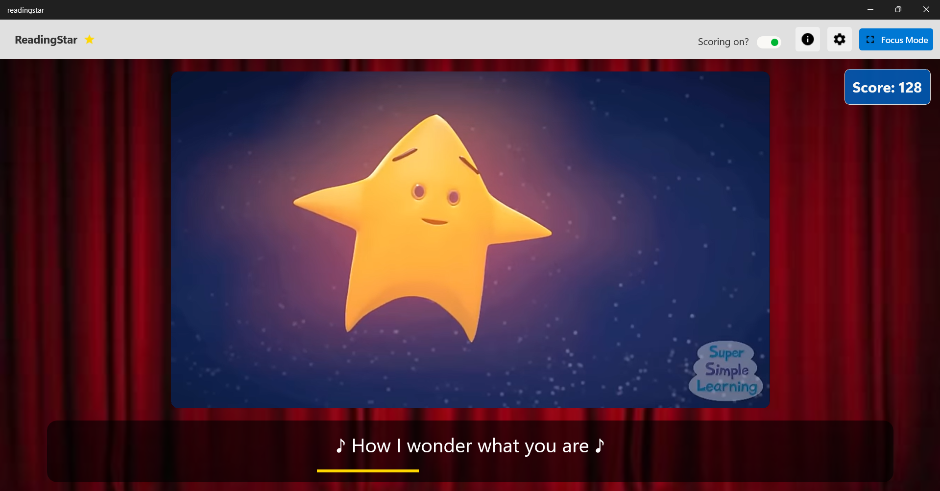
Focus Mode
Focus mode minimizes distractions while maintaining essential functionality. Following the visibility heuristic, it keeps only crucial elements visible. The prominent exit button addresses the user control and freedom principle, allowing easy navigation back to the main interface. The simplified design helps prevent errors through reduced complexity.
Settings Customization
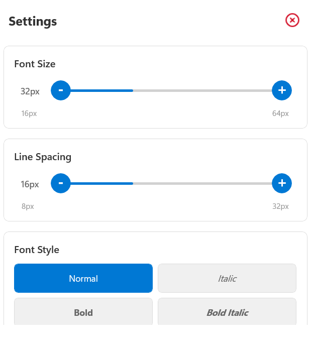
Text Customization
Font size and style controls provide flexibility for different user needs, adhering to the flexibility and efficiency of use heuristic. Clear visual feedback shows how changes will affect the interface, supporting user control and freedom.
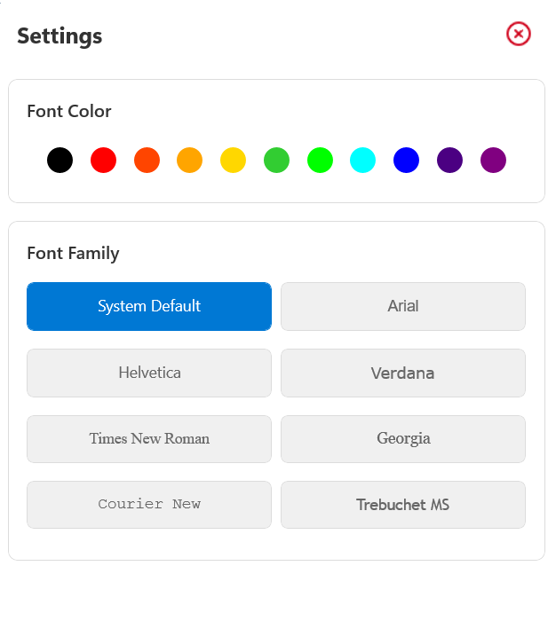
Visual Customization
Color and font family options support accessibility needs while maintaining aesthetic consistency. The interface follows recognition rather than recall by using familiar font names and visual color selection, making choices immediately apparent to users.
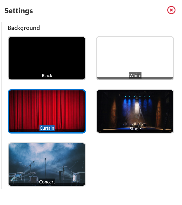
Background Themes
Multiple background options provide user flexibility while maintaining consistent functionality. The preview images follow the match between system and real world heuristic, showing exactly what users will get, preventing confusion and errors.