UI Design
Design Principles
The UI was designed around a single guiding idea: users should not have to learn a different application shell for each assistant. Instead of building four disconnected interfaces, SmolPC uses one shared desktop shell and changes the active mode, help content, setup state, and prompt suggestions depending on the task. This supports the broader project goal of a unified offline platform rather than a collection of unrelated demos.
Simplicity
Simplicity was applied by keeping the product inside one persistent shell with one main input pattern. The user always sees the same sidebar, conversation area, composer, and workspace header, while more advanced information such as hardware details, model status, and setup troubleshooting is pushed into overlays or drawers instead of crowding the main flow. This means that switching from Code to GIMP or Writer changes the task context without forcing the user to relearn the whole interface.
Consistency
Code, Writer, Slides, GIMP, and Blender all use the same core layout: shared sidebar, common header controls, the same conversation view, the same composer bar, and the same setup and status language. This means that switching tools feels like changing context inside one product rather than launching a new product each time.
Visibility
Important state is always visible. The interface exposes the active mode, setup readiness, model and runtime information, loading states, and host-application availability so that users can understand whether the assistant is ready and what environment it is currently using.
Feedback
Feedback is provided through startup loading screens, setup banners, streaming assistant responses, quick examples, availability messages, and error surfaces for host-app launch or inference issues. This is particularly important for a local AI system, where users need to understand why a request may be slower or blocked on a prerequisite.
Tolerance
The interface is designed to help users recover rather than fail abruptly. Setup gating explains missing prerequisites, mode help panels explain what a mode is for, and chat history persists across sessions so users do not lose their place when a workflow needs to be retried.
Learnability
Each mode uses short, mode-specific welcome copy and example prompts to teach the user what the assistant can do. This matters because the same shell supports very different tasks, from coding help to image editing and Blender guidance.
Unified App Shell
The implemented interface is centred on one reusable application shell. The current app builds this shell from shared frontend pieces for the sidebar, workspace header, mode switcher, conversation view, composer, setup surfaces, overlays, and help. Switching from Code to Writer, Slides, GIMP, or Blender changes the active workflow inside that shell rather than replacing the entire UI with a different frontend.
| UI Element | Purpose | Why It Matters |
|---|---|---|
| Sidebar | Shows saved conversations, search, and chat actions inside one persistent workspace. | Keeps the core layout stable across all modes and makes the app feel like one product instead of separate assistants. |
| Mode switcher | Changes the active workflow between Code, GIMP, Blender, Writer, and Slides without leaving the shell. | Reinforces the idea of one platform with several specialised modes rather than several standalone apps. |
| Workspace header | Shows the current conversation title, mode controls, export, shortcuts, hardware status, and model/runtime status. | Keeps important system state visible at the top of every workflow without changing the overall page structure. |
| Workspace controls row | Holds the context toggle, theme controls, and mode-help access beneath the header. | Provides a second layer of shared controls that stays consistent even when the active mode changes. |
| Startup loading screen | Explains that the app is checking setup and waiting for engine readiness before normal use. | Prevents the interface from appearing broken while local runtime preparation is still in progress. |
| Setup banner, setup panel, and setup wizard | Warn when a dependency or model is missing, show detailed setup status, and guide first-run provisioning. | These are the main UI mechanisms that make host-integrated modes understandable without inventing different setup screens per mode. |
| Conversation view and welcome state | Show mode-specific onboarding copy, example prompts, and the running conversation in the same content area. | Most visible mode changes happen here, but they still sit inside the same shell and message layout. |
| Composer bar and voice controls | Provide one input pattern for typed prompts, dictation, stop-generation behaviour, and per-message read-aloud. | Preserves one consistent interaction model while still supporting accessibility features and longer conversations. |
| Model recommendation banner | Warns when the current small model is a poor fit for tool-backed modes such as GIMP or LibreOffice. | Lets the same shell guide model choice without creating separate performance or diagnostic pages per mode. |
| Help drawer and overlays | Explain mode purpose, controls, troubleshooting steps, hardware, and runtime/model information. | Supports learnability and recovery while keeping advanced details out of the main conversation view. |
| Host app launch controls | Open or focus GIMP, Blender, or LibreOffice from inside the current workflow when the mode is ready. | Bridges the gap between the shared shell and the real host applications without changing the UI family. |
Primary Shell Sketch and Wireframe
Because the current product uses one shared shell, the main UI artefacts on this page are also shared-shell artefacts: one hand-drawn sketch and one interactive high-fidelity wireframe. Code mode is used as the clearest reference view because it follows the common shell without needing an external host application, which makes the shared interaction pattern easiest to see.
Why Code Mode Is the Reference View
Code mode shows the common sidebar, mode switcher, workspace header, controls row, welcome state, conversation view, and composer without the extra launch or readiness steps needed by host-integrated modes. It therefore provides the best single snapshot of the shared shell before the report explains how Writer, Slides, GIMP, and Blender adapt that same structure.
Hand-Drawn Sketch
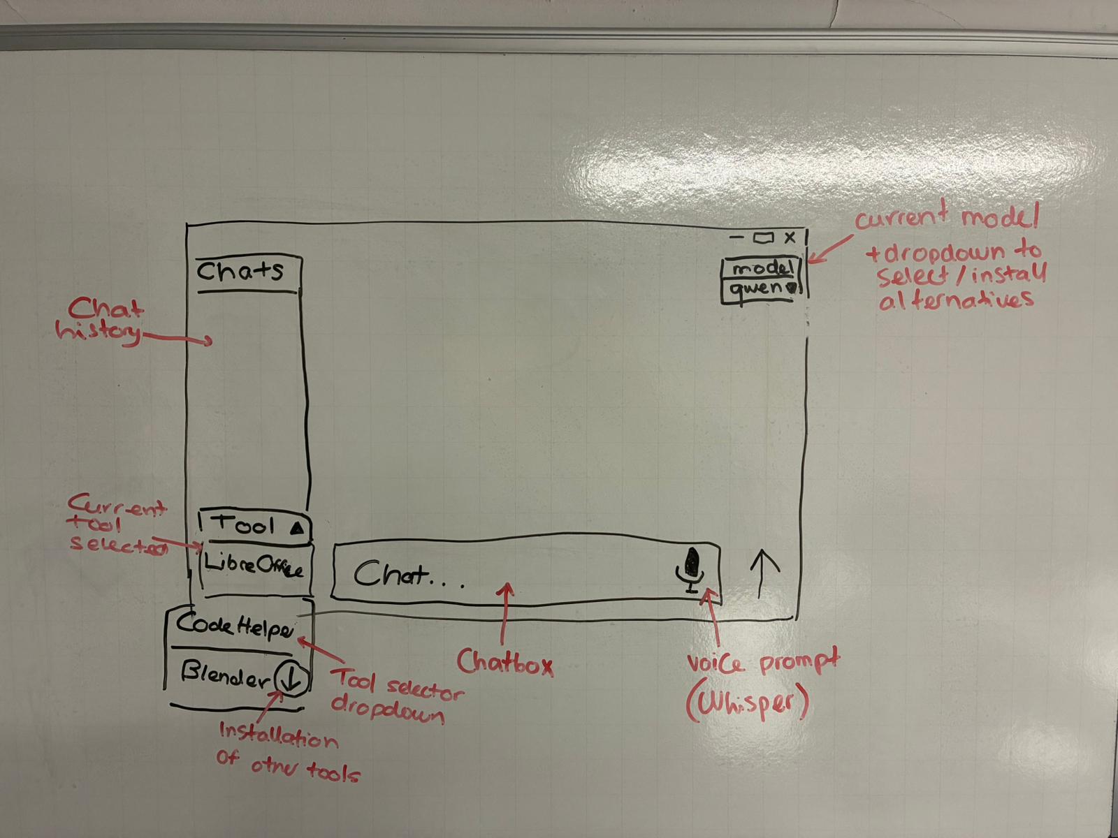
This early shared-shell sketch captures the first attempt to unify the platform around one desktop layout rather than separate assistant frontends. The core structure is already visible: a persistent sidebar, a central conversation workspace, a shared input area, and clear mode-level controls that could be reused across coding, office, image-editing, and 3D workflows.
Shared-Shell High-Fidelity Wireframe
The current wireframe is embedded below and is also available as a standalone HTML artefact: Shared-Shell Wireframe (open full page). It preserves the clearest high-fidelity snapshot of the common shell structure that informed the implemented SmolPC 2.0 interface.
Design Evolution
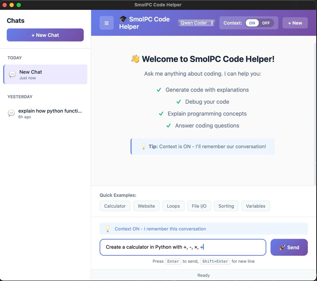
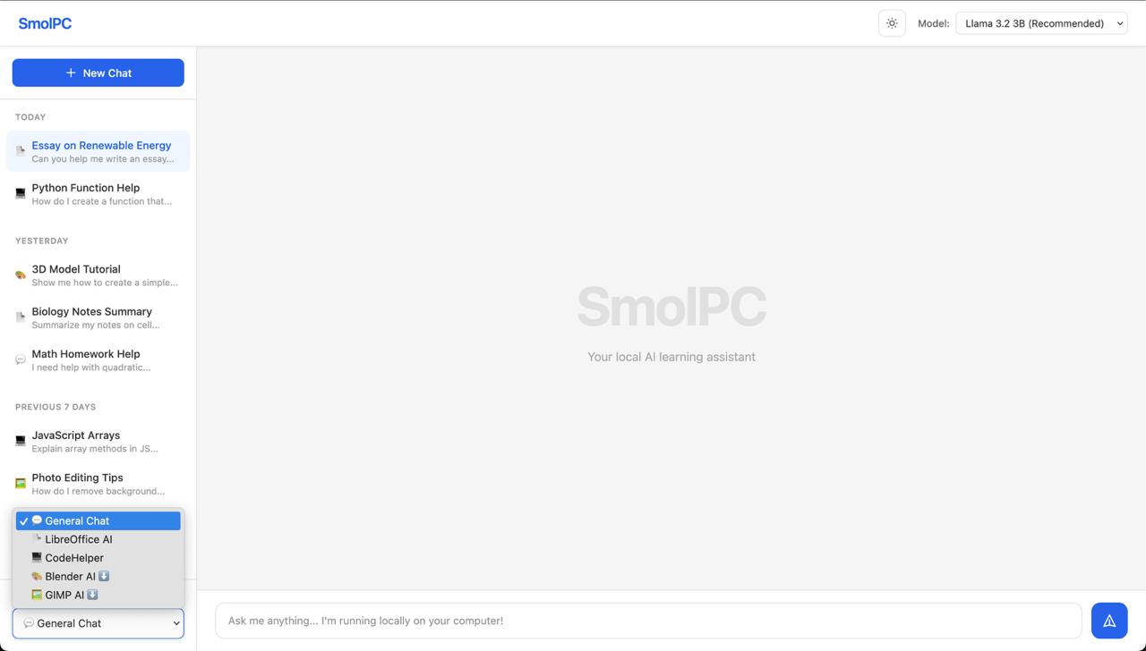
The final shared shell emerged through a small number of increasingly unified concepts rather than through separate UI tracks for each mode. The two snapshots below show that progression: an earlier Code-focused concept and an early unified-shell layout that moved the project closer to the final SmolPC 2.0 structure.
Mode-Specific Adaptations
The final UI differences between modes are mainly differences in copy, guidance, readiness, help, and host-launch behaviour rather than differences in page layout. Each mode below is therefore described as an adaptation of the same shell, not as a different UI family.
Code
Code mode is the reference path through the shared shell. It uses the common welcome state, quick examples, conversation view, composer, model info, hardware panel, keyboard shortcuts, export control, context toggle, and optional voice controls without needing an external desktop host application.
This makes it the simplest expression of SmolPC 2.0's common interaction model: one shell, one conversation layout, and one set of status surfaces.
Writer / Slides
Writer and Slides reuse the same shell but change the welcome copy, suggestions, setup state, and launch affordances to suit document and presentation work. The user still stays in the same conversation layout, but the prompts, mode label, and help content become office-specific.
These modes also rely more visibly on LibreOffice readiness and launch controls, and the UI can recommend a stronger tool-capable model when the selected small model would be a poor fit for office workflows.
GIMP
GIMP keeps the same shell but places more emphasis on host-app availability, setup guidance, and direct edit prompting. The main UI changes are in readiness messaging, the GIMP launch control, the GIMP-specific help copy, and the expectation that the assistant will summarise concrete image-editing actions rather than only answer general questions.
This lets the UI stay familiar while still making it obvious that the workflow depends on a live external editor and bridge.
Blender
Blender again uses the same shell, but the welcome copy, example prompts, help drawer content, and troubleshooting emphasis are all tuned for scene-aware guidance. The UI needs to encourage questions about the active scene, object, material, or modelling step rather than generic chat.
The result is still one consistent frontend, but with Blender-specific guidance layered into the shell through copy, launch behaviour, and contextual help.
Design Artefacts Summary
This page therefore centres on one shared-shell sketch and one interactive high-fidelity wireframe for the common SmolPC 2.0 interface. The supporting implemented screenshots appear in the Appendix user manual, while the rows below explain how each mode appears inside that same shell.
| Area | Primary Artefact | How It Appears in the Final UI |
|---|---|---|
| Unified App Shell | Hand-drawn sketch + interactive shared-shell wireframe | Shared layout, navigation, sidebar, workspace header, conversation view, and composer reused across all modes |
| Code mode | Shared-shell wireframe + implemented screen | Reference path without an external host app, with quick examples, context controls, export, and voice support inside the common shell |
| Writer / Slides | Shared-shell adaptation | Mode-specific onboarding, launch controls, setup messaging, and office-oriented prompt framing |
| GIMP Assistant | Shared-shell adaptation | Host-app availability, setup guidance, launch controls, and concise edit summaries inside the same shell |
| Blender | Shared-shell adaptation | Scene-aware guidance, contextual help, troubleshooting cues, and Blender-specific welcome content |