Iterations and Forks
Click the buttons below to jump to the corresponding section.
1. Setup Infrastructure 2. Data Cleaning Features 3. Data Visualization Features 4. Data Analysis Features 5. Optimizations 6. Feature Additions 7. UI Enhancements
Iteration 1 – Test UI with initial system architecture
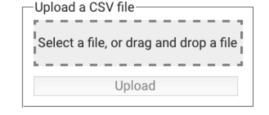
Initial upload interface.
Our first iteration was a simple skeleton implementation of our system architecture. This consisted of an Angular.js frontend whose assets were served by a Flask backend communicating via Socket.io. In order to test our architecture, we built a very simpe UI that would allow us to upload a file to the application. The diagram above shows the first iteration of this simple upload screen UI.
Iteration 2 – Development of user interface and Data Cleaning features
Since we were using Angular.js as our front end framework, we decided to use Angular material as our UI library as it allows the use of directives - this makes it easier to manage the HTML and CSS code. We started by creating a basic user interface which consisted of 3 tabs, one for data cleaning, analysis and visualisation. Once we had this in place we decided to begin developing our must have and should have data cleaning features, some of which included filling missing values, scaling and quantizing. Due to the large number of data cleaning features we had, we decided to use an accordion menu to group the cleaning features into relevant categories.
The image below shows the first iteration of our clean tab as well as some of the data cleaning features we had developed in the menu on the right of the window.
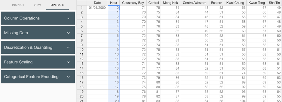
Data cleaning features with the spreadsheet style interface.
Iteration 3 – Development of Data Visualization features
During this iteration, we primarily focused on developing the data visualization techniques listed in our requirements, these included histograms, scatter plots, line charts, and word frequencies. We therefore used a JavaScript graphing library called Plotly.js to generate interactive graphs on the front-end. We also tried to make the user interface very simple to use, we therefore made the UI context aware and also included autocomplete features for selecting the variables. The image below shows the first iteration of our visualize tab.
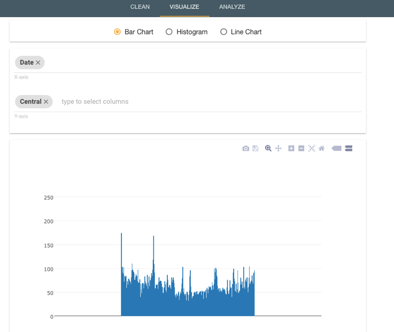
Data visualization feature with graphs generated with Plotly.js.
Iteration 4 – Development of Data Analysis features
After completing most of the data visualisation features, we then went on to developing the data analysis features. Some of the features included obtaining the averages of each variable as well as the number of unique and missing values. For each variable we also decided to include a frequency table which list the number of occurrences of a particular value. Finally, we also added a summary as well as search column at the top of the tab to enable a user to quickly search for the analysis card of a particular column. The first iteration of the analyse tab can be seen in the image below.
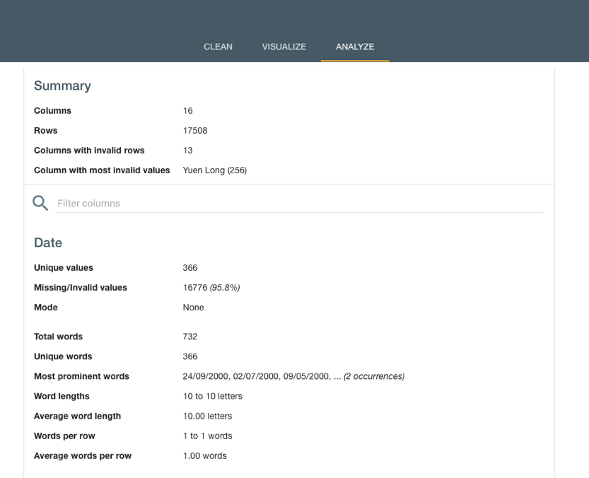
Data analysis feature with all column analyses shown in a single page.
Iteration 5 – Optimizing the Application
Partial loading of Data
After having completed most of our must and should have features, we decided to stress test our application by uploading larger files. We soon realized that our application was lagging significantly if large files were uploaded, this was due to the front-end loading the full data set after every cleaning operation performed on the data. We therefore changed our implementation of our frontend to partially load the dataset and to allow the user to select a range of columns and rows they would like to view. The UI of this feature can be seen in the bottom of the clean tab which is pictured below.
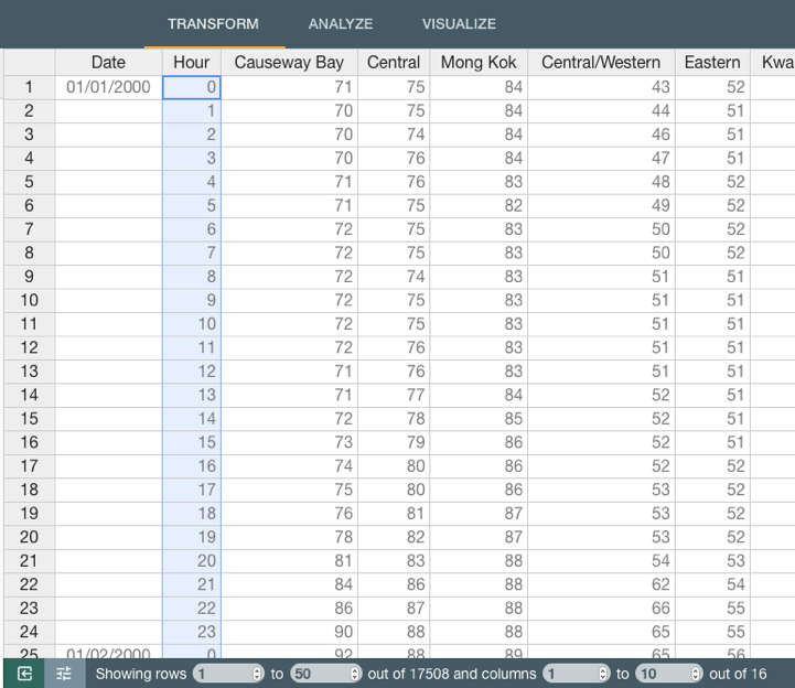
Partial loading implementation with the table navigation bar.
Optimizing Visualizations
We also realized that the current graphing library we were using was incapable of dealing with large datasets, as it would take a very long time to generate a graph which were in most cases cluttered and difficult to read. We therefore decided to generate the graphs on the backend using matplotlib and serving the static images to the frontend.
The image below shows a graph that is generated using the new library.
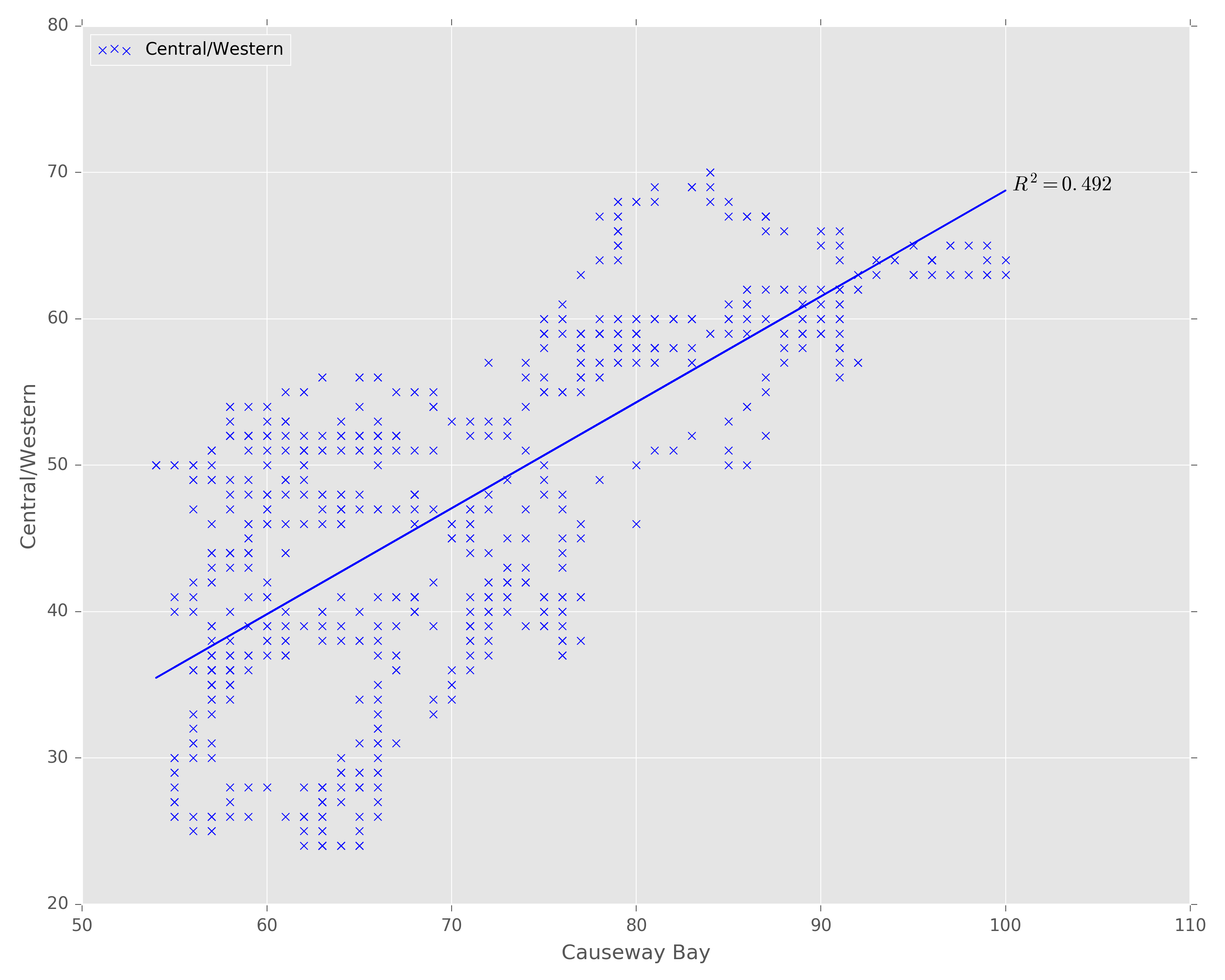
Data visualization generated using matplotlib.
Iteration 6 – General feature addition
This iteration involved us extending the range of functionality offered by our application. We decided to add an export feature that would allow the user to download the manipulated dataset in JSON and CSV format. We also decided to allow the upload of JSON, and XLS(X) to the application. Another useful feature we implemented was undo, this allows the user to undo a single operation applied to the dataset. Finally, we updated the UI for the upload screen and added a feature that allows the upload of a sample of the dataset using a seed. This is particularly useful if the dataset is large. Below is an image of the new upload screen with the additional features.
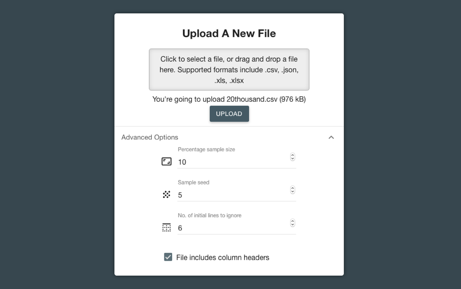
Additions to the upload page.
Iteration 7 – UI Enhancements
This final iteration involved us working on the user interface only. We decided to enhance the UI of both our visualize and analyze tab.
Visualize Tab
Below is an image of the final iteration of the visualize tab. We tried to make the interface as simple as possible by reducing the number of inputs on a menu which can be hidden. We also added a zoom feature as well as button to download the chart.
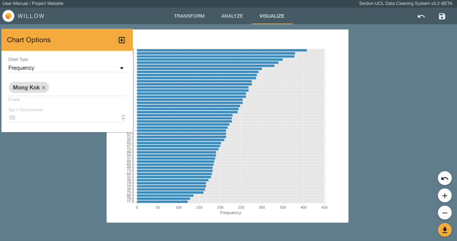
New UI for the Visualize tab.
Analysis Tab
We also overhauled the analysis tab making it more user friendly and appealing. In order to facilitate easy comparisons between columns, we decided to have a tiled interface where the user can select up to 4 different columns to view at the same time. We also tried to enrich the user experience by making the column selector context aware as well as add autocomplete function. Below is an image of the final iteration of the visualize tab showing the analysis for two columns.
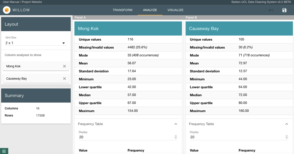
New UI for the Analyze tab.

