
User Interface Design and Development
This page details the design and development of the user interface and user experience for the front end of our system, including sketches and diagrams that leads to the final design. Click the buttons below to jump to the corresponding section.
1. Initial Sketches 2. Initial Wireframes 3. HCI Principles 4. First Prototype
Initial Sketches
In the beginning stages of developing the user interface, we sketched out some ideas on how the various screens/pages/views will look layout-wise. We decided that the system will have 4 main views, which are: Cleaning, Visualisation, Analysis, Data Loading. We decided against spliting the functionalities into more views because we think that it would make navigating between the views and finding the right feature confusing for the users. (Click to enlarge image.)
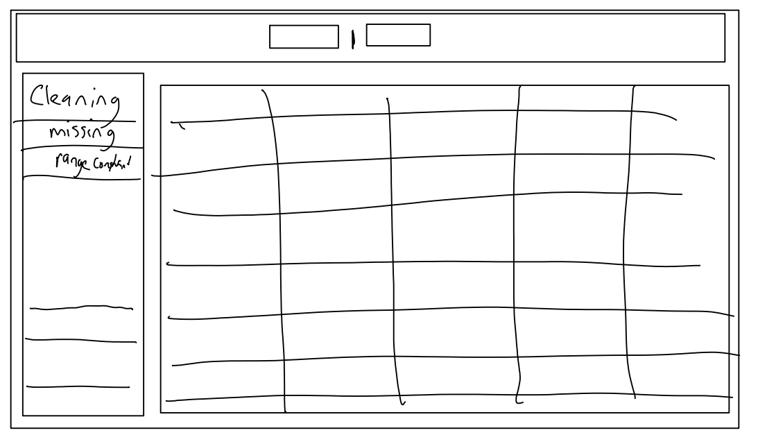
Sketch of Cleaning tab. |
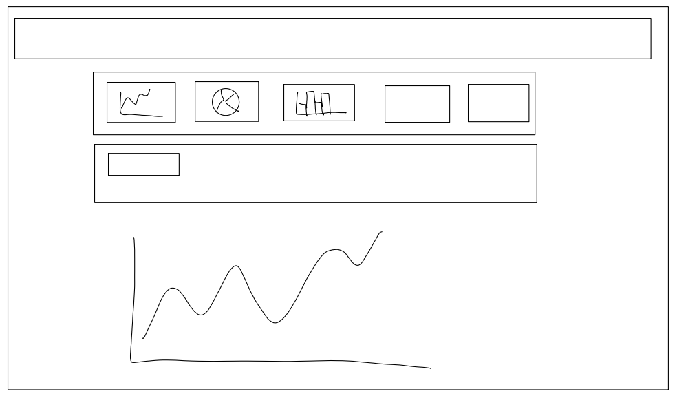
Sketch of Visualisation tab. |
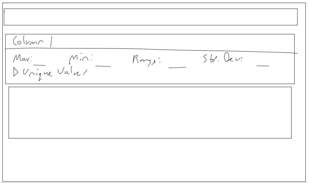
Sketch of Analysis tab. |
Initial Wireframes
After sketching out how we think the layout of the different views should be, we proceeded to produce the first wireframe; creating a cleaner and clearer overview of the layouts.
All views (except for Data Loading) will have one common element, the navigation bar (nav-bar). The nav-bar will be positioned on the top of each view and includes buttons/links that allow users to switch between the different views. The nav-bar shall be fixed on the screen, so it is available even if the user scrolls down; this enables easier navigation between the views.
Cleaning
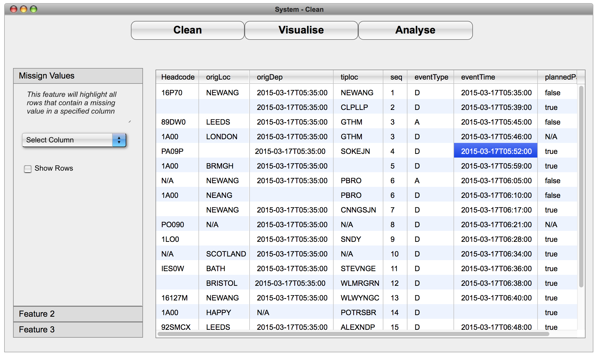
The cleaning tab will be where the user can access all the cleaning features of the system. There will be fixed toolbar on the left side of the view which will list all available features for cleaning data. Each item in the list will be expandable such that when clicked, they will reveal the options relevant to them. The toolbar will scroll independently from the rest of the view.
The dataset imported by the user will be displayed on the right of the toolbar in table/spreadsheet style. The dataset will be partially loaded and displayed with the option of loading more rows. The user can view the data and select columns they wish to operate on using the tools in the toolbar.
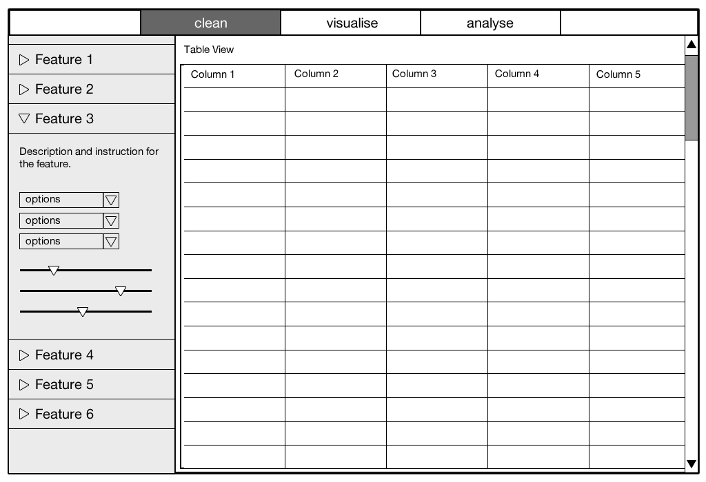
Wireframe of Cleaning tab.
Visualisation
The visualisation tab will be where the user can visualise the dataset they imported. On the top of the view will be a pane where the user will be able to select a type of visualisation method (graph); the options will be displayed as icons with labels to assist the user. Below this will be where the user selects the relevant columns they want to visualise. Which columns to be made available for selection depends on what the user selected as the visualisation method (ie. the user need to have selected a visualisation method before selecting columns). After the selections have been done, the visualisation will be displayed below the selection panes.
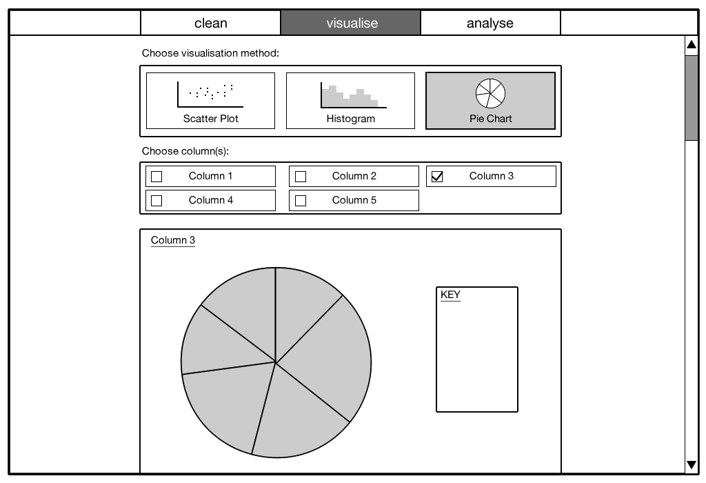
Wireframe of Visualisation tab.
Analysis
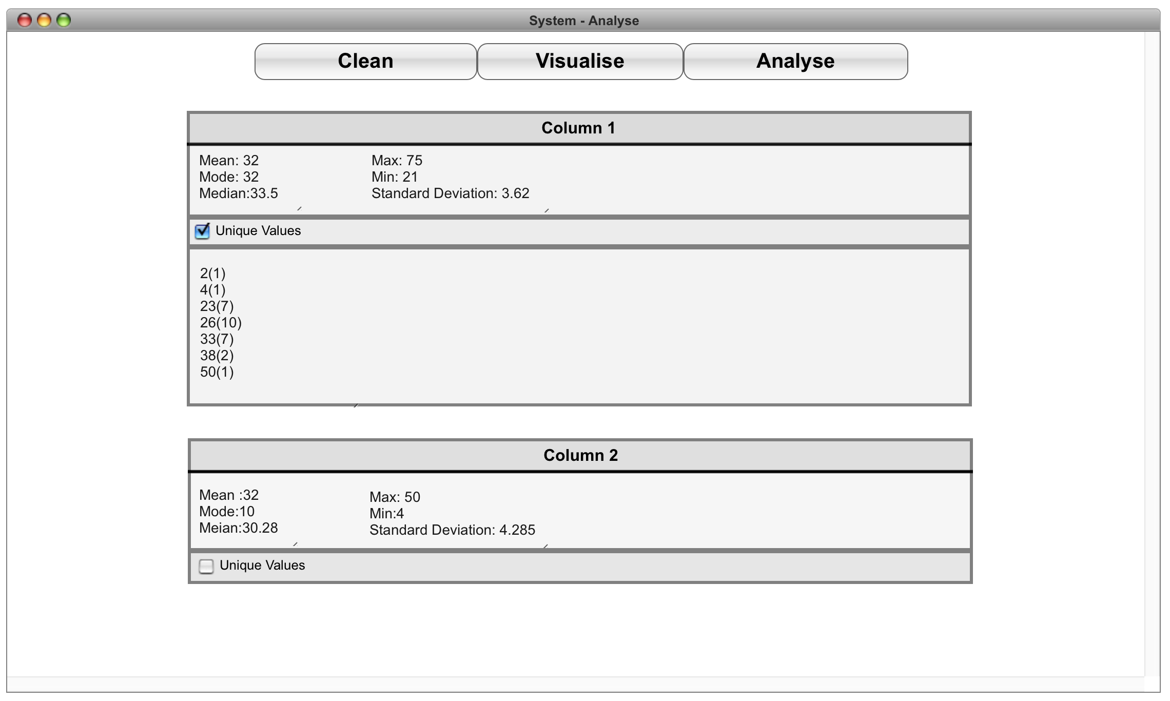
The analysis tab will let the user see properties and characteristics of the dataset the user imported. This view will contain “information boxes”, one after another in a single column. Each column of the dataset will have one “box” which will contain information about that specific column. For example, if the column contains numerical data, it will display statistical measurements such as averages, range, and dispersion. Additional information such as unique values will also be available as an expandable dialog.
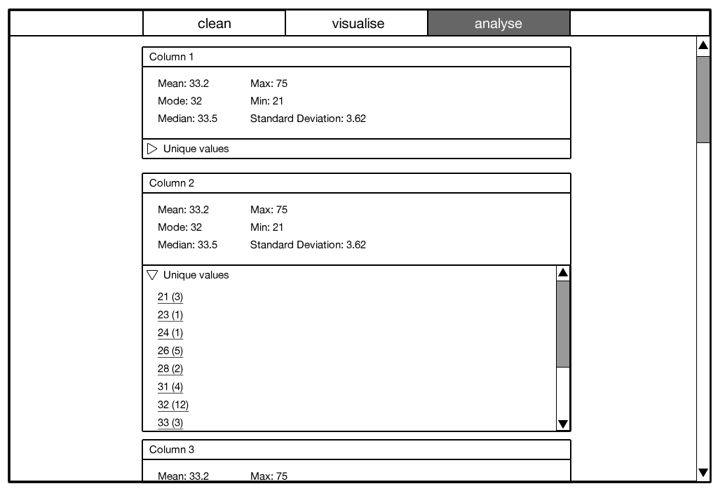
Wireframe of Analysis tab.
HCI Principles
While designing the UI, we focused on anticipating the needs of our user and ensuring that the interface has elements that are easy to access, understand and use to facilitate those actions. While choosing elements to use within our interface, we tried to be as consistent and predictable in our choices, we did this in order to achieve a UI that supports efficiency, task completion and user satisfaction. The five main ways in which we were able to achieve this was:
Visibility
In order to achieve visibility, We made sure to select elements and lay them out in a way that makes it obvious what they are used for. A good example of this is our static tabs functionality that enables the user to navigate between different sections of the app, we therefore decided to position these tabs at the top of the page in a central location in order attract the users attention. We also tried to minimize the number of elements on any given screen to prevent the user from getting confused. Finally we have also designed the UI in a way to prevent the user from accessing pages that have no navigational options.
Affordance
This is when an elements sensory characteristics intuitively imply its functionality and use. We did this by altering the appearance of some of our elements such as buttons and tabs to suggest the idea of pushing the element – this was achieved by raising the elements slightly above the rest. We also incorporated scroll bars around the spreadsheet, this makes it easier for the user to identify the ability to drag down and view more objects. Finally we also intend to give all of our checkboxes and radio-buttons rollover/hover effects, this would increase the affordance of the elements.
Feedback
This is when the users presses a button and the system reacts in a manner that clearly communicates what has just been accomplished. In order to achieve this we incorporated functionality such as hover states on all our links, tabs and buttons, this means that the appearance of the element will change once it has been clicked. We have also decided to incorporate an animated loading icon or progress bar that will appear on the screen while the data is being processed.
Mapping
Mapping creates a clear relationship between what the user wants to do and the mechanism for doing it. Though there were not many instances in our UI that required natural mapping, we still utilised it when considering the icons we will be using. We wanted the upload, save and export icons to be easily identifiable, and therefore decided to choose the most common representation of each.
Consistency
The main way in which we were able to achieve consistency in our UI, was by making sure that all our structures and interactions are consistent. A simple example of consistent structure is the placement of the static tabs in the same location in all the pages. We also made sure that all the tables displayed in the analyse tab look the same and have the same interactions. At the same time, all the icons we have chosen to use are all consistent with each other in terms of their general appearance. Finally we tried to keep our colour schemes, fonts, font size, borders, and effects as consistent as possible across all our pages.
Constraints
Constraints limit the actions that can be performed by the user, thus increasing the usability of the design and reducing the likelihood of operator error. We were able to incorporate this by automatically changing the available list of features in our sidebar depending on the rows, this would prevent users from carrying out cleaning operations which are not possible. Another example is when the user selects a graph to visualise, the system will only allow the user to select a certain number of variables depending on the graph. We are also considering using error sounds to alert the user when an entry is incomplete or invalid.
First Prototype
Before presenting our first iteration of the user interface to our client, we decided to create the first prototype of the user interface. This prototype builds on what we have got from the wireframes, adding links between the different views and responsive elements such as drop-down menus and tick-boxes to demonstrate how those elements work. Although the graphics has been tweaked from the wireframe to look more visually appealing, this prototype does not aim to represent the visual design of the UI. Below are the screenshots of the prototype; an interactive prototype is also available.
View the interactive prototype
First prototype of Cleaning tab.
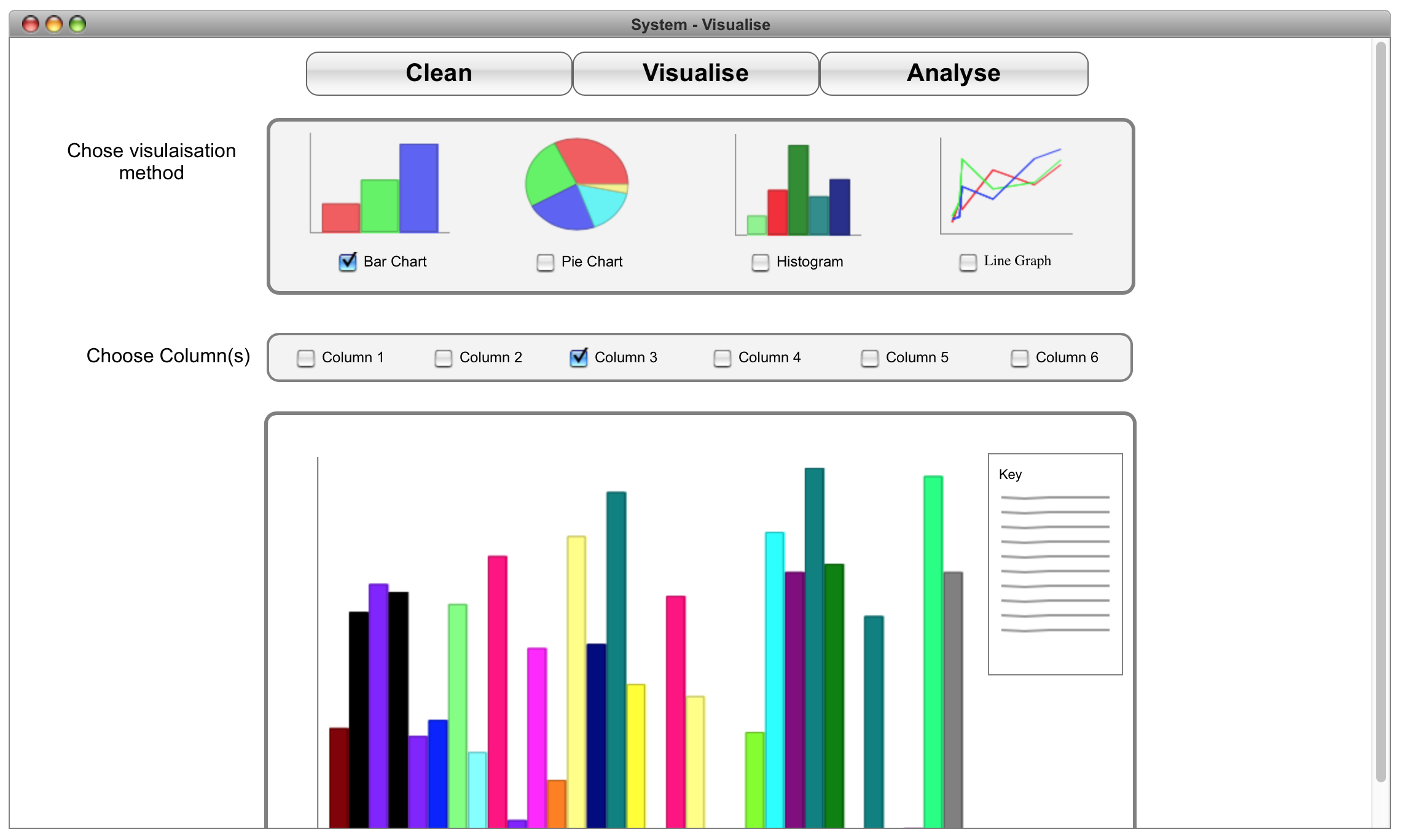
First prototype of Visualisation tab.
First prototype of Analysis tab.
This prototype was created using ForeUI.