HCI
This page highlights the design of the user interface and user experience of the front end system. This includes initial sketches, wireframes and also first prototype of our application. There are also screen shots of the some of the key pages of the final product.
Initial sketches Initial Mockup HCI Principles Screenshots of Final Product
Initial sketches
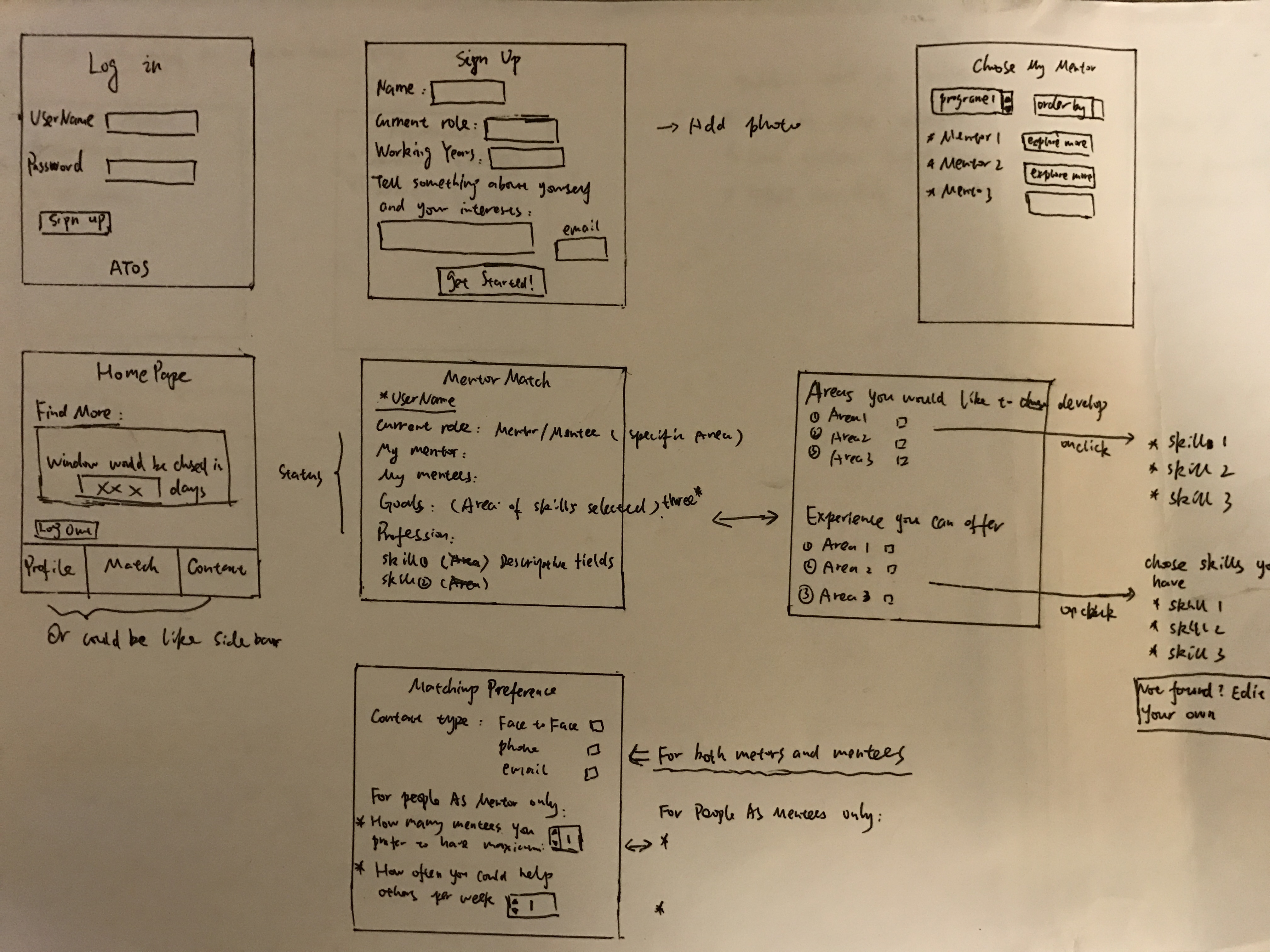
During the beginning stages of developing the user interface, we sketched out some ideas on how the various screens/pages/views will look layout-wise. We decided that the system will have 6 main pages, 1 for user authentication, a clean and user friendly home page, and also 4 other pages for the application process.
Initial Mockups
After sketching out how we think the layout of the different views should be, we proceeded to produce the first wireframe; creating cleaner and clearer overviews of the layouts. The wireframes/mockups were designed using Ionic Creator.
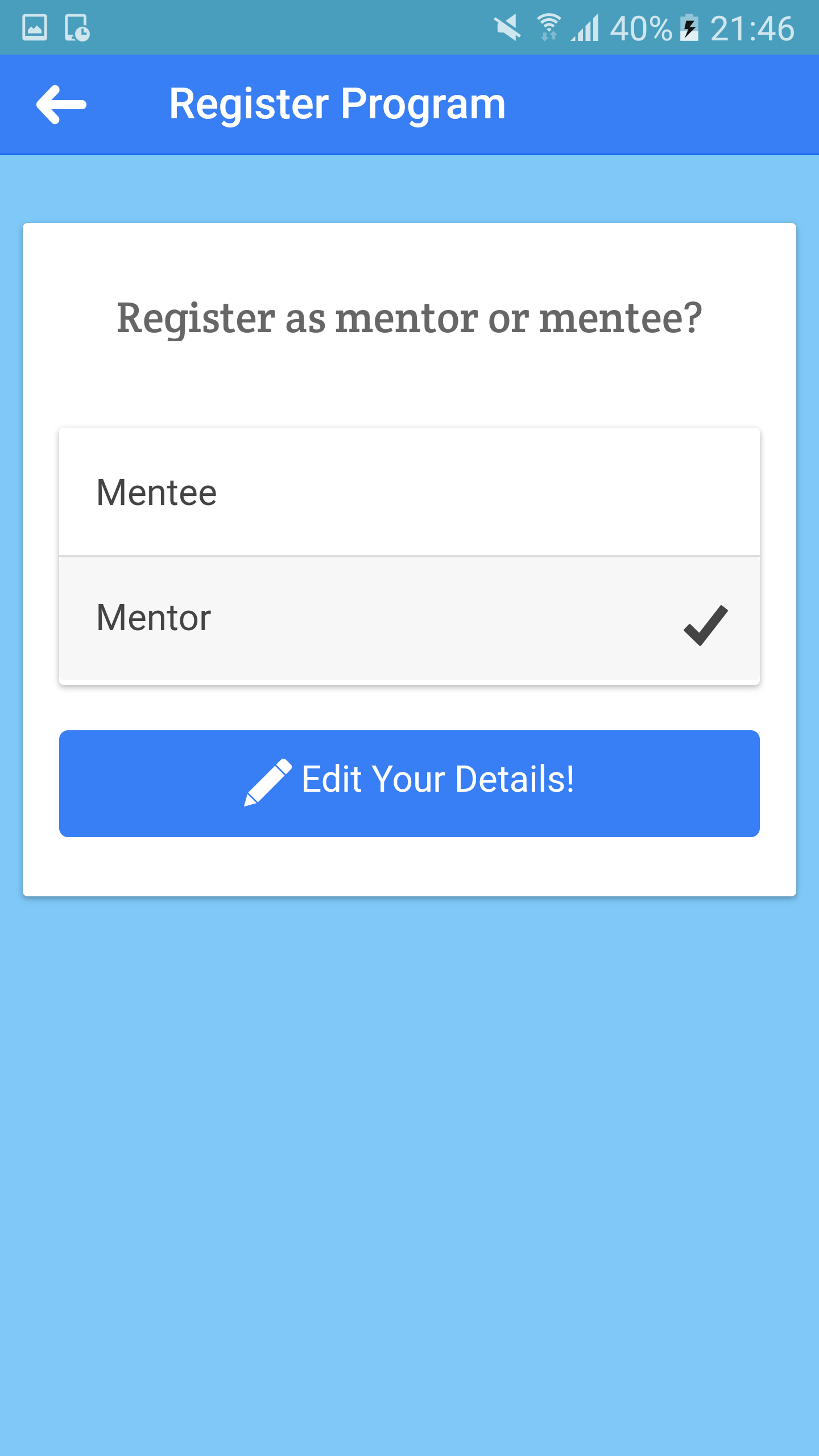
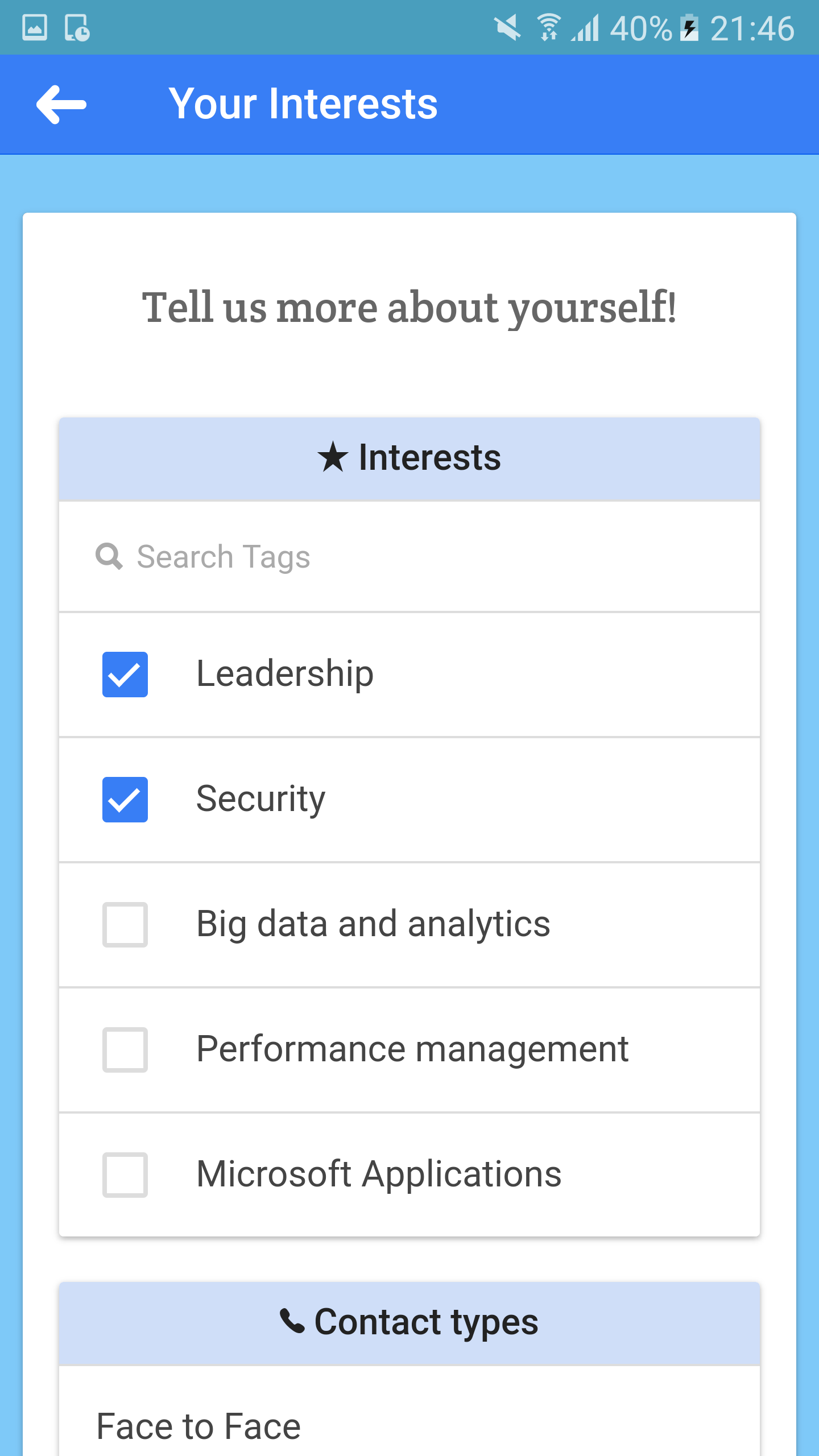
There are 5 main layouts for the mockup. The first is the user authentication pages where users create an account to use the application. The second page is the landing page which is where users can choose to enrol in any of the available mentorship programs. When the user selects a mentorship program, there would be a page that shows the details and information of that specific program. After that the user will have to enter their respective interests so that the system can match them to a mentor or mentee. Users can also manually enter some of their interests if it is not available in the selection. Finally the process of application is the confirmation page, where users choose to register themselves as a mentor or mentee. (Please click to enlarge images)
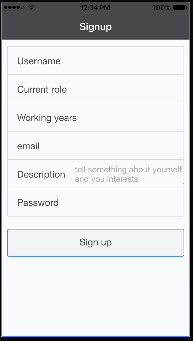
Authentication page
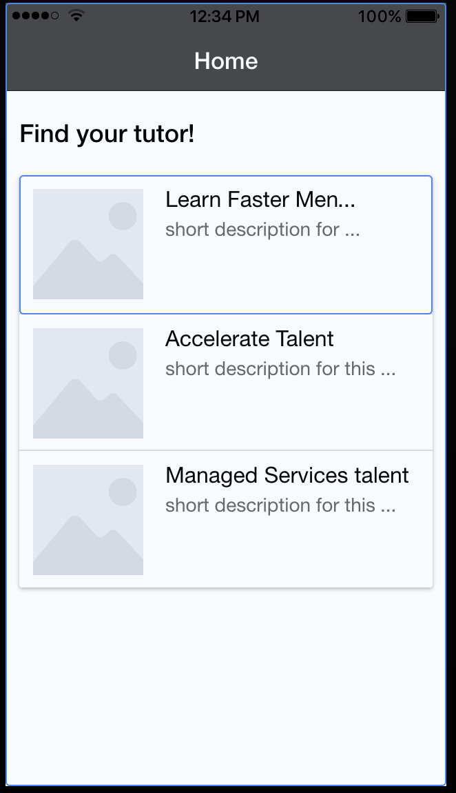
Landing page
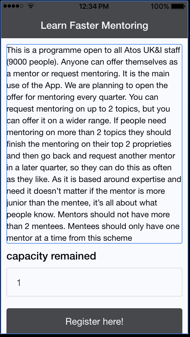
Overview of mentorship program
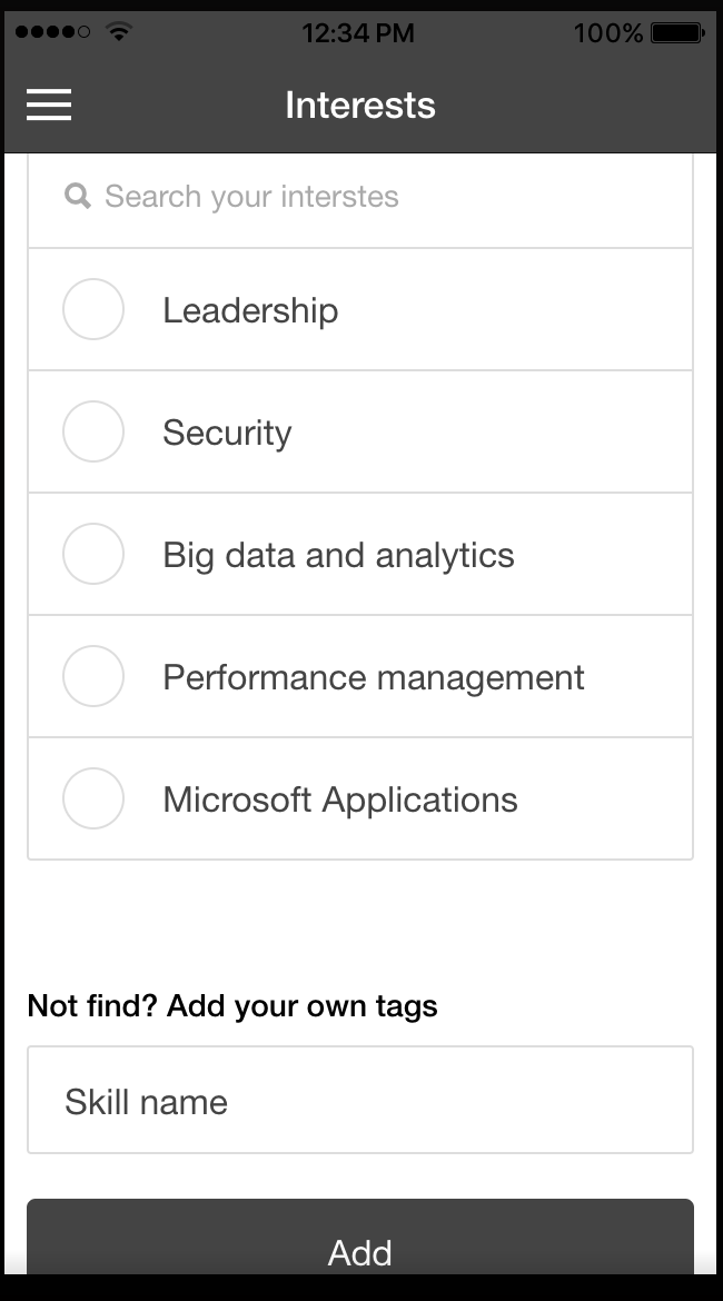
Application page(Entering interests)
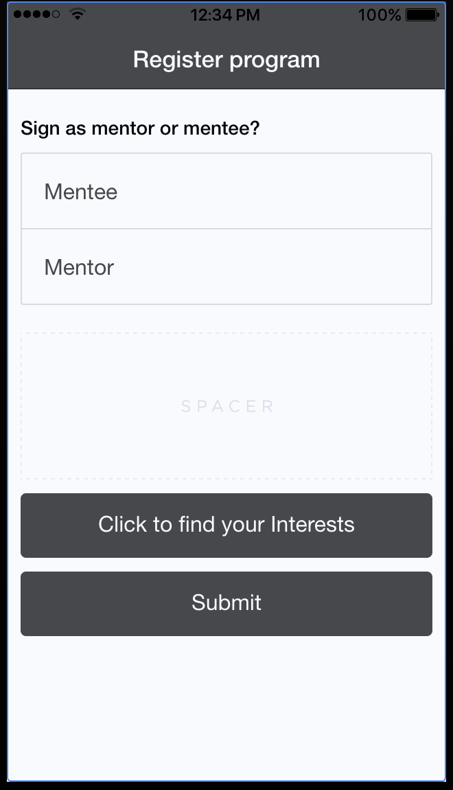
Confirmation page
First Prototype
We decided to create the first prototype of the user interface. This prototype builds on what we have got from the wireframes, adding links between the different views and responsive elements such as drop-down menus and tick-boxes to demonstrate how those elements work. However, this prototype does not aim to represent the visual design of the UI. A link to the interactive Ionic prototype is available below.
HCI Principles
While designing the UI, we focused on anticipating the needs of our user and ensuring that the interface has elements that are easy to access, understand and use to facilitate those actions. While choosing elements to use within our interface, we tried to be as consistent and as possible to acheive a UI that supports efficiency, task completion and user satisfaction. The ways that we were able to acheive this were:
Visibility
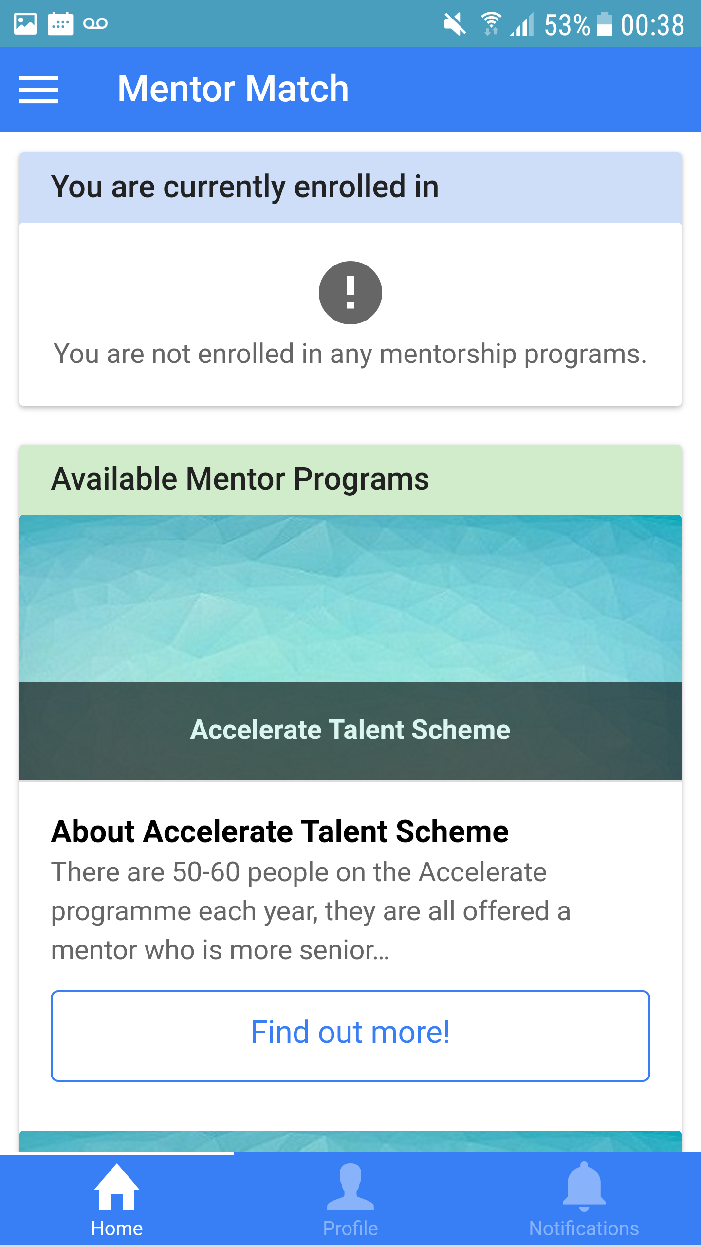
In order to achieve visibility, we made sure that elements were laid out in a manner that makes it obvious for what they are used for. We tried to keep elements in large sections and position important information at a centre location. We also try to arrange elements in an orderly row and column system. Icons were also used to help express specific functionalities. An example of this would be our home page where we listed individual programs clearly and indicating clearly which programs they were registered in and which programs that were available.
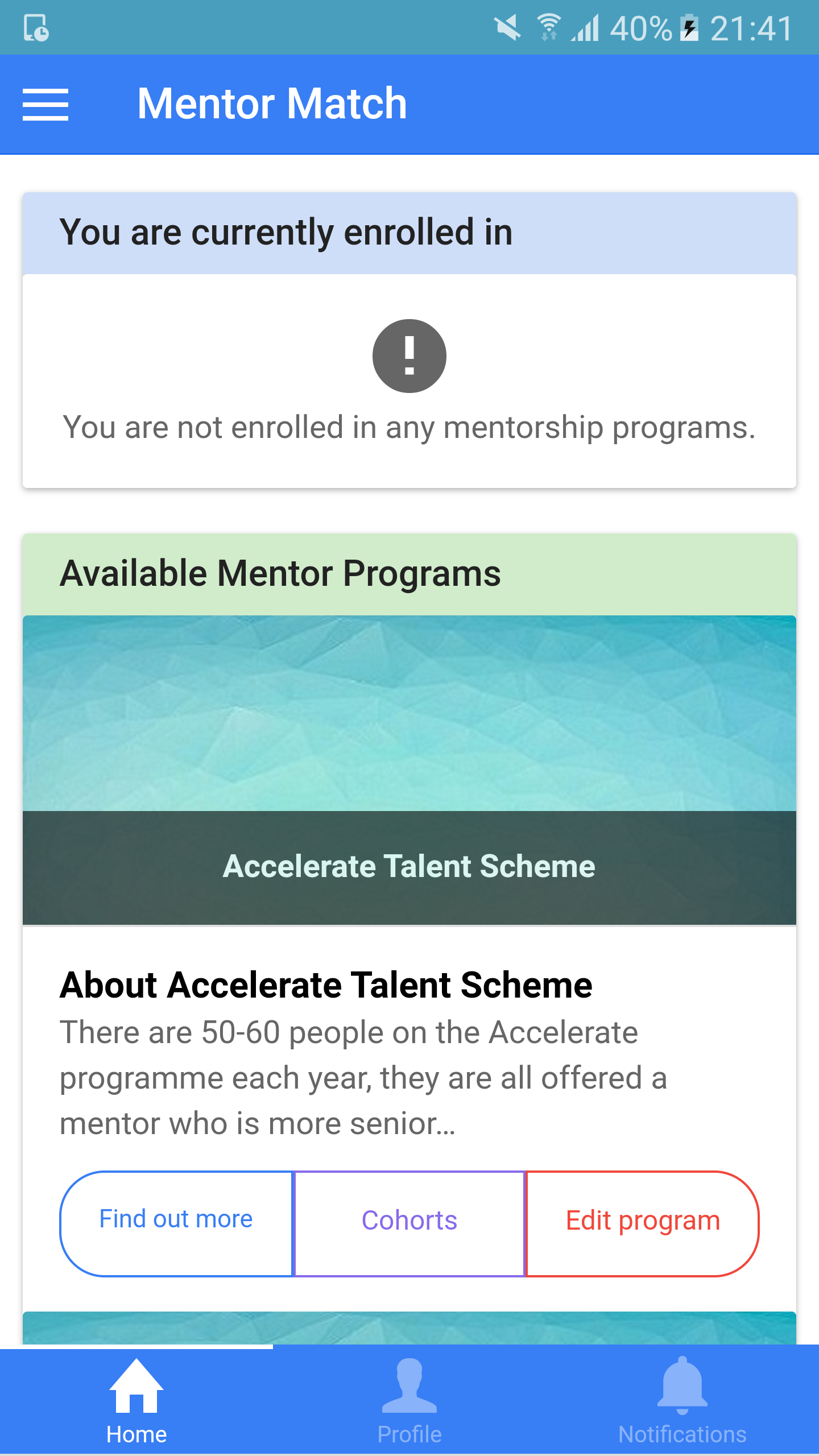
Home Page display
Feedback
This is when the users presses a button and the system reacts in a manner that clearly communicates what has just been accomplished. In order to achieve this, we used functionalities such as hovers on buttons and links and pop ups. We also try to incorporate toast notifications whenever an important action is completed for example after the creation of cohorts/programmes and after registering for a programme. We also implemented ‘alerts’ when users are performing something critical to ensure users don’t do anything undesired unintentionally. An example of this would be an alert box to make sure that admins want to delete mentor programmes or cohorts.
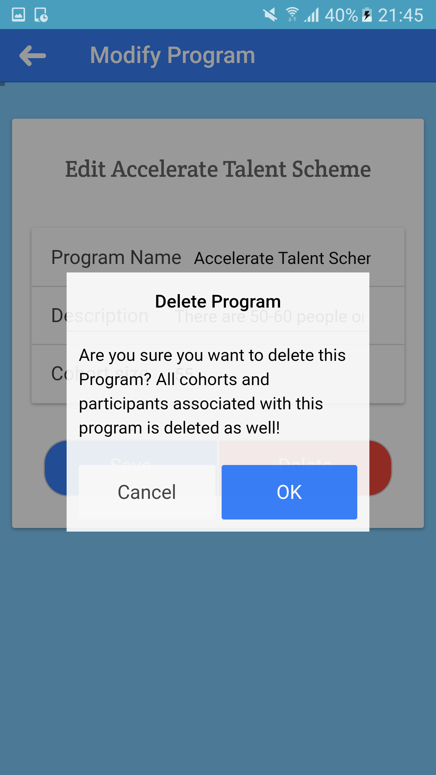
Alert before delete programme
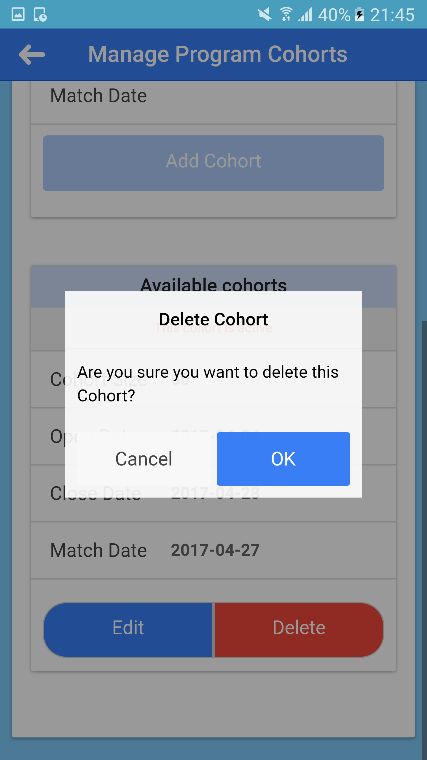
Alert before delete cohort
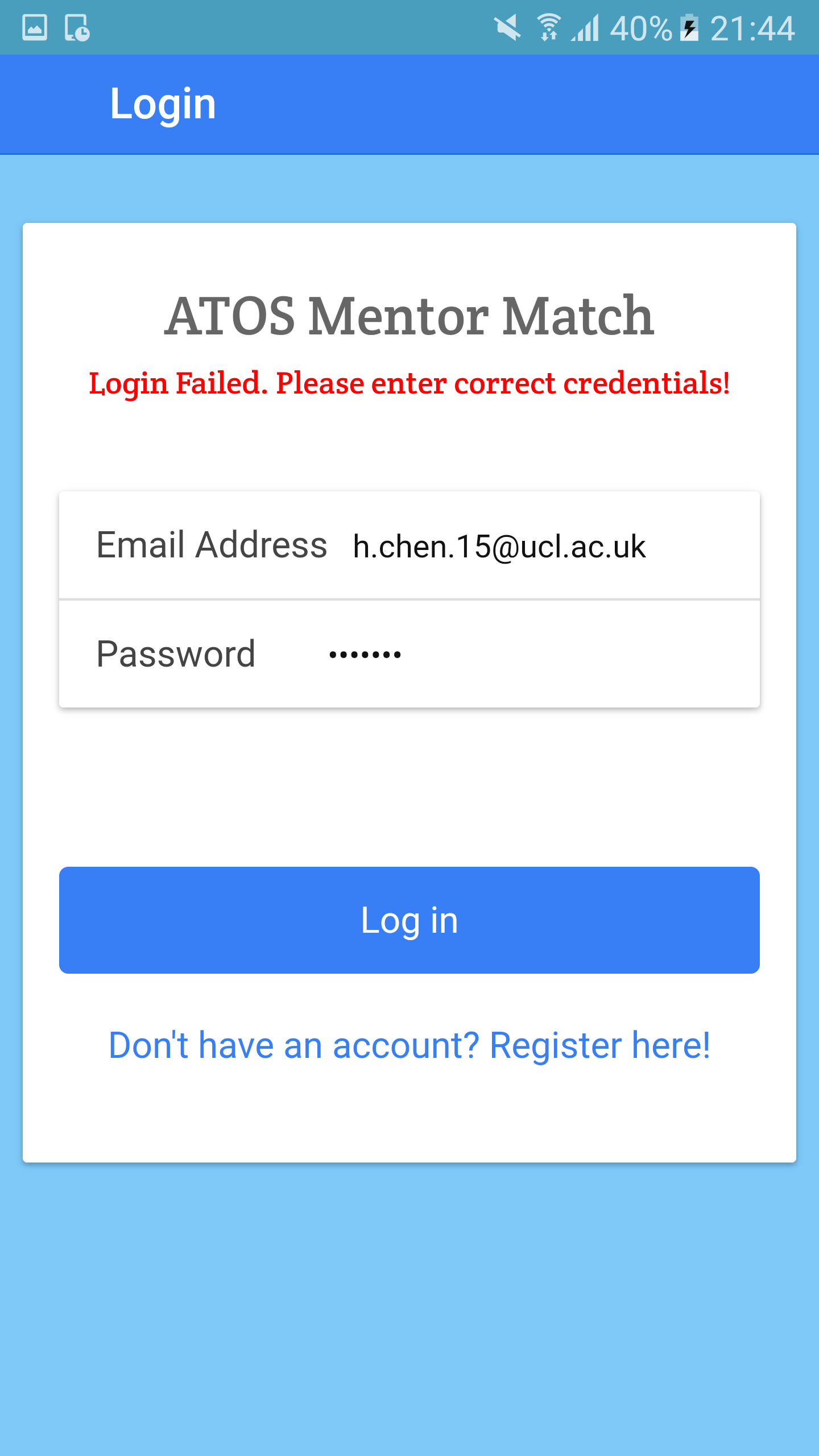
Fail login Feedback
Consistency
We achieved consistency in our UI by making sure that all our structures and elements were consistent. We tried to make sure that every page followed the same general theme. For example, colour themes and font styles and sizes would be maintained throughout the individual pages. Here are some examples of the common design patterns that we used for our forms.
Layout of cohort page
Layout of registration page 1
Layout of registration page 2
Constraints
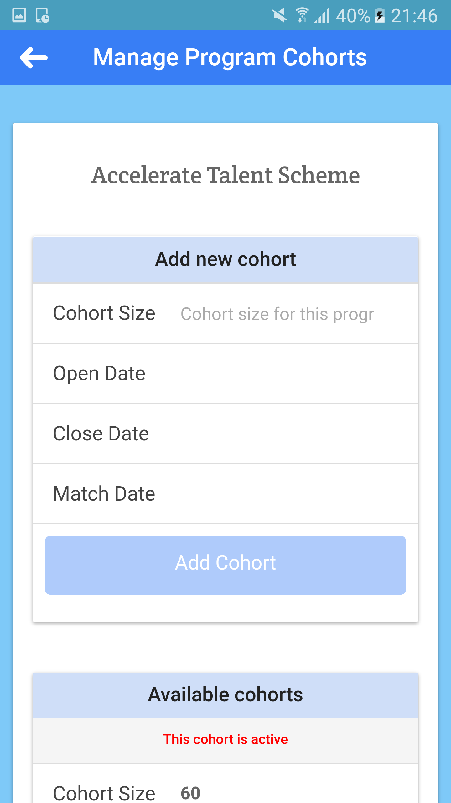
We have also designed some constraints when designing our user interface to ensure that users do not perform any undesired actions. For example, users are not supposed to sign up for programmes which have no active cohorts. Also, when filling up forms, we ensure that users fill in all the required details before they can even submit the form. This is done by disabling buttons and only enabling them once the users have performed the required actions. Below are some examples of constraints that are present in our application to prevent users from doing unwanted actions.
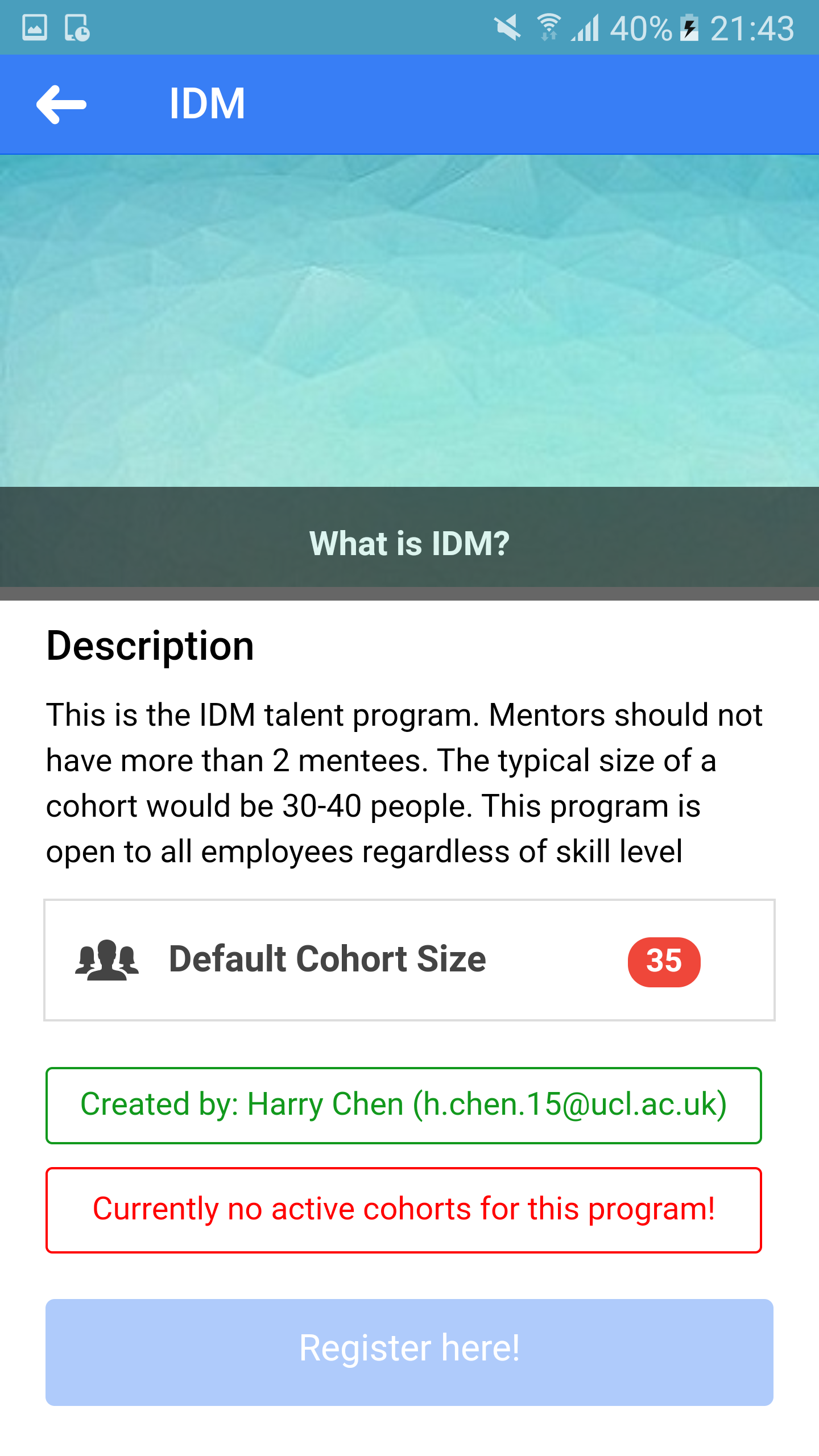
Only can register if have active cohort
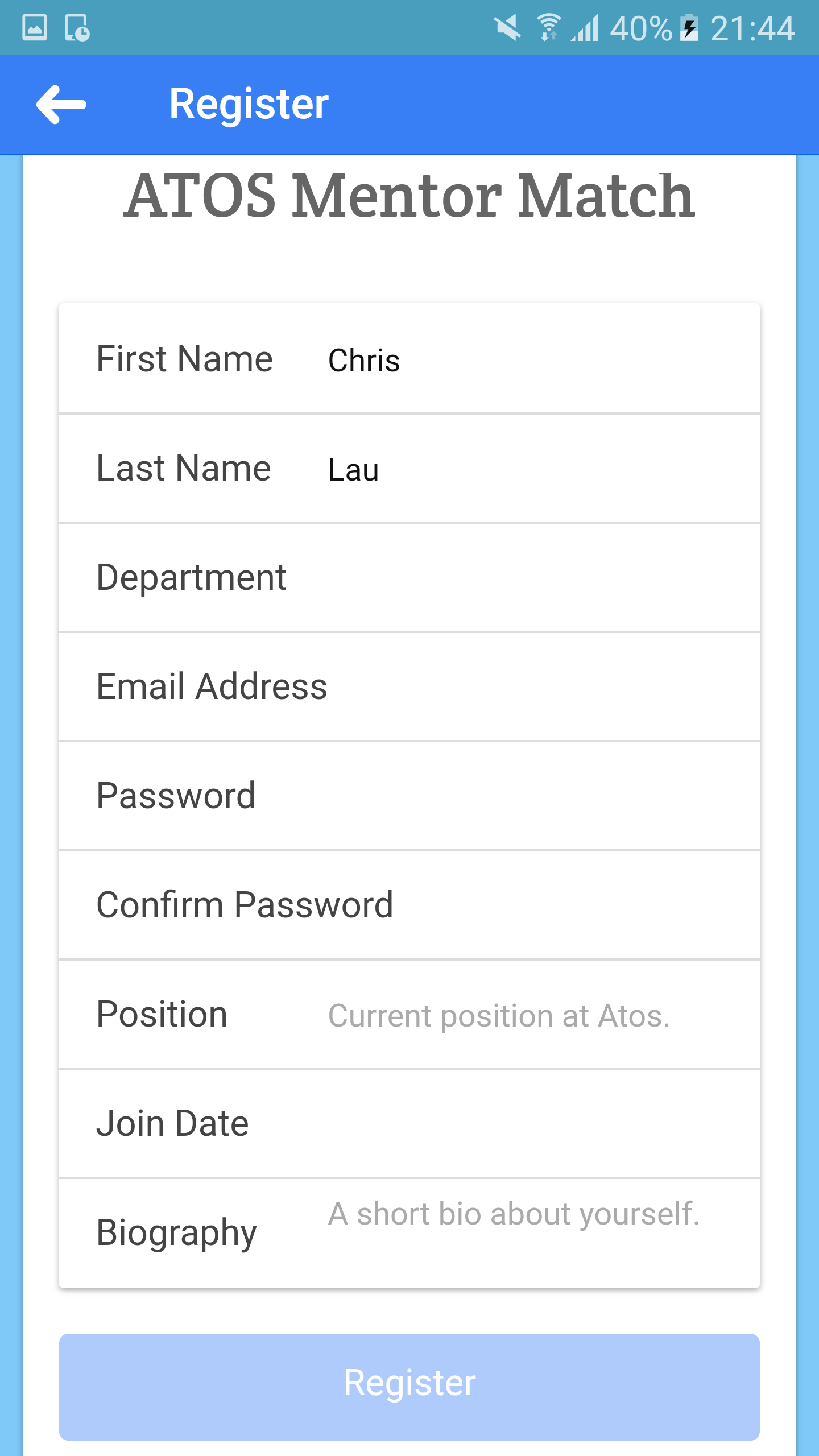
All fields required.
Final Screenshots
Below are some screenshots of how our final product looks like. These are some of the key features that our application has such as a home page that allows users to browse through available programs and find out more/register for them. A simple profile page that displays basic information about the user. A notification page that indicates when a new programme is created, when a cohort is active, when mathcing begins etc.
Final Home Page (Admins)
Final Home Page (Normal User)
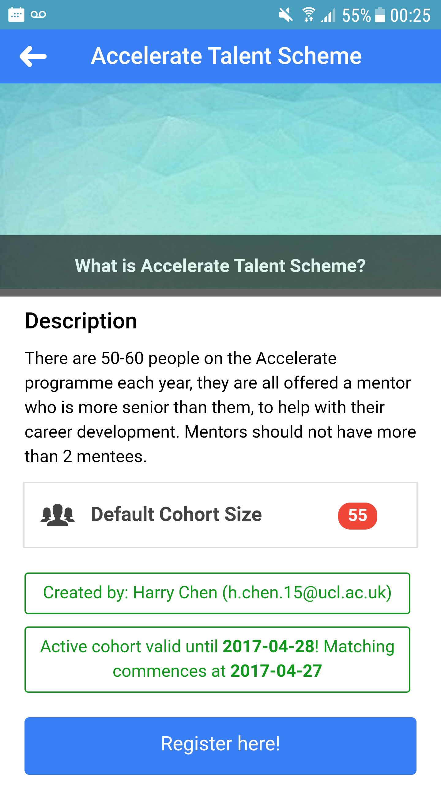
Program Description page.
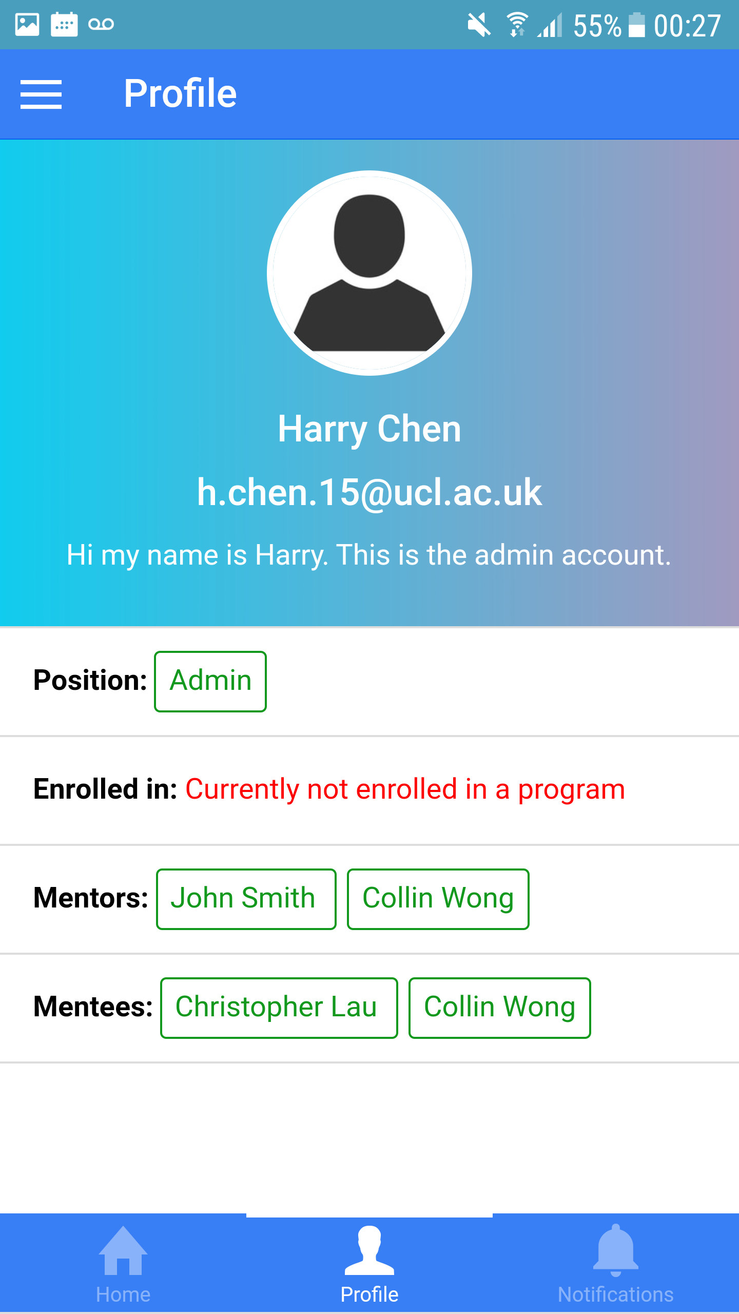
Profile page.
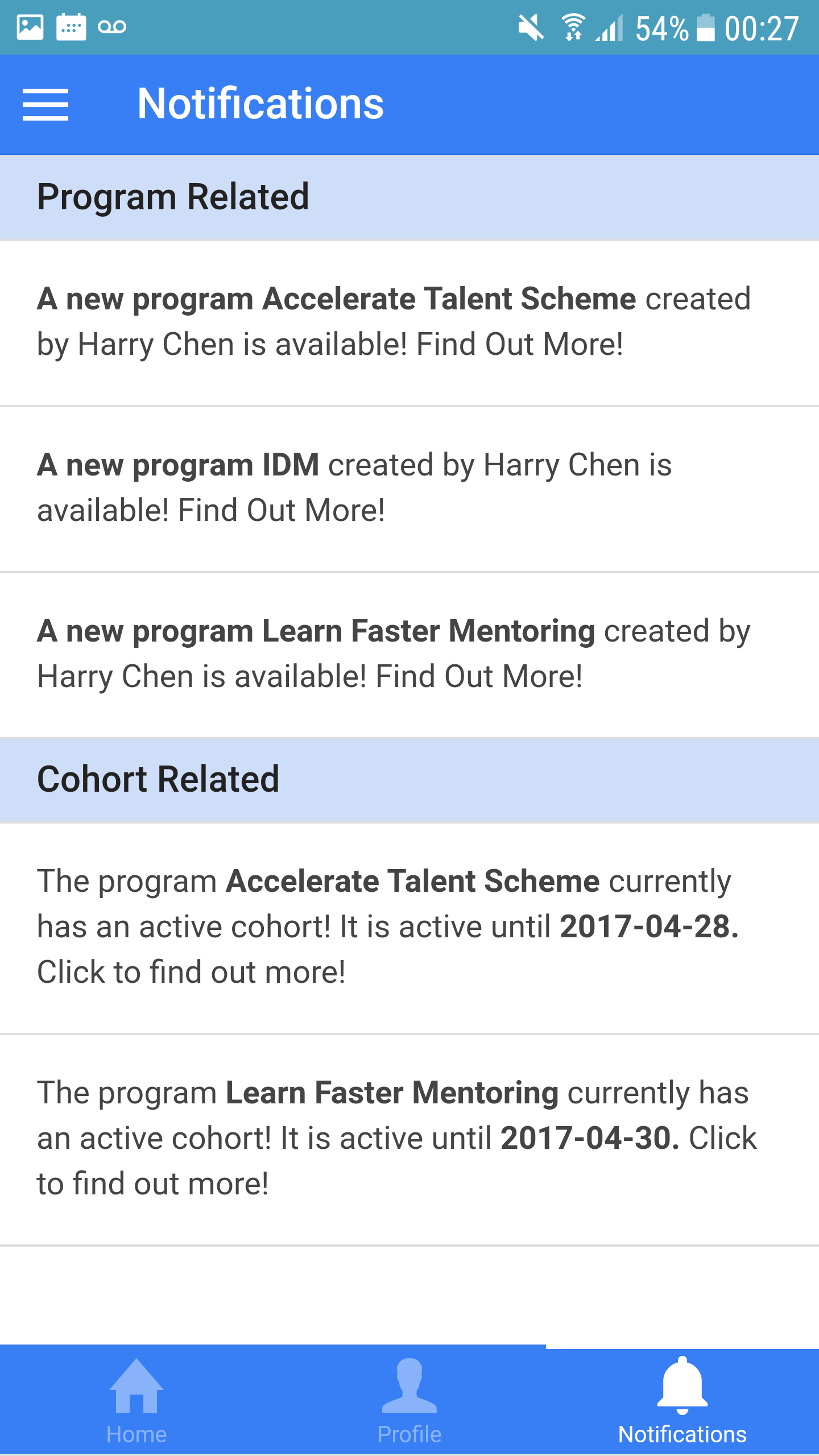
Notifications page.
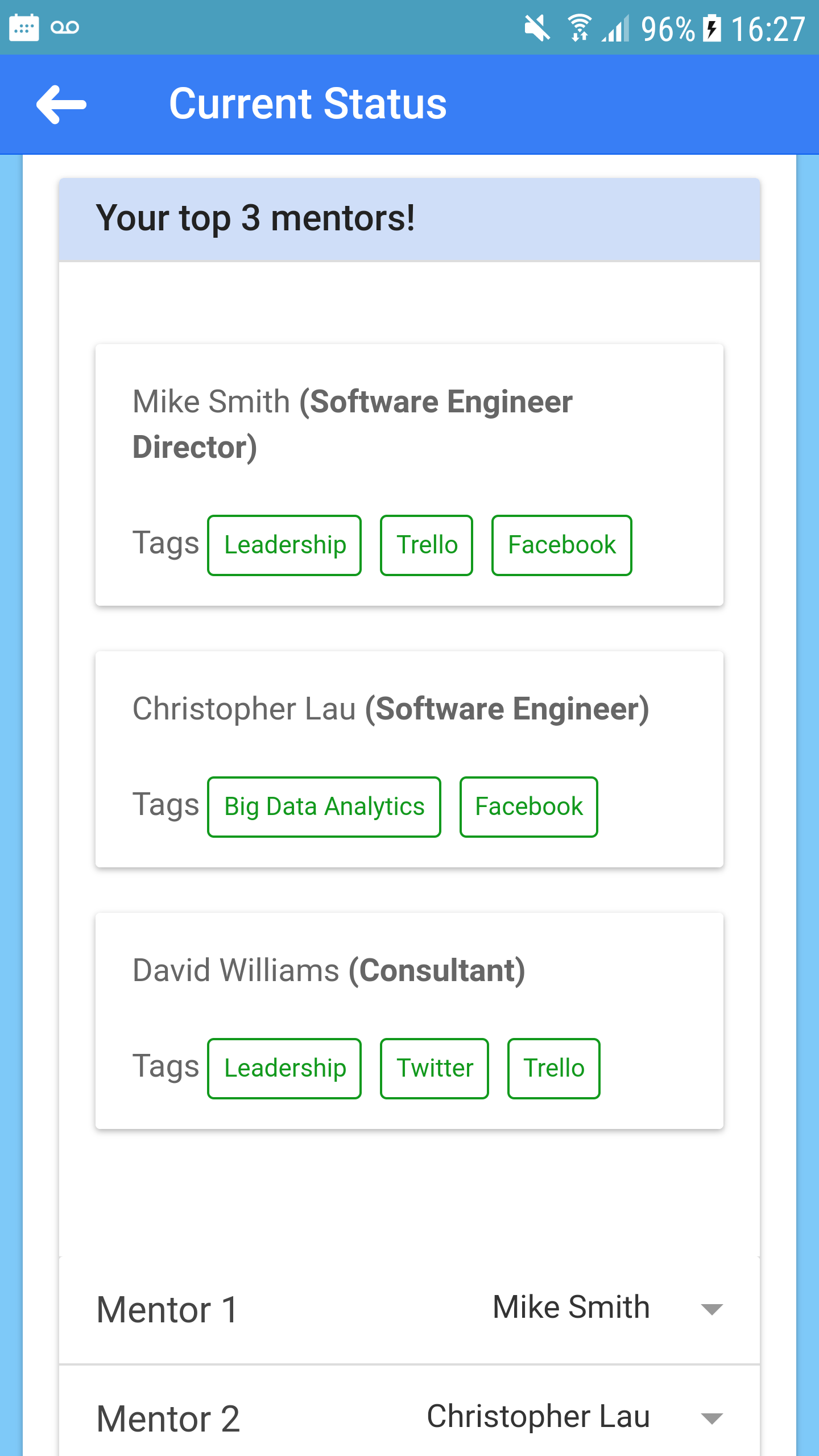
Choose top 3 mentors.