Design Principles
During the process of designing the user interface we made sure to consider the following design principles in order to ensure
the work we were producing would be both good computer science and also of the high quality that our clients are looking
for. The following details how we considered these design principles (visibility, affordance, feedback, consistency and
constraints).
Visibility
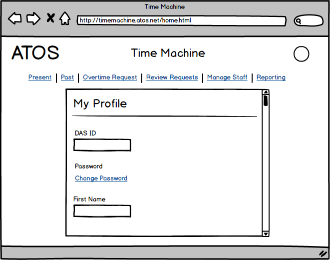
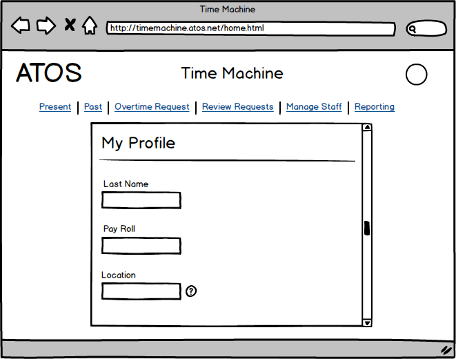
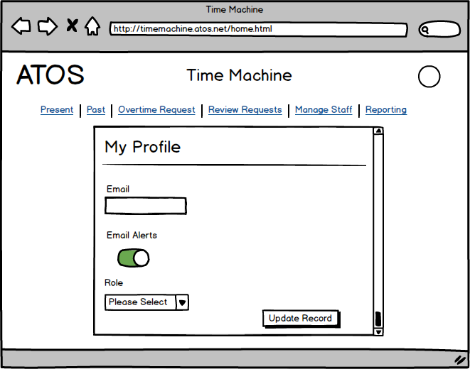
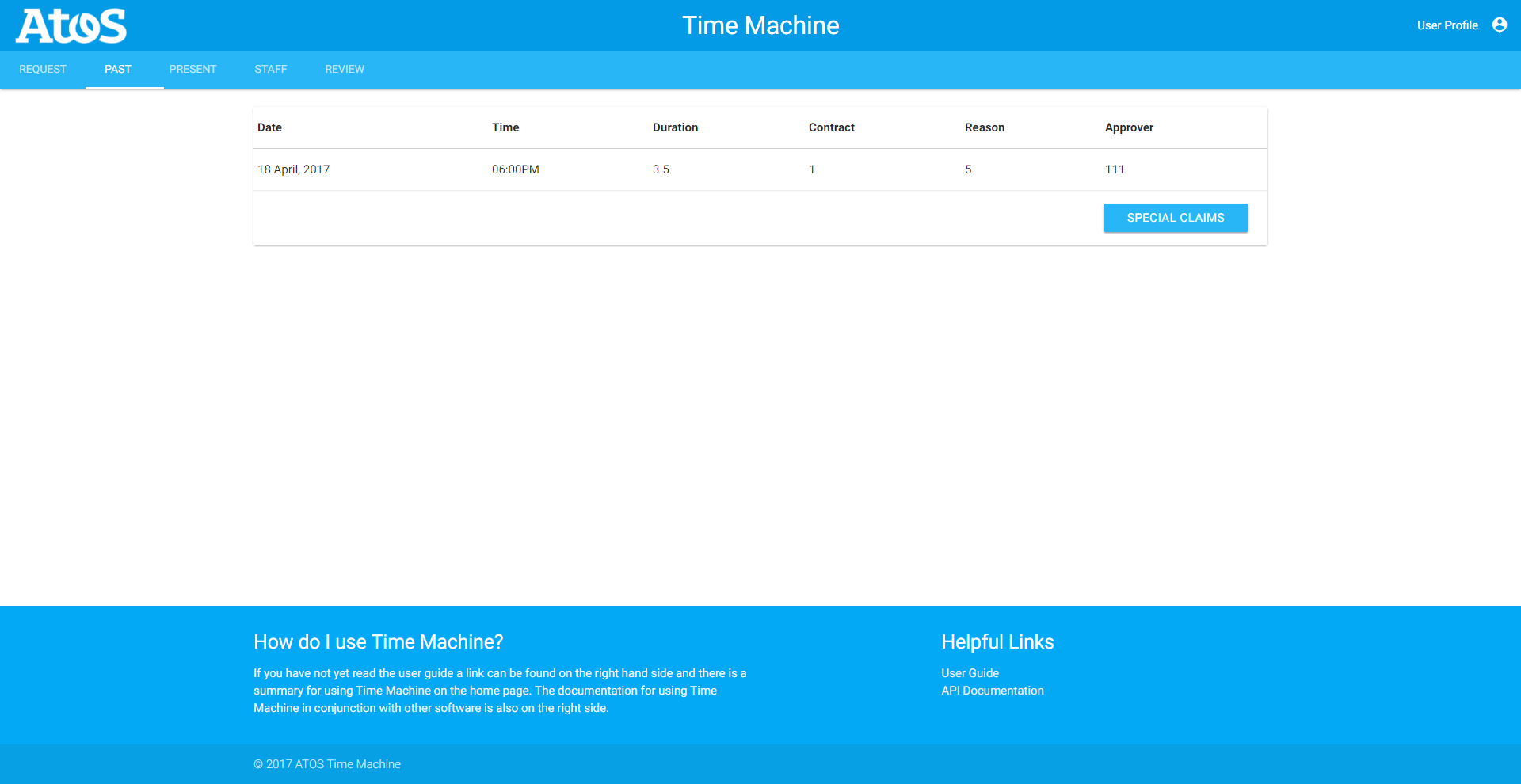
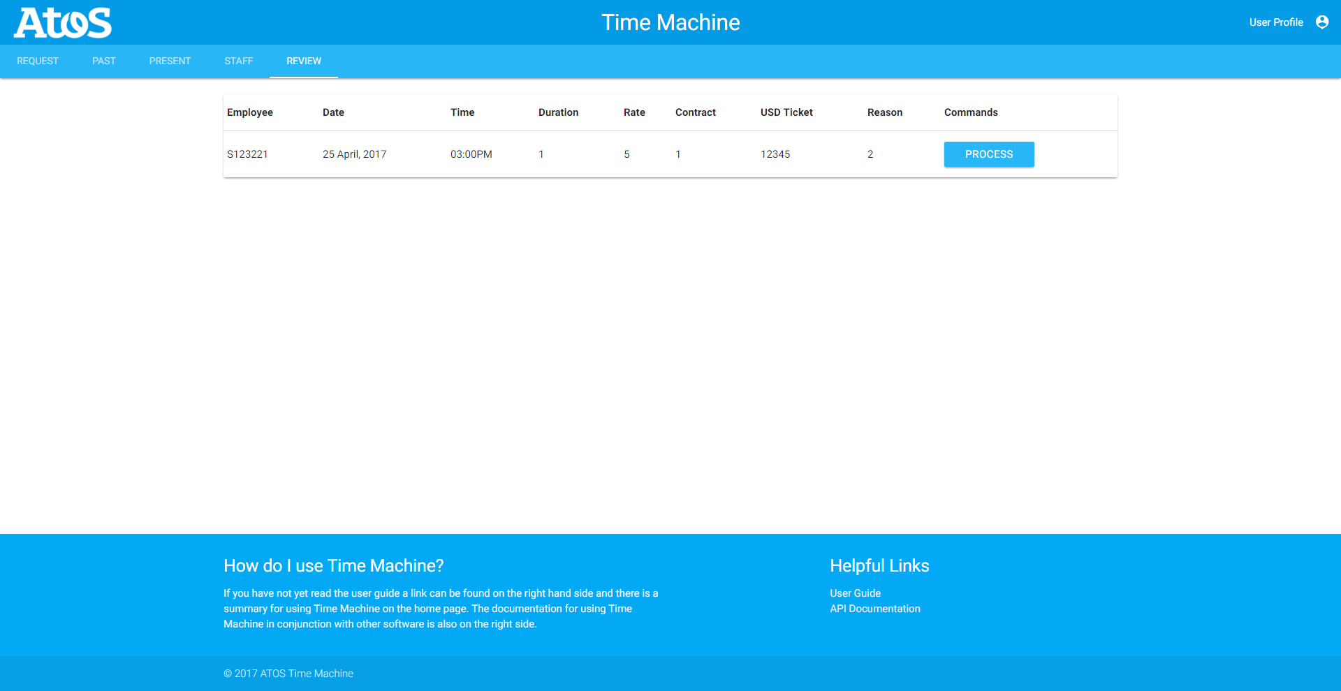
We ensured that we considered visibility when designing our user interface prototype, by ensuring that none of the functionalities
were hidden. All of the button, text inputs, and other inputs were made large enough such that everything can be found
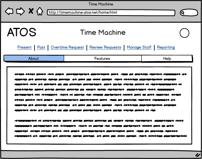
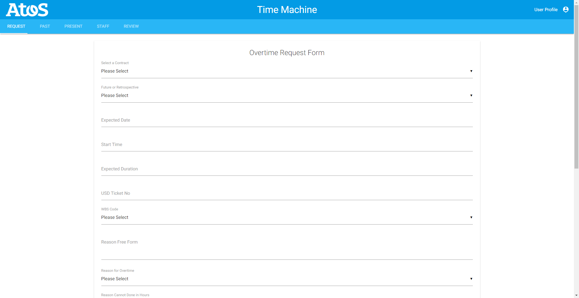
without it being obtrusive to the other elements on the page. We also made use of several tabs throughout the design
most notably the static tabs resident at the top of every page once logged which makes it really visible where the different
sections and functionalities are. We also made it so that’s possible to get every page from every page page with a minimal
amount of clicks ensuring users can not get to page they shouldn’t.
Affordance
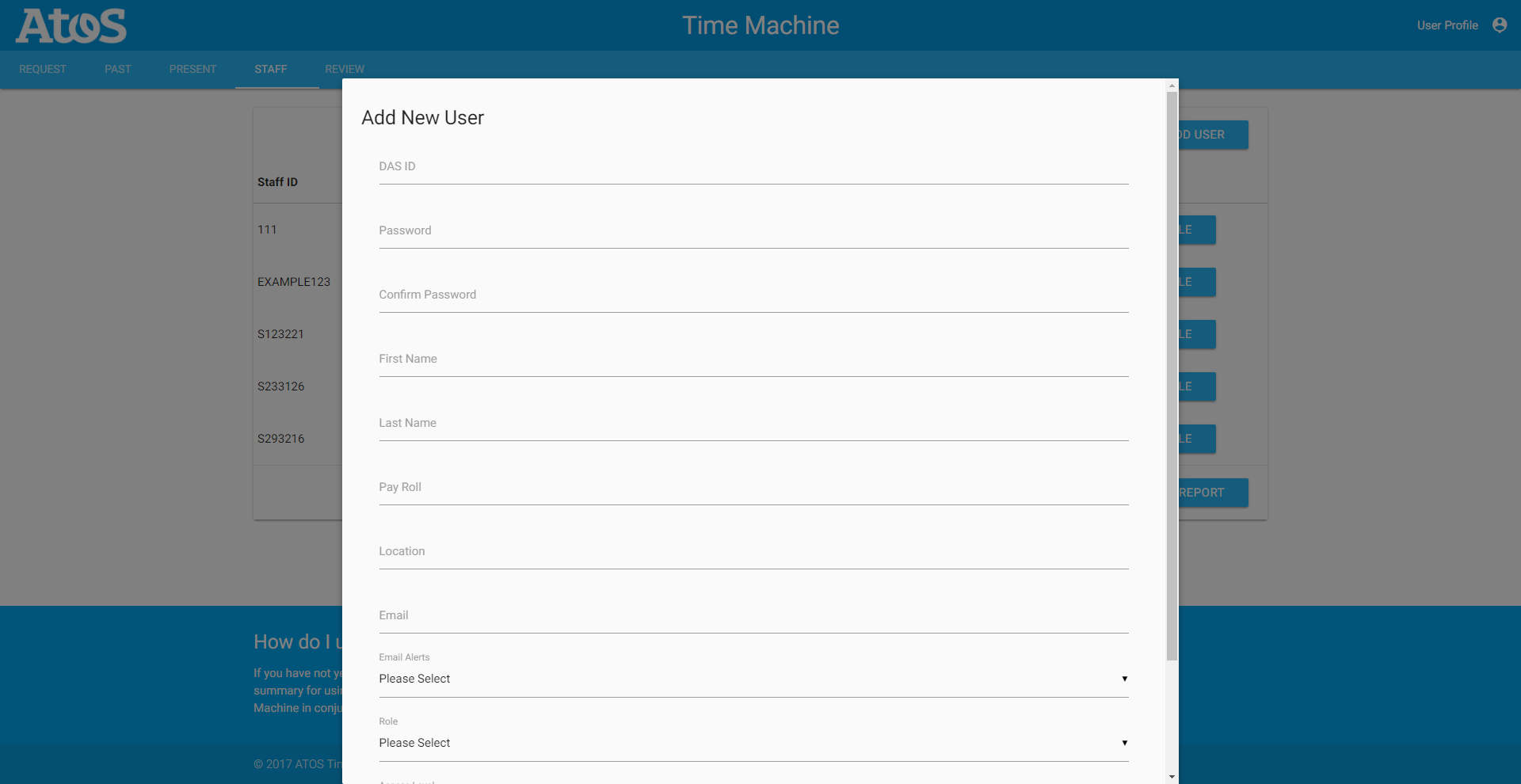
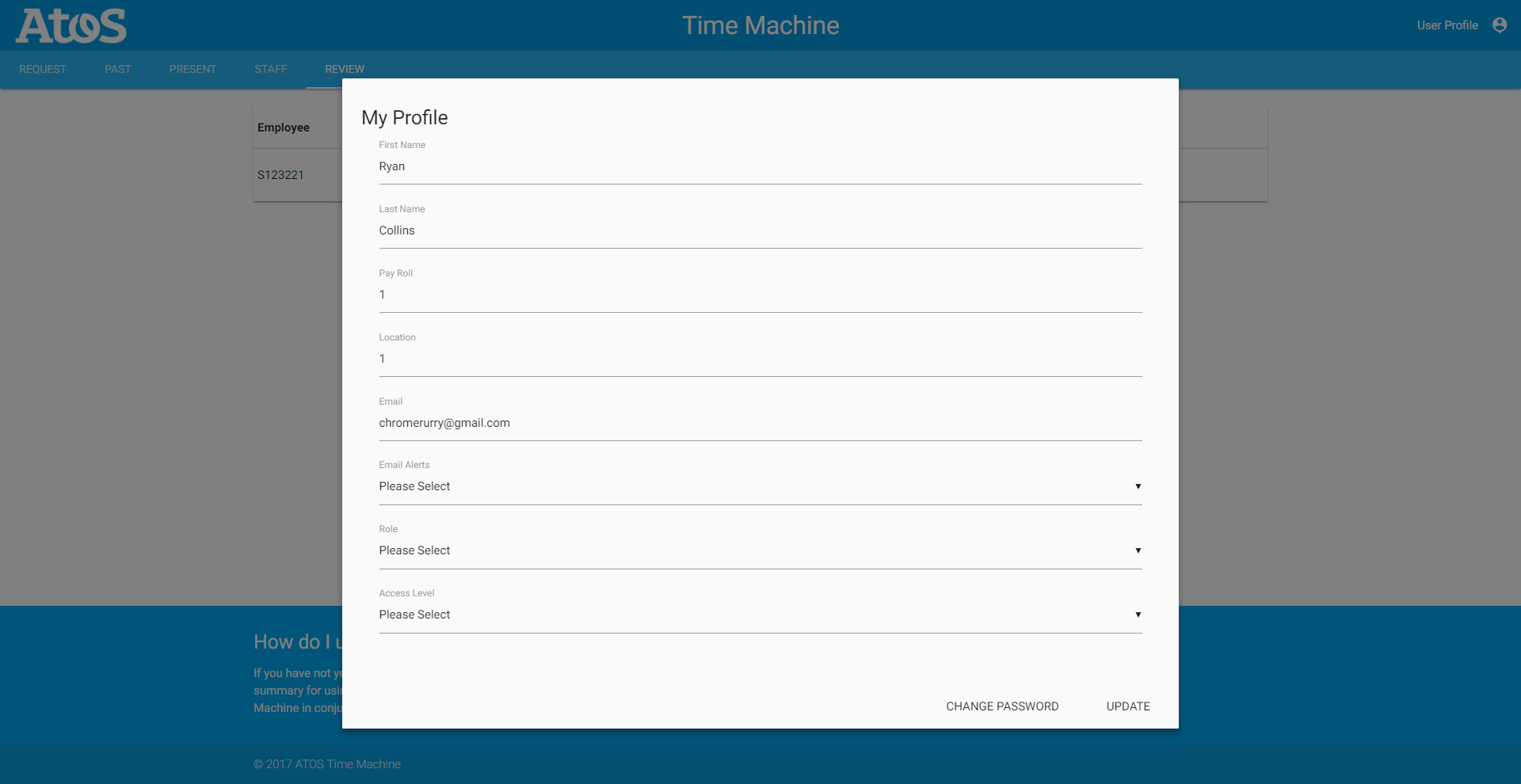
We ensured that we considered affordance when designing our user interface prototype, by ensuring that all elements on the
web application avoided being ambiguous, such as making sure the buttons actually looked like something which could be
pressed down. We also made it so every input on the page clearly states what it is in order to make it intuitive about
what to put into those inputs, or when to use them. We also went with a minimalist approach to the design which means
we only have what we need on the page as to obfuscate details on the page making it somewhat more difficult to use and
navigate.
Feedback
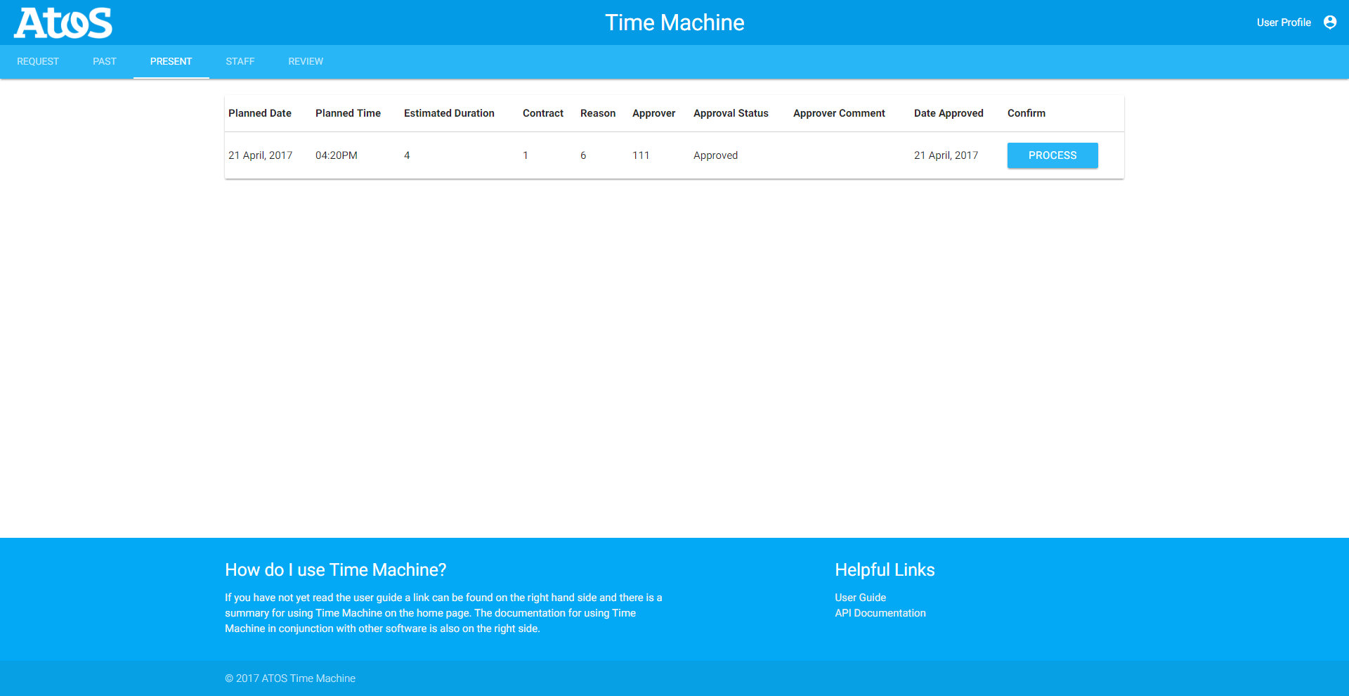
We ensured that we considered feedback when designing our user interface prototype, by ensuring that the user always knows
the intended result of the input element that the are accessing and that after an action on the system has being completed
it is clearly communicated to the user that what they wanted to do has or hasn’t been a success. In order to achieve
this every button, text field, and other inputs will have tooltips which activate upon hovering over these elements informing
the user of what the intended use of it is. We also plan to have dialog boxes on all non-reversible inputs like submitting
an overtime request to give to user a chance to back out if they made a mistake.
Consistency
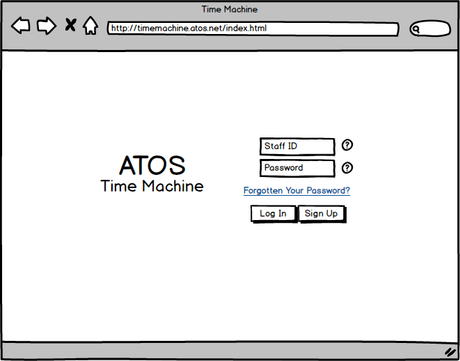
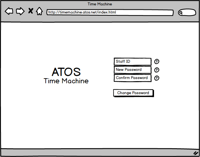
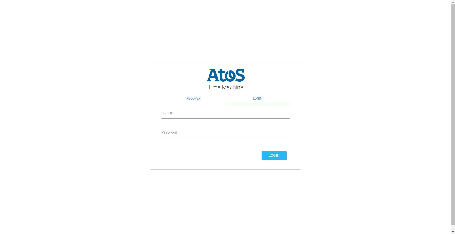
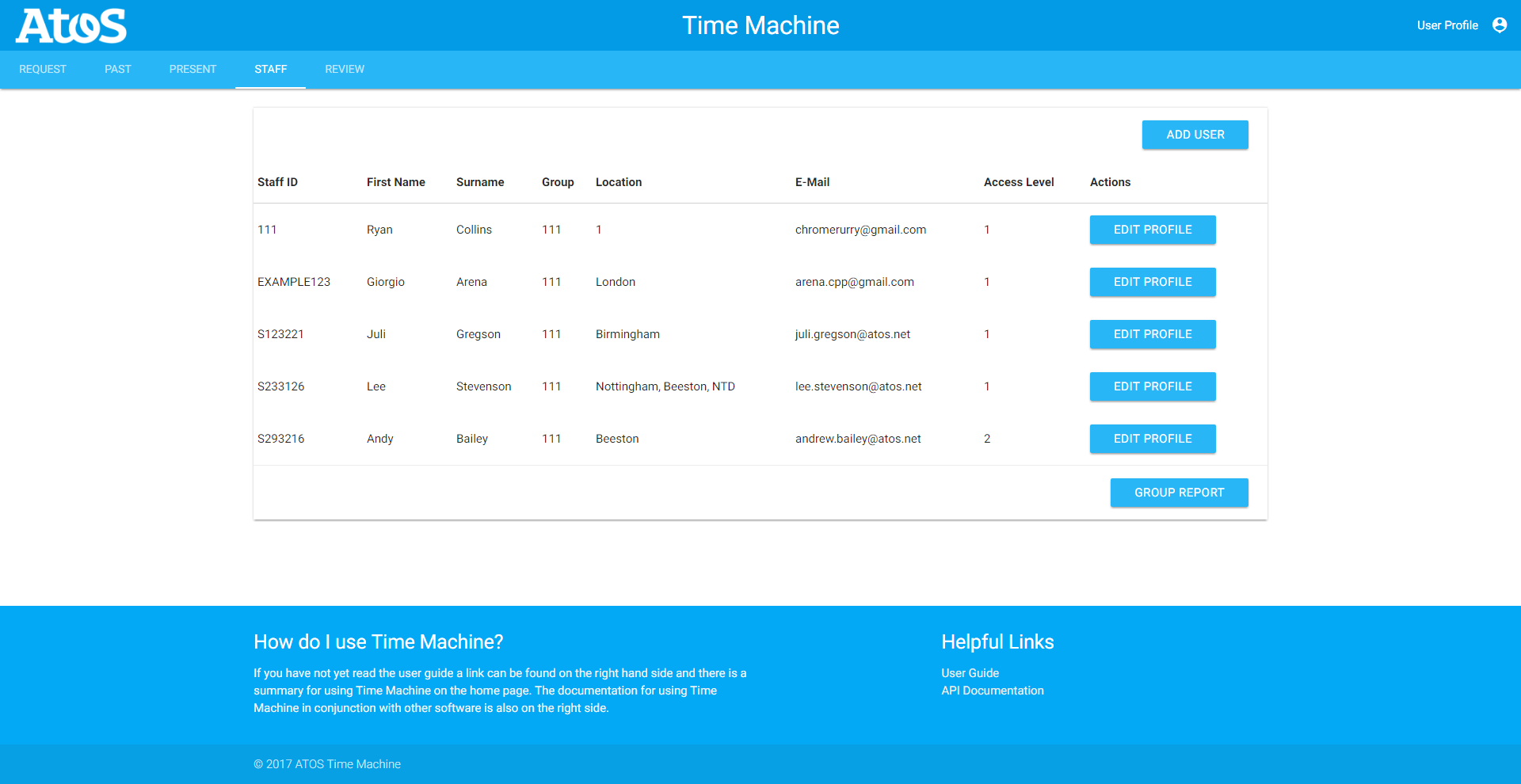
We ensured that we considered consistency when designing our user interface prototype, by ensuring that there is a consistent
theme across all of the web pages in our web application. This can be seen from the ATOS logo (which functions as a home
button) and common set of static tabs found out the top of every page except the login page. The way in which forms are
presented has also been made consistent across all relevant screens to allow users the opportunity to get used to the
style eventually increasing the rate of which they can used these forms. We have even made the login page consistent
with the recover password page in the sense that the ATOS logo remains in the same location in both screens and the input
elements remain in the same “column” on both pages.
Constraints
We ensured that we considered constraints when designing our user interface prototype, by ensuring that is impossible for
our users to navigate to a page they should not be able to access so the only error they get is when they have a client
side issue like a lack of internet connection. We are also planning to have varying permission levels of the site depending
on the role associated with the user’s profile, that limits which of the systems functionalities can be accessed. We
will implement this by removing the associated screens with these functionalities from the static tabs situated at the
top of the page and redirecting them to the home page if they manually try to access it.