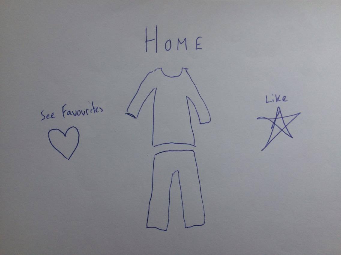
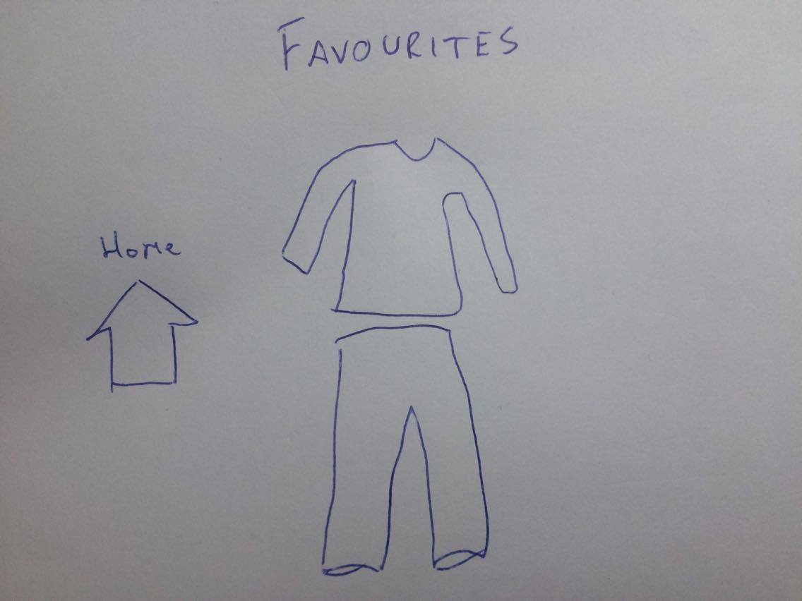
Sketches


Mock-ups


HCI Principles

Prior Considerations

Before developing the User Interface (UI) to achieve good User Experience (UX) we had to understand the Don Norman’s design principles and how they would be applied to our system [1].

This is what the design principles mean in terms of our application:

  • Visibility - all the system functionality (browsing through items, liking outfits, viewing outfits) is clearly displayed to the user for them to be able to action these commands.
  • Feedback - the feedback in our system is given by changing what the user sees in reply to a voice command or hand gestures.
  • Affordance - to make it easy for the user to know how to interact with objects, we will make animated buttons so that that it encourages interaction.
  • Mapping - to make sure controls have an intuitive relationship to the real world, the controls (such as tapping and voice commands) will represent what the user would expect in real life. For example, a tap on an object will show you the next object.
  • Consistency - all our hand gestures, voice commands, menus and interfaces will remain consistent throughout the application for ease of understanding.
  • Constraints - we will restrict certain commands depending on the current scene (Home or Favourites). An example of this is not allowing to swap only the bottom item of a liked outfit in favourites because the outfit comes as a whole.

If we design the user interface considering the above pointers, it should result in good usability and user friendliness.


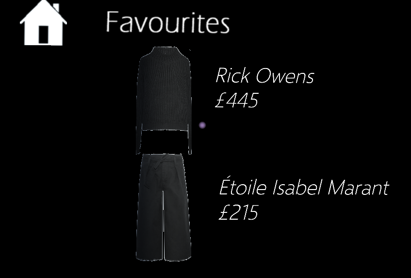
Screenshots of Final Delivery

Given that our project is best viewed in the Microsoft HoloLens, these screenshots are only referential. They were captured using the HoloLens Emulator on a computer, so the graphics card and several other aspects make the quality of the actual app different.
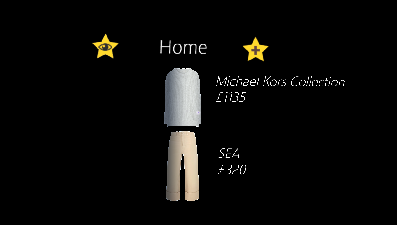
Home

Favourites


References

[1] Preece, J., Rogers, Y., Sharp, H. (2002), Interaction Design: Beyond Human-Computer Interaction, New York: Wiley, p.21