Unit and Integration Testing

Unit Testing

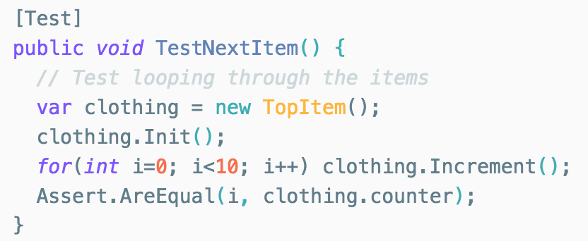
Along with the usual manual testing methods such as user acceptance testing, we ventured into a set of tools implemented by Unity to help us with test automation. This was done by writing ‘Editor C# Scripts’ in Unity, which allow separate Unity objects to be tested individually using our own test scripts. Unity test tools utilises nUnit as the basis for their unit testing framework, which is a well known and easy to use framework already. We ensured to enable automatic unit test code execution on every recompile so we had immediate feedback whilst writing code. Some example Unit tests we wrote:

  • TestNextItem()/TestPrevItem() - tests if looping through the list of individual clothing items works as expected.
  • TestAddToFavourites() - makes sure that invoking "addToFavourites" adds the correct clothing items to the lists of favourites.
  • TestJSONParse() - checks if the cleanup of the API response is valid.
  • TestNextOutfit()/TestPrevOutfit() - asserts that iterating over outfits increments/decrements all the outfit elements, instead of just one.
  • TestNavigation() - ensures that the correct UI element properties are being set when invoking navigation methods.
Integration Testing

In order for us to test the integration of the individual Unity objects and assets we required a higher level of tests, which ideally is what the Unity Integration Test Framework is for. Integration tests are also considered one of the easier methods of starting to write automated tests, since they don’t have requirements on the architecture of the code, making them a good starting point for us. We utilised the Unity/C# 'Assert' method which is able to monitor the state of whole objects at runtime (or playmode as Unity calls it) and pause the execution if a certain condition on the object is met. This uncovered more bugs compared to our Unit tests which simply ran individual test functions on single components of objects. It proved to be very useful for debugging, where we could pause the entire simulation if a certain condition was met, to ensure our application was behaving as expected, and handling exceptions as required.


User Acceptance Testing

We decided that the best method for user acceptance testing is to use the black-box method. This method allows potential users to test the app without any prior knowledge about its functionality. After which, we got the users to test the following broad use-cases:

  1. Navigate through the tops/bottoms using hand gestures
  2. Use a voice command to go to a previous top/bottom
  3. Add multiple outfits to your favourites
  4. View your favourites
  5. Navigate through the favourites using voice commands
  6. Return to the home screen

As our team do not own the Microsoft HoloLens, this type of testing had to be done in the labs with volunteering students who did not have any knowledge about our project. We chose 15 students from a variety of disciplines, informed them about the basic premise of our app and let them experience it for themselves for a couple of minutes to see if they were able to understand what it was and what it did. After this, we asked them to perform our set use cases above, where we graded our app depending on how much guidance they needed to complete the use cases. Upon finishing the use cases, we gained some qualitative feedback regarding ease-of-use, and what changes they would make to better the experience.


User Feedback

Use Case

Successes without further guidance*

Comments

1 8 Users understood gaze and tap well, but found it rather unnatural
2 12 Most users found that saying “previous” whilst gazing at an item made it navigate back one, however some mentioned that “back” would have been a more suitable command.
3 14 Some users found it confusing that the “add to favourites” button didn’t respond to being tapped.
4 10 Certain users found there wasn’t enough distinguishing the “add to favourites” and the “view favourites” buttons, causing confusion.
5 15 After having used a voice command, users generally found them to be more predictable than the hand gestures alone.
6 15 Every user either tapped on the home button or was able to guess the “go home” voice command when prompted.

Improvements from feedback

After receiving feedback from our users, we collated an ordered list of potential features to implement and were able to make substantial improvements to our application as a result. These include:

  • Adding animation and sound effects to UI buttons upon selection to simulate responsive feedback.
  • Changing the 'view favourites' button to a more clear and accurate representation so as to minimise confusion.
  • Implementing additional voice commands for similar actions such as "add to favourites", "add this to my favourites", "favourite this" etc.
  • Adding labels for the price and brand name of clothing items, obtained from our client's API.