Final Delivery
Below you can see a number of screenshots showing the dashboard that is used for displaying information about the sensor data. In the first picture, two graphs of temperature and light are seen, each one having a different colour (selected by the user) to improve the overall user experience. In the second picture an overview of a specific surgery can be seen, with all the required information (Doctor, Patient, Room, Rating etc) where the user can understand how the procedure went in general.
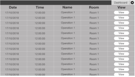
In the third pictuure, the user has to enter all the information required to start an event and in the fourth picture a list of the archived data can be seen with the option to download each one in an xml form.

Number of graphs displaying sensor data

Overview, showing key details of the surgery
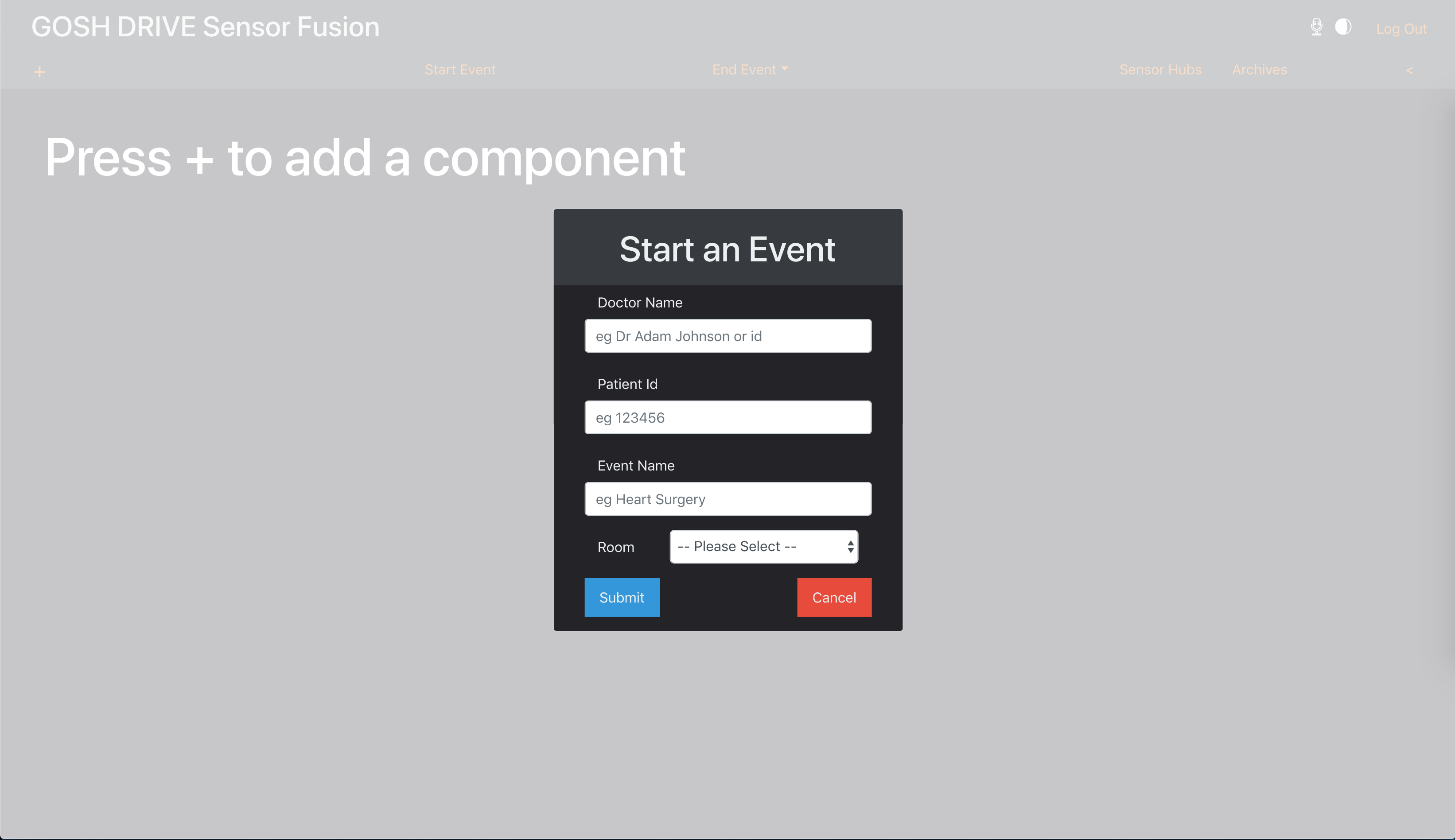
Start an event for a specific patient

List of past operations