To ensure that not a lot of time is taken up for the sole purpose of self-evaluations, this platform is designed to be as simple as possible to avoid unnecessary time consumption since most NHS staff are busy with their care services.
Humans make mistakes. Realising this, we have designed our system to warn users if they have done something wrong. For instance, if a self-evaluation is not completed when submitted, an alert dialog will be issued to ensure that the form is completed.
This feedback system helps the users to navigate the platform much easier.
Since our users are of various different age groups, we designed the system with obvious and large icons whenever actions are needed. Our website font-size is also set to ensure ease in visibility for all. Standards icons are also used throughout the
website to ensure that users are aware of how to execute simple actions like closing the programme by having an (X) button.
To help users familiarise with the system, we implemented similar horizontal navigation bar throughout all the pages despite after changing webpages. In doing so, it is easier for users to navigate from one page to another. For logging in and logging
out, the button can be found at the top-right of the page, which is a usual orientation for most pages and this can help user navigate through the platform more easily.
SKETCHES
Before being able to proceed further with the project, we must first draft a few sketches on how we plan to design the system. This stage is crucial as it provides a stepping stone for more development milestones in the future stages. Some of our initial
sketches can be seen below.
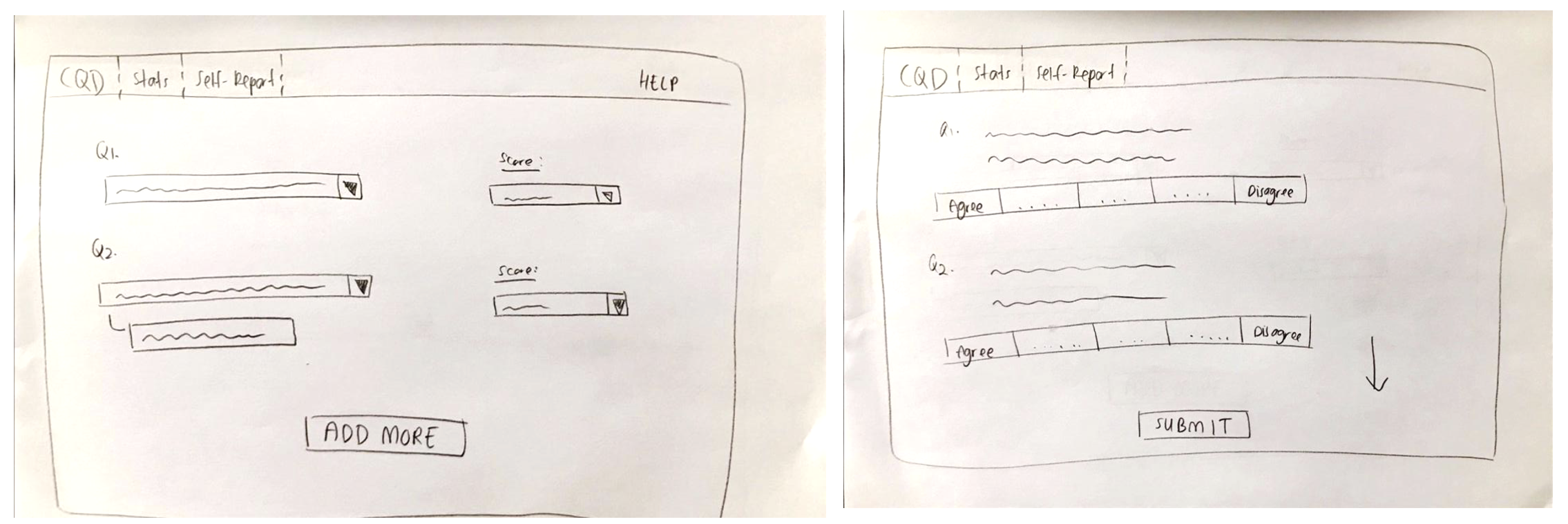
SKETCH 1
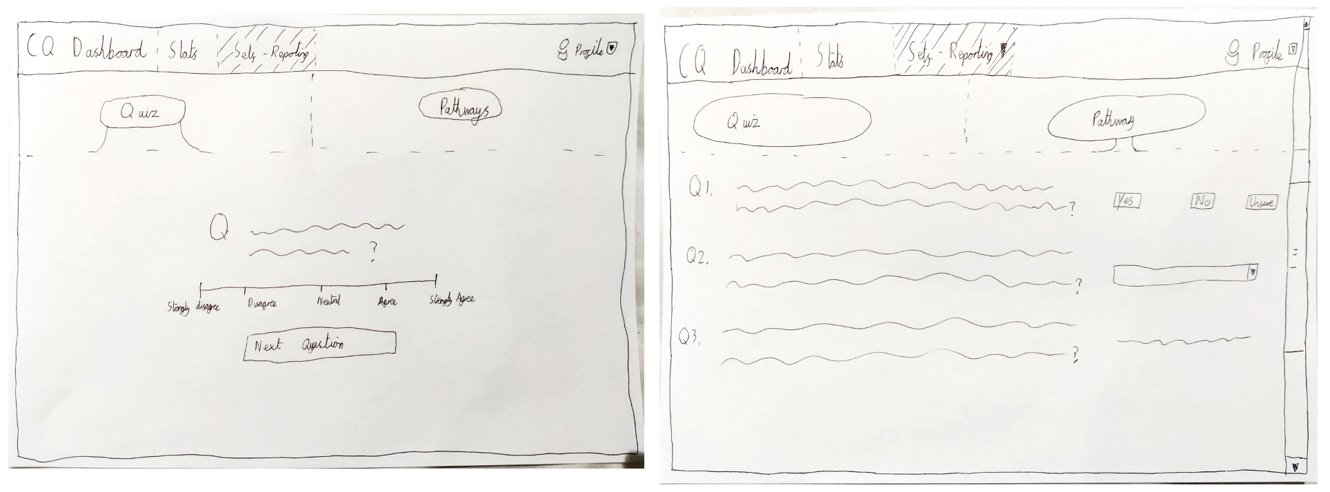
An initial sketch on how our self-evaluation page might look like. We decided to implement the Likert Scale in order to grade the clinicians' compliance to the NHS Wales' standards.
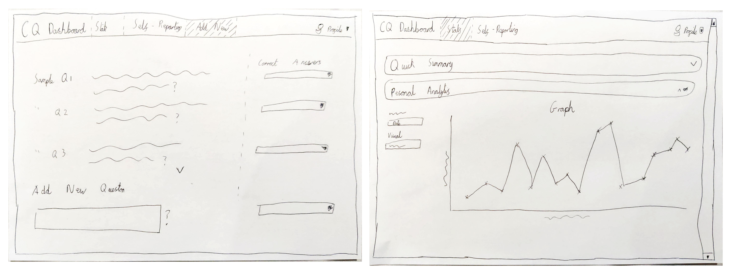
The two sketches to the left showcase how we envision the creation of multiple dashboards, which can be created by Heads-of-Departments. Graphs are then used to display the progress of the clinicians.
SKETCH 2
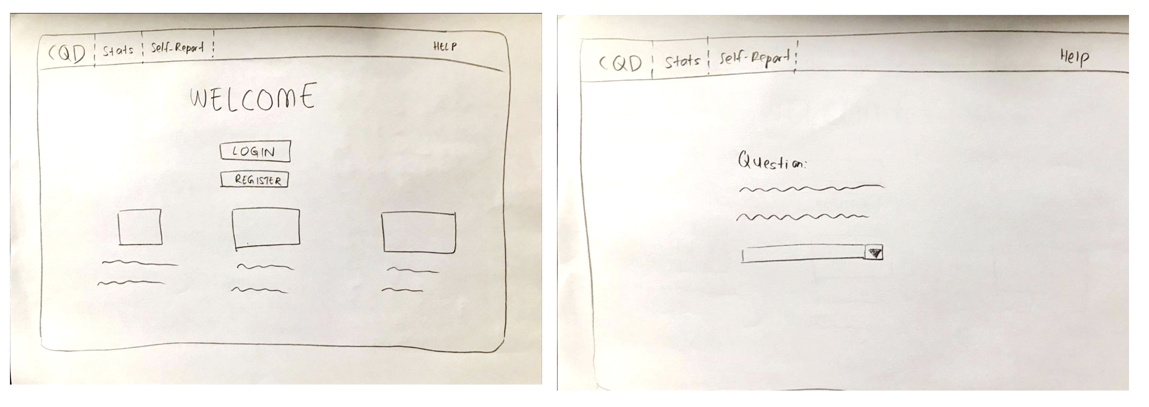
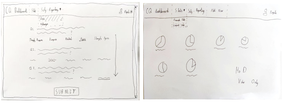
These second sketches show the more complicated sketches of the system. A design of the login page has been added along with more intuitive displays of the self-evaluation questions. Dropdown menus are also planned to be used for providing responses to the given questions according to the Likert scale.
LOW-FIDELITY PROTOTYPE
Prototypes are essential in giving us a chance to test the design of our project before proceeding with its development. It provides interactivity to our sketches which helps in detecting any possible design issues to be instantly fixed. Our low-fidelity
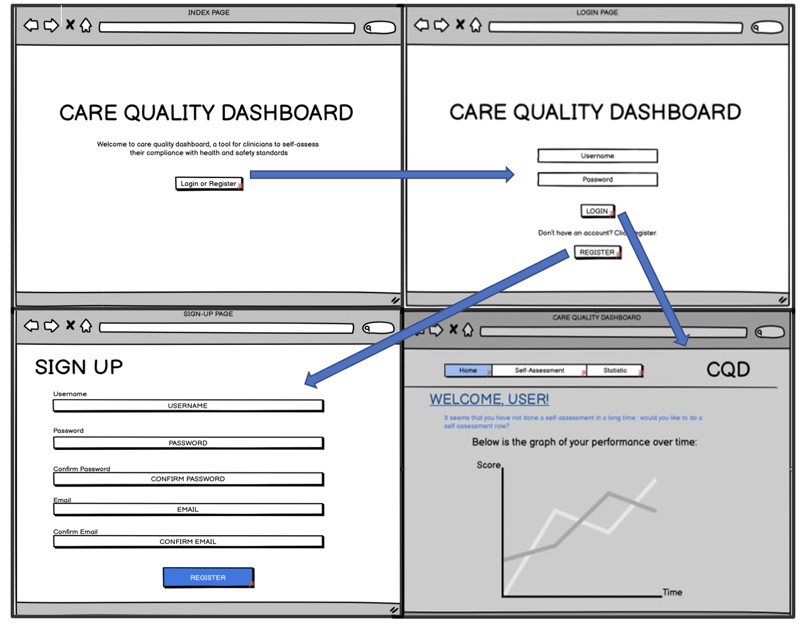
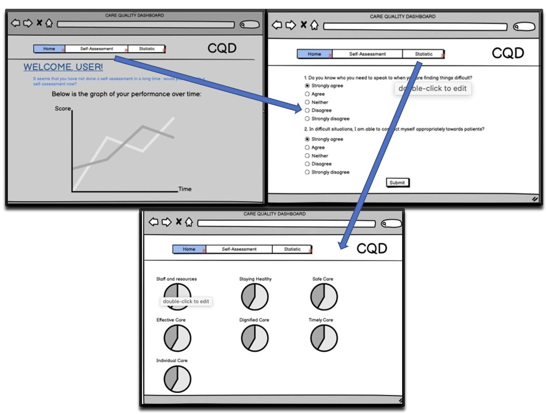
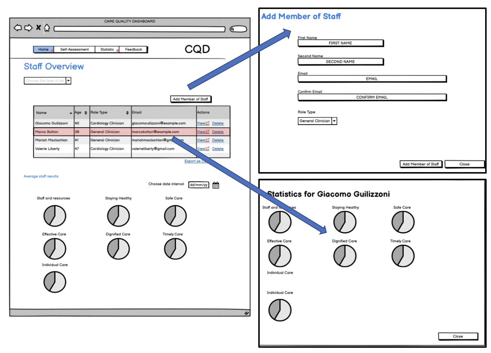
prototypes have been created using Balsamiq and they are attached below. Arrows are included in the diagrams to indicate the flow of the pages for each of the following actions.
Process 1: Logging into the System
Process 2: Self-Evaluation Process
Process 3: Head-of-Departments' Navigation
HIGH-FIDELITY PROTOTYPE
High-fidelity (hi-fi) prototypes are prototypes which most closely resemble the final project in terms of design and functionalities. Our hi-fi prototype has been created using Figma to help with visualisation, click on the button below for an immersive
experience of using our proposed interface.
DESIGN EVALUATION
After studying the sketches and prototypes that we have created prior, we proceeded with the evaluation process of the sketches. This allows us to decide whether the features we decided to implement earlier are still relevent. Our design evaluation can
be seen below.
| No. | PROBLEM | POSSIBLE SOLUTION | SEVERITY |
|---|---|---|---|
| 1 | Viewing multiple lines on one graph plot may cause some lines to over-lap, resulting in an uncomprehendable graph | Allow users to choose which aspect of compliance to be represented by means of the graph using checkboxes | 3 |
| 2 | Longer loading time for graph after multiple evaluations | Allow user to choose time range of statistics to be displayed | 3 |
| 3 | Pie charts do not include percentages when displayed | Add percentages to pie charts so that results can be analysed better | 2 |
| 4 | Date of the self-evaluation is not recorded | Allow users to add date of self-assessment | 2 |
| 5 | Hard to keep track of unanswered questions | Add a progress bar in the form to check if the form has been completed fully | 1 |