Human Computer Interaction(HCI)
Design Principles
Simplicity
User interfaces should be simple and elegant. Classics never go out of style. Such a user interface will allow users to perform the task in the simplest possible way without any unnecessary extra details. A simple user interface is when you cannot remove any feature from your user interface because all of them are necessary. HeartBOT has a simple user interface design, with a chat window, text bar and send and help buttons all of which are crucial to its working.
Consistency
Consistency creates familiarity which increase usability. Familiarity makes the interface easy to use and predictable as the users have experience in using something similar. HeartBOT uses a basic web chat interface like other chatbots. All the icons and buttons are rounded for consistency.
Visual Structure
A consistent visual structure creates familiarity and makes it easy for the user to use the interface. HeartBOT follows a red colour scheme, has rounded icons and consistent navigation which make its visual structure consistent.
Include user feedback in design
Testing and validating UI (user interface) choices through user feedback ensures an effective UI. For HeartBOT we collected user feedback on our sketches and prototypes and improved them accordingly and at the end we did user acceptance testing and added a help button because of user feedback.
Reduce Cognitive Load
One of the factors UI designs should focus on is to reduce cognitive load for users which means not letting the users think and making the interface easy to use. For HeartBOT it only takes one click on the send button to find the information and since HeartBOT uses a common chat interface most users understand and recognise how to use it. Therefore, minimising the steps and having a familiar interface reduce cognitive load for users.
References
[1] https://uxdworld.com/2019/09/09/simplicity-in-design/
[2] https://www.uxpin.com/studio/blog/ui-design-principles/
Sketches
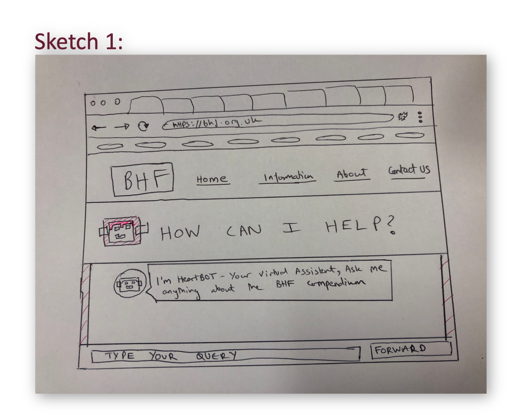
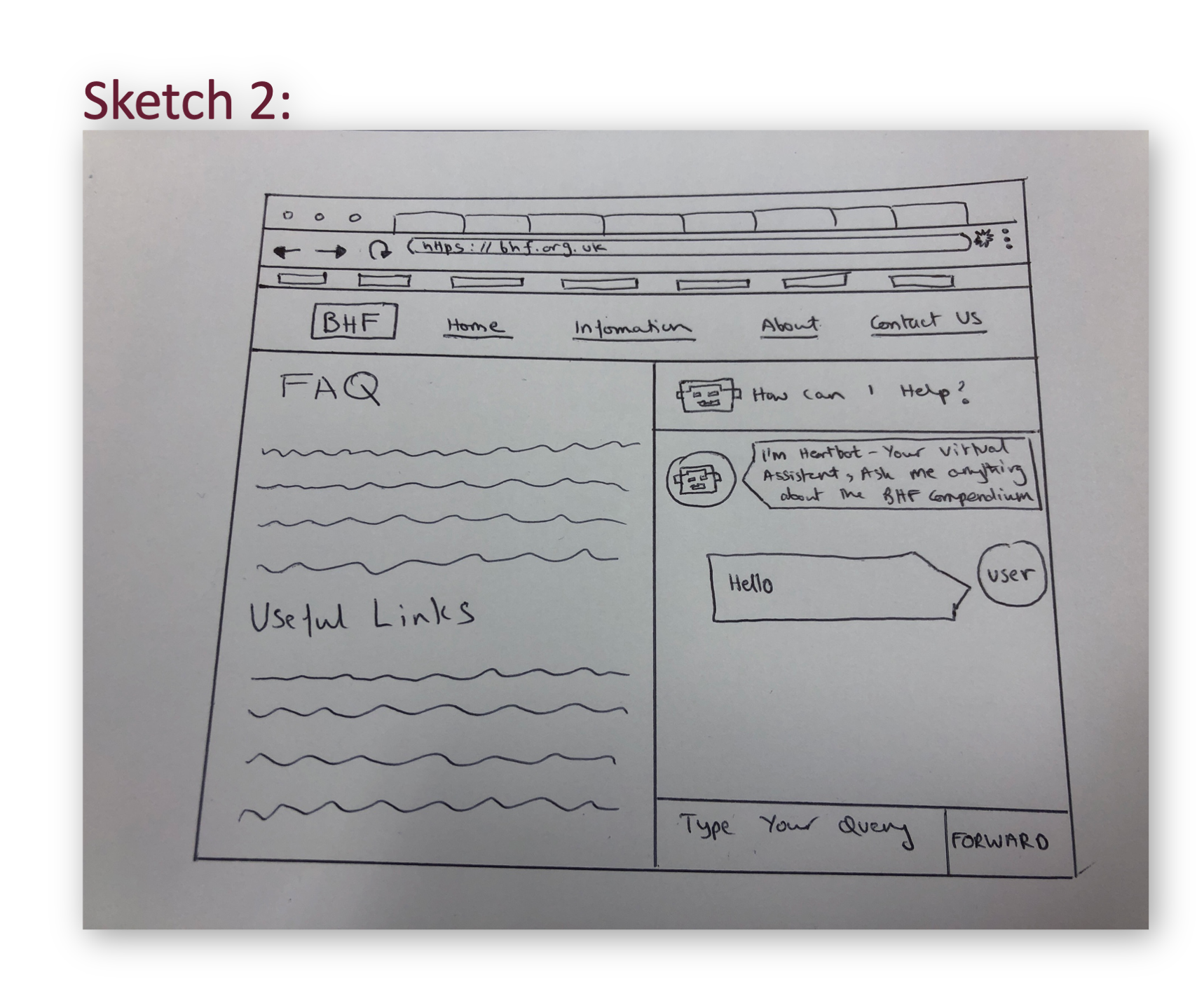
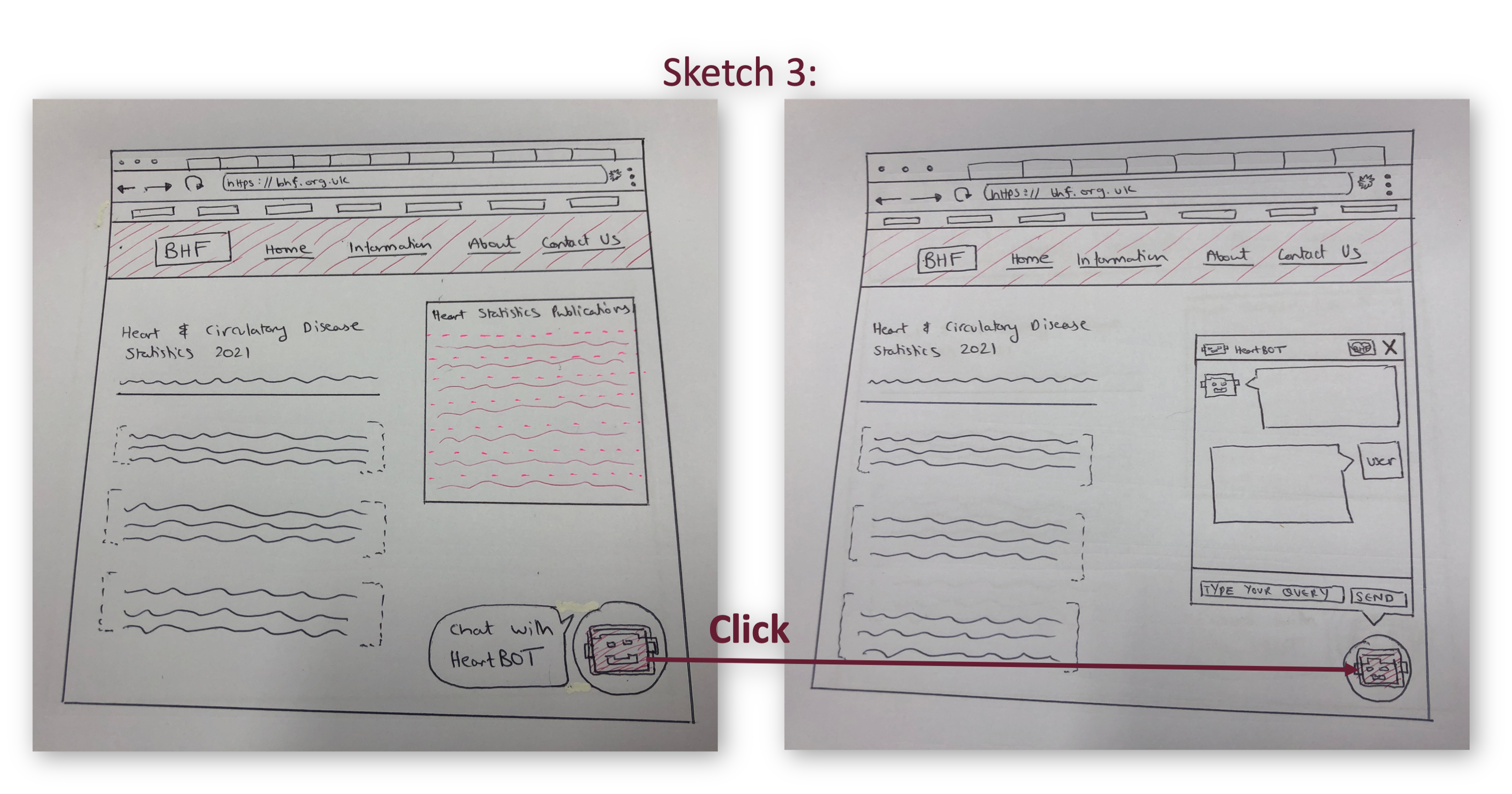
After gathering and deciding our requirements, making personas and scenarios, we created 3 sketches that show possible designs of the chatbot. We then consulted our users and reviewed each design choice with them to get their opinions and feedback. Users preferred this third sketch because: The pop up chatbot takes up less space and is easily integrated into the current website. People are more used to pop up style chatbots as they give a messenger sort of feel, so it is easier to use for them. They also found it more fun to interact with the buttons, and the chat bot can easily be closed if it is not needed.
Prototype
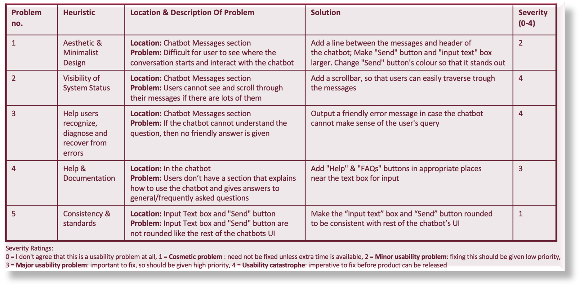
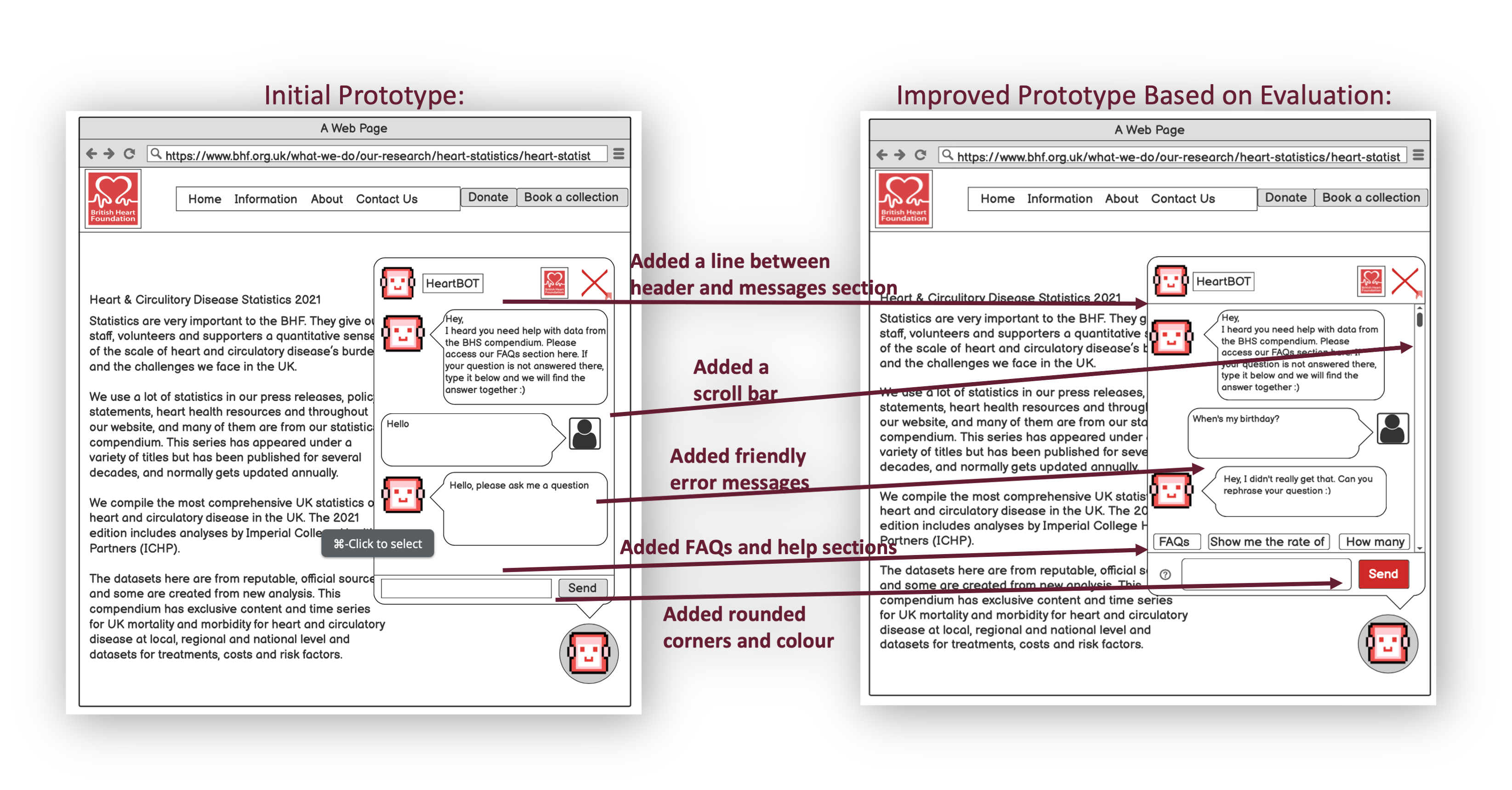
Using the sketches and feedback from our users, we have developed our first interactive wireframe. It shows how a user could interact with the chatbot and what they would see. We iterated through the development life cycle by revisiting our design and improving our initial prototype based on the evaluation. Due to our limited time, we chose to perform a heuristic evaluation since it could be quickly completed: