UI Design
Design Principles
In developing our community engagement platform, we are committed to adhering to key design principles that prioritize user experience and sustainability. These principles will guide our decisions throughout the design and development process, ensuring that the platform is intuitive, engaging, and impactful.
Community-Centric Focus
Our primary design principle is to place the community at the heart of every decision. We aim to create an interface that feels welcoming and inclusive, fostering a sense of belonging. This involves understanding the diverse needs of our users, from residents reporting local issues to businesses engaging with the community. We will conduct ongoing user research and gather feedback to ensure that the platform meets the evolving needs of its users. For instance we will prioritise features that facilitate direct communication between community members, such as discussion forums, to build a stronger sense of community.
Intelligent Interaction and Personalization
Leveraging the power of GenAI, we will design interactions that are not only efficient but also intelligent and personalized. The platform will proactively provide relevant information and recommendations, streamlining user workflows and enhancing engagement. This principle extends to content delivery, ensuring that users receive information that is tailored to their interests and preferences, thereby maximizing the platform's utility and appeal.
Feedback
We will implement diverse feedback mechanisms to ensure users are informed of system responses. This includes textual messages, visual alerts, progress indicators, and dynamic visual cues like animations and color changes to clearly communicate outcomes.
Sustainable Design and Efficiency
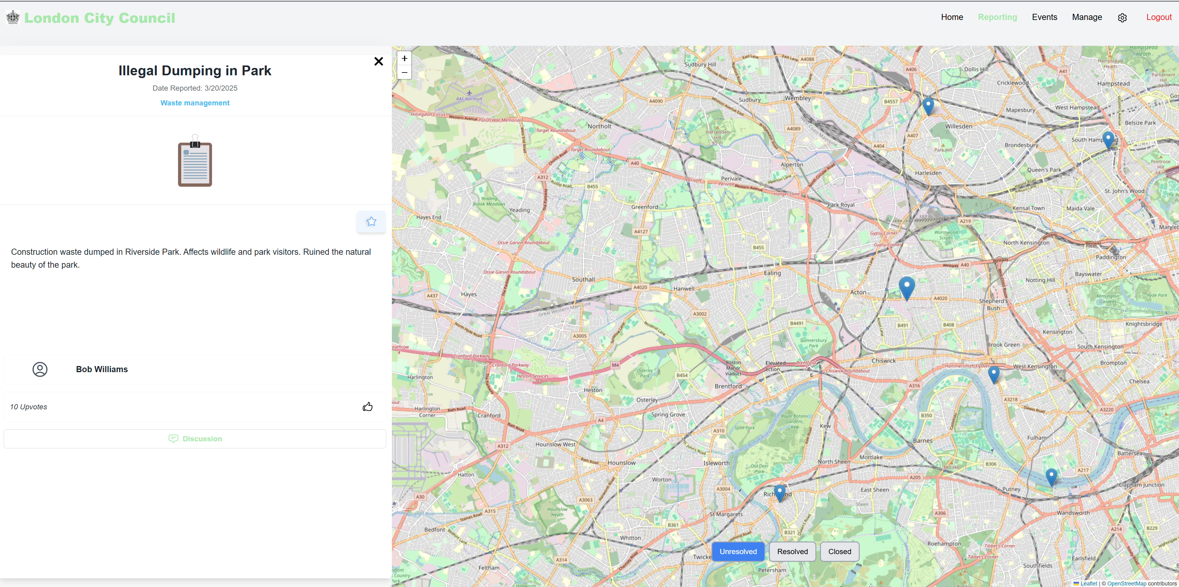
Reflecting our commitment to green software principles, we will prioritize energy efficiency and resource optimization in our design choices. This includes minimizing network traffic, and selecting energy-efficient technologies. We will also strive to create a user interface that promotes sustainable behaviours, such as encouraging the reporting of environmental issues through dedicated reporting categories and highlighting eco-friendly community initiatives through featured articles and events.
Clarity and Simplicity
We will strive for clarity and simplicity in our user interface, ensuring that all features and actions are easily understandable and accessible. This involves using clear and concise language, intuitive icons, and consistent design patterns. We will minimize cognitive load by organizing information logically into distinct sections, providing clear visual hierarchy, and ensuring that user actions are predictable and consistent across the platform. For example, a consistent navigation menu will be present on all pages, and key actions will be easily accessible through prominent buttons and clear labels.
Sketches
We started by sketching initial ideas based on user requirements, design principles, and our defined personas and scenarios. We then used an iterative approach, refining each sketch based on feedback and incorporating necessary improvements.
An example of an early stage sketch is shown below:
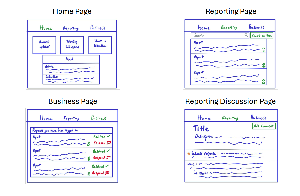
Building on the previous sketch, we developed a new iteration with a stronger focus on community engagement. Feedback suggested that the platform should go beyond just reporting issues, incorporating features like local events, discussions, and community updates.
In response, we refined the design to include a personalised feed and an interactive map for tracking reported issues and upcoming events, inspired by FixMyStreet [1]. These changes made navigation smoother and helped highlight relevant updates, creating a more engaging and user-friendly experience.
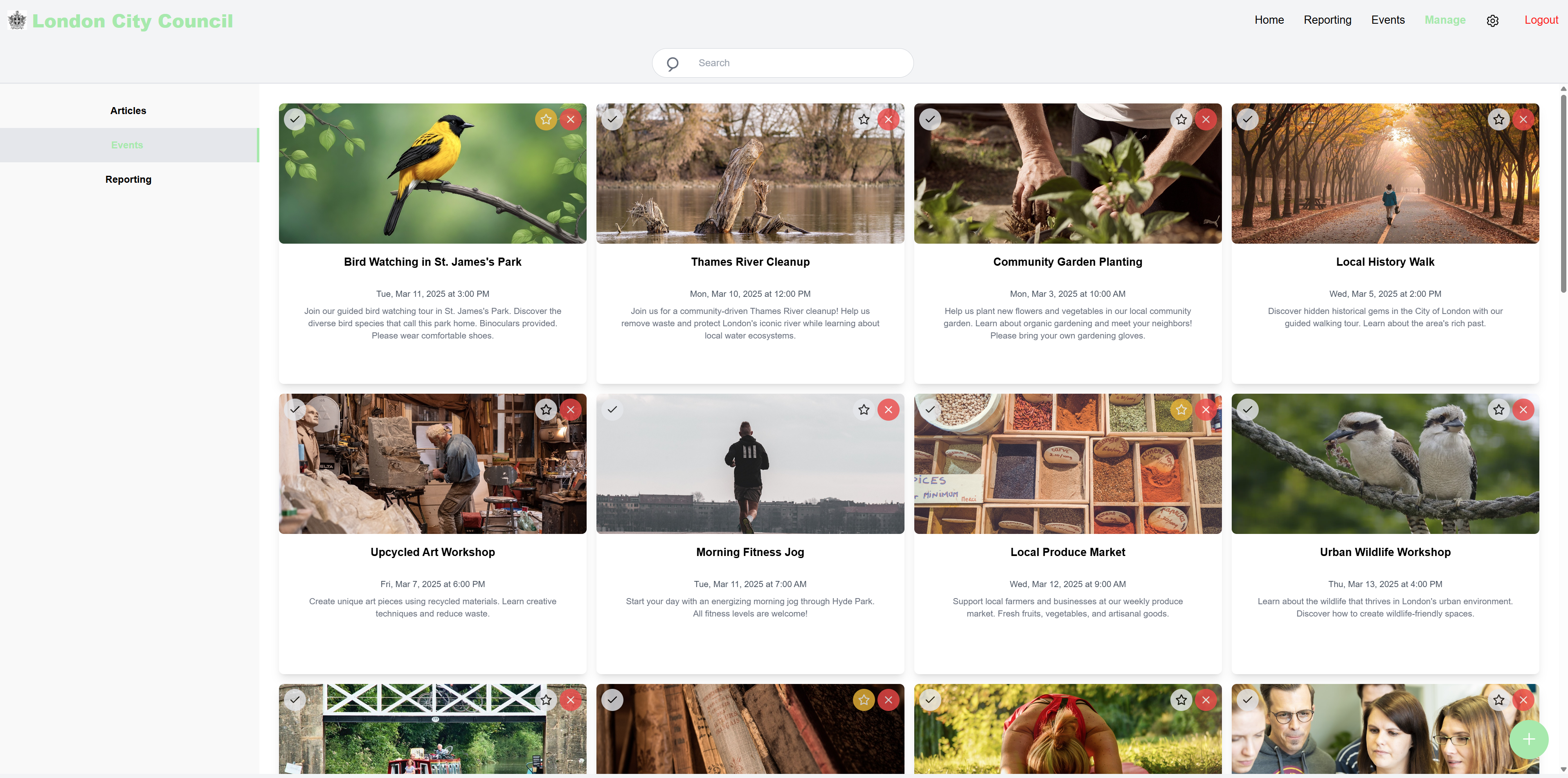
Prototype
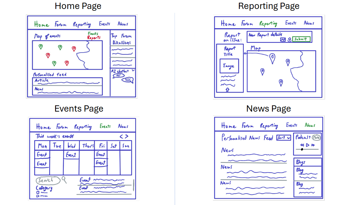
This first prototype was inspired by sketch 2 and was designed using Figma. The aim of this prototype was to further explore the usability of our product in the early designing stages.
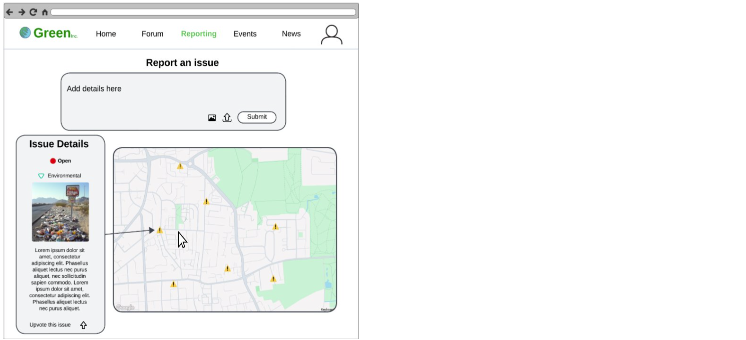
Our prototypes heavily utilise curvature and rounded fonts to increase perceived value [2]. The calendar on the Events page is inspired by the calendar on TickTick [3]. By designing a modular system using Agile UX, we can switch or adjust components to address technical or requirement challenges later [6].
Evaluation of prototype
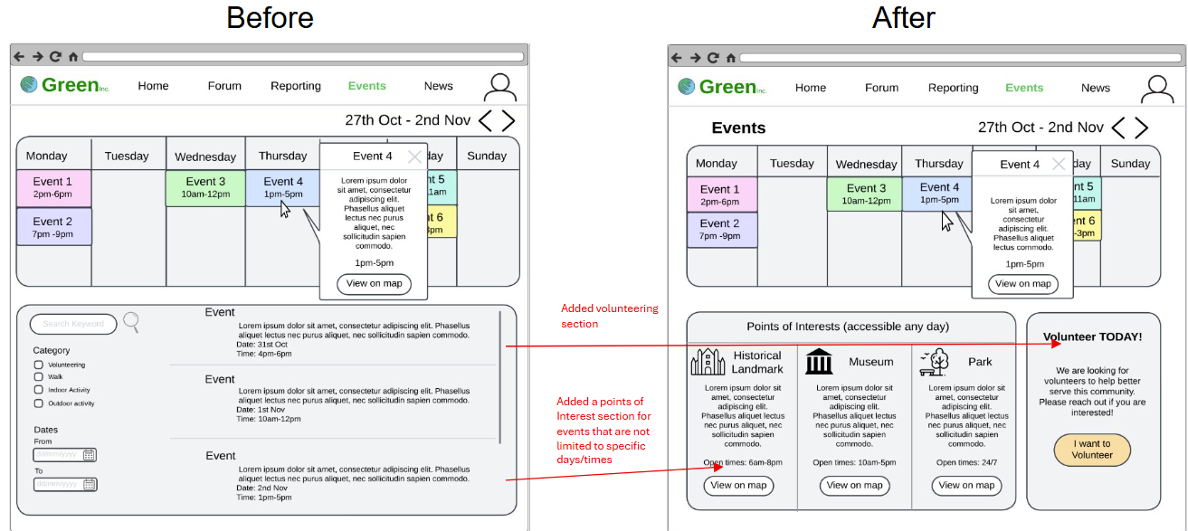
We decided to perform a user-guided heuristic evaluation, providing a concise and effective evaluation of our current prototype. The users identified the following issues, as shown in the table below:
| Heuristic | Problem | Solution | Severity |
|---|---|---|---|
| Aesthetics and minimalistic design | The Home page is too crowded with features. | Remove some sections on the Home page and simplify the design. | 1 |
| Visibility of system status | The AI feature on the Home page is small and does not stand out. | Reposition the AI section to make it more prominent. | 2 |
| Engagement and user motivation | The list of events on the Events page is not innovative or engaging. | Redesign the Events List section to make it more engaging. | 2 |
| Engagement and user motivation | The Forum page displays a list of forum posts, which is not visually engaging or innovative. | Redesign the Forum section to make it more interactive. | 1 |
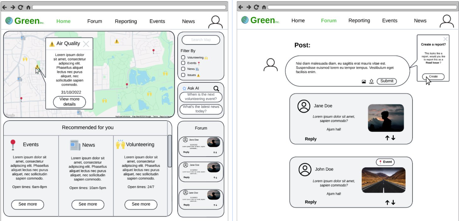
Improved Prototype
After evaluating our prototype, we decided to make modifications and improvements to it:
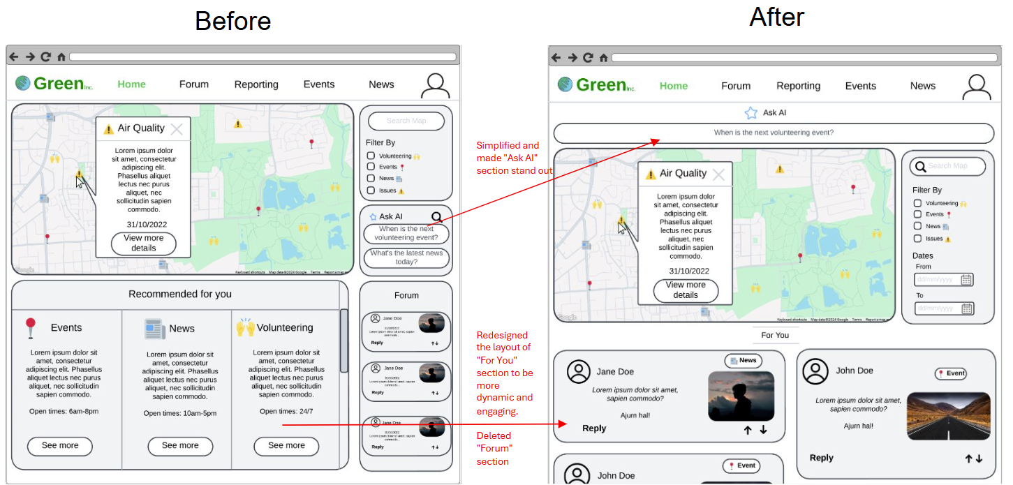
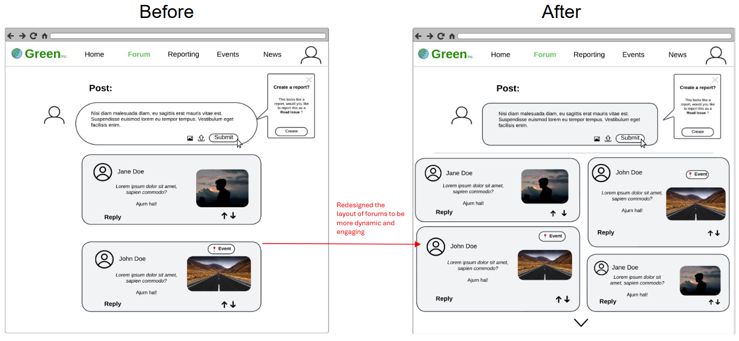
The design of the Forum page and "For You" section of the Home page were inspired by Pinterest [4] and Flipboard [5].
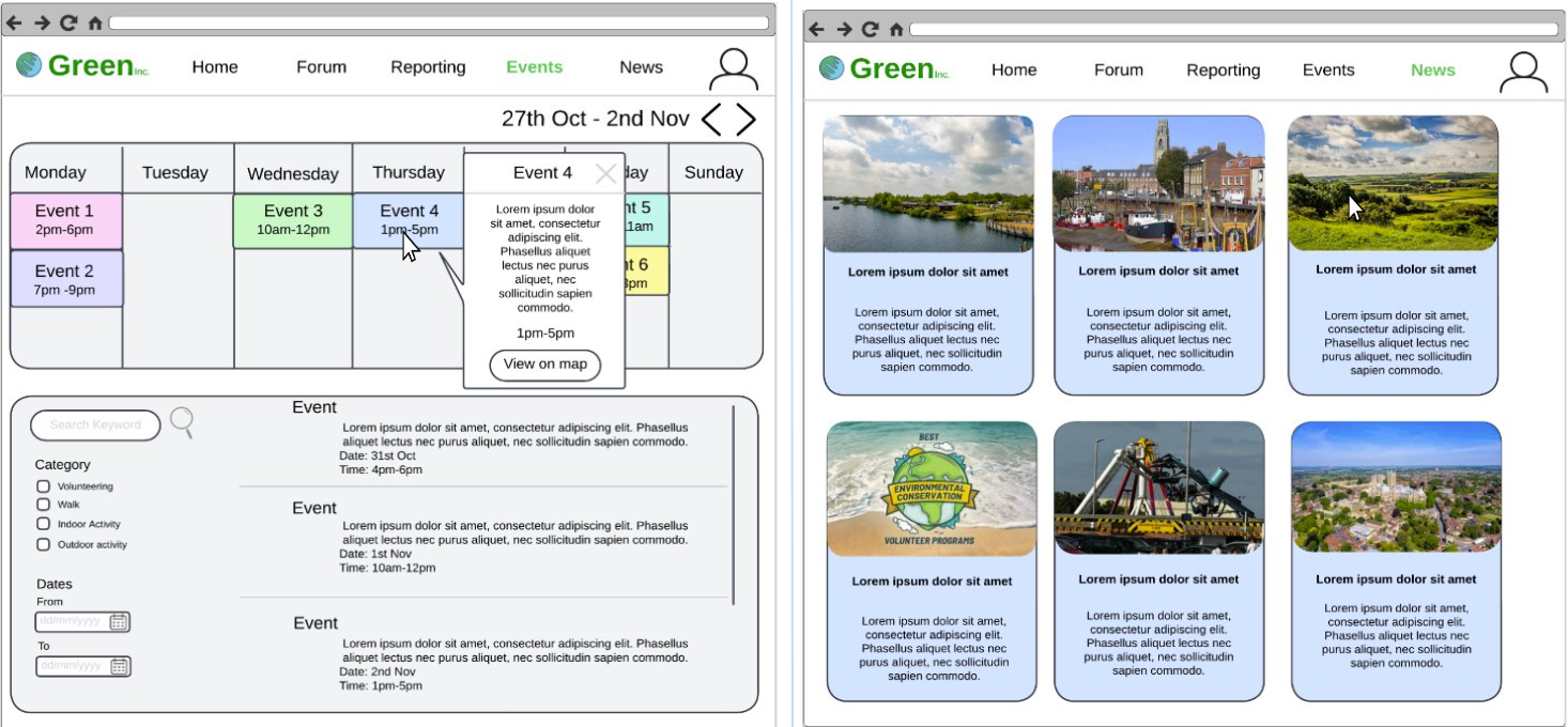
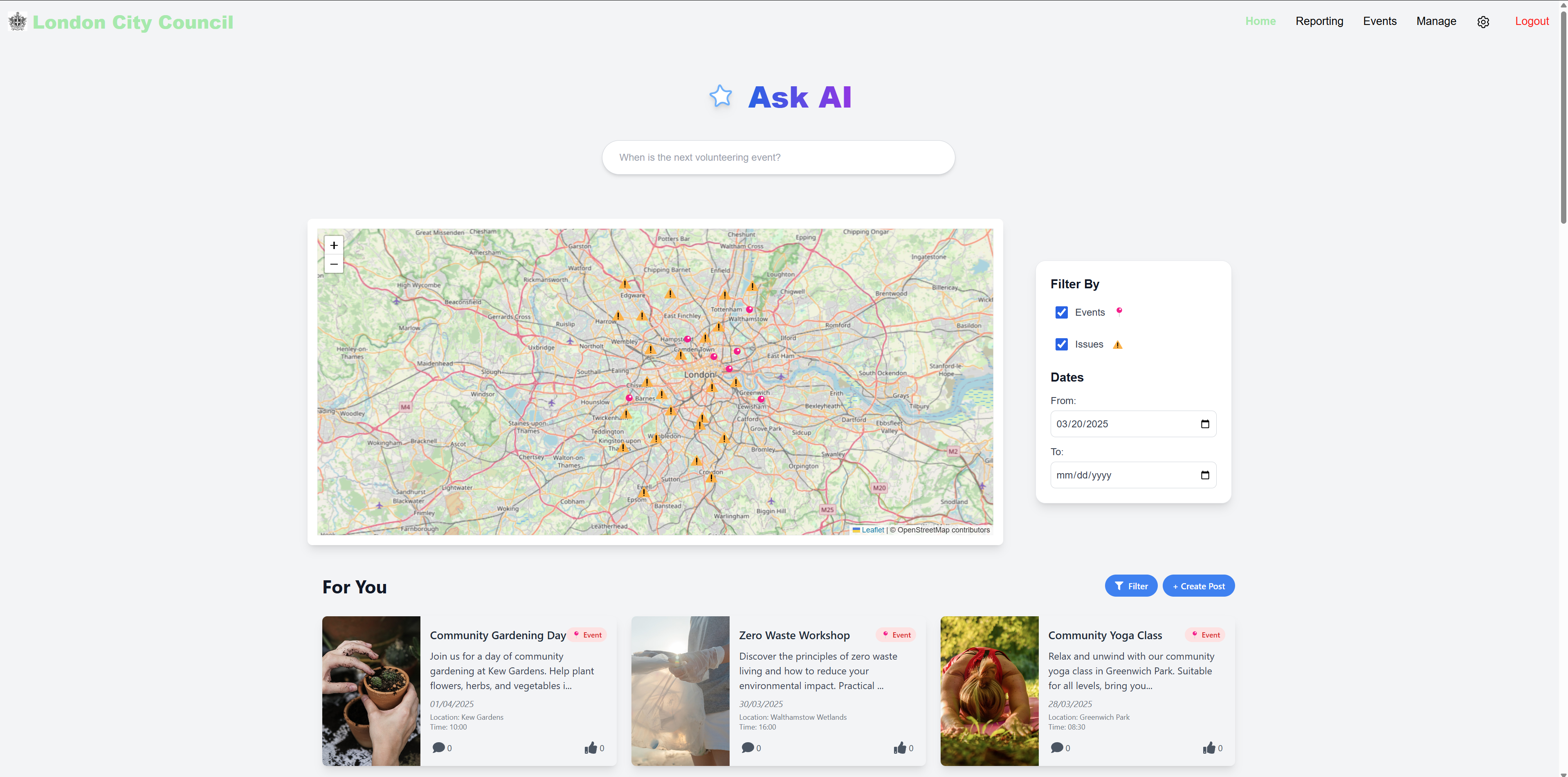
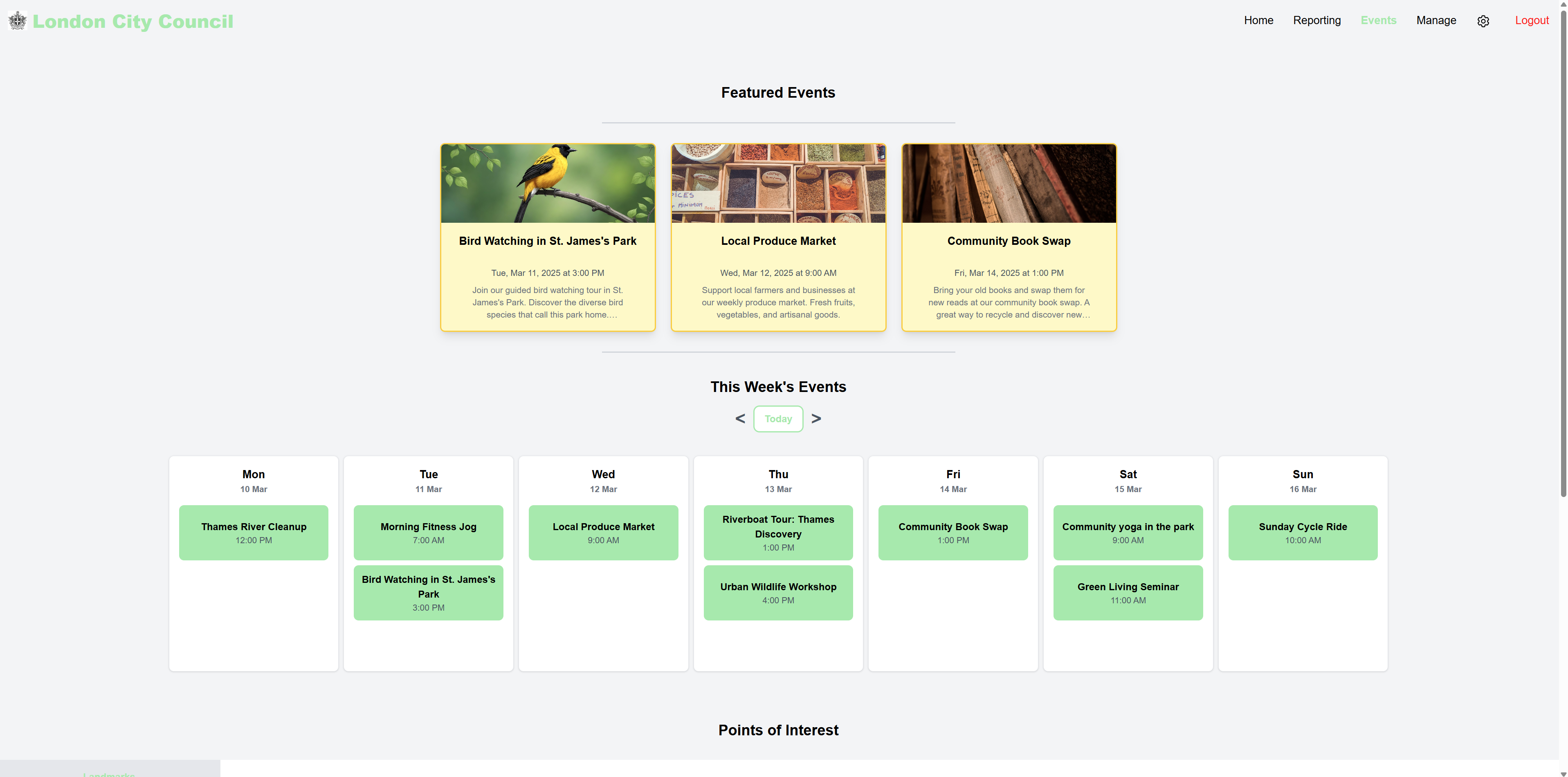
Final UI Design
Our final UI looks quite different to our initial sketches and prototypes developed within the first few weeks of the project. As we advanced in the project, and thought of the features we wanted to implement with the client, our design changed progressively. We were able to get more feedback and improve our UI, while keeping in mind our Design Principles.
References
[1] FixMyStreet. [Online]. Available: https://fixmystreet.com. [Accessed November 2024].
[2] Chen, J and Lehto, X (2024). Shaping digital luxury perception: The impact of curvature in website design. [Online]. Available: Shaping digital luxury perception: The impact of curvature in website design. [Accessed November 2024].
[3] TickTick. [Online]. Available: https://ticktick.com. [Accessed November 2024].
[4] Pinterest. [Online]. Available: https://pinterest.com. [Accessed November 2024].
[5] Flipboard. [Online]. Available: https://flipboard.com. [Accessed November 2024].
[6] Helen Sharp, Jennifer Preece, Yvonne Rogers (2015). Interaction Design : Beyond Human-Computer Interaction Vol Fifth edition. Chapter 13. [Online]. Available: Interaction Design : Beyond Human-Computer Interaction Vol Fifth edition. [Accessed November 2024].