Implementation
The main part of our project has been on the development phase. The key features of the website are: the login system (with user registration/onboarding), the statistics page, the self-report page and the manage pages.
We will describe the login system (inc. user registration/onboarding) in detail, and provide an overview of the rest of the areas.
Login System
As we were aware that the timescales for approvals in the NHS would take several months (see the research page), we decided to implement Keycloak as our authentication ‘middleware’, which runs as a separate Docker container in our system.
This provides a simple username-password authentication system where credentials are stored in our Keycloak database. A summary of our Keycloak implementation is as follows:
We have a Keycloak container in our Docker Compose configuration
A custom Realm (in the form of a JSON file) is imported on creation of the Docker Container to configure the Keycloak instance with e.g. our custom Client and Roles
A custom bash script runs in our PostgreSQL Docker Container to create the additional
keycloakdatabase used by the Keycloak instanceWe have configured a Custom Provider in NextAuth.js in our web-app to interact with this Keycloak instance to handle authentication
Whenever a user logs in, we make sure our own database is synced with the Keycloak database by performing a Prisma
upserton theuserstable, to ensure we have the logged in user’s ID in our own database, and their role (user_type)
For future development, if it turns out we can use an official NHS authentication method, we will be able to configure Keycloak to use the NHS system as an Identity Provider.
User Registration
Administrators can create new accounts for Hospitals, Health Boards, and/or Administrators (the first account is created by the development team and handed over at the end of development)
Hospital users have access to a “manage departments” page, where they can create departments and have access to a unique URL that can be shared with department managers to join this department
Department managers have access to a page where they can find their department’s unique URL that can be shared with clinicians to join this department
Internally, we decided this would use the concept of join codes. In this implementation, a single department will have two unique codes: one for department managers to join a department, and one for clinicians to join a department.
To complete this, we worked primarily on the API backend:
We used the
nanoidlibrary, as it was a highly popular, lightweight, secure and URL-friendly unique string generator with all the features we required: custom length and custom alphabet.We decided on a 9-character alphanumeric case-sensitive string as the join code: this is complex enough to defend against brute force/enumeration attempts, and simple enough to allow users to type, if needed in future (although the functionality works via simply visiting a URL containing the join code).
Created new page at
/join/department_manager/JOIN_CODEand/join/clinician/JOIN_CODE, which make use of Next.js server-side rendering to check access permissions and perform the required Keycloak and database interactions to update the user-type in both databases.
Two database tables: department_join_codes, and clinician_join_codes facilitate the use of join codes. We did experiment with using a single table — join_codes, which had both clinician_code and department_code columns, however decided against this so we could support the possibility of a department having e.g. a clinician code, but not department-manager code.
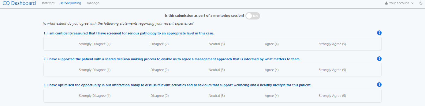
Self Reporting Page
The self-report page asks users if they are engaging in a mentoring session. It provides a series of Likert Scale and short text-based questions relating to the Standards, each with corresponding training URLs:
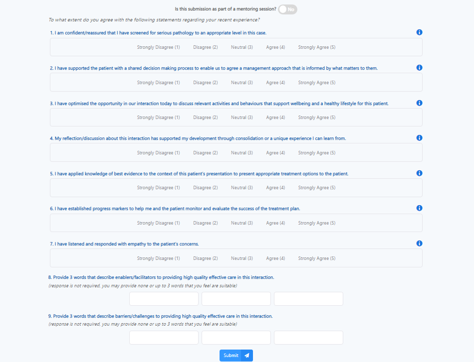
It uses a component-based design, with LikertScale, and LikertScaleQuestion, and Info components (information buttons).
A WordsQuestion component allows the user to provide 3 words that describe positive and negative feelings concerning the respect of the standards.
We used React state to write validation logic for unanswered questions and display error messages only show when an answer is unselected. We also created an AlertDialog component to ask the user to confirm their submission, or to show errors. This improves the User Experience as users are clearly informed twice about which questions have been unanswered.
This page uses the POST /api/responses API endpoint which uses Prisma to save the responses to the database.
Statistics Page
The statistics page contains meaningful visualisations that enable mentoring, supervision, and analysis. Straightforward averages and personal analytics are displayed along with a more detailed line chart showing results over time with adjustable filters specific to each user type. Word Clouds also shows responses to the text-based questions:
This page consists of several custom-made components, such as a Accordion, Filter, AnalyticsAccordion and LineChart component.
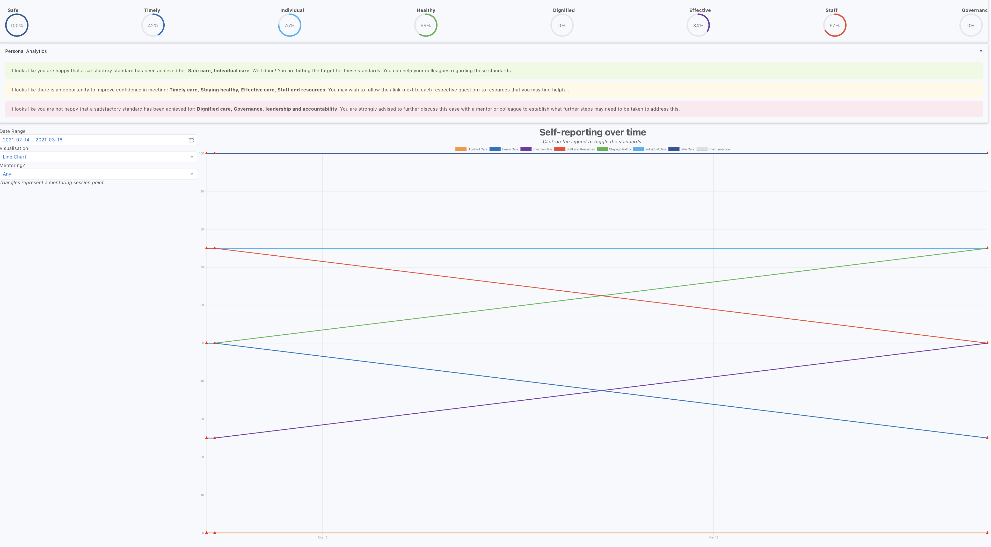
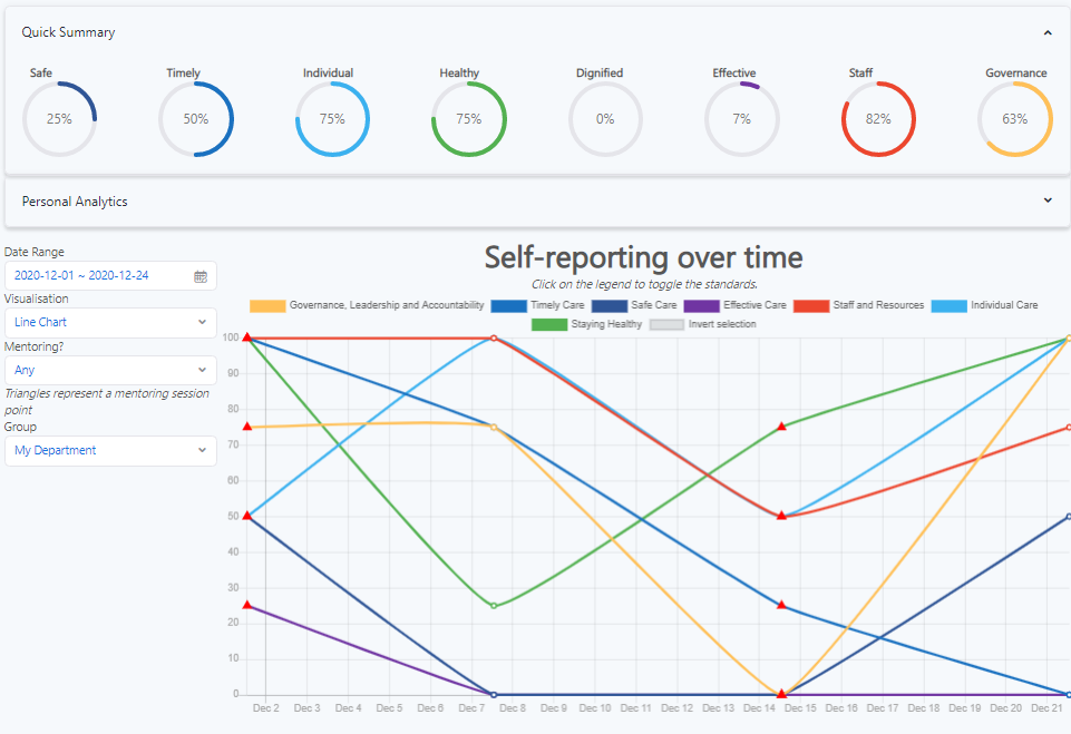
Personal Analytics
The ‘personal analytics’ section on the Statistics page provides insights on previous self reports.
In this there are various messages showing how you if you haven’t completed a self report in the last week. To implement this we used the React Suite Panel component to create an accordion and the React Suite Message component to display the messages with their respective colours which correspond to positive, neutral etc.
Similarly, the 'circles' accordion uses the React Suite Circle component to display average performance to-date. Importantly, this calculation is done on the backend in the GET /api/responses API endpoint to reduce the workload required for client devices.
See below for screenshots of both:
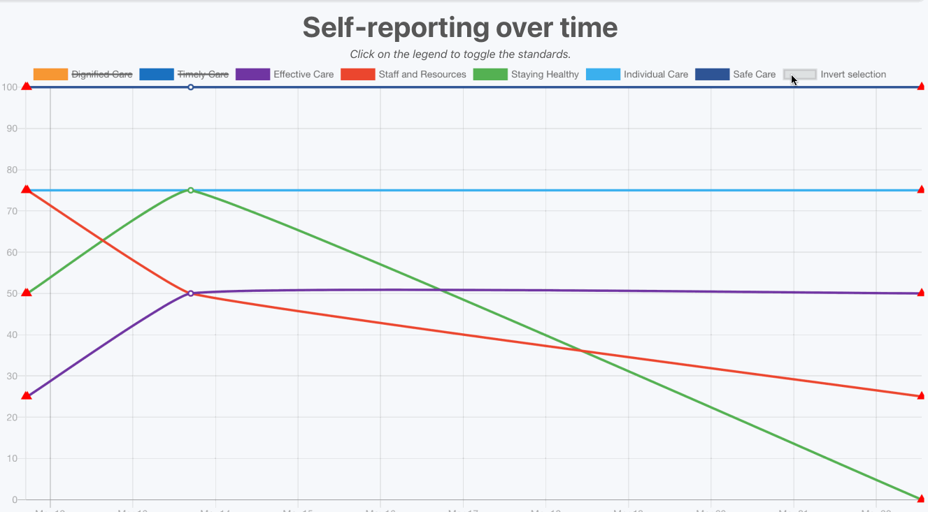
Legend Selection
The ‘invert selection’ button in the legend enables users to quickly toggle between sets of lines, to narrow down their criteria more easily. To implement this we followed an example from the Chart.js documentation, and set the legend click handler to invert the selected lines:
An example of how it works is shown below:
Filters
The filters section allows the user to select the date range, visualisation and mentoring session toggle.
Moreover, different user groups have a 'Group' filter to view data for different groups. For example, a department manager should be able to see their own data, or their department’s data, and a health board should be able to see their health board’s data, but also any hospital or department in their health board’s data.
The GET /api/responses endpoint has logic to determine a user's access rights and query parameters to enable this functionality (e.g., health boards should be able to request data for hospitals/departments in their health board, etc.). The GET API endpoints for /api/hospitals and /api/departments list the corresponding entities for the appropriate user types so they can be listed in the dropdown.
Examples: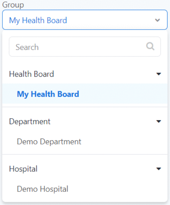
Visualisations
Line Chart
We are using the open-source Chart.js JavaScript charting library with an open-source React wrapper [react-chartjs-2](https://www.npmjs.com/package/react-chartjs-2) to implement the line chart. We made use of the library's callback functions to set the hover-over tooltip to display whether the session is a mentoring one or not, enabling the user to have a clearer understanding about the significance of particular points:
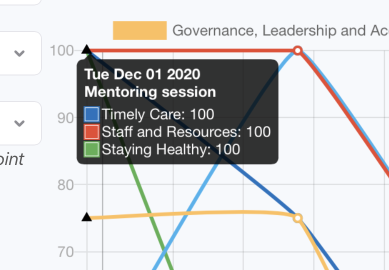
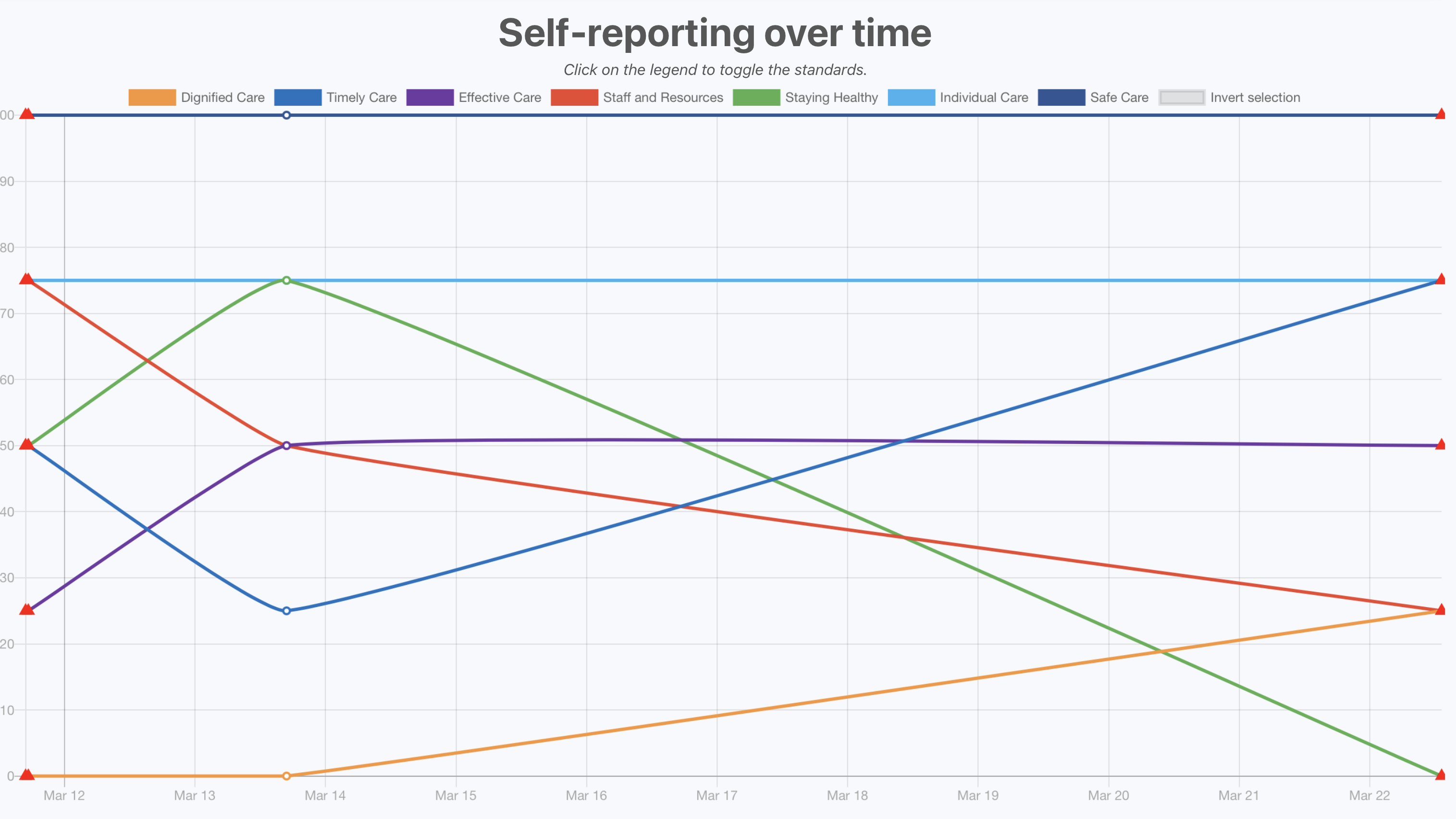
We used the Chart.js point-styles (https://www.chartjs.org/docs/latest/configuration/elements.html#point-styles) property to represent all mentoring session points by triangles, making it easy for users to distinguish them with a non mentoring session point at a glance. This is most useful in the “any” mentoring filter which shows both non mentoring and mentoring session points (see image below).
The GET /api/responses API endpoint makes use of a query parameter to add WHERE clauses to the query to return the correct results to the client.
Word Cloud
We implemented the word cloud by making use of the react-wordcloud https://www.npmjs.com/package/react-wordcloud component, which provided us with an initial styling, word cloud generation, and animations, and was easy to use, with a well documented API.
We used React state to tie the Visualisation dropdown filter to display the Word Cloud when selected. The word cloud receives the words to show via the GET /api/responses API endpoint.
The word clouds are split into two: for enablers, and barriers:


Manage Pages
Administrators can manage questions, health boards, hospitals and users, whilst departments can edit training URLs tailored to their department for each question. Departments and Hospitals can also manage ‘join codes’ to allow users to register.
Join codes
This involved implementing 3 main parts: clinician join code in the manage page for departments, the department join code in the manage page for hospitals and the leave department button for both clinicians and department managers.
Clinician Join Codes (manage page for departments)
The clinician join code functionality involved adding a section to the department manage page. To do this we used the
<CopyToClipboard/>component from react-copy-to-clipboard for the copying functionality needed and fetched the join code for that department using the GET/api/departments/[departmentId]API endpoint.We wired the ‘re-generate URL’ button to the PUT
/api/join_codes/[...params]API endpoint which uses Prisma to update the database accordingly and return the new code: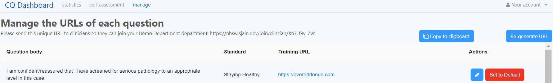
Department Join Codes (manage page for hospitals)
For hospitals. we created a new manage page to display a table of departments in the respective hospital, fetched using the GET
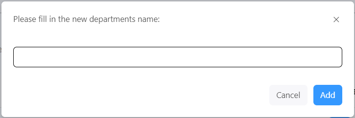
/api/departmentsAPI endpoint.Similar to the department manage page, we added added copy and re-generate buttons. Additionally, we added a button to allow the hospitals to create new departments which utilises our
<AlertDialog/>component used in other pages and the POST/api/departmentsAPI endpoint: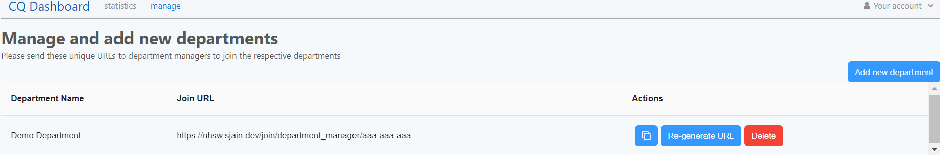
Leave department button
To allow clinicians/department managers to leave their department, we added a button to our
<ProfileButton/>component in our header and then wired it thePOST /api/departments/API endpoint, which removes that person from their respective department in the database using Prisma: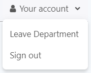
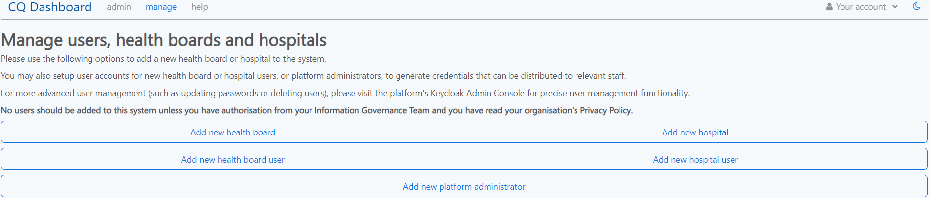
Administrator pages
User management is already provided through the Keycloak Admin Console, however implemented a administrator-accessible page that allows them to create Health boards and Hospitals, or users of those types, or new administrators themselves.
We implemented this as we were concerned that the amount of options and data available through that Console might be overwhelming or confusing on first use, and that it might be simpler to create a page for users to get used to before they moved to the Keycloak Admin Console for more advanced user management (such as deleting users).
The page is shown below:
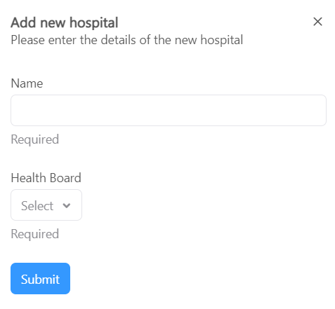
Each of these options opens a dialog containing a short, simple form to enter the relevant details, for example when adding a new hospital:
This page uses API endpoints for creating users (POST /api/users), and fetching data such as hospitals or health boards (GET /api/hospitals, GET /api/health_boards) through the API for administrators.
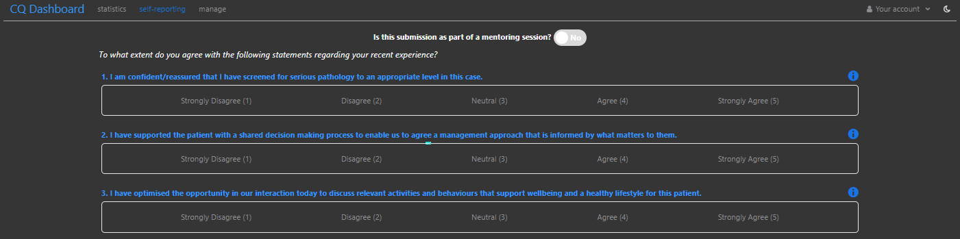
Dark theme
We decided a nice addition to our platform would be implementing a dark theme that users can switch to if they prefer. A dark theme/mode is a common feature in many popular platforms such as Google and Twitter, so we felt it would benefit users who tend to use dark mode elsewhere.
React Suite's own documentation is an open-source Next.js app that implements a dark theme, so we were able to inspect how that works. We also analysed their example React app over here which to understand and implement a dark theme in our Next.js app. In summary, we load/unload the React Suite dark theme/light theme CSS files when appropriate, and make use of a global CSS class that allows us to override the stylings of each theme.
A comparison of how the self reporting page looks in normal and dark theme:
The user can then change this theme using a moon button in the header which we created using the React Suite <Button> component in conjunction with the <Icon>:
Server Side Rendering
To improve the User Experience, we removed the ‘flashes’ that occurred when e.g. the header was switching between the default ‘not logged in’ state and the correct state for the logged-in user. This ‘flash’ occurred because we were using client-side rendering, with the session being fetched on every page load and then re-rendering the contents of the page.
To fix this, we made use of Next.js' Server Side Rendering for each of the initial page loads. This was one of the core advantages of us for picking Next.js as our framework at the beginning of the project. The initially rendered HTML for every user is correct for their logged-in state.
Importantly, all other changes and updates to the UI are stateful, and dynamic, using our REST API (i.e. client-side rendered).
Responsiveness
A conversation we had with our client at the beginning of the project was what devices users will be using to access the platform. We were told that we should expect them to be using any sort of device, ranging from mobiles or tablets, to desktops/laptops, i.e., a fully responsive UI such that the platform is usable on various different screen sizes.
Most of the responsiveness was achieved by use of CSS Media Queries which allow us to target different CSS rules based on the screen sizes of our users.
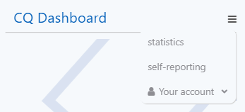
One of the main areas we had to work on was the Header, which was overflowing when using small screen sizes. We implemented this using React Effects and additional CSS classes, in conjunction with Media Queries to display the ‘hamburger’ menu when the screen size is small:

When clicked, the menu looks like the following: