Design principles
To provide a simple and intuitive user experience, we focused on the User Interface (UI)/User Experience (UX) of the platform during the initial weeks of this project (Human Computer Interaction, HCI). We also adopted a user-centered approach through the development of the software, showing our work regularly to users so we could act upon feedback.
We employed the following HCI design principles throughout our web-app:
Consistency
The horizontal navigation bar at the top of the page is a common trend in many popular websites, enabling users to easily navigate the site by following their intuition.
Moreover, when changing between user types, the overall interface of the platform and order of the navigation menu buttons stays uniform.
The user profile dropdown and links to logout/sign in are at the top-right of the screen, another popular trend for modern web-applications.
Feedback
For every action a user takes, a visible reaction is shown in the form of a page change, an alert dialog, a temporary message at the top of the screen, or permanently displayed notification. When areas of the webpage are loading, we have made sure to add a loading icon or message, to help users see the current system state.
Visibility
We tried to make the core UI elements obvious, with highlighted or large call-to-action buttons where action is necessary, or using standard icons (e.g. an 'X' for 'close') to represent common actions.
Mapping
To make the platform easy to navigate, the navigation bar boldens/highlights the text of the page the user is currently on, to help orient themselves on the website.
In line with Visibility, actions that can be performed on each page are as intuitive as possible.
Our comprehensive User Manual also explains in detail how each page and feature of the platform works.
Sketches
As we were collaborating remotely due to the COVID-19 pandemic, we used Miro as a tool to sketch out various potential designs.
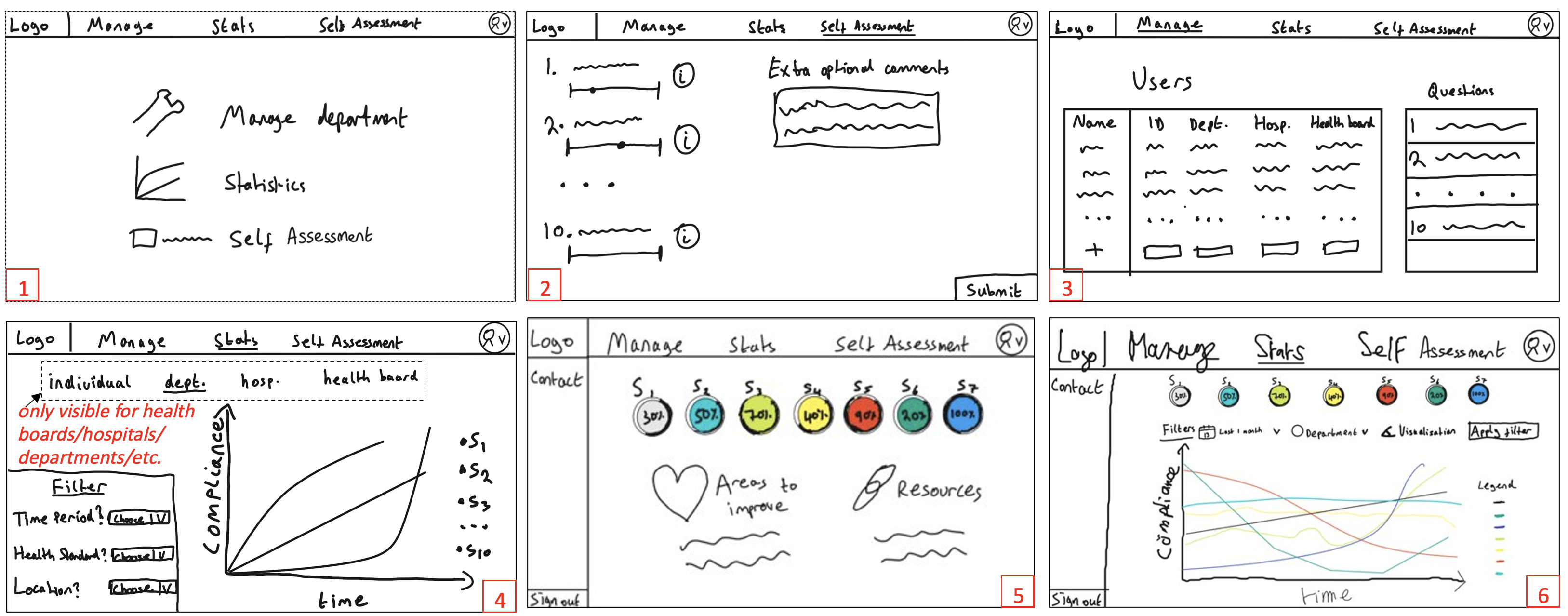
The initial design had a homepage, self-assessment page (Likert scale questions/optional comment questions), manage users/questions page (for department managers), and a statistics page (to visualize and filter data for different groups depending on your position).
Sketches 5 and 6 below are alternative designs where we experimented with different homepage versions (e.g. with sidebar/extra educational content).
The first version of our sketches is below:

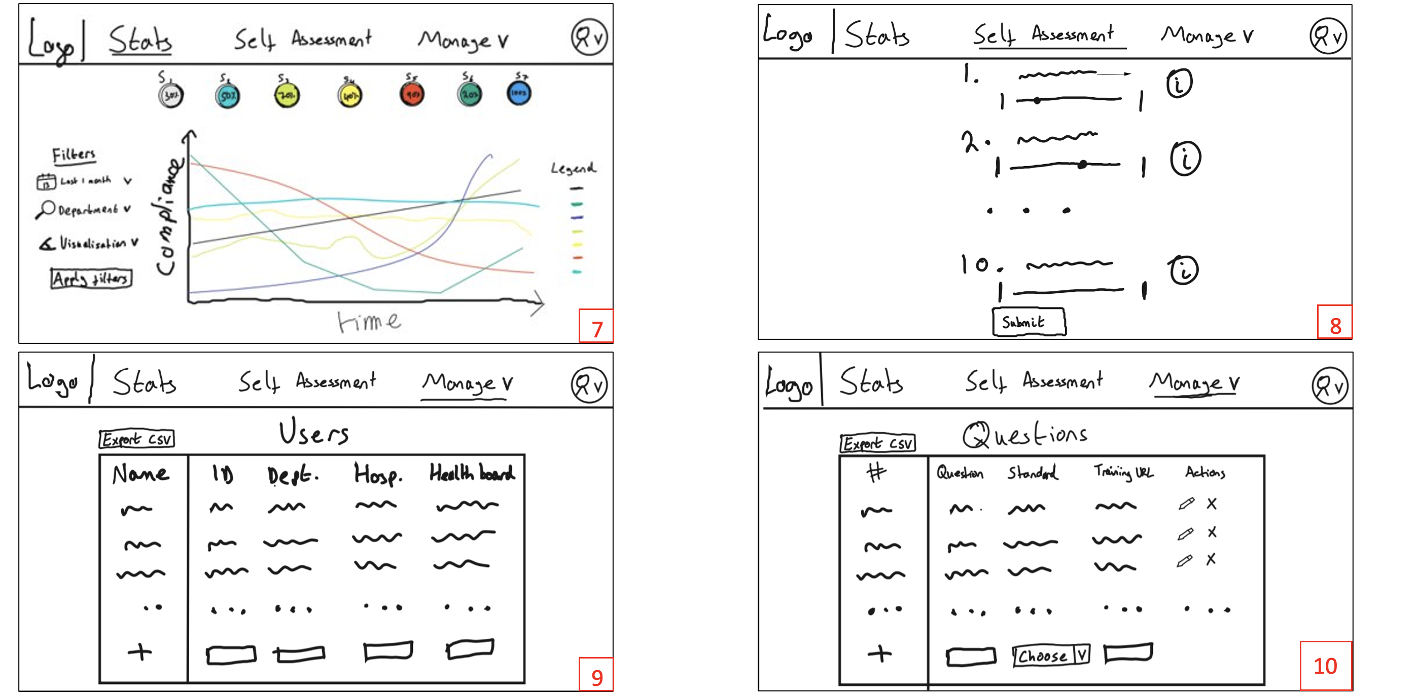
We iterated on these sketches after receiving feedback from our users:
We combined the homepage/statistics pages based on what users would most commonly use.
We added visual color coded indicators of average performance to-date.
We removed the sidebar and the text-based questions to simplify the layout and avoid overwhelming users.
We split the manage users/questions functionality into separate pages, with new intuitive table layouts and an “export CSV” option.
The final version of our sketches is below:

Online interactive wireframe/prototype
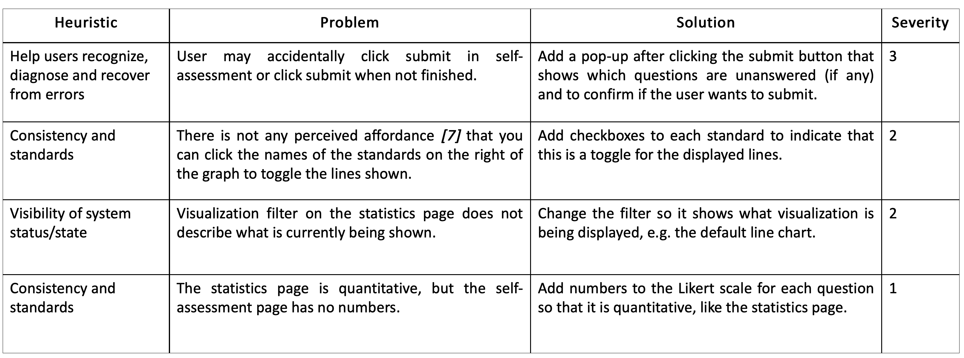
We used our requirements and sketches to design an interactive prototype using Figma and we asked a user to interact with this via Microsoft Teams and the Figma Present functionality to gather feedback. This helped us to evaluate our initial prototype, to create the following evaluation table:

We iterated on the prototype again using our evaluation table, to create the following prototype: