System Architecture Diagram
Below is a high-level diagram illustrating our AI-powered web page creation workflow, the VS Code extension wrapper, and the internal components—ranging from the Python OCR service to the CraftJS React interface. Each subsystem plays a unique role in converting user instructions and optional screenshots into finalized web pages.
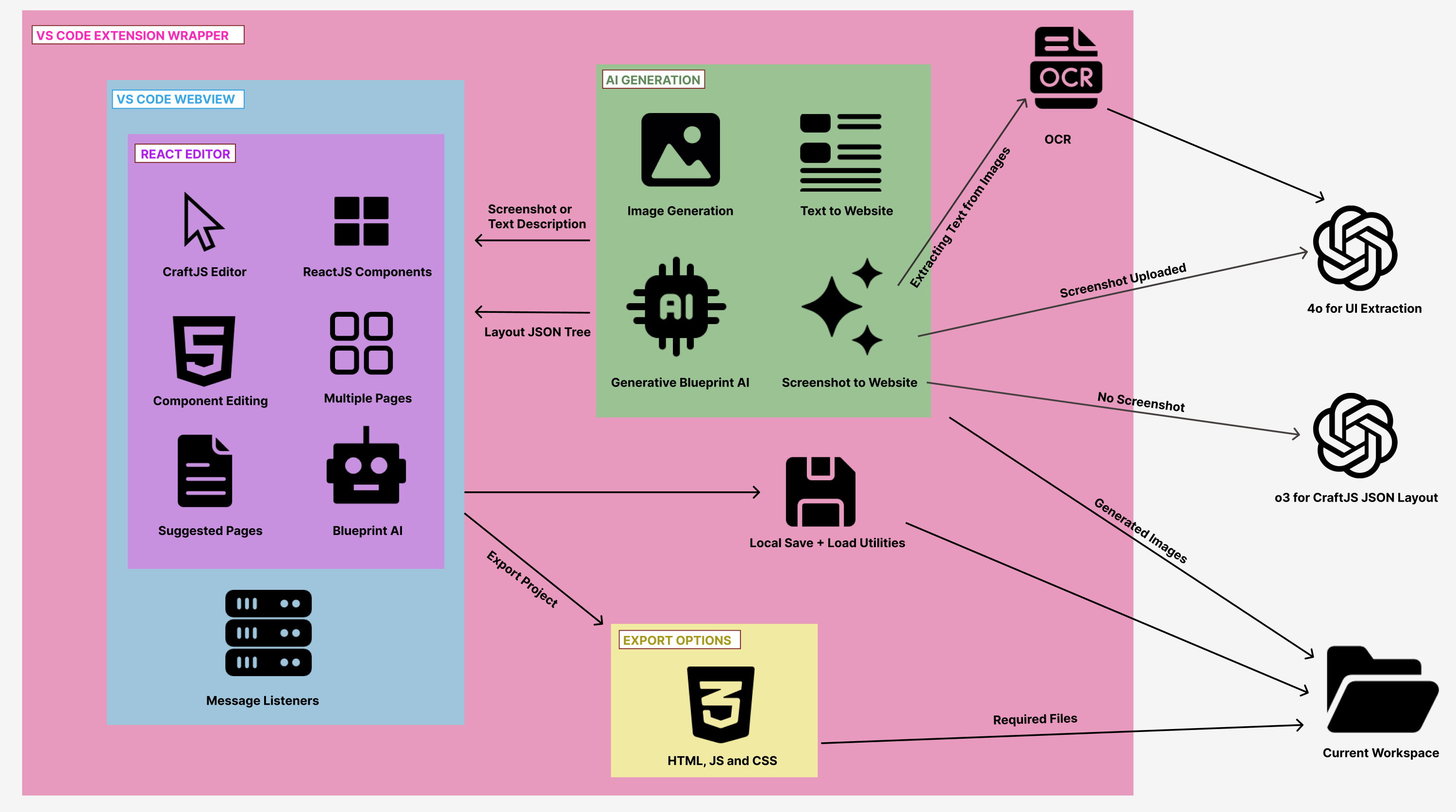
The VS Code Extension Wrapper is responsible for seamlessly embedding our React-based editor into the Visual Studio Code environment. It provides a communication layer between front-end interfaces (HTML/JS) and back-end Python services. When users open the extension, they see a webview containing our interactive React Editor, which includes:
- CraftJS Editor: The drag-and-drop canvas where pages are visually built using components such as containers, buttons, text fields, images, and more.
- Multiple Pages Support: Users can switch between or create new pages, each represented as a distinct CraftJS layout.
- Component Editing & Sidebar Panels: Allows setting properties (color, text, size, etc.) and advanced layout controls.
- Suggested Pages & Blueprint AI: Automated prompts from the AI that recommend next pages to create or refine existing layouts.
- Message Listeners: Monitor data flow between the front-end and extension back-end for tasks like saving, loading, and exporting.
On the AI Generation side, there are multiple functionalities that interface with the VS Code webview:
- Image Generation & Text-to-Website: Enables users to upload screenshots or text descriptions, which the AI then transforms into structured CraftJS layouts.
- Generative Blueprint AI: A model that synthesizes front-end elements (navigation bars, footers, hero sections, etc.) based on recognized text, user prompts, or both, returning a well-structured JSON tree conforming to CraftJS specifications.
- Screenshot to Website: Ties together the Python OCR service with advanced AI summarization. The recognized text from EasyOCR is fed to specialized prompts that summarize UI content and overall layout (GUI structure), culminating in a full-fledged page blueprint.
The OCR process is invoked whenever a user supplies a screenshot. Our Python OCR script utilizes EasyOCR to extract textual content, returning recognized lines, bounding boxes, and confidence scores. Depending on the presence of a screenshot, different OpenAI models are used:
- 4o for UI Extraction: Called when screenshot data needs to be parsed for interface labels and textual content.
- o3 for CraftJS JSON Layout: Typically engaged when generating a final structured page layout from textual instructions or summarized UI components.
Once the AI outputs a Layout JSON Tree, the data is passed back to the React Editor, updating the CraftJS canvas in real time. Users can further refine and interact with these elements, making design edits or adding custom content without leaving VS Code.
Finally, the system supports Local Save & Load Utilities for versioning and offline editing, along with robust Export Options to produce production-ready HTML, JS, and CSS files. These files, as well as any generated images and additional resources, can be saved to a user-specified folder (the Current Workspace in VS Code), making the created pages immediately deployable or further editable in a standard development workflow.
By combining Python-driven OCR, AI-based layout generation, and a feature-rich React/CraftJS editor under a unified VS Code extension, our system provides a streamlined experience for converting raw ideas—or entire screenshots—into functional, multi-page websites. Every layer is designed to be modular, ensuring that future enhancements like improved AI models, more sophisticated screenshot transformations, or expanded export capabilities can be integrated without disrupting the overall architecture.
System Architecture & Component Interconnections
This section provides an extremely detailed and extensive explanation
of how the various parts of the BlueprintAI system fit together—from
the initial “Home” screen to generating designs (via either screenshot
or text input), through to the Editing Interface with multiple
sidebars (Left Sidebar, AI Sidebar, and Properties Sidebar), as well
as the deeper AI features and export flows. The following diagrams are
referenced from the
./system-architecture directory, where they illustrate
high-level connections among major components and flows:
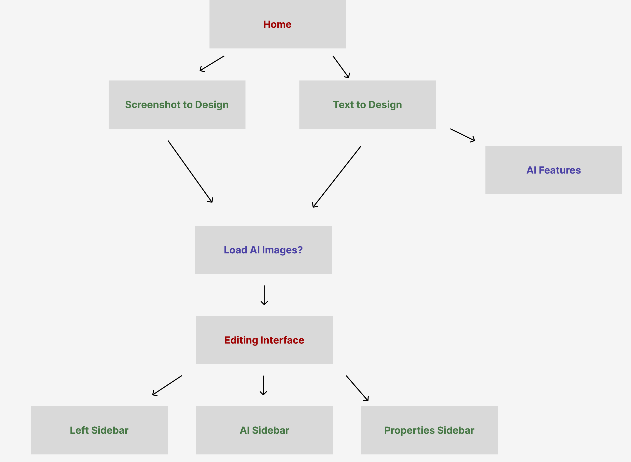
At the root of the system, users start at a Home view. From here, two main options facilitate creating a new web design: “Screenshot to Design” and “Text to Design”. This mirrors the core idea behind the First Page Creator, which accommodates both text-based instructions and actual image uploads (e.g., screenshots). Once the user selects one of these creation paths, the system employs AI logic and—if necessary—OCR to parse text from the screenshot. At this point, additional features such as Auto-completed suggestions (akin to ChatGPT) and Multiple design options or themes may be shown, giving the user flexibility in choosing a layout style or overall aesthetic.
When a screenshot is uploaded (the Screenshot to Design path), the system uses EasyOCR to detect text elements. This detected text—along with the user’s descriptive instructions—feeds into the getBlueprintLayout(...) function, culminating in an AI-synthesized layout. In contrast, if a user opts for Text to Design, only textual input (no screenshot) is provided, and the system applies generative AI to create a draft layout based purely on textual description. Either way, the user eventually advances to a stage where they can Load AI Images (an optional step that allows image generation or insertion of AI-generated graphics).
Beyond these two initial entry points, the “AI Features” node (seen to the right in Figure 1) indicates that advanced AI-driven functionalities can be accessed independently at any time. For instance, after the system has generated an initial layout, the user may want to iterate on design details: adding or removing components, modifying them, or generating new images. These AI features can handle iterative prompts—refining layout geometry, color schemes, text, or images on request.
Once the user has chosen their input path and optionally generated or loaded any AI images, the process flows into the Editing Interface. This is the central environment where the user interacts with a droppable CraftJS Canvas. On this canvas:
- Components can be dragged and dropped to fine-tune the layout. Each component is interactive, offering visual indicators when hovered or selected.
- The system displays a suitable Indicator Box around the selected component, providing quick-access icons to move, hide, or delete that component entirely. These fundamental editing capabilities combine with the AI-driven approach to streamline the front-end design process.
Surrounding the Editing Interface, there are three key sidebars:
1. Left Sidebar: Subdivided into multiple tabs such as Components, Layout, Pages, Undo/Redo, Save/Load, and Import/Export.
- Components Tab lets you search and drag in UI elements like Buttons, Containers, Text, Images, Videos, and more.
- Layout Tab includes margin/padding controls and a hierarchical layers view of all components on the canvas. It allows naming, hiding, or reordering nested elements.
- Pages Tab manages multiple pages (e.g., Home, About, Contact), with the ability to add, rename, delete, or reset pages. It also exposes “Suggested Pages” that the AI can generate upon selection (e.g., “Pricing Page,” “Product Details,” etc.).
- Undo/Redo grants revision control for quick layout changes.
- Save/Load & Import/Export handle local backups, direct JSON imports, or full project exports (including HTML/CSS/JS).
2. Properties Sidebar: Found on the right. When a user selects a component, its customizable properties appear here. This includes text fields, color pickers, sliders for spacing or sizing, toggles, and more. It also contains a button to open the AI Iterative Chat Menu, enabling guided reconfiguration of one or more selected elements based on textual instructions to the AI.
3. AI Sidebar: Typically hidden but can be expanded to facilitate deeper generative AI modifications. Users can type prompts such as “Replace this navigation bar with a collapsible vertical menu” or “Add a hero banner image with a bright blue background.” The AI processes these requests and proposes layout updates, which the user can accept or reject.
Ultimately, once the user finishes editing or exploring design variations, they can proceed to export the entire project. The “Export Menu” on the left sidebar allows them to select specific pages or all pages, estimate project size and lines of code, and then generate a production-ready bundle (HTML/CSS/JS) that’s easily portable to standard development tools or production hosting environments.
This seamless flow—from the Home screen to Screenshot to Design or Text to Design, optionally Load AI Images, and finally into the Editing Interface—is central to the BlueprintAI experience. Each step is designed to maximize ease of use, whether you’re a non-technical user seeking quick prototypes or a seasoned developer looking to accelerate page-building tasks.
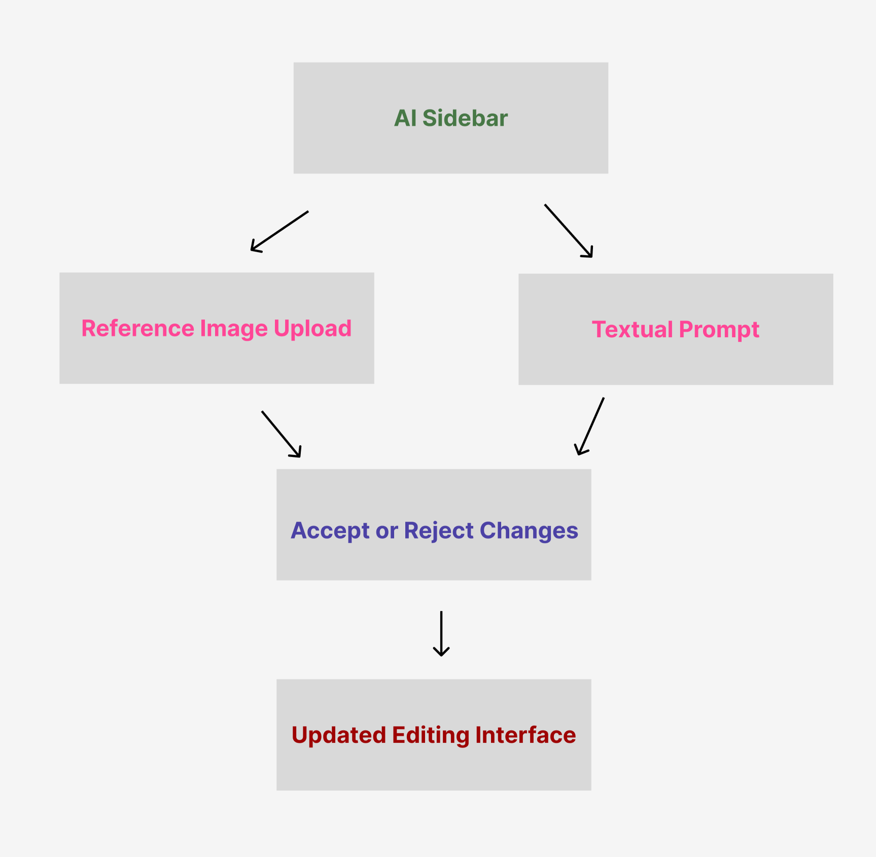
The second diagram highlights the AI Sidebar and how it processes user inputs to refine the layout. The AI Sidebar represents a dedicated space where users can iteratively interact with AI-driven suggestions for both small tweaks and large-scale design changes. In the bigger picture, it meshes neatly with the First Page Creator, as well as the Properties Sidebar in the main interface. This means that after generating an initial layout—whether from text or a screenshot—users can always return to the AI Sidebar for further enhancements, new component additions, or style overhauls.
Below is a more comprehensive breakdown of the steps illustrated:
- Reference Image Upload (optional):
- A user can upload a screenshot or smaller snippet that clarifies the specific change they want. For instance, if they want their existing navigation bar to mimic the style of a particular website or a previously designed element, they can provide that reference image here.
- The AI uses pythonBridge.ts (if needed) to tap into the EasyOCR-based flow for additional text extraction, or it simply uses the raw image context if the goal is a broad layout suggestion.
- This “visual guidance” can prompt the AI to generate new layout structures or incorporate visual cues—such as color palettes, button styles, or headings—similar to those found in the reference image.
- Textual Prompt:
- Users type or paste a detailed description of the desired changes. For example, they might say, “Transform the top banner into a carousel with three rotating images,” or “Add a price filter section under the navigation sidebar.”
- Multiple elements on the canvas can be selected simultaneously. The system will tag them (e.g., “BarChat1,” “BarChat2,” etc.) so the AI can reference each component individually or in groups. This helps the AI produce more targeted results, especially for wide-scale updates.
- The user can also specify how they want to handle existing text, color palettes, or alignment constraints, giving the AI a clearer creative boundary.
- Generate & AI Processing:
-
The AI Sidebar uses the function
handleGenerateClick() in
AiSidebar.tsx to collect the user’s prompt and any
image bytes. This payload is then sent via
vsCode.postMessage (under the command
'blueprintAI.generateLayout') to the extension’s
backend or an AI service endpoint.
- Internally, the system calls getBlueprintLayout(...), getSummariesFromScreenshot(...) (if an image is present), and ultimately the OpenAI Large Language Model. All AI responses come back in a format that can be seamlessly translated into CraftJS JSON.
- Model Selection is automatic: if a reference screenshot is provided, a more robust model (e.g., “gpt-4o”) might be chosen; otherwise, it defaults to “o3-mini-2025-01-31,” per the project logic.
- Accept or Reject Changes:
- Once the AI produces a suggested update (in strict JSON form), the user is presented with a concise “diff” or summary of changes. This summary highlights which components have been added, modified, or removed.
- The user can compare the proposed layout to the current one. If it aligns with the user’s vision, they can Accept the changes to immediately reflect them on the CraftJS Canvas.
- Optionally, users might upvote or downvote the AI’s suggestions to guide future interactions. This helps refine iterative improvements if the system is designed to learn from feedback within the session.
- Updated Editing Interface:
- After acceptance, the user is redirected back to the Main Interface, where all the new or revised components appear in real time. This is the same droppable CraftJS canvas seen in the First Page Creator or subsequent design sessions.
- Users can then open the Properties Sidebar to fine-tune the newly introduced (or altered) elements—adjusting sizes, fonts, or alignment. Alternatively, the user might choose to invoke the AI Sidebar again for additional modifications, thus creating a continuous feedback loop between manual design and AI-driven suggestions.
- This cyclical approach—prompt AI, review, accept/reject, revise in the Properties Sidebar, and prompt AI again—gradually polishes the layout until the user is fully satisfied.
Functionally, the AI Sidebar acts as a “live design assistant,” always available for either global or micro-level changes to the canvas. It works in tandem with the Properties Sidebar (for direct property edits on individual components) and the Layout/Pages Sidebars (for broader structural or page-level manipulations). Specifically:
- The AI Sidebar is triggered when a user wants higher-level or conceptual transformations (e.g., “Add new navigation,” “Move the hero section above the search bar,” “Restructure the footer,” etc.).
- The Properties Sidebar is best for granular details—tweaking fonts, color pickers, margin sliders, or toggling advanced behaviors on a single selected component.
-
Integration: Because the AI Sidebar uses the
internal blueprintAI commands (like
blueprintAI.generateLayout or
blueprintAI.generateLayoutSuggested), everything stays
synchronized with the underlying data structures (store.ts
in the webview-ui/src/store directory). This ensures no
mismatch occurs between AI-suggested changes and what’s rendered
on-screen.
Ultimately, the AI Sidebar stands as an essential bridge between user-driven creativity and the system’s advanced generative AI capabilities—empowering users to build or update web pages with fewer manual steps, while still retaining control over the final outcome.
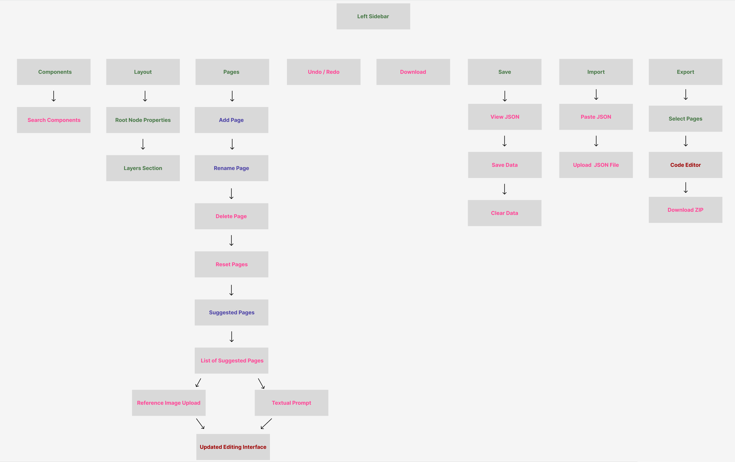
This final diagram provides a more comprehensive bird’s-eye view of the entire editing environment and Left Sidebar functionality. It showcases how all the different sub-features (Components, Layout, Pages, Undo/Redo, etc.) come together to form a cohesive workflow. Below is an even more detailed breakdown of these sections, clarifying both the user’s experience and how these elements interconnect at a technical level.
1. Components
- Search Components: Users can quickly locate desired UI elements, such as Buttons, Containers, Text blocks, Image placeholders, Navigations, Sliders, and more. As new custom components are developed (like StarRatings or custom Navigations), they appear in this searchable list.
- Drag & Drop to Canvas: After finding a component, the user drags it onto the CraftJS canvas. An “Indicator Box” helps them place it accurately relative to other components. This box highlights any valid insertion points or hover-based positions.
- Customization happens either via the Properties Sidebar (to adjust text, color, or advanced logic) or by further AI-driven modifications (through the AI Sidebar).
2. Layout
- Root Node Properties: Here, users can modify global margins, padding, page width, or background color. This affects the overarching layout container, sometimes known as the “root node.”
- Layers Section:
- Provides a hierarchical tree of all components on the canvas. Components can be expanded or collapsed to view nested items.
- Rename Components: Users can rename each component (e.g., from “Container1” to “MainHeader”) to keep the structure organized.
- Toggle Visibility: Quickly hide or show certain sections to test different designs or manage crowded layouts.
- Reorder Items: Drag items around in the tree to reposition them in the layout. Clicking on a component in the tree also selects it on the canvas for further property edits.
3. Pages
- Add Page: Generates a blank or AI-assisted new page, defaulting to “Page X.” This triggers a fresh CraftJS layout context, so the user can design multiple distinct pages within the same project.
- Rename Page: Allows the user to change the page’s name to something meaningful (e.g., “Home,” “AboutUs,” “Contact”).
- Delete Page: Removes an existing page and its associated components from the project. A confirmation step may ensure users don’t inadvertently lose work.
- Reset Pages: Clears or resets all pages back to default states, useful when starting over or discarding multiple incomplete designs.
- Suggested Pages: Displays AI-driven or user-configured recommendations, such as “Login,” “Checkout,” or “FAQ.” Clicking on one of these suggestions:
- Loads a List of Suggested Pages in a modal or list format.
- Lets the user specify a Reference Image Upload or Textual Prompt to guide how that page is generated.
- After submission, the system transitions to the Updated Editing Interface, automatically populating the newly created page’s layout via the AI flow.
4. Undo / Redo
Offers version-control-like capabilities at the UI level, capturing state snapshots each time the user adds, repositions, or deletes a component. Particularly important for iterative experiments (e.g., to quickly revert an unwanted AI change or a manual adjustment).
5. Download
Provides a quick method to create a local backup of the current project. Typically, “Download” might output a JSON snapshot that can be instantly re-imported if users want to share their design or switch machines. Unlike a full “Export,” it does not necessarily include production-ready HTML/CSS/JS files—just the CraftJS layout data.
6. Save
- View JSON: Displays the raw CraftJS-compatible JSON that underlies the entire layout. This is handy for advanced users, debugging AI-generated results, or verifying certain properties (e.g. if the AI inserted the correct “data-id” attributes).
- Save Data: Commits the project state to local storage (e.g., browser localStorage) or a user-designated file path via the extension’s backend. This ensures the user can close VS Code and later resume where they left off.
- Clear Data: Wipes out all locally saved states, effectively resetting the system to a fresh environment.
7. Import
- Paste JSON: Lets the user copy raw layout JSON from somewhere else (e.g., Slack, GitHub, or a snippet file) and paste it directly into the interface. The system rebuilds the entire design, preserving all components and their properties.
- Upload JSON File: Allows importing from a .json file on the user’s filesystem. This could be an earlier download from the same project or a design from another user. Everything merges into or replaces the current layout.
8. Export
- Select Pages: The user can choose which subset of pages to include in the final export. For a large multi-page site, they might only want to export the “Landing Page,” “About Us,” and “Contact Us” to test or deploy first.
- Code Editor: Some workflows allow the user to view a code preview inside the VS Code extension before finalizing the export. Future enhancements may include automatically generated unit tests, advanced animations, or a .NET-based bundling pipeline.
- Download ZIP: Packages the pages (HTML, CSS, JS) and any associated media or comments into a single archive. The user can then open it in a standard text editor or place it directly on a server for hosting.
Practical Workflow Example: Suppose a user starts by creating a “Home” page with Text to Design. They refine the layout manually, then use Suggested Pages to add a “Features” page, uploading a screenshot for guidance. They drag new Components onto that page, rename them in the Layout > Layers Section, and reorder them using the hierarchical tree. Next, they frequently Undo/Redo to test different banner placements, saving progress occasionally via Save Data. Once satisfied, they Export the “Home” and “Features” pages in a single .zip to share with the team or deploy.
The Editing Interface in the center is highly flexible, enabling both manual design manipulations and AI-based iterative changes:
- Manual Edits: The user can move, resize, or remove components at will. The Properties Sidebar on the right shows each component’s style or functional properties (fonts, colors, interactions, etc.).
- AI Sidebar Integration: For more sweeping or structural changes—like adding an entire “Hero” section with a new design theme—the user enters a textual prompt or uploads a reference image. The AI proposes updates to the underlying JSON, and the user can accept or reject them.
- Synchronizing to Pages Tab: Each time a new page is added (manually or via AI suggestions), the Pages sidebar updates. The user can switch between pages, rename them, or clear them if the design doesn’t meet requirements.
Meanwhile, the entire pipeline leverages the AI Flow behind the scenes. If the user supplies a screenshot, the system triggers runPythonOcr(...) and subsequently getSummariesFromScreenshot(...), obtaining textual content and layout suggestions to feed getBlueprintLayout(...). Otherwise, it simply sends user text instructions to the generative AI for direct “CraftJS JSON” creation. All results are rendered in real time, bridging the gap between a user’s broad design concepts and the final, structured webpage code.
Design Patterns
In Blueprint AI, we employ a variety of well-known software design patterns to organize code, promote reusability, and ensure that different parts of our AI-driven pipeline integrate smoothly. Below is a comprehensive look at how each pattern is specifically implemented within our system.
| Pattern | Description | Implementation in This Project |
|---|---|---|
| Observer | Maintains a one-to-many dependency between objects so that when one object changes state, all its dependents are notified and updated automatically. |
In This observer mechanism is critical for the SuggestedPages flow as well—once the user picks a suggested page and the AI completes layout creation, the same event system updates the canvas. All dependent UI components (sidebars, preview thumbnails, page indicators) reflect the latest changes automatically. |
| Composite | Composes objects into tree structures to represent part‐whole hierarchies, allowing clients to treat individual objects and compositions of objects uniformly. |
In the Droppable CraftJS Canvas, each React component can be a parent (e.g., Container) or child (e.g., Text, Button). CraftJS nodes are internally stored as a hierarchical data structure, reflecting a “part-whole” relationship. The Layout Sidebar in the LayoutTab further demonstrates Composite by letting users expand or collapse child elements, rename them, and hide or delete them. By treating each node in the same way—whether it’s a single Text element or an entire Container with nested components—the editor achieves consistent operations across the tree. |
| Command | Encapsulates a request as an object, thereby letting users parameterize clients with different requests, queue or log requests, and support undo operations. |
The main left sidebar includes Undo and Redo features that treat user actions—such as creating, moving, or deleting components— as discrete commands. Each action is recorded in a stack-like structure, allowing straightforward reversal or reapplication. When a user selects “Delete Icon” on a component, a DeleteCommand is issued, removing the target component from the CraftJS tree. This approach ensures changes can be reversed if needed. The same logic applies to “Hide Icon” actions, where toggling visibility can also be undone or repeated. |
| Facade | Provides a simplified interface to a complex subsystem, making the subsystem easier to use. |
The BlueprintAiService in
- UI Summary Prompt (e.g., - GUI Layout Prompt (e.g., -
Final CraftJS Layout Prompt
( Users or higher-level modules call a single function, getBlueprintLayout(...), which under the hood orchestrates screenshot-based OCR, multiple AI prompts, and the final JSON layout assembly. This facade pattern shields the calling code (e.g., AiSidebar.tsx or SuggestedPages.tsx) from the complexity of chaining multiple AI requests. |
| Strategy | Defines a family of algorithms, encapsulates each one, and makes them interchangeable. |
Within - “gpt-4o” for screenshot-based UI extraction - “o3-mini-2025-01-31” for layout generation without screenshots The calling code does not need to know which model is selected; it simply invokes a single function and receives AI-generated text or JSON layouts. Each model is effectively a “strategy” for generating text, applied interchangeably based on whether a screenshot was uploaded. |
| Builder | Separates the construction of a complex object from its representation so that the same construction process can create different representations. |
getFinalCraftJsLayout(...) implements a builder-like approach: it receives raw user instructions, plus optional UI/GUI summaries, and incrementally merges them into a single-page JSON layout that the CraftJS editor can render. At each step, the function references AI responses that define container structures, text blocks, or design themes. Because the “construction” logic is separated from the final JSON representation, we can easily swap or extend steps without breaking the entire layout assembly— for example, introducing a new “theme” prompt or adding specialized components (like a StarRating widget). The same base building process still arrives at a coherent, valid CraftJS representation. |
By leveraging these design patterns—Observer, Composite, Command, Facade, Strategy, and Builder—Blueprint AI achieves a consistent and flexible architecture that handles complex AI tasks, organizes UI elements in a hierarchical manner, and simplifies both user interactions (e.g., drag-and-drop, undo/redo) and developer maintenance efforts. Each pattern ensures that distinct concerns (like AI prompts, component nesting, or editing actions) remain well-structured, ultimately contributing to a more scalable and intuitive codebase.
Design Goals
Blueprint AI is built upon foundational goals that ensure a seamless blend of AI-driven web page creation and user-friendly editing workflows. These goals guide our architectural decisions, from how we structure the Python OCR service to the layout of our CraftJS editor in the VS Code extension. Below is a comprehensive look at each major design goal and the specific actions we take to fulfill it.
| Design Goal | Actions to Take |
|---|---|
| Seamless AI Integration |
Ensure that the user’s text prompt and optional screenshots
flow directly into
Once this textual data is extracted, it’s passed into specific AI prompts: UI Summaries for textual content and GUI Summaries for layout structures. These prompts converge in the final CraftJS layout, ensuring that the editor’s canvas instantly reflects all recognized UI elements in a consistent manner. By centralizing the pipeline in getBlueprintLayout(...), Blueprint AI can automatically handle complexities such as upscaling or grayscale conversion, screenshot text analysis, and layout generation—freeing users to focus on higher-level design inputs. |
| User-Friendly Interface |
Provide clear expand/collapse mechanisms across the Properties Sidebar, Component Sidebar, Layout Sidebar, and Pages Sidebar to avoid clutter in the VS Code webview. In each sidebar, collapsible panels and intuitive icons guide the user toward the controls they need. The canvas allows drag-and-drop for user components (buttons, images, etc.) with direct visual feedback. We also enable upvote/downvote on AI responses in AiSidebar, allowing users to iterate or regenerate suggestions until they achieve the desired style. Each newly created page includes an organized summary of design choices, so users understand the rationale behind AI decisions. |
| High-Level Layout Editing |
The droppable CraftJS Canvas must effectively display an Indicator Box whenever users hover or select a component. This box highlights the boundaries of the item, offering quick access to move, hide, or delete icons. Whenever components are dragged, hidden, or removed, the canvas refreshes in real time, letting users visually confirm changes. This ensures a user can reorganize entire sections of a page (e.g., moving a Hero component above the Navigation bar) within seconds. |
| Undo/Redo Robustness |
Incorporate a Command pattern approach for each layout modification, whether it’s dragging a component, deleting an element, or hiding it. Each action is packaged as a reversible operation, so clicking “Undo” seamlessly rolls back the latest change. This approach prevents complicated side effects: if a user accidentally removes an entire section (like a Container with multiple nested items), one Undo click restores it instantly. Similarly, Redo re-applies the last undone step without forcing the user to replicate prior actions. |
| Modular & Maintainable Codebase |
Keep Python OCR functions in Further, group related UI components in logical subfolders (e.g., PropertiesSidebar or PrimarySidebar) so that expansions to these features—like adding a new tab or property control—do not bloat a single directory. |
| Flexible Export Options |
Provide an ExportMenu component that allows users to pick which pages to export, choose a target folder, and see an overview of total file size and lines of code. By default, it exports the project as HTML/CSS/JS, but we plan to expand to .NET or other frameworks in the future. Partial unit tests and commented code are bundled in the export, promoting easy extension. This includes any animations or custom logic added to components, so the resulting package is immediately usable in standard development workflows. |
| Fast Page Creation & Iteration |
Use SuggestedPages to propose immediate ideas (like “About Us,” “Contact,” or “Services”). Then, CreateSelectedPage prompts the user for a textual description or optional screenshot. This data is passed to the AI for an almost instant layout generation in the CraftJS editor. By reducing manual steps—e.g., automatically switching to the new page after generation—users can iterate more rapidly through design ideas, quickly toggling or refining content, and obtaining immediate AI-driven updates. |
| Clear Layout Structure Overview |
Present a visual hierarchy of all components in the Layout Sidebar. The Layers Section enumerates containers, text blocks, and nested items, mirroring the underlying CraftJS tree. Users can rename each node (e.g., changing “Container1” to “HeaderContainer”), hide elements, and hover to see which part of the canvas is selected. This centralized overview is vital when working with deeply nested structures or multiple pages. A single glance reveals how containers and child elements interrelate, reducing confusion when rearranging layouts. |
| Consistent Theming & Design Variants |
In the First Page Creator, we offer multiple theme options (e.g., minimalistic, bold, modern) and short, AI-assisted suggestions (similar to ChatGPT) to help users shape their initial text input. Users can pick a style that resonates with their project or experiment with multiple variations to see different color schemes and layouts. As soon as a layout is generated, the user sees the chosen theme reflected in component spacing, color usage, and typography. They can quickly revert or pick another variant if they want to compare different aesthetics. |
| Accurate OCR & Text Summarization |
For screenshot-driven page creation,
EasyOCR in the
We merge these summaries (e.g., bullet‐style outlines of nav items, textual content, layout sections) into the final CraftJS JSON, ensuring the textual portion is accurately represented. Users then see a page that faithfully reflects the textual structure of their screenshot, allowing them to edit or refine with minimal friction. |
By aligning the core system with these design goals, Blueprint AI consistently delivers an accessible, fast, and intelligent web development workflow inside VS Code. Users benefit from a smooth AI-driven experience—combining robust OCR, flexible design capabilities, and a clear, user-friendly interface—while developers maintain a well-organized, extensible codebase.
Data storage
In Blueprint AI, all persistent data is stored locally in the user's
browser via
localStorage—specifically keyed under
"blueprint-ai-data". This local storage mechanism is
powered by the logic in our store.ts file and is designed
to conditionally load and save project data for every session of the
Blueprint AI extension. This allows for immediate retrieval of user
preferences and project details within the same browser environment,
without reliance on external databases or cloud services. Everything
below describes precisely how Blueprint AI performs, updates, and
retrieves these data fields from localStorage, always
conditioned on the logic in store.ts:
1) BlueprintAI Store State Shape:
• Our local store is defined by the
StoreState interface in store.ts, which
includes exactly four fields: pages,
selectedPageId, suggestedPages, and
userPrompt.
• The pages array is an exhaustive list of
all the user-created or AI-suggested pages, each represented by the
Page interface (id, name, an
optional thumbnail, and the layout tree in
CraftJS JSON). By default, only one page exists (id: 1,
named “Page 1”). Blueprint AI conditionally populates this array each
time the user or the AI system adds or modifies a page.
• The selectedPageId indicates which page is
currently being edited in the Blueprint AI interface. This
conditional pointer ensures that the design canvas,
properties sidebar, and other features always reference the
appropriate page.
• The suggestedPages array holds additional
recommended page names (e.g., “Account,” “Buy Again,” “Best Sellers,”
“Returns & Orders”) that Blueprint AI proposes to the user. These
suggestions are surfaced in the Pages Sidebar or within other modals
to guide potential new pages the user may want to generate.
• The userPrompt string is a flexible area
for saving any text prompt that the user entered in the AI-driven
flows (such as designing a new layout, adjusting an existing design,
or describing new features). Each time a user interacts with the
iterative AI chat or the “Create With Imagination” page builder,
Blueprint AI conditionally updates userPrompt so that it
remains accessible across sessions.
2) Default Local State:
• The initial data structure is declared inside
storeState in store.ts. This default
includes one sample page and an empty userPrompt—ensuring
a consistent starting point for first-time or reset sessions in
Blueprint AI. The store is primed with four default suggested pages.
This ensures that even before the user creates or loads anything,
there's a clear reference in the UI to build from.
• Blueprint AI only populates local storage with these
defaults if no prior saved data exists under
"blueprint-ai-data". If there is existing data, the store
merges the fields from local storage into memory conditionally.
3) Conditional Loading at Startup:
• On every launch of the Blueprint AI extension, the code
attempts to retrieve the JSON string from
localStorage.getItem(STORAGE_KEY). If
savedData is non-null, it conditionally parses the string
and merges each key into the current storeState. For
example, if the parsed data has pages, it updates
storeState.pages; if it has selectedPageId,
it sets that too, etc.
• If the user had previously created multiple pages or
typed in a multi-sentence prompt, all of that is immediately reloaded
into the Blueprint AI interface on extension open. This ensures a
frictionless user experience where previous session designs or AI
prompts are restored exactly as they left them.
4) Accessing Stored Data (Getters):
• Blueprint AI uses dedicated
getter functions from store.ts to conditionally
read data from memory, such as getPages() for the full
pages list, getSelectedPage() for the currently active
page object, getSuggestedPages() for recommended page
names, and getUserPrompt() for the last user prompt.
Because the store synchronizes to local storage on demand, these
getter calls reflect precisely what's persisted in the browser when
saved.
• For example, when the user opens the
Pages Sidebar in Blueprint AI, the application calls
getPages() to render the entire list of local pages.
Likewise, the AI Chat Flow reads
getUserPrompt()
to show the user’s most recent text input in the chat or iteration
interface.
5) Handling State Changes (Subscriptions):
• Multiple arrays of listener functions exist
within store.ts, each of which is notified conditionally
when a relevant section of the store changes (e.g.,
pageListeners, selectedPageListeners, and
promptListeners). This ensures that whenever the user or
the AI modifies the layout or updates the user prompt, the
corresponding parts of the Blueprint AI interface re-render
automatically.
• By subscribing to pageListeners, any UI or
logic that depends on the array of pages or suggested pages will be
refreshed. Similarly, components reliant on which page is currently
selected subscribe to selectedPageListeners, and features
tied to user input text watch promptListeners. This
subscription model helps maintain a dynamic, reactive environment for
the entire Blueprint AI design experience.
6) Updating and Saving (Mutations):
• setPages(newPages) replaces the entire
local pages array with a new list. For example, the AI
might generate a fresh layout for the user’s “Buy Again” page, and in
response, setPages stores the updated structure. In
Blueprint AI, once the user finalizes or accepts an AI response, the
relevant page is replaced or appended.
• updatePage(id, partialData) merges changes
into a particular Page object, such as if the user
updates the name from “Page 1” to “Home Page,” or modifies the layout
JSON with an AI-generated snippet. This function is used heavily in
any direct manipulation of a single page (dragging a component in the
CraftJS canvas, etc.).
• setSelectedPageId(id) changes which page is
currently active. For instance, if the user navigates from “Page 1” to
“Best Sellers,” setSelectedPageId updates the local store
and triggers selectedPageListeners to recast the design
canvas.
• setSuggestedPages(newPages) is called
conditionally when the AI or user wants to refresh the recommended
page list. Blueprint AI might push new suggestions after seeing what
the user typed into the AI Chat. This ensures
Pages Sidebar always shows relevant next-page ideas.
• setUserPrompt(newPrompt) is invoked
whenever the user edits the text prompt or when the AI modifies it for
iterative flows. The store updates
userPrompt accordingly, and the entire system can respond
in real time.
7) Local Persistence Workflow:
• At any point after these setter or updater functions
run, the
saveStoreToLocalStorage() function can be called to write
the current storeState object back into
localStorage. Internally, it uses
JSON.stringify on the entire store (pages,
selectedPageId, suggestedPages, userPrompt) and places it under the
key STORAGE_KEY, i.e. "blueprint-ai-data".
• Because saving happens conditionally upon user
interactions or explicit calls, no large overhead or complex logic is
needed. The user can also trigger a “Save Locally” button from within
Blueprint AI’s main sidebar, which calls
saveStoreToLocalStorage() in the background.
8) Resetting the Store:
• When the user requests a full reset—perhaps by hitting
“Refresh All Pages” or “Clear Storage”—Blueprint AI calls
clearStoreFromLocalStorage(). This removes the entire
key/value pair from localStorage and resets the in-memory
storeState to the default structure (one page named “Page
1,” default suggestions, and empty user prompt).
• Subscriptions are notified once again so that any UI
depending on the store quickly reverts to a blank state. This is
crucial for scenarios where the user wishes to begin a fresh project
or discard all AI-suggested designs.
9) Blueprint AI Context-Specific Usage:
• First Page Creator Flow: By default, a single
“Page 1” is stored. As soon as the user types a text prompt (like
“Create an eCommerce homepage with a big hero banner”) or uploads an
image, the AI generates a new layout. The store’s
pages array is updated, and
saveStoreToLocalStorage() is invoked. If the user closes
the extension and reopens it, the generated page is restored from
localStorage.
• Main Interface & Canvas: If the user
reorders a button or changes a text component inside the CraftJS
canvas, updatePage() merges the new layout structure. The
Properties Sidebar might also call
updatePage() when editing margins, backgrounds, or other
design attributes. Each modification can be saved locally so that the
user’s design is retained.
• Pages Sidebar & Suggested Pages: The
suggestedPages field in storeState is
updated conditionally to reflect any new or removed suggestions. Once
the user picks one of these suggestions (“Returns & Orders,” for
example) and requests an AI layout, the store adds a new page object.
No external DB is used; it is purely local to
blueprint-ai-data.
• Export Menu: The selected pages to export and
their layout data are all pulled from store.ts. Because
everything is stored locally, the user’s entire editing session is
readily available to transform into a downloadable zip. This is done
without sending any user design data to external services once it is
in the local store.
Therefore, Blueprint AI ensures that every aspect of local data
management—from retrieving initial saved states on extension load, to
conditionally updating pages during the design process, to finalizing
or clearing data—is precisely handled through the
store.ts file. This local storage approach offers
immediate read/write access, zero external dependencies, and complete
user control over saving and resetting, reflecting Blueprint AI’s
mission to keep front-end development streamlined, private, and
user-friendly.