User Interface Design
Design Principles
From the very offset of our project, knowing that we were working to develop an app for teachers at the National Autistic Society, we knew we needed to place an emphasis on ensuring that our User Interface was not only functional but also accessible, not too overstimulating and simple to use. Whilst our approach to the UI changed in numerous ways between Term 1 and Term 2 due to the change in our understanding of our client requirements, the following design principles remained at the forefront of our minds:
- Simplicity: The UI should be easy to navigate, with an intuitive layout that minimises the need for additional technical knowledge.
- Accessibility: The design should be inclusive, catering to the needs of students with autism and other special educational needs. This includes using clear fonts, appropriate color contrasts, and avoiding overwhelming animations or effects.
- Consistency: The UI should maintain a consistent look and feel throughout the application, ensuring that users can easily understand how to interact with different components.
- Feedback: The application should provide clear feedback to users, confirming actions and indicating when tasks are completed or errors occur.
Term 1: Quiz Engine Design
We originally imagined the application as a standalone quiz engine, where teachers could load pre-written multiple-choice questions and run interactive quizzes. However, instead of answering questions via traditional methods like online apps or pen and paper, our approach would leverage the idea that students can non-verbally convey their answers to multiple choice questions through coloured cards that correspond to the different answers. This approach, inspired by platforms like Kahoot, assumed that our app would manage content delivery, the creation of quizzes and the storing of results. We accordingly designed sketches to support our vision, which we presented to our clients at the NAS.
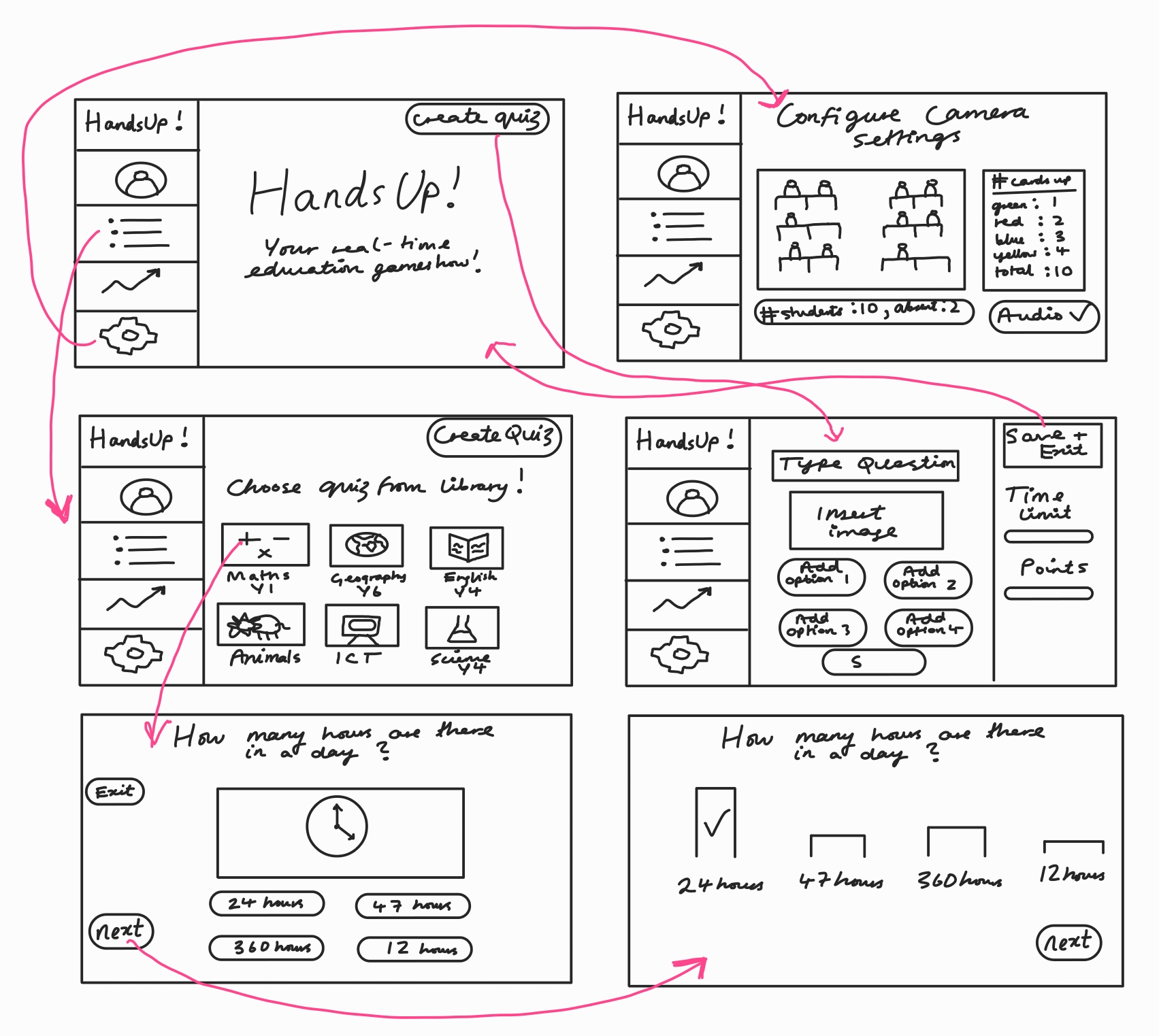
The interface was developed using Python and CustomTkinter, with a full-screen experience, bright autism-friendly colours based on the Zones of Regulation, and interactive buttons for navigation.
At this stage, UI considerations centered around visual clarity, color sensitivity, and providing feedback in a calm, non-overstimulating way. Font choices, layouts, and color palettes were selected in consultation with occupational therapists from the NAS.
Term 2: Change of Requirements
After a review meeting over the winter break, it became evident that our application was not meant to replace existing classroom software like PowerPoint or SmartBoard tools. Instead, it needed to serve as a lightweight overlay - a utility that runs in conjunction with these already established systems in the teaching space.
This change in direction prompted a full redesign of the UI architecture. We transitioned from Python to MFC (Microsoft Foundation Classes) in C++, allowing us to build a Windows-native, high-performing application that seamlessly integrates into the existing teaching ecosystem.
Some of our key design decisions included:
-
Always-on-top functionality: Ensures the app stays visible above slides, videos, or web browsers, without requiring teachers to change their flow.
-
Compact, movable window: Can be repositioned or dragged to a secondary monitor, supporting flexible classroom setups.
-
Offline capability: The app runs fully offline—an important requirement in many school environments with limited connectivity.
-
Minimal UI footprint: Displays only relevant information (e.g. color counts or hand detection), reducing cognitive load for the teacher and avoiding distractions for students.
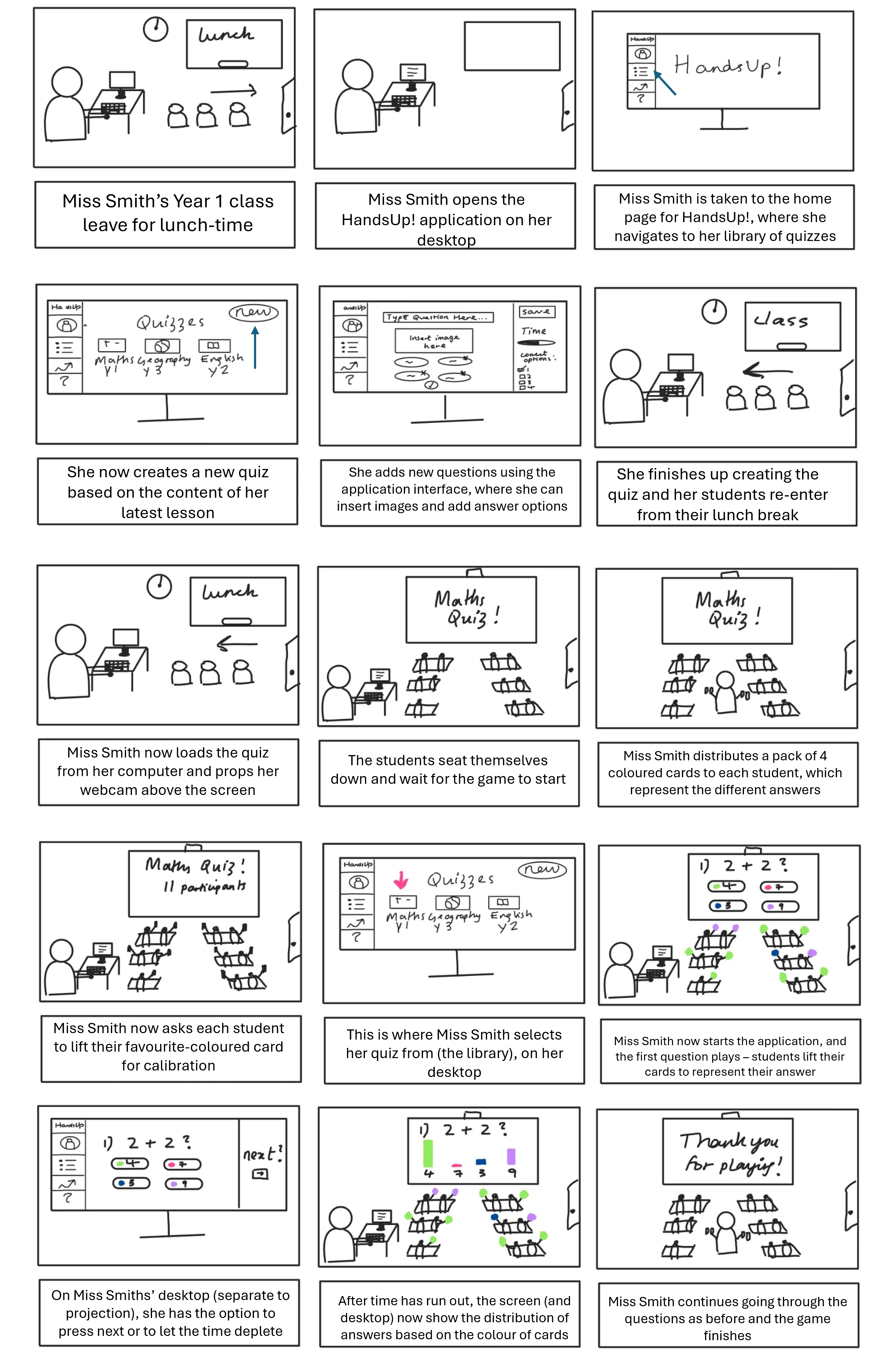
One piece of feedback that our clients at the NAS really emphasised was the role of the colour in neurodiverse learning spaces. They wanted to ensure that colours in our application were not too bright or overwhelming, and that they were autism-friendly, highlighting the importance of avoiding colours that correlate with emotion (known as the Zones of Regulation). However, due to our colour detection algorithm and difficulties in contrast between the autistic friendly colour palette (neutral tones) and the colours in the background scenery, we were unfortunately not able to go ahead with this. However, our clients understood and were happy for us to go forward with the 4 main colours: red, blue, green and yellow.
As mentioned above, our application design is simple and minimalistic with our user's requirements at the forefront of our design. Rather than drawing attention to the app, the main focus remains with the teacher's slides, allowing students to keep focused on the content rather than get distracted by the app visuals. Our application acts as an engagement tracker for the real time detection and counting of hands and coloured-cards raised.
Please refer to our screenshots below and our Implementation and System Design pages for further information.


