User Interface
Development of the User Interface
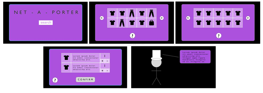
The front page contains the Net-a-porter logo and the search bar. We believe that this definitely ticks the goals of effectiveness and efficiency. The page contains minimum components but conveys all function clearly. We think this goes hand-in-hand with learnability in that it’s obvious to users that to find clothes to try on, they have to use the search bar to find specific products.
The next page was definitely done with the HoloLens in mind. We needed a design that was easy to navigate only with the use of gestures. So we thought a grid with big square boxes that can be used to choose specific products was the best for usability. The idea of a scroll was rejected as well because small and reactive movements are harder to transmit using the HoloLens and so we opted for a page system where you click buttons either side of the grid to change the page. We’re using voice input throughout for users that would like to use it. Voice isn’t as accepted as we would like so we have to left it as an additional option for navigation and manipulation. We have a question mark button that will open an additional panel that explains to users how to use the voice input and what commands to use.
All the decisions made during the design of the UI were made with UI1. UI2 is achieved as gestures and voice are the means of input. UI1 is general so we can’t refer to one specific design decision that achieves this. We’ve achieved through a course of decisions that have ensured that, as a HoloLens project, the user can begin using it with as little direction as possible and come away from the experience appreciating the ease of functionality.
