Testing
Testing Strategy
With a game, the main testing mechanism is through user tests and we conducted these through semi-structured interviews where we recorded the participants actions and whether they made error, with both an eye tracker and a mouse and asked them questions about the game's concepts, mechanics and design. User testing was carried out at different stages of the project with the results feeding into our design and development process.
We also carried out a series of unit tests on the critical logical components of the game, in addition to carrying out performance benchmark testing to measure the effectiveness of our efficiency improvements.
User Acceptance Testing
We carried out four user testing sessions and below is a summary of the results and the improvements made as a result of the user testing.
Participant 1 and Participant 2 each reviewed early prototype versions of the game, while Participant 3 and Participant 4 reviewed a later version of the game.
| # | Design | Usability | Start Menu | Pause Screen/Settings Menu | Game Screen | Storyline | Sound Design | Changes Made |
|---|---|---|---|---|---|---|---|---|
| 1 | The prototype's yellow and blue colour combination was distracting and the buttons should have shadows or gradients so they look like they can be pressed. Would also like to see the bottle flow through the pipes. | Using both the mouse and eye tracker is very easy, however the dwell time colour change in the prototype is not always easy to see. | Clear and easy to select the buttons. | Nice format for the buttons, but it's not clear which button is for sound effects and which is for background music. | Confused about why the level timer was going down in sharp intervals rather than gradually. The time limit before the water stored in the funnel disappears is too short. Would have preferred a selection box to also appear when a pipe or grid block is selected. Prefers one target pipe as multiple target pipes would make the game too confusing. | The storyline is an important and engaging aspect of the game and they would like to continue playing the game to discover more about the characters. | Found the background nature sounds to be boring, but really liked the water and button sounds. | Changed graphics design and colour theme to be more aesthetically pleasing and to fit the game's identity and storyline better. Changed buttons to have gradients and shadows so they look more like traditional buttons and also added a visible message in a bottle sprite to the water flow. In addition, the dwell time colour change was made to be more visible and the buttons in the settings menu were replaced so that they had more obvious meanings. The level timer was also changed so that it decreases gradually and the time limit of the funnel was increased to 1 minute and 30 seconds. A selection box was added to the pipes and grid blocks and we continued to use a single target pipe in our levels. We also changed the background music and also enabled users to choose which option they preferred. |
| 2 | The tutorial should be clearer and there needs to be a cohesive visual design for the game. Maybe make the information panel for the tutorial more central and change the police tape style border. | Easy to use but, the buttons need to be clearer. | It is slightly unclear what the functionality of the buttons on the Main Menu are without labels. | Would want to change the visual design to be more aesthetically pleasing. | Some of the pipes being 2D and others being 3D is slightly odd and the 3D pipes don't always line up when rotates. Would have expected a congratulations screen with information about how long the level took and then the message unlocked screen rather than having all the information in one screen. | Really likes the storyline idea and would also like the ability to read messages unlocked from previous levels again. | It would be good to allow the user to choose between different background music options. | Changed tutorial to be clearer and more detailed, with the game component being discussed being highlighted. Changed the visual design of the whole game to be cohesive and visually pleasing. Added labels to buttons to make their functionality clear. Changed all the pipes to be 2D with shadows that line up when rotated. Added a message library where the user can read through previously unlocked messages and enabled the user to choose between several background music options. |
| 3 | The buttons are quite large and easy to select and the labels make their functionality clear. The tutorial highlighting the game component it is explaining is incredibly useful. | The game is easy to use with both a mouse and an eye tracker, especially with the colours changing as dwell time increases. | Really likes the graphic design of the start menu as it sets the tone for the game. | The buttons are clearly labelled and are of a good size and the font is clear. | Likes the game's concept and finds it original however, the funnel design could be improved and it could be made easier to not accidentally open it. | Likes the fact that you can skip the storyline if you want to. | Found the ability to turn the sounds on and off really handy and likes the ability to change the different sounds. | |
| 4 | Likes the consistent theme of the buttons and the fact that the menus aren't too crowded. | Likes the fact that they have the choice to set the dwell time so that it is appropriate for them. | Found that having the button to start the tutorial on the start menu was eally strange and out of place. | Likes the fact that all the buttons are labelled. Really likes the fact that there are toggles rather than individual buttons for sound and music. Finds the currently selected dwell time being highlighted useful. Thinks that the back to game button should be a bit further away from the restart button. | The selection square is black and is hard to see against the sewer background. The grid is easy to see and is useful for placing pipes on, but the indicator for the number of pipes remaining could be made prettier. | Good part of the game which can add another reason to carry on playing but not essential and can be skipped easily if you don’t feel like reading. | Likes playing their own music so they are glad that they can stop the in game sound easily but, would have liked the ability to preserve user preferences over game sessions. | Moved the tutorial from the start menu to the level grid and moved the Back to Game buttons further away from the Restart Game button in the pause menu. Changed the selection grid to white so that it is easily visible and placed the pipe counters into bubbles. User preferences for example, dwell time and whether sound effects or background are on or off are now preserved across game sessions. |
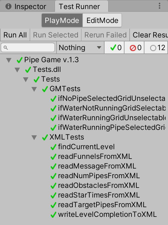
Unit Testing
We used Unity unit tests to test the critical, logical components of the game for example, Game Manager and XMLHandler.
Performance Benchmark Testing
We carried out several efficiency improvements and conducted benchmark testing to test their efficacy.
Using Object Pooling to reuse water droplet objects rather than constantly creating and destroying them
Initial Benchmark Tests
- Lowest CPU usage by Unity = 50.4%
- Highest CPU usage by Unity = 54.4%
- Average CPU usage by Unity = 52.1%
Benchmark tests after improvements
- Lowest CPU usage by Unity = 48.2%
- Highest CPU usage by Unity = 52.3%
- Average CPU usage by Unity = 49.8%
Disabling the GazeAware2d scripts when the eye tracker is not connected
Initial benchmark tests
- Lowest CPU usage by Unity = 47.8%
- Highest CPU usage by Unity = 49.7%
- Average CPU usage by Unity = 50.6%
Benchmark tests after improvements
- Lowest CPU usage by Unity = 46.9%
- Highest CPU usage by Unity = 49.7%
- Average CPU usage by Unity = 48.2%