Sketches

After writing our MosCow list, we started the initial HCI-focused research on our interface. Meanwhile, we also hosted meet-ups with our clients to illustrate our design focuses.

During our sketching process, we kept the 3 Key Usability Principles in Mind (Dix, 2011). A design similar to YouTube is chosen for learnability. Infinite scrolling and fast switching is used for flexibility. Icon hints are also heavily used for robustness.

See below for couple of sketches drawn for our intended user interface.

alternative alternative

Interactive Prototype Video

Following our sketches, we made a short video used to demonstrate our interactive prototype designed with Adobe XD's default toolkit (Adobe, 2019).

Evaluation of Prototype

Our team carried out heuristics evaluation on the above interactive prototype and asked couple of users to test out our UI. After we have collected the issues, we made changes accordingly to make the UI more accessible than before.

Table below is a list of problems we have collected by then.

HeuristicProblemSolutionSeverity
Consistency and standardsIt is not obvious that the title on the ”My” Page is clickable .Change the format of the title, and add an click icon next to it.2
Consistency and standardsIt’s not obvious for the user to close the search bar.Add an instruction below the button to help user find the correct way to close the search bar.2
Flexibility and efficiency of useWhen user is in the video page, it’s not very efficient to find the suggestion videoAdd suggestion video part in the video page4

HCI Design Highlights

We paid great attention to HCI when implementing our application, hence we are presenting some noteworthy highlights.
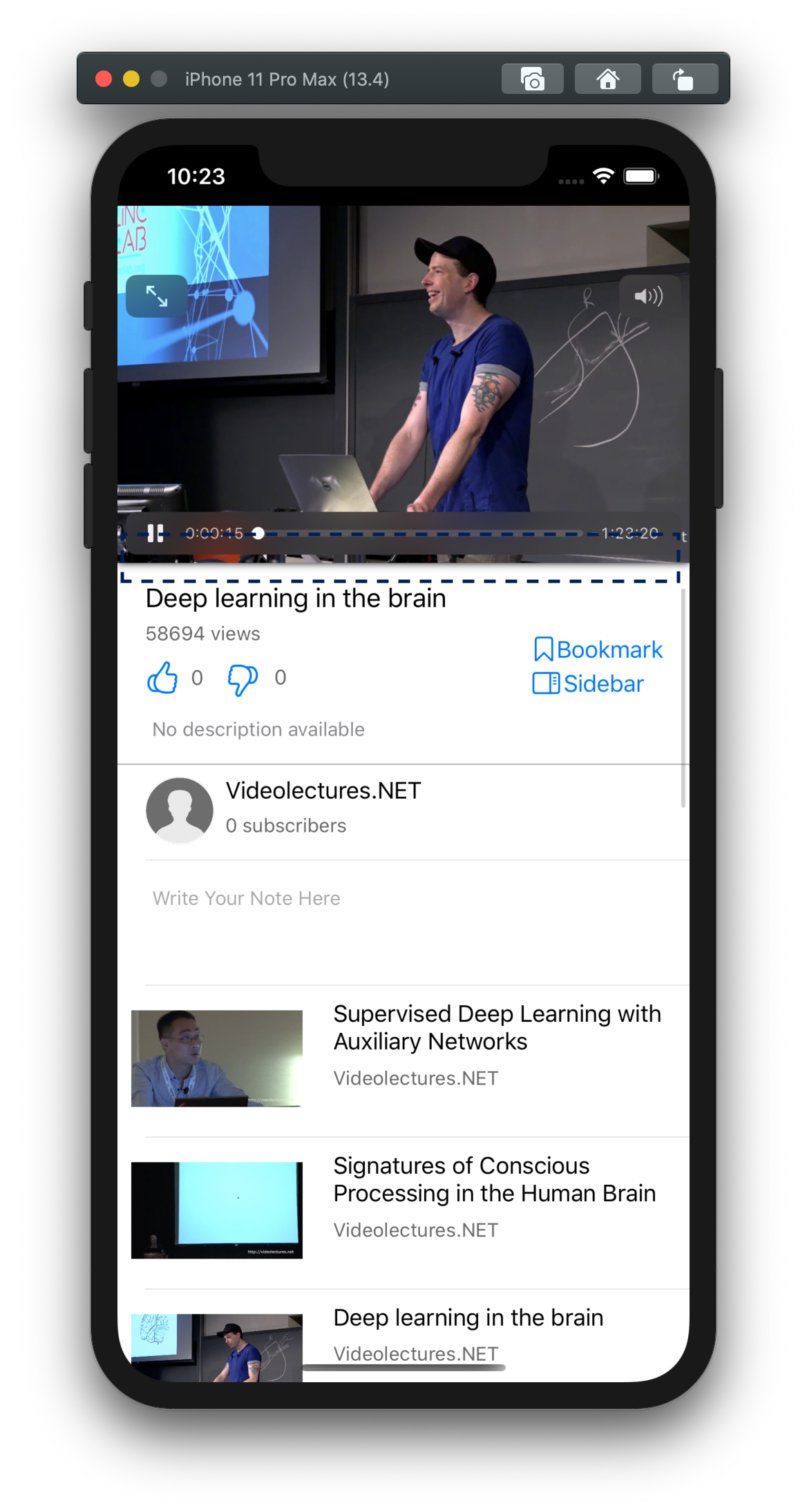
Shadow

alternative
alternative
alternative

Shadow is everywhere, and is a perfect tool for showing different levels and layers of elements on the screen. We used CGLayer to add subtle shadows to key UI elements on screen. Take PlayerView for example, the floating shadow hints user it is draggable and could be easily minimised by simply swiping down.
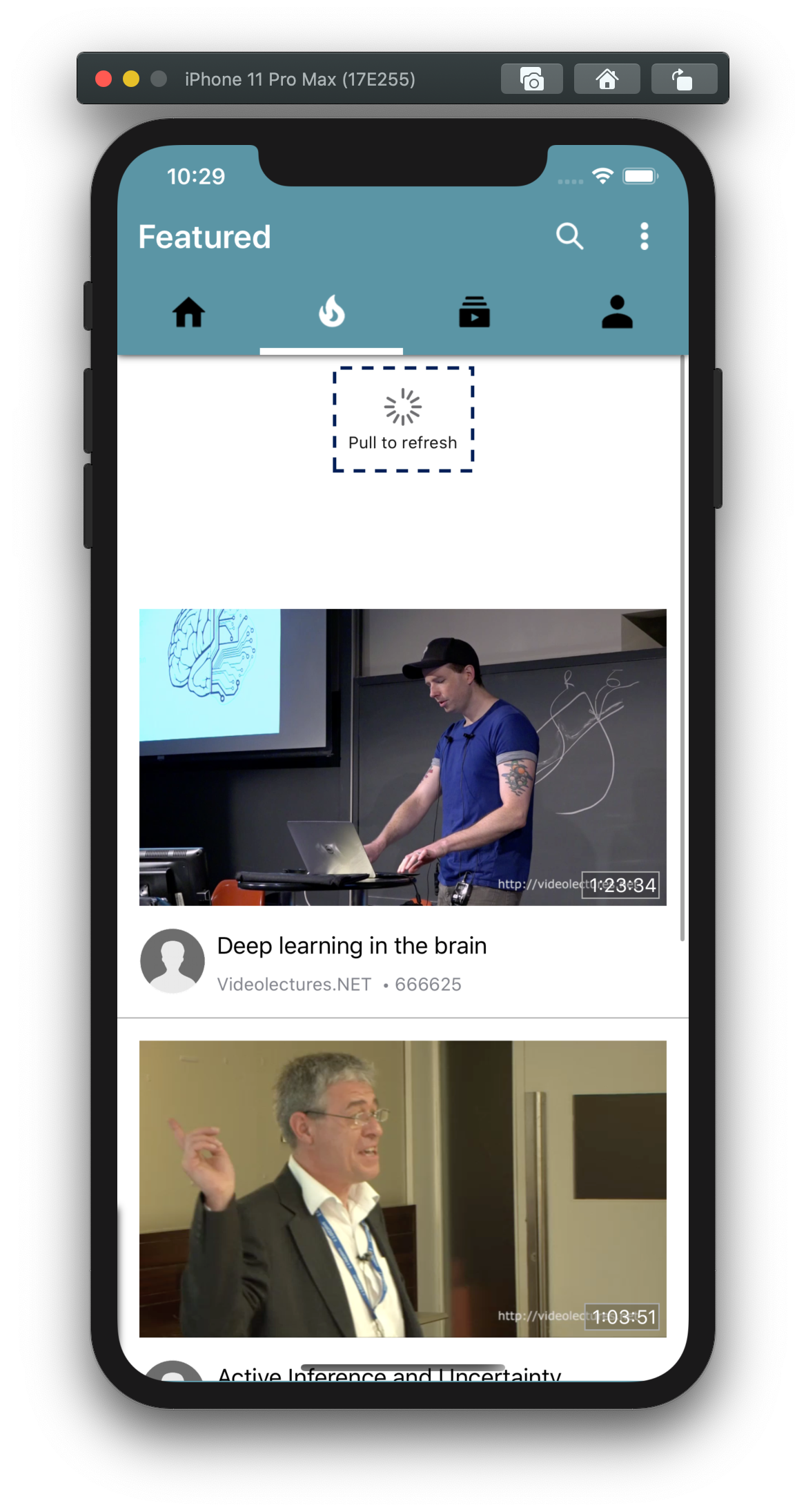
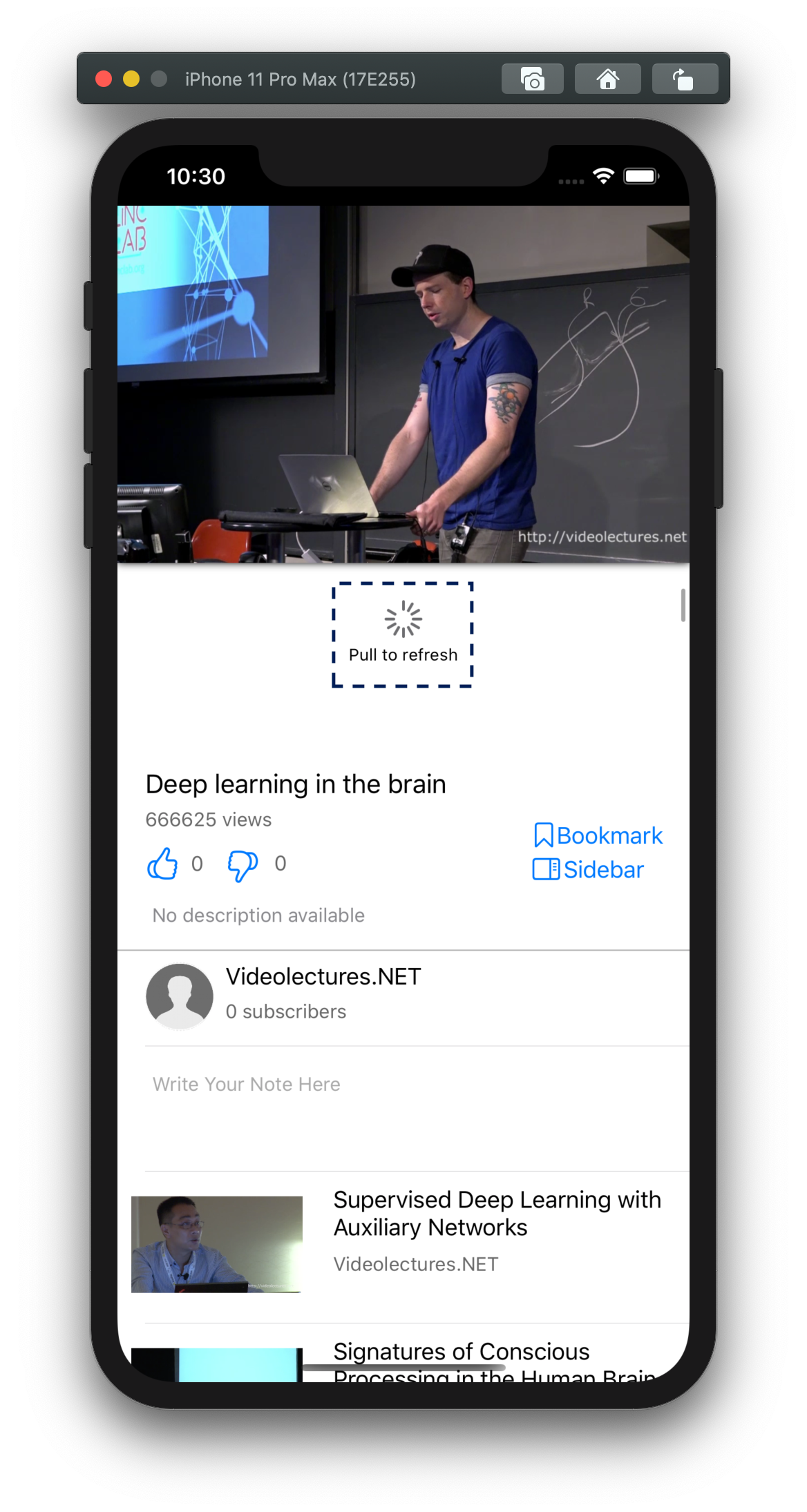
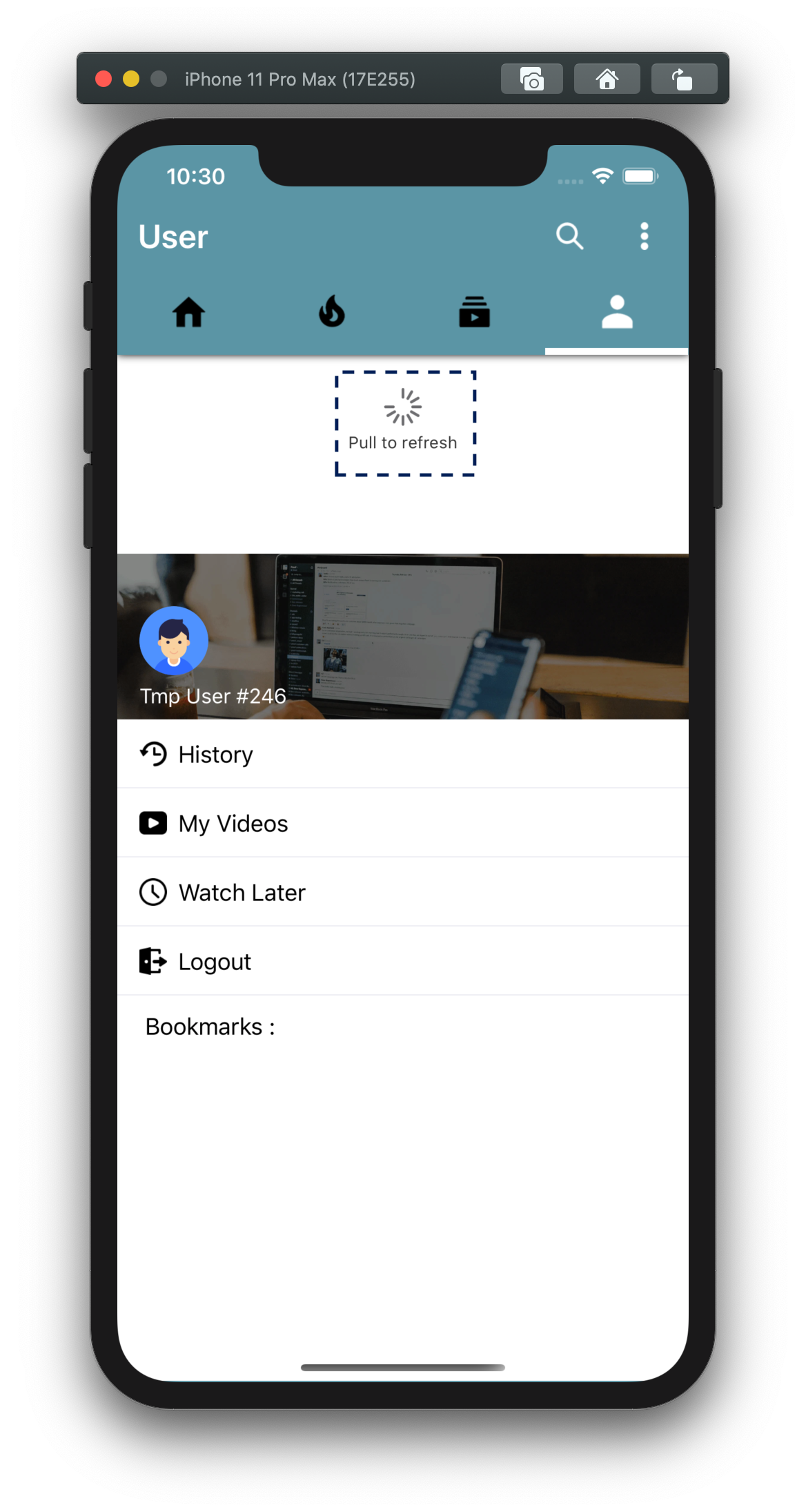


Pull

alternative
alternative
alternative

Pulling an seemingly un-pullable table could mean a lot. This could well be a desperate move made by the user when they find the View not loading correctly. Well, we considered this from a HCI standpoint and added pull to refresh for every single UITableView to make sure even if it is not loading correctly, users can make a second attempt.
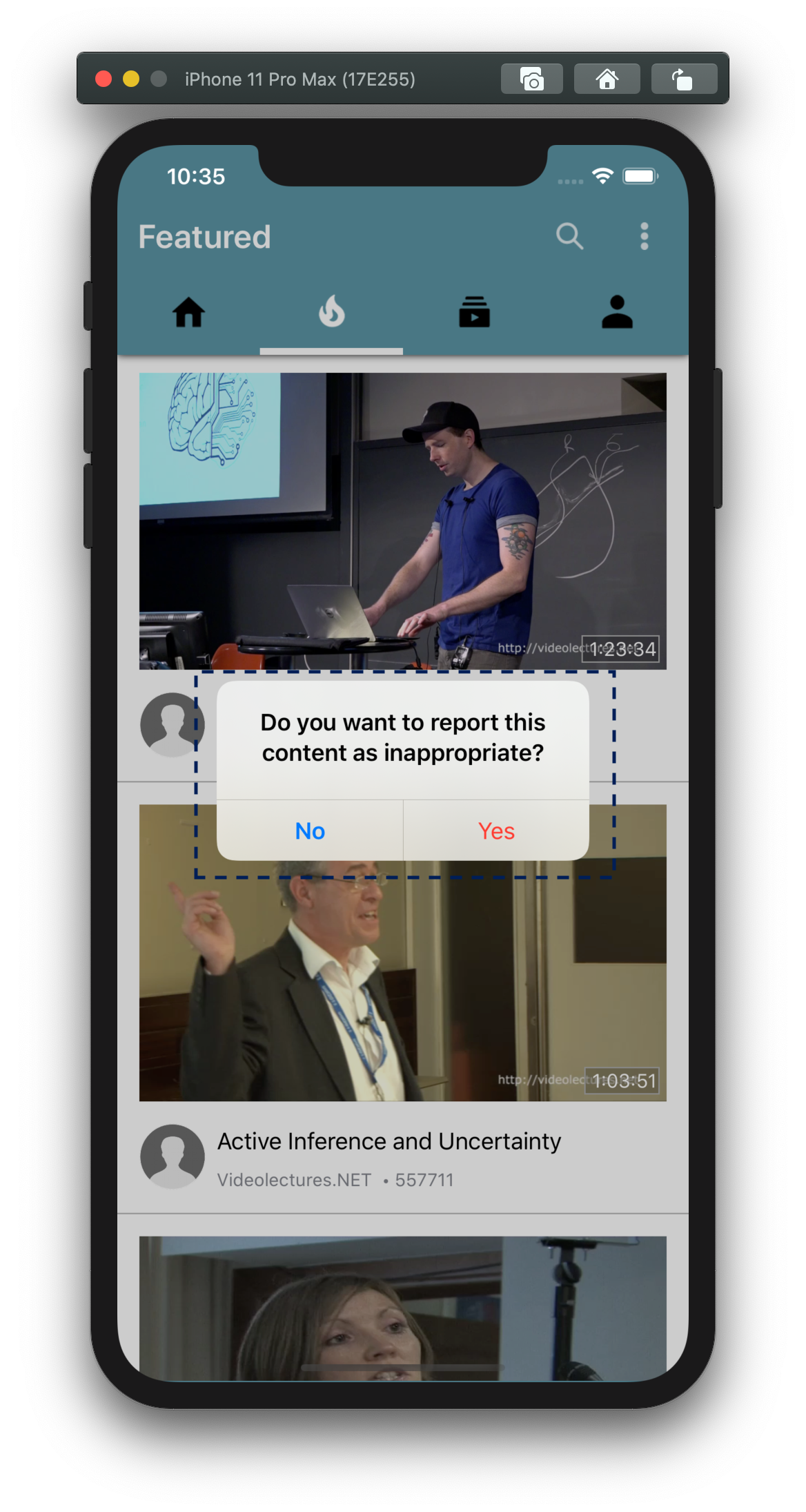


Pop Up

alternative
alternative
alternative

Pop up is generally bad as we do not want to make drastic measures to tell users want actions they are taking. However, in certain circumstances, we find them absolutely necessary and also used a UserFeedbackController to provide the iPhone's iconic haptic feedback when certain important events are happening.

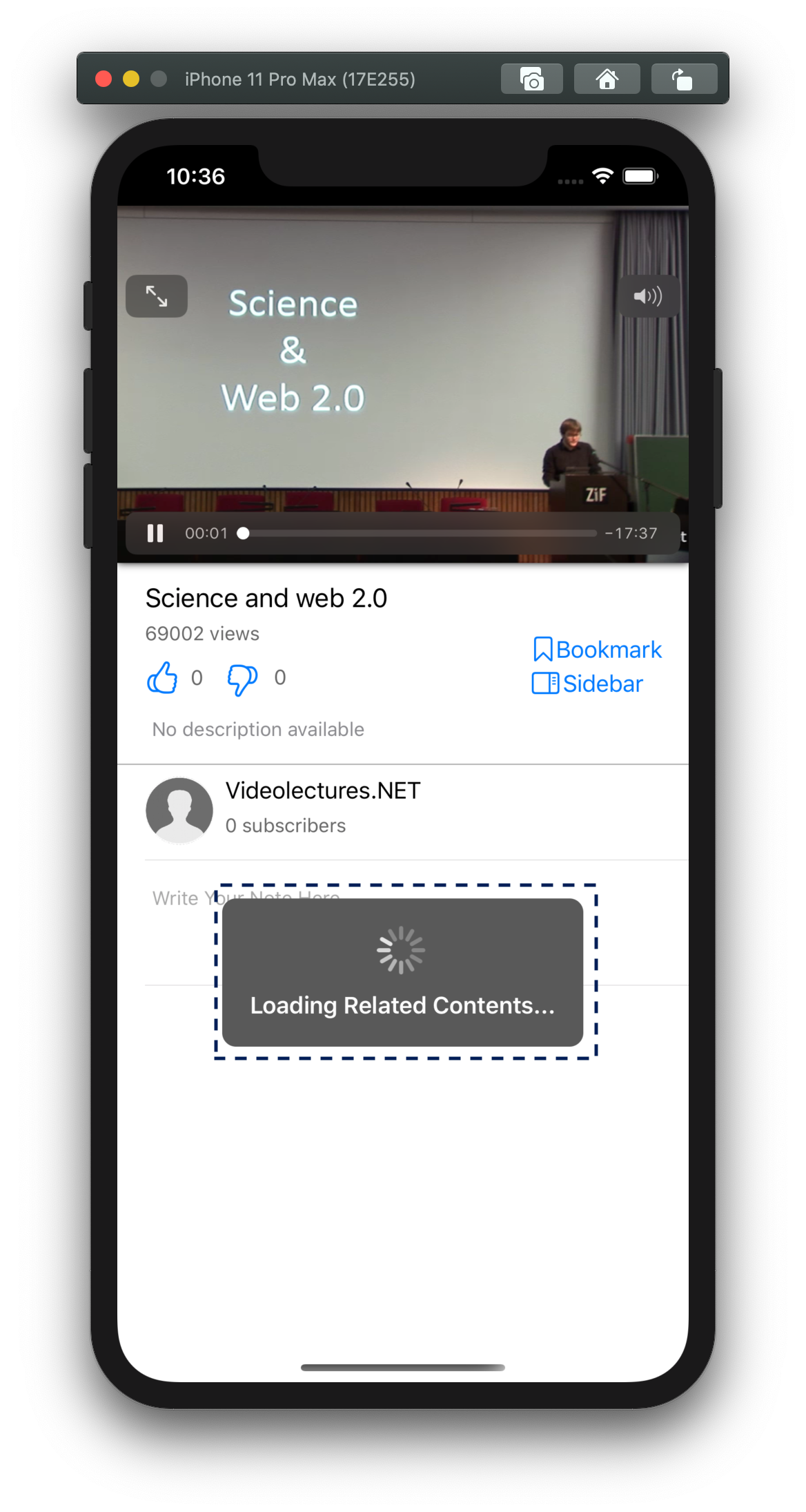
Loading Pop up is also useful so as it hides the View from user's operations. We can inform users to the loading progress as well as stopping them from touching loading contents and turn application into an unknown state.

References

  • Adobe.com. (2019). Download free Adobe XD | UX/UI design and collaboration tool. [online] Available at: https://www.adobe.com/uk/products/xd.html [Accessed 21 Oct. 2019].

  • Dix, A. (2011). Chapter 3 interaction. Human-computer interaction. Harlow [u.a.]: Pearson Prentice-Hall. ISBN: 978-0130461094.