UI design
Design principles
Simplicity
When designing the user interface (UI) for the configuration generator and skill viewer web apps, we wanted to make sure that the UI is easy, simple and intuitive to navigate. For the configuration generator web app, we decided to use a series of forms spread across several pages as it would allow users to quickly add data while focussing only on the part of the plugin they are working on. This provides a simpler interface for adding to and modifying their plugin configuration.
The skills viewer web app is formed of a single page and only contains a search input for entering URL, a select tag for choosing to sort skills by plugin or categories, and a list of skills; thus, the result is a very intuitive interface for users to visualise skills with only a few clicks.
Consistency
In the configuration generator web app, forms and components relating to intents, synonyms, regexes, and lookups are all on one page as they are all related to intents – what the user might say to Ask Bob in a query. The components relating to responses, skills and stories are on their respective pages. This separation of forms and items respects tolerance as similar items are grouped.
All forms use the same styling for inputs, labels, and buttons. The same hover and focus animations are used as well to bring about a more consistent design. Under each form is the list of items made by the form, ensuring that users understand where to find everything. As a result, after learning how to navigate one page, users ought to know how to navigate every page.
Visibility
When editing an item, the page scrolls up to the right place and the data of the item is filled automatically into the form. The text of the form changes to say ‘edit’ where it formerly said ‘add’, and the colour of the submit button changes as well. We chose to add this feature to clearly show the user when they are editing.
Text is large and clear and the font used is accessible. Furthermore, icons are clear, large, and have clear, hover and focus animations.
For the ‘add stories’ form, the ‘steps’ inputs can be drag and-dropped to be sorted. This allows users to quickly change the order of the steps and modify steps with fewer clicks. Each step has a draggable icon to demonstrate to users that they can be dragged.
Feedback
The configuration generator web app had validation functionality that runs whenever users make a change to ensure that only correct values can be entered into forms on submission; forms will not submit with invalid input. Furthermore, the users receive positive feedback when entering valid information into the form. This is done to ensure there are no non-printable characters that may cause the Ask Bob voice assistant to crash when parsing the configuration file.
Whenever users enter invalid input, an error message is shown under the input that caused the error. This provides a clear response specific to the input field, which also turns red to make it evident there is an error, thereby helping users quickly understand an error has occured and how to fix it.
The skills viewer handles errors caused by the user entering an invalid endpoint by showing an error message. The app does not crash in this case, and no skills are fetched.
Tolerance
Users can edit form data by clicking on the edit gear icon at the top-right-hand corner of item components. For example, when this is done for an intent component, the data of the selected intent will then automatically be filled into the form to be edited. This allows users to easily edit misspellings or small mistakes without deleting or adding the item again.
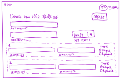
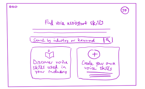
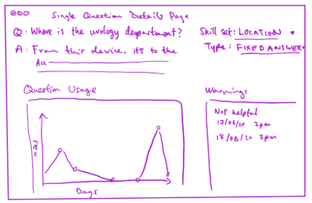
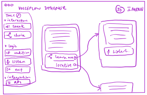
Hand-drawn sketches
The following sketches were made when we were initially designing the configuration generator web app: