UI Design
Section 1 - Overview
With Babylon Studio, we set out to develop a User Experience (UX) that is simple, minimal, accessible, and understandable, without having to sacrifice on performance and functionality. We focused on 3 key design principles that guided our decisions for the User Interface(UI) elements, which are detailed below.
The UI has undergone several rounds of iteration and modifications to the end goals in order to better align with our target demographic and to correct areas of improvement that were identified during our Research and Testing phases. This eventually resulted in a well-refined UI/UX that is better suited to our appliacion, as well as our target demographic, than our initial prototypes.
Section 2 - Design Principles
Our vision for our platform's UI was centered around building dynamic, descriptive, and responsive elements. These 3 pillars aim to reduce unnecessary on-screen information and offer a cleaner and more enjoyable UX.
Our minimal and dynamically resizable two-pane window allow both sections of the app to vary in width, allowing users to set their preffered panel size. This also allows us to adjust use the app from any aspect ratio or screen dimensions.
Keeping our young audience in-mind, we also implemented control interfaces with clear labels or icons that concisely describe their purpose. This reduces the need for additional help and lowers the learning curve for wokring with Babylon Studio.
We also focused on providing real-time feedback to users through the extensive use of Next.js state and context callbacks. This allows us to receive, process and show updates made on the the app near immedietly. This is all client-side processed to take away server and network latency from the equasion and provide the user with fastest possible feedback for each of their actions.
Section 3 - First Sketches
We began development with rough sketches of a UI window:
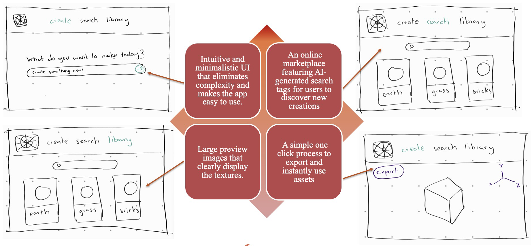
After a few iterations, we came up with the following idea:
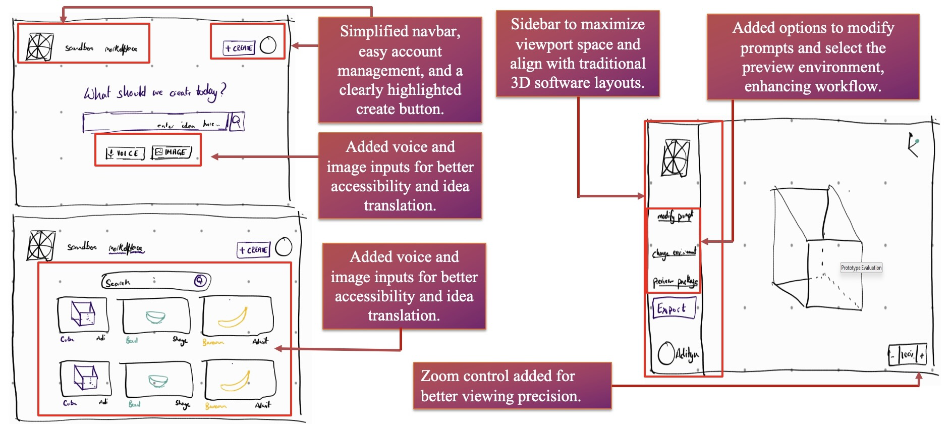
We felt that this a strong base to start with, and chose to build a prototype based of these sketches in order to test its effectiveness and gather user feedback for further improvements.
Section 4 - Prototyping and Initial Wireframe
Our first demonstrative wireframe build, based of our sketches:
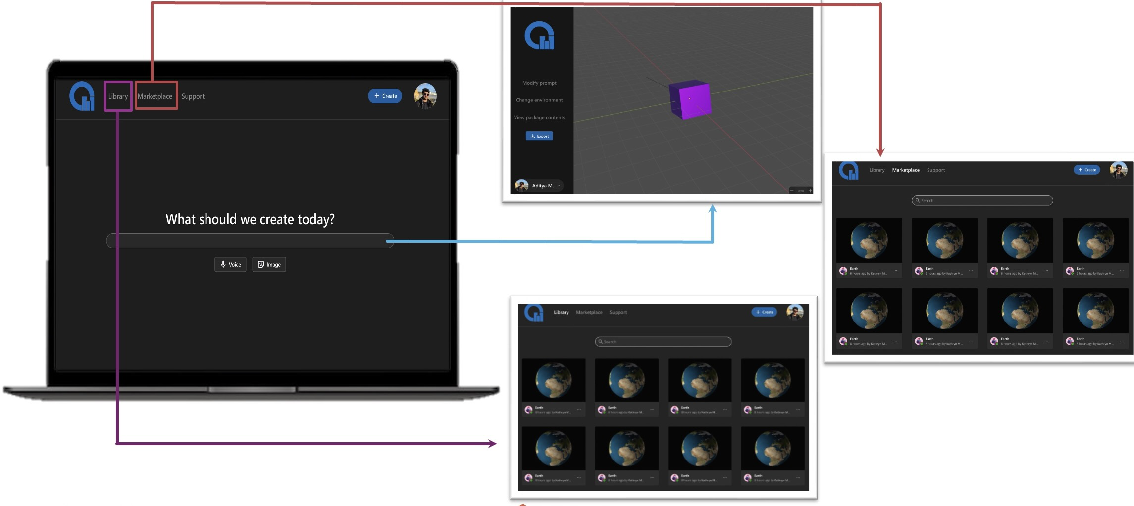
and after a few more iterations, we finally settled on:

where:
1 - Adds overflow containers to clean up the home page and make scenes visible only if the users wants to see them.
2 & 3 - Highlights important information on the current page, providing a clear visual hierarchy for user attention.
4 - Simplifies the input promt to make it more usable and accessible.
Section 5 - Re-Evaluations & Final Product
During the course of our project, we made several key changes to our objectives that resulted in the final product being different to our initial prototype idea. During our re-evaluations, we acknowledged that a block-based interaction system would be far more effective at learning the nuances of 3D scenes. Having pivoted to blockly, we went through a similar process of iterating and prototyping till we eventually settled with the a satisfactory UI.
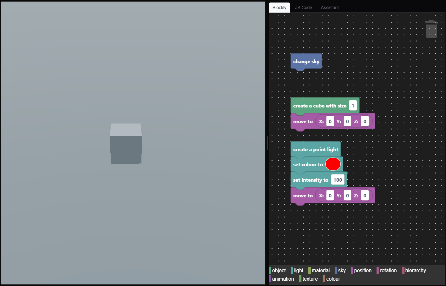
This version of the UI is what we shipped with the release build of our platform to our clients.