HCI Design Principles
Visibility
Visibility involves creating interfaces that clearly display functionality. When
functionality is not visible on the interface it makes the functionality more difficult to
find and to
know how to use (Sharp et al., 2019), thus increasing the cognitive load for the user. Users
should
know how to
access important functionality just by looking at the interface.
To apply this principle to our project, we ensured that all of our major features are
clearly
displayed on the user interface.
One example of a place where we applied the HCI principle of visibility is when users want
to
add a patient. Accessing this functionality requires clicking a button.
We did the following
to satisfy this design principle:
☑ Coloured it bright green.
☑ Labelled it.
☑ Positioned it at the top of the page.
☑ Made it large.
Consistency
Consistency involves designing interfaces to have similar operations and use similar
elements for achieving similar tasks (Sharp et al., 2019)
When an interface does not adopt consistency it can be confusing for users to navigate it.
To apply this principle to our project, we ensured that all similar features/characteristics
are
displayed in the same way on the interface.
Some examples of places where we applied the HCI principle of consistency are as
follows.
☑ All booked slots are green and all unbooked slots are yellow.
☑ Add appointment and add patient buttons are both green.
☑ Add appointment and add patient buttons are both in the same place on their respective
pages.
☑ Update and cancel buttons are the same for appointments and patients.
☑ Search fields are in the same place on the patients page and appointments page.
Feedback
Feedback involves sending back information about what action has been done and what has been
accomplished (Sharp et al., 2019).
The interface should provide feedback when users make an action, to show the current status
of
the system.
For our web app, ocularists and admins should be recieving feedback about their actions,
specifically, to inform them whether their actions were successful or not.
To apply this principle to our project, we ensured that all of our major features provide
feedback if deemed necessary.
One example of a place where we applied this HCI design principle is when users fill out
forms.
We did the following to satisfy this design principle.
☑ Provided text feedback.
☑ Provided colour change feedback.
☑ Outline on the currently selected field.
☑ Submit button changes colour when clicked.
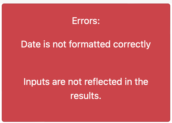
Above is an example of a typical error message that a user may encounter on our system. This
meets HCI design principle
of feedback as defined by Sharp et al., this is because the message tells the user what has
been done and what has
been accomplished.
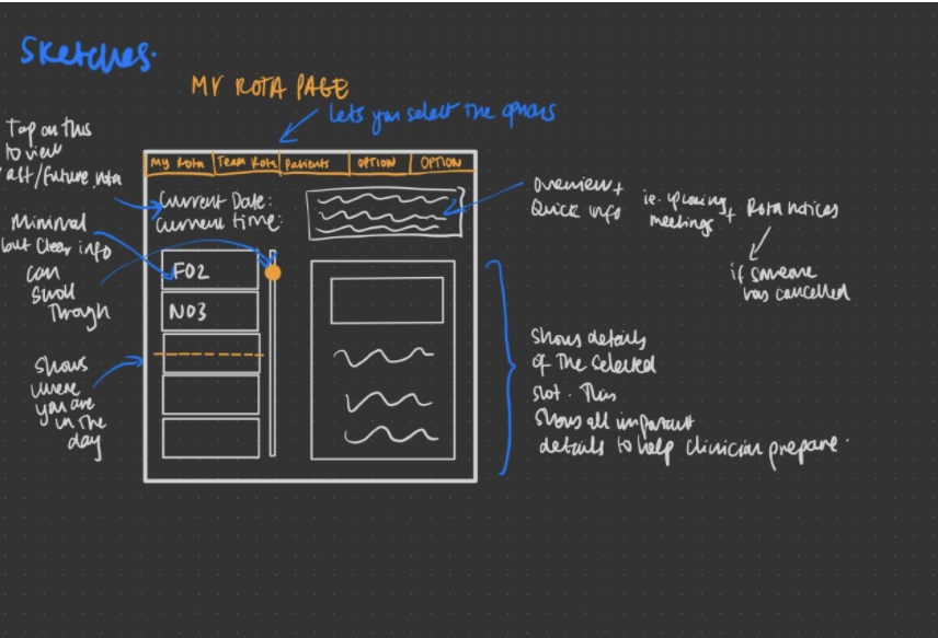
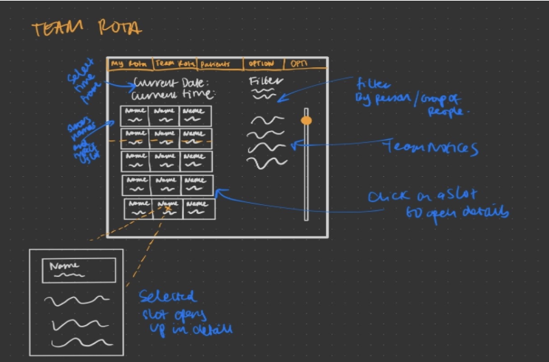
Our Sketches
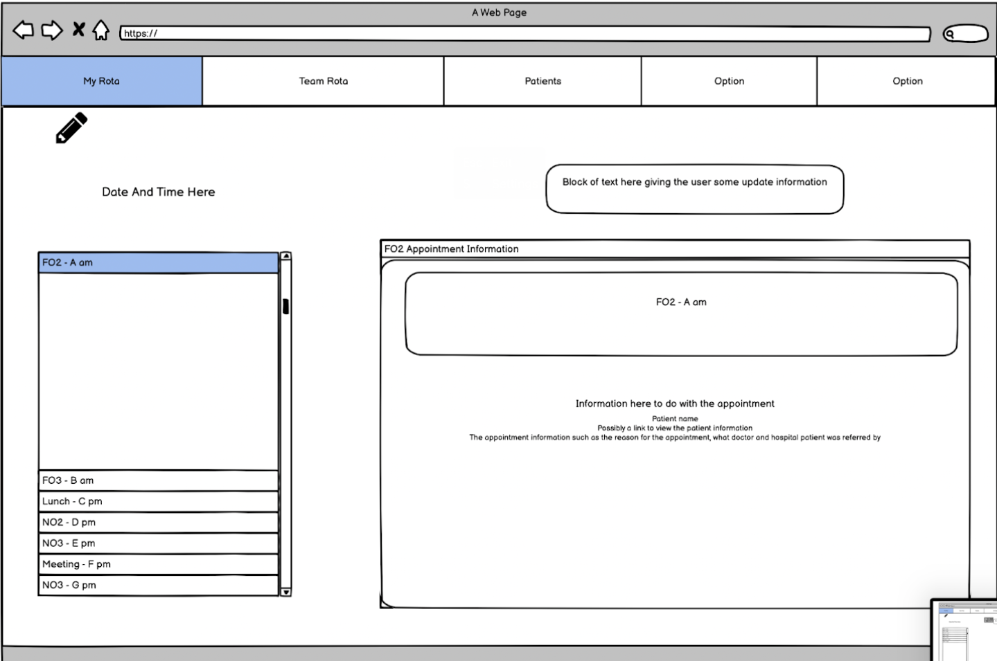
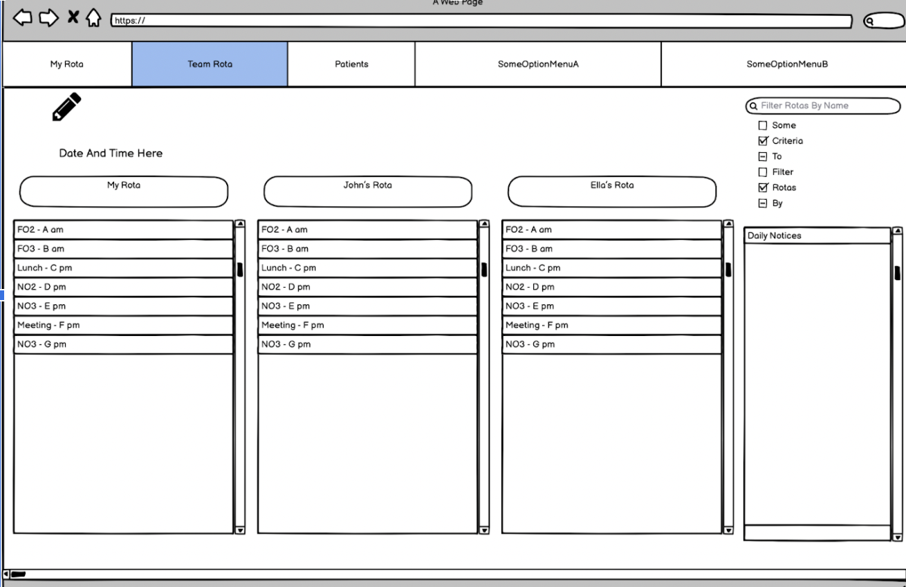
We drew sketches for my rota and team rota page and made an effort to adopt the HCI design principles. Our sketches allow ocularists to easily see their schedules for the day. We designed a highlighted pointer to the current location in the rota. This rota tells the user what slot they are in currently, without having to cross-check with a watch or clock. The idea of “clicking on a slot to see the information” allows the user to be presented with an abstracted view but also have the flexibility to view and edit the information at a granular level. We also came up with the idea of a notice box. This will keep ocularists up to date with any changes in appointments.
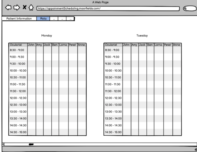
First Prototype
First, we created a prototype with Balsamiq. We presented this prototype and all of our sketches to the users. When we reviewed this prototype we found that it is very similar to the current system, this is the system that the users already have so many problems with. However, they particularly liked features from one of the more updated sketches, after receiving this feedback we considered alternatives and created another prototype.
Second Prototype
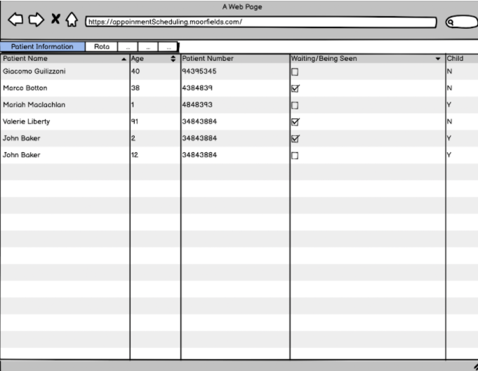
After considering the feedback from the users on the first prototype, we created a new prototype of the system. User feedback suggested that too much information was shown at once. To fix this problem we made an extra effort to keep relevant data together and we added expandable menus, scroll bars, checkboxes and search fields. This functionality helps the user view only the information that they want to see, therefore it solves the largest concern that users had with the last design and the current system.
Evaluation of Prototype
We used heuristic evaluation (Sharp et al., 2019) to evaluate our prototypes. Here is the evaluation of our first prototype, the solutions were reflected in our second prototype and in our final product. Severity is measured out of 5
| Heuristic | Problem | Solution | Severity |
|---|---|---|---|
| Flexibility and Efficiency of Use | Ocularist should be able to filter the information about the patient, to view only the relevant information about one patient. | Add filter functionality to view patient page. | 2 |
| Visibility of System Status | Need an option for a user to mark patient as arrived. | Add an “Arrived” checkbox next to each patient in the rota. | 1 |
| User Control and Freedom | Need the ability to change an appointment type and/or the ocularist that the appointment is booked with. | Added an edit appointment option to each appointment in the team rota. | 2 |
Reference : Sharp, H., Rogers, Y. and Preece, J., 2019. Interaction design. 5th ed. Wiley, pp.549 - 561