UI Design
SKETCHES
First sketch
We had two sets of sketches which were improved over time. The first design was our initial attempt.
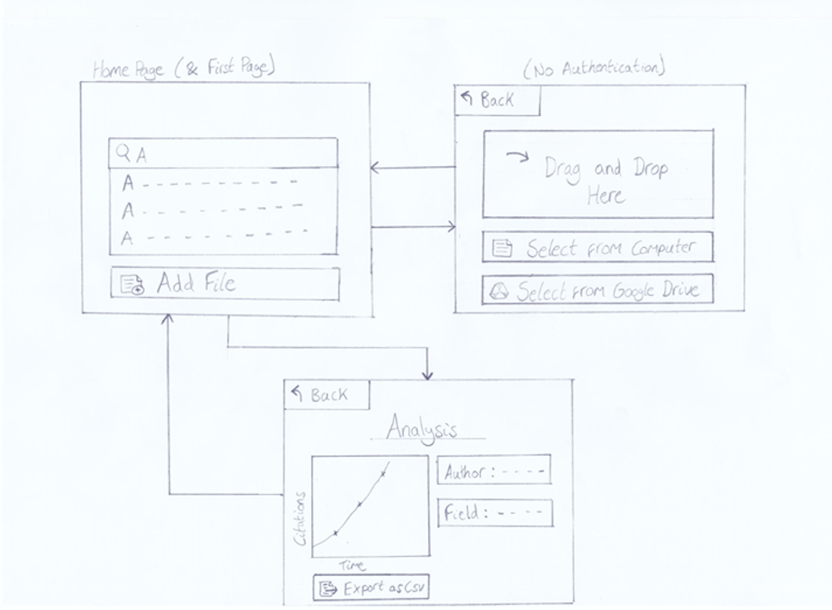
We wanted to discuss what our client thought about our design.
We are arranged a call with our client to get a feedback. After the feedback
, we came up with another design
which had the best features from the first
one but also some suggestions from our client.
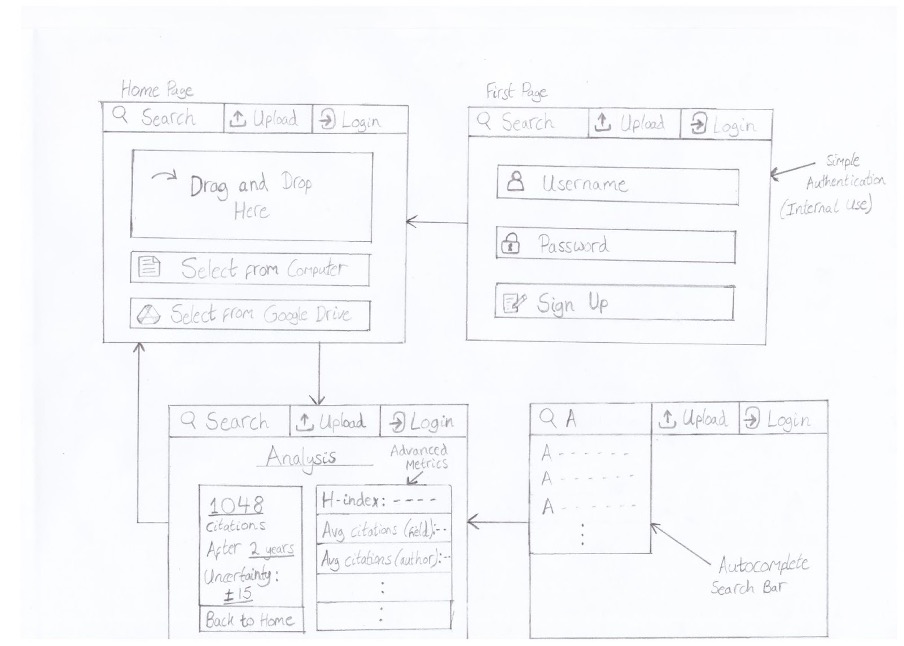
Second sketch
The second sketch has been improved and was used as a basis for the prototype
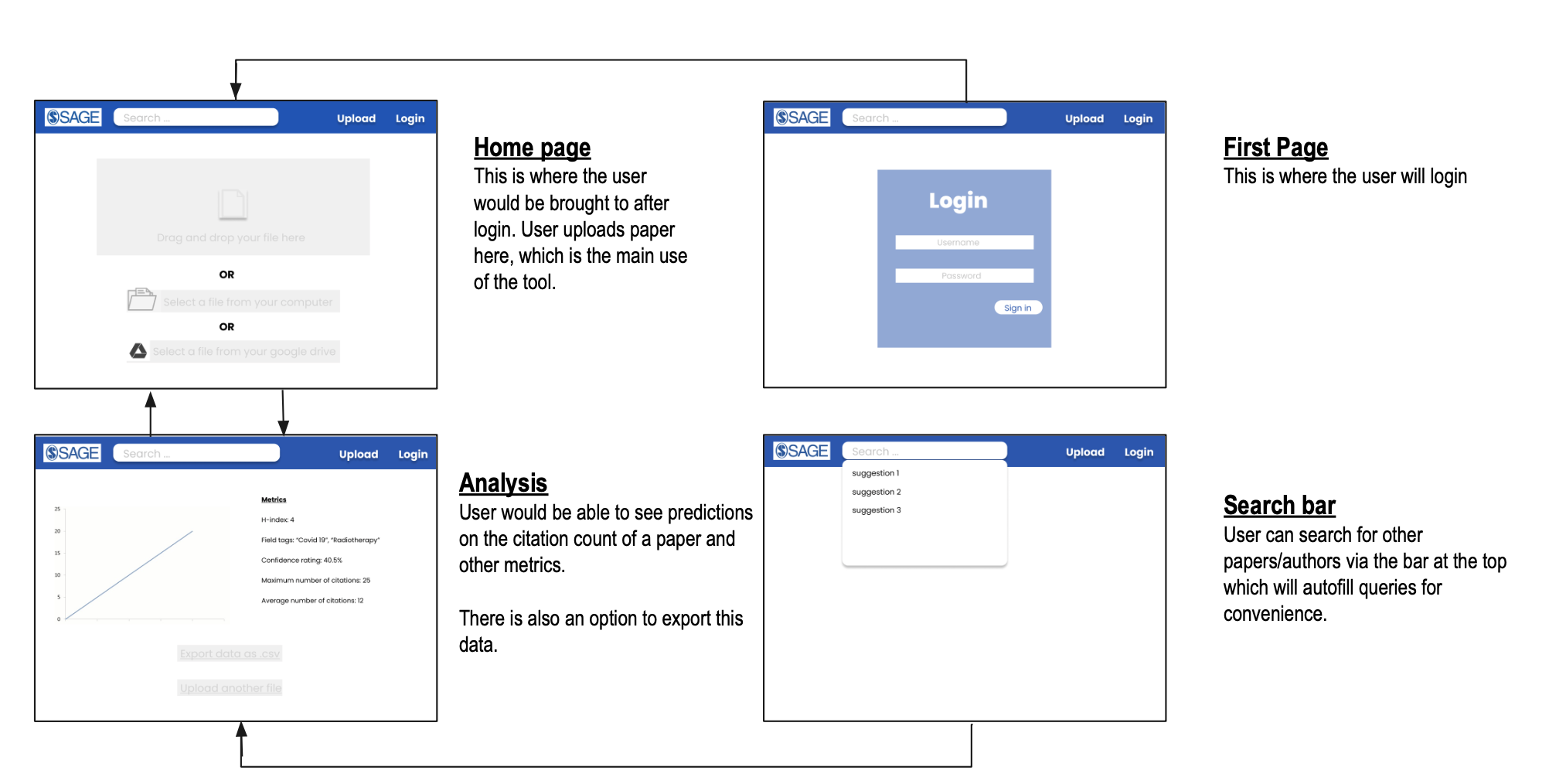
Figma Desgins
We had two sets of sketches which were improved over time. The first design was our initial attempt.
Design principles
- Simplicity
- Our approach is very straightforward and simple. Our UI is also minimalistic
- Our solution doesn't not include unnecessary buttons and text boxes to confuse th4 user
- Consistent
- We have used the same design and style across all the pages in the webapp.
- Visibility
- Our program has clear indication on what all to add and do as going through the page. There is a step-by-step structure for finding the citation prediction
- Feedback
- Our web app prints or displays messages to inform the user if the previous command was successful
- For example-
- After uploading the file , depending on the extension and if the file can open , there is either a tic mark (successfully uploaded file) or a cross mark ( error)
- The citation count is printed along with abstract and title
- For search bar , if the DOI is correct it display all the details. Otherwise it displays “Invalid DOI”
- Tolerance