UI Design


Design Principles

We had some principles in mind while designing our GUI to make it user-friendly as this is extremely important since our target users are members of vulnerable groups. Some of these include:

Visibility

We made sure to use large and readable font sizes. We also used contrasting colours in our GUI, especially light background colours and dark texts so that no text camouflages in the background and creates confusion for the users.

Clarity

We have used simple and easy words for the users to understand. Additionally, we have added images corresponding to each functionality so that there is no uncertainty when navigating our program.

Consistency

We have been consistent with our placement of buttons and colour schemes throughout the application so that the users know where to expect certain options (for example, where the back and home buttons would be on a page).

Accessibility

Since users are using their hands to navigate, most of the buttons are kept on the bottom half of the screen to avoid users from lifting their hands high for long periods of time. We have also made large-sized buttons so that users can easily click on them, avoiding unnecessary precision.

Sketches

Initial Sketches

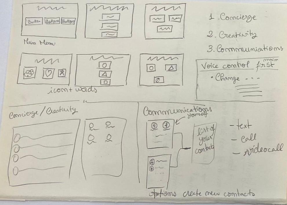
After gathering requirements by conducting interviews and creating personas, scenarios and use cases, we sketched a few designs to have an idea of how to place different functionalities in our program. We ended up with four main pages: homepage, communication, concierge, and communication. We used these designs to get feedback from the clients.

Final Sketches

After receiving feedback from the client, we improved our sketches. Some of the suggestions were that the buttons should be placed horizontally on the bottom to make them more accessible since users would not need to raise their arms a lot. Furthermore, the homepage would be more engaging with a newsfeed and a reminder list.

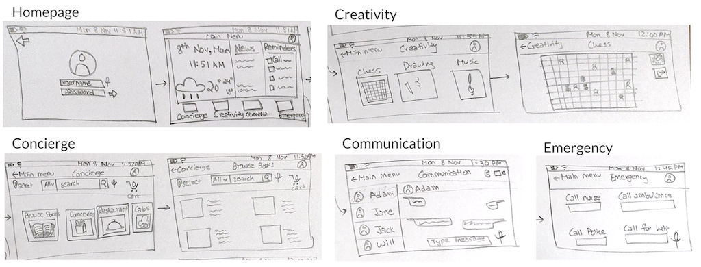
The improved sketches are below, with an additional emergency page added:

Wireframe

Initial Prototype

Once we were confident with our sketches, we decided to use Figma to create our prototype. Figma is a prototyping tool that can be used online and several people can edit the same prototype together. We decided that this software would be a good fit for us to use since we were working online due to the pandemic. We also linked the pages to each other so that clicking on a button during prototypr testing would take us to the expected page.
The design we created using this tool is below:


Evaluating Prototype

After receiving feedback from the prototype testers, which were the members of other teams, we made a table of heuristic evaluation and rated the severities as listed below:

Severity Ratings:

0 = I don't agree that this is a usability problem at all
1 = Cosmetic problem: need not be fixed unless extra time is available
2 = Minor usability problem: fixing this should be given low priority
3 = Major usability problem: important to fix, so should be given high priority
4 = Usability catastrophe: imperative to fix before the product can be released


Improved Prototype

Bellow you can the improvements we made to our prototype. These improvements correspond to the colour codes on the prototype evaluation above.