Loading...
We designed two sketches that we’d use for our app, and then will use the questionaire to see what users prefer.
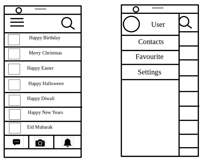

While the first sketch was intended to be a scrollable list of templates, and swiping right for a context menu, the second sketch is more so a box format, with a single button at the bottom that will contain a floating menu. The intention of the first sketch was to showcase the templates first and foremost, while keeping all the other stuff hidden from plain sight, while the second sketch focuses a bit more on accessibility for said stuff, by keeping it within easy reach for the user.
After running a second questionaire related to sketches of the app, we found that users prefer the first interface, although one noted that it was slightly too cramped.
Based on the Sketch and user feedback, we made our initial prototype of the app, by making the homepage, template page and editing page.
We redesigned it with the intention to make it more minimalistic.
We did it by removing many of the seams that made the sketch feel rigid.
We tried to make the interface consistent with the industry standards to lower the learning curve as much as possible for the users.
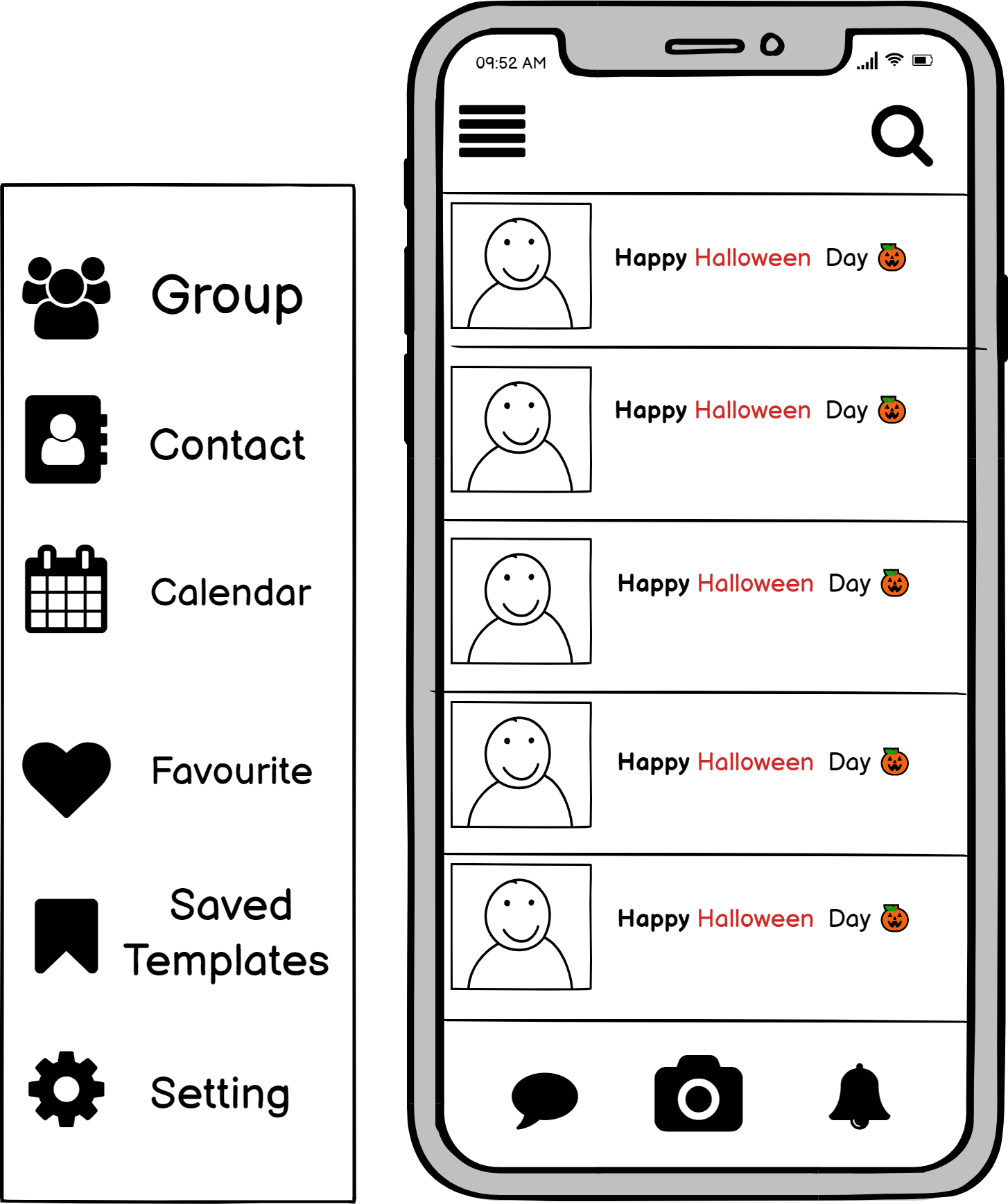
This went through a few iterations, improving its flexibility and efficiency each time. In the beginning, users could only scroll to select templates. We first added the ability to like templates to make good ones easier to find as they will come up first. After that we provided users with three sorting methods.
These options are available on both the saved templates and the search.

We designed this page with the intention of making it as easy as possible for the user to spot the tools they need to prevent errors.
The user can upload videos and music as well as search for pop up animations that we either provide or that were posted.

Yuni is just a normal student. After a session of card writing, she realizes that she spent quite a bit of time on it even though she has course work to do. She downloads the app thinking it would help her save time in her future endeavours. When her next friend’s birthday comes up, she loads the app, quickly finds a template she likes, writes her message and adds her friend’s favorite cover of happy birthday. She then sends it without having to go find a mailbox and saves her greeting to use as reference to make her next one even faster.
Maple has been a lawyer for over 20 years. As it is an independent job, she needs to get her work directly from her clients. She has made a tradition to send handwritten greeting cards over the Christmas holidays to her friends and clients to keep in contact and spread some cheer. However, this process is very tedious and time consuming for her, as the list of people increases every year.
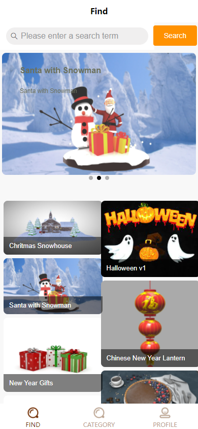
For our final UI, taking inspiration from both sketches, and additional ideas we brainstormed, and decided to go with sketch 2 layout of the greetings, except with a few additional things. We placed a search bar at the top, so the user can easily filter through the different models. Underneath it, we have a rotating cycle of different greetings the user could use before the actual list of greetings available.
At the bottom of the page we have a context bar, to switch between the finder, categories and the profile section of the user, keeping thing minimalistic, yet easy to detect and understand.

For the category page, we kept things organised, and had all the different festivals and occasion tucked to one side of the screen, while the rest of the space can be used to display each message available to use, as well as giving the creator of said message, when the holiday is supposed to be next as well as when that particular message was uploaded to the app.
The user profile page will be used to save any interaction the user has done on the app, including their own posts, while also being the place to change any settings. While originally we intended to use a context menu pop up with the three dashes at the top left corner, we decided it was better to just have a dedicated page for all this stuff, and allow for extra screen real estate on the templates page.
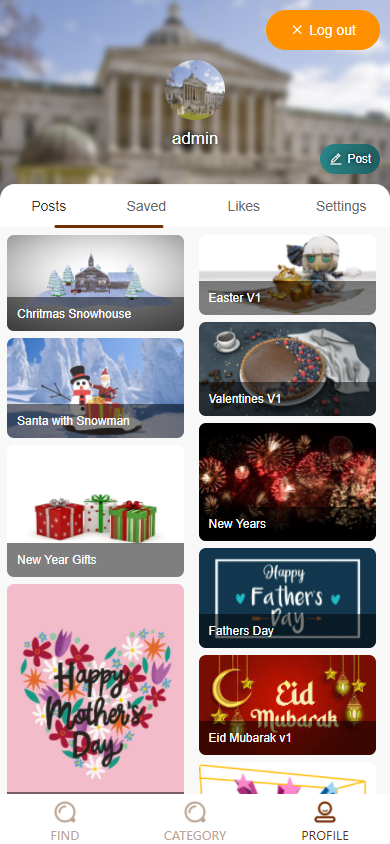
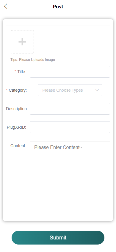
To actually post anything, the user just has to select the post button on the user profile page, then just fill in the necessary details, and it will soon be uploaded to the server.
On the user page, the user can register the accounts and log in here. The GDPR policy is also available on the registration page.