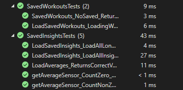
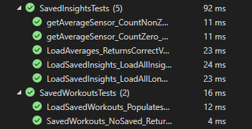
Users will undoubtedly use this app every day, in order to make it error free, we had to thoroughly test it, both by using the app every day ourselves, as well as testing it through series of unit and integration tests. In our use case, we tried making the testing process as intuitive for the developers, as the app is for the users. From a high-level perspective we realised that there are to main aspects of the app, which are not only crucial for its functioning, but represent the foundation for any future modifications to the app. We know there are two core components, since everything a person does in the app is either directly or indirectly connected to creating, saving, editing, as well as recording workouts or reviewing the insights about past exercises. Therefore we decided to focus our testing on those two key points.
In the real-world, Project-VeloCity will be used by a range of people in a variety of circumstances and so in the process we must consider human behaviour and how one would/could interact with the app. Consequently, every aspect of the app must be thoroughly tested to ensure it is capable (or not) in dealing with a variety of user behaviour.
The aim of Project-Velocity is to aid users during their workout and provide a user-friendly assistant to ease the workout process and so the app’s functionality should be tested against this precedent thus meeting all the users need
We used xUnit as our testing tool, mainly testing key functioning components for the app with unit tests. Additionally, in order to simulate interactions between multiple components of the app, apart from testing individual parts, we used integration testing approach where we tested the important functionalities such as saving and extracting data about both saved workouts and insights, which represent the core use case of our app. In the following section we will discuss further the results of our testing.

.png)
Unit tests include workouts and insights, which represent the core for not only that part of functionality but overlap with any new addition we had in the app throughout its development. Making sure that foundations hold despite any modifications was crucial in keeping it safe and free of malfunctions. Furthermore, in order to provide isolated testing, we created an entirely new project on its own branch, where not only can we test the models separately from the interaction of the user, but provide a layer of independence, making sure that functionalities of the app are safe themselves, and therefore mitigate the functional errors which could eliminate the seamless and intuitive use cases that we were trying to build for our users. Going layer by layer in the foundational aspects of the app, we managed to build an app which will be modular, since the core of it will be separated

Integration testing required us to identify what are the high-level functionalities we had for our users. We found that, at its core, the app needs testing for two specific points connected with insights and workouts, and those two points are quite intuitively, saved insights and saved workouts, respectively. Since we are saving the insights we had to mock adding of the workouts to the dedicated folder as well as extracting them from it, checking the correctness of their count in the process. Similar aspects applied to insights, although due to its inherent greater complexity, we had to add additional test cases, which would test its broader functionality with the regards to the high-level aspect of the app.
To check if our app met users’ expectations we met with four different people, all from different backgrounds, but with the common factor that they all are target users of our project, as they all suffer from a visual impairment.
We let them try our app and then checked if they agreed with the
following statements:
| Statement | Totally dis. | Partially dis. | Neutral | Agree | Totally agree |
|---|---|---|---|---|---|
| The app is intuitive and easy to use | 0 | 1 | 1 | 1 | 2 |
| I was able to start a workout (for the first time) without any help | 0 | 0 | 1 | 1 | 2 |
| I am able to save my favourite workouts for future use | 0 | 2 | 0 | 1 | 1 |
| I can know my current heart rate and cadence using voice commands | 0 | 1 | 1 | 0 | 2 |
| The app connected to my Bluetooth sensors correctly | 0 | 0 | 0 | 1 | 3 |
| The app is accessible for visually impaired people like me | 0 | 0 | 2 | 0 | 2 |
| It is very useful to see the insights from my past workouts | 0 | 0 | 0 | 1 | 3 |
| The visual feedback (HR and cadence values) is useful | 0 | 0 | 1 | 2 | 1 |
| My training intent is among the ones the app offers | 0 | 1 | 1 | 1 | 1 |
| I will continue using the app in the future | 0 | 0 | 2 | 2 | 0 |
From these responses we notices some key areas to improve ahead of
the final app release, mainly the accessibility of the GUI. We made
buttons even bigger and further simplified the GUI. Another change
we implemented was during an active workout, now if the heart rate
values is too high, there will be a colour change in the label
displaying the heart rate so the user can visually notice the
warning sign.
After we had made those changes, we let the users try our final
release version and asked them their opinion on the same statements:
| Statement | Totally dis. | Partially dis. | Neutral | Agree | Totally agree |
|---|---|---|---|---|---|
| The app is intuitive and easy to use | 0 | 0 | 0 | 1 | 3 |
| I was able to start a workout (for the first time) without any help | 0 | 0 | 0 | 1 | 3 |
| I am able to save my favourite workouts for future use | 0 | 0 | 0 | 0 | 4 |
| I can know my current heart rate and cadence using voice commands | 0 | 0 | 0 | 2 | 2 |
| The app connected to my Bluetooth sensors correctly | 0 | 0 | 0 | 1 | 3 |
| The app is accessible for visually impaired people like me | 0 | 0 | 0 | 2 | 2 |
| It is very useful to see the insights from my past workouts | 0 | 0 | 0 | 1 | 3 |
| The visual feedback (HR and cadence values) is useful | 0 | 0 | 0 | 0 | 4 |
| My training intent is among the ones the app offers | 0 | 1 | 1 | 1 | 1 |
| I will continue using the app in the future | 0 | 0 | 0 | 2 | 2 |
The main conclusion we can draw from their responses is that the app
caters to and meets the needs of visually impaired people, which was
our main objective. We can also discover from the responses than one
minor improvement to be made is the addition of more training
intents / types as to include everyone’s fitness lifestyle.
The integration & unit testing showed that the foundational
components that we were building upon are safe and secure with
regards to any modifications we, therefore ensuring us that any bugs
which appear in the development of its broader functionality
originate exactly from that additonal code rather than the core
components of our app. Allowing us to be focus and determined on
creating the best accessibility-first fitness tracking app there is.
Zack - 21 years old, university student
He used to practice sports on a daily basis before his vision worsened.
Philip - 35 years old, bank teller
Has progressive eyesight loss. He used to be an amateur athlete but with his condition’s progression he only seldom uses his training bike.
Amy - 30 years old, welfare officer at a large firm, born blind
She has never practised sports regularly but would like to get into a habit.
Mary - 61 years old, pensioner
Suffers from eye strain. She wants to keep in shape doing some exercises at home but has a heart condition so she must monitor her vitals.