Over the years, the mobile applications transformed the way we use
technology in our daily lives. From solely enabling us to
communicate through phone calls to supporting us in managing
personal finances and tracking our health and fitness goals.
This tremendous advancement of mobile applications was unfortunately
not followed by comprehensive accessibility features, which would
allow people with blindness to use them with ease.
According to Washington University [1], almost every person who uses
an assistive technology, such as a screen reader, can describe
negative experiences with apps that do not provide proper support.
All of this made our team even more motivated to create something
meaningful, something inclusive, something that will be equally
useful to disabled and non-disabled.
“We were determined to make the accessibility-first fitness tracking
app.”
The most important aspect of developing such an app was without a
doubt the User Interface Design, since it acts as the crucial link
bridging the gap between individuals with disabilities and those
without.
Throughout this page, we will go over all of the most important
aspects of the User Interface Design, which is what really makes
this app unlike many others in the fitness tracking app market.
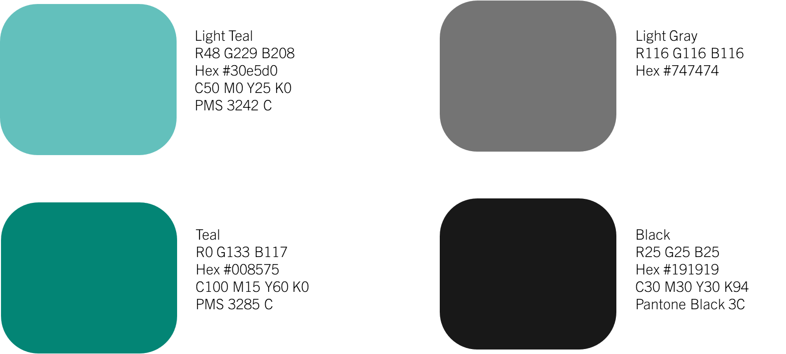
High Contrast Colours
When designing the app, we opted for using
high contrast colours.
Not only do they provide better accessibility for visually impaired
users, but also accommodate the needs of those with colour
blindness.
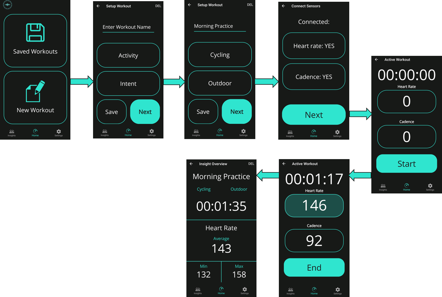
Intuitive and Simple Navigation
To make sure that our app is as simple to use as possible, we moved
away from using pop-up windows and convoluted multi-layered
navigation tree with vast number of different options to using
intuitive and simple streamlined system which allows users to
know where they are and what they are doing at every point in time.
Screen Reader Friendliness
Although many apps are compatible with screen readers such as
TalkBack, many of them have not yet managed to thoroughly implement
all of its functionalities, incorporating it with the app’s design
itself.

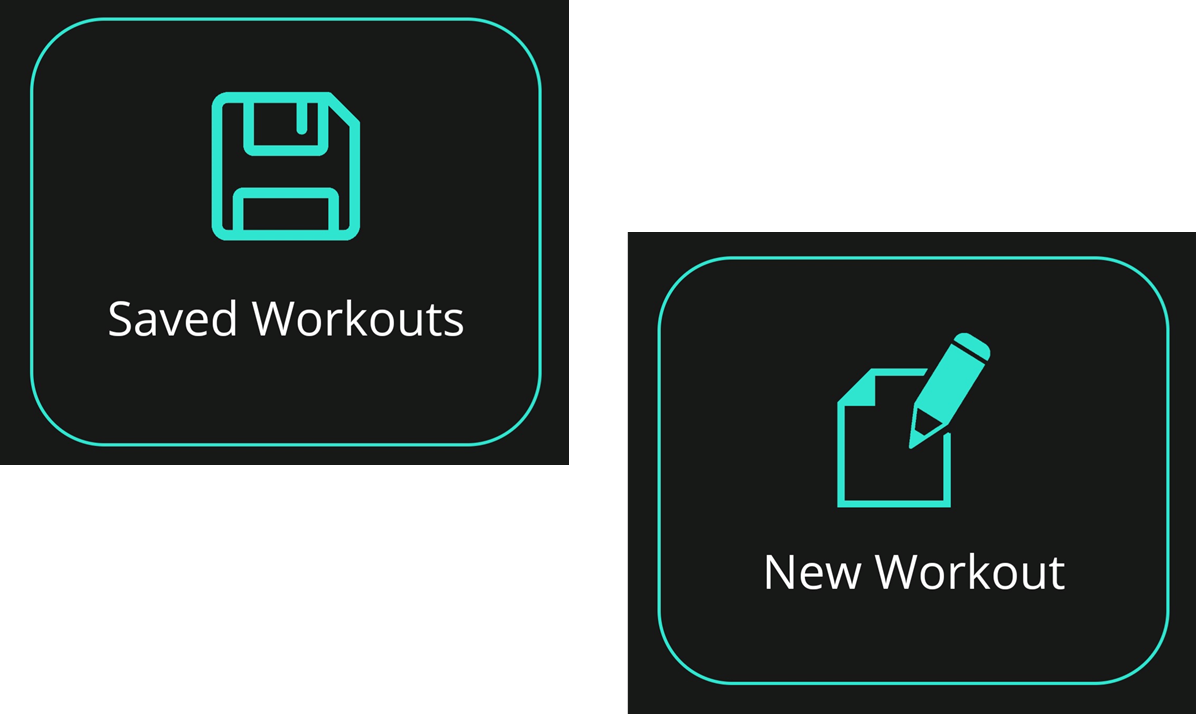
Disability-Inclusive Design Elements
Although screen readers help individuals with blindness, relying
solely on them, they tend to exclude visually impaired people who
prefer not to use them. How we approached this challenge was
designing the core aspects of the UI with respect to their needs.
That comprised of using increased text visibility, large simple
controls, and implementing advanced features during active workout
such as colour brightness change respective to the range set, as
well as the use of shapes to also assist users with colour vision
deficiencies [2].

Speech Recognition - Virtual Coach Integration
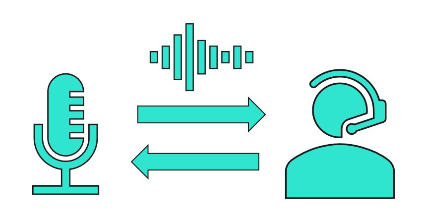
This is what primarily differs our app from all the others. Adding
this functionality didn’t only enhance the user experience, but
opened up an entirely new layer of interaction with the device and
the app itself. From being able to check your heart rate during the
workout to getting motivation when needed, all without a touch of a
button. This represents a universal point of access for all types of
app users, ranging from those with disabilities to those without.
Text-To-Speech Feature
Apart from screen reader functionality, it offers built in
text-to-speech integration, which ends up being helpful not only to
those using screen readers every day, but also visually impaired
people who just need some extra help when reading the text on the
screen. Although it enables features like single switch button for
selecting different types of activity types and training intents, it
also allows for virtual coach features mentioned in the Speech
Recognition Integration section.

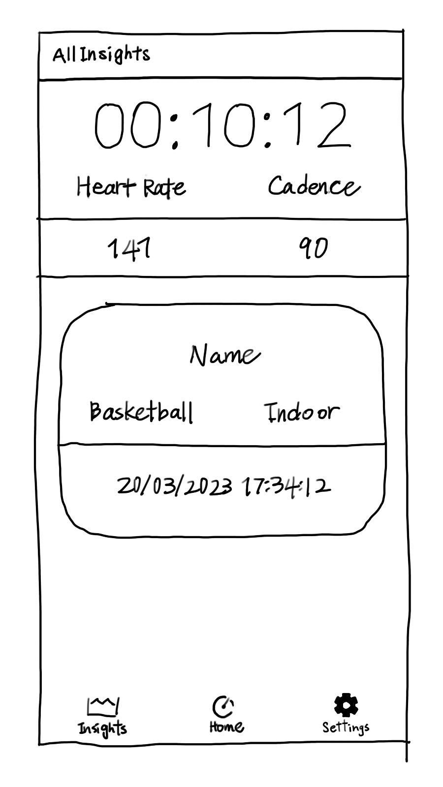
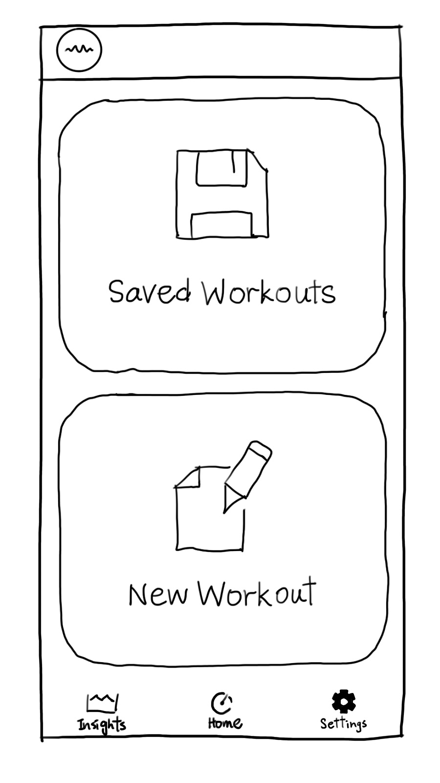
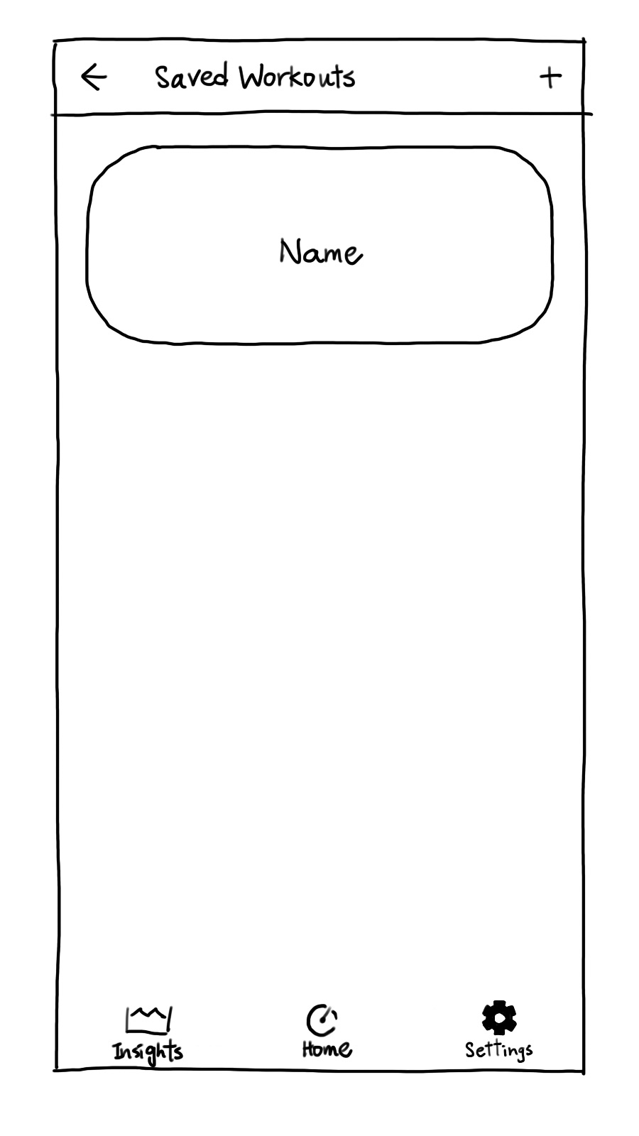
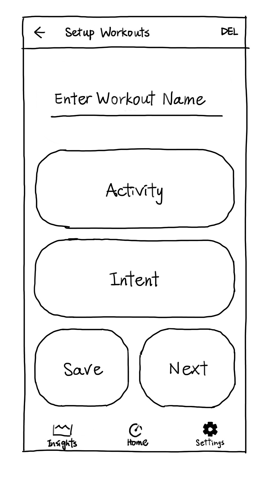
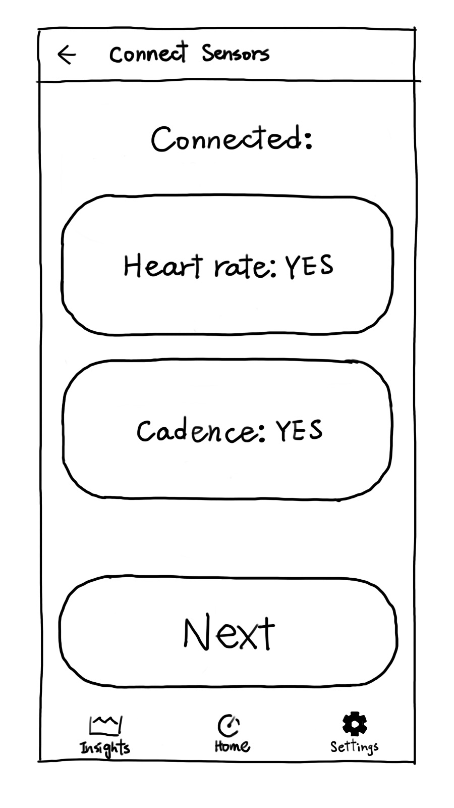
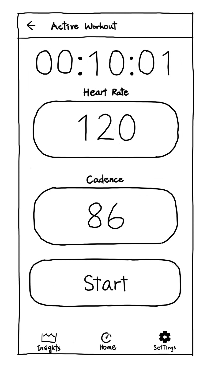
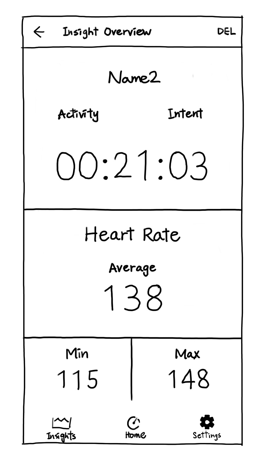
Hand-drawn sketches
The development story starts here, after numerous iterations and
continuous feedback from the potential users, we ended up using the
following final design, transferring it from the paper to lines of
code in the process.
