Human-Computer
Interaction
(HCI)

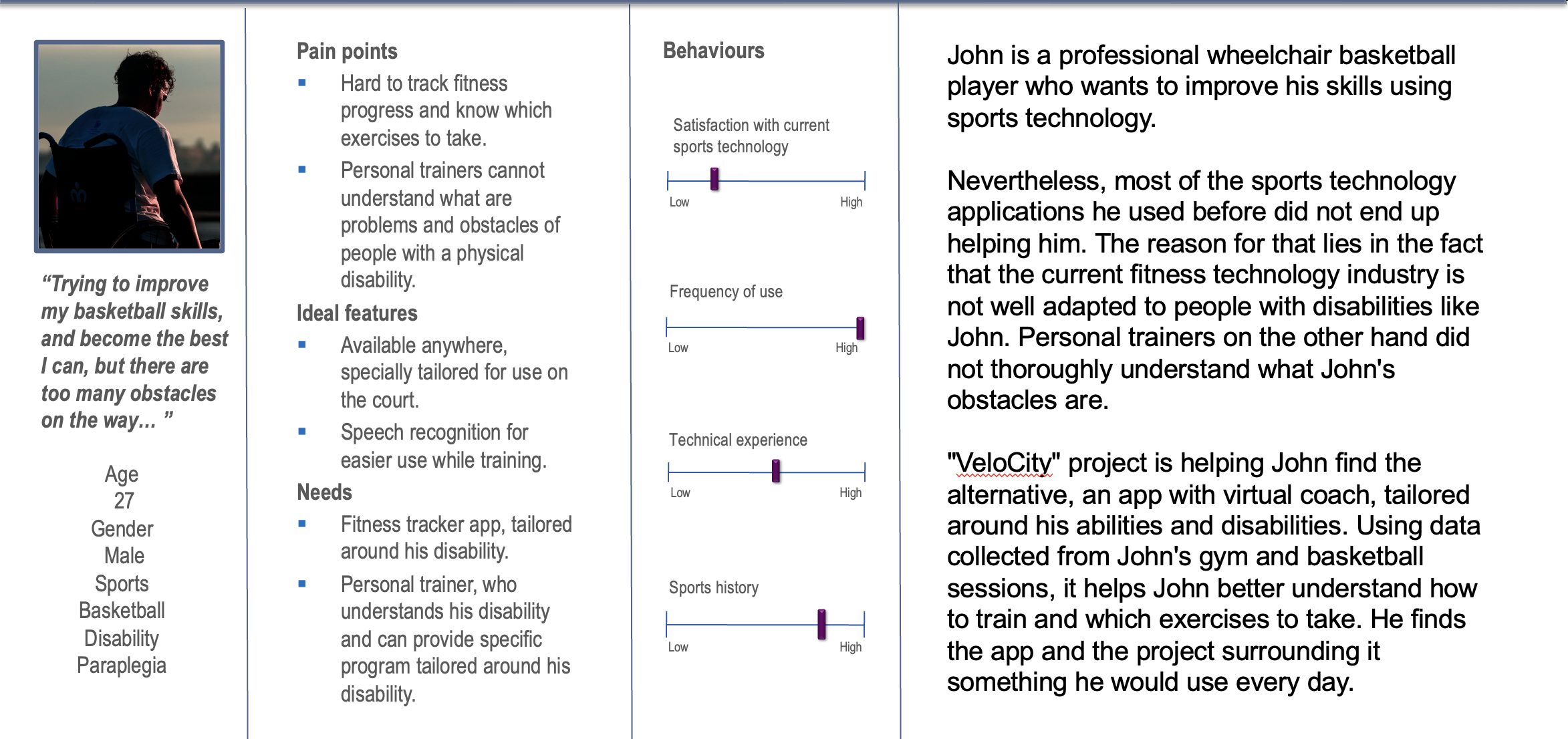
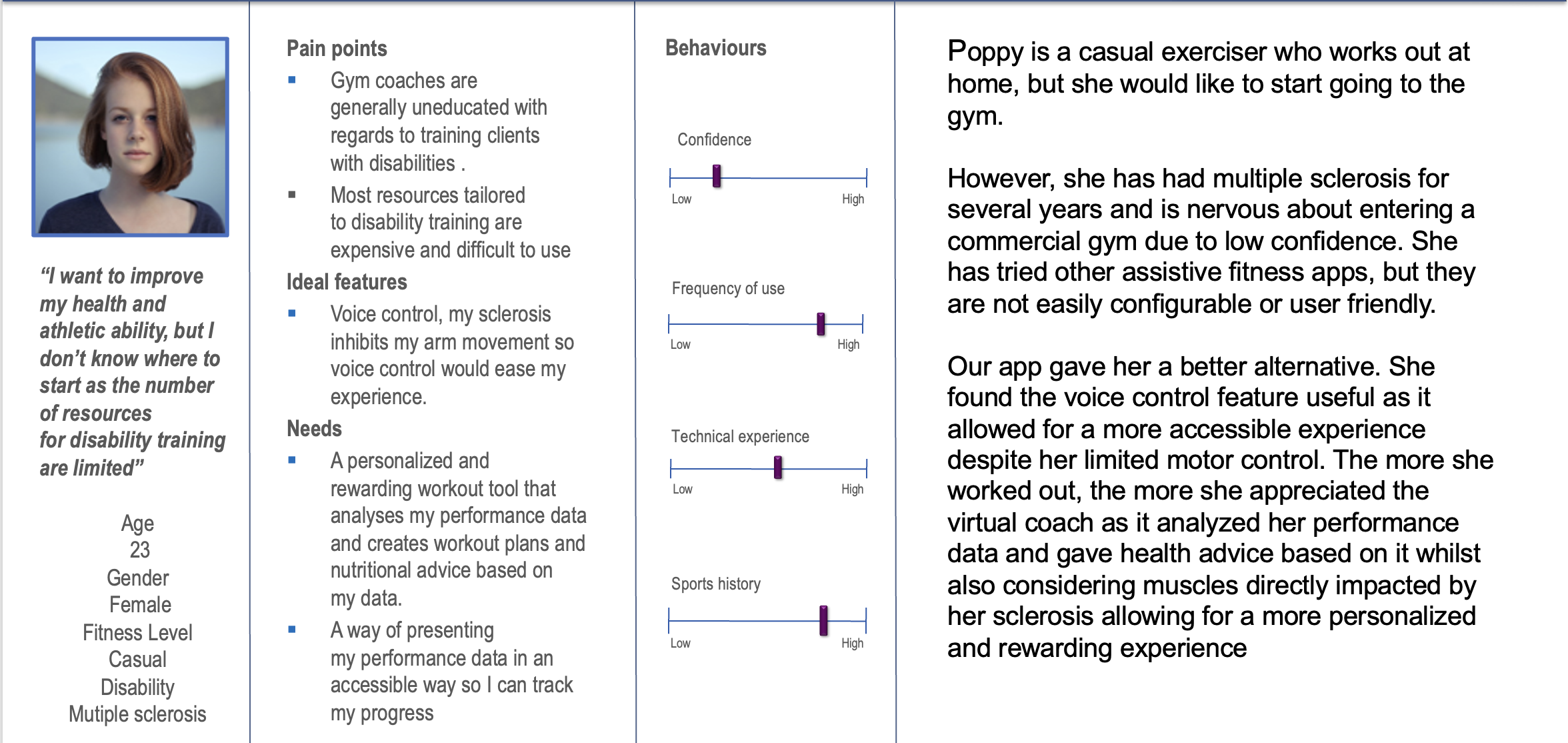
We created personas so we could more accurately represent what our target user-base would look like and how they would interact with the app
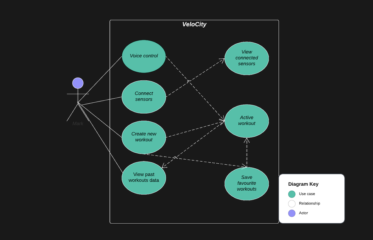
The use case diagram below illustrates what actions users can take when interactacting with the app.
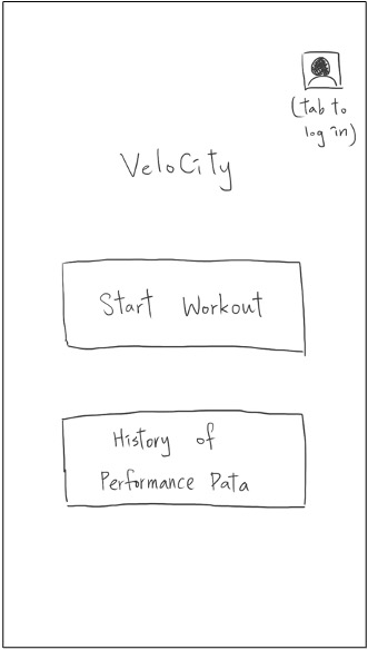
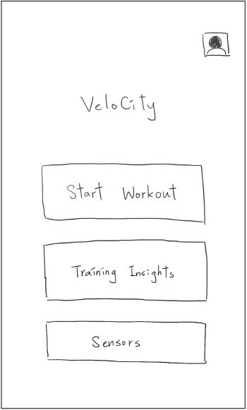
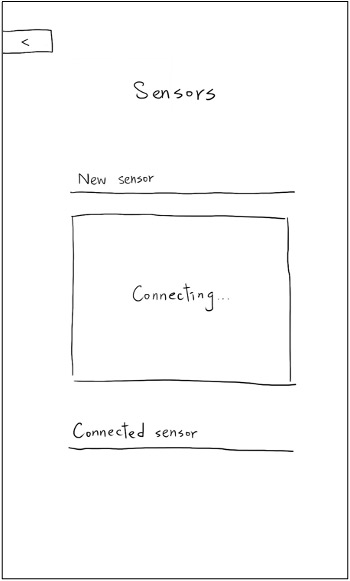
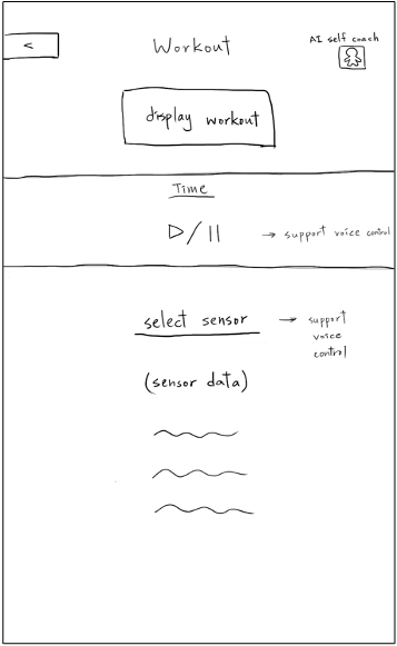
Once we gathered user requirements and understood our users better using personas & scenarios, we drew sketches to discover how the mobile application would look like:
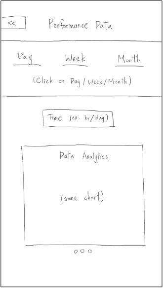
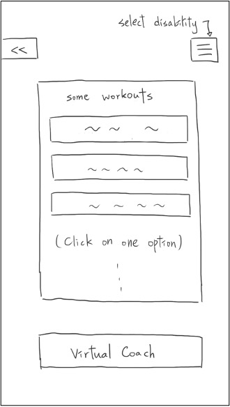
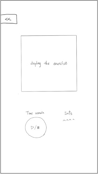
The users said it is clear for them to navigate through each page from the home page and, compared to sketch 1, a title on every page helps them identify where they are. They also stated that, on the workout page, putting both virtual coach and sensor data together benefits the efficiency of the workout. As for adding voice control, the users feel more confident about using the app and the AI self-coach.
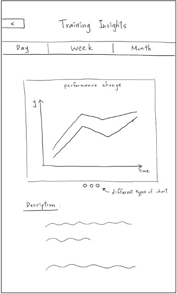
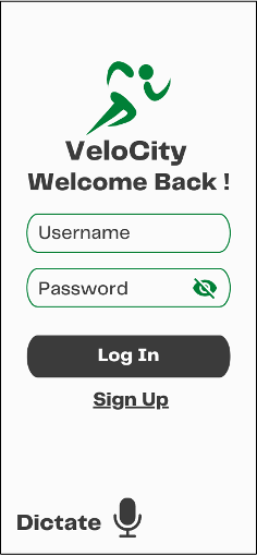
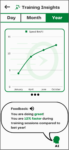
Using Figma, we designed some mock-up deisgns for the app, our initial prototype was inspired by our 2nd sketches.

We chose a heuristic evaluation as it would allow us to identify the usability problems in the user interface design proposed in our prototype, we had evaluators assess the prototype to improve the effectiveness of the evaluation.
| Heuristic | Problem | Solution |
|---|---|---|
| Learnability and utility | App provides no descriptions on its functionality which creates a bad experience for first-time users | Add descriptions where necessary |
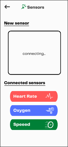
| Consistency and standards | In the sensors page, it is not clear that one must manually add sensors | Include an 'add sensors' button |
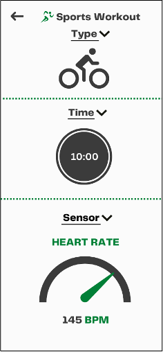
| Effectiveness and utility | In 'Sports Workout' there is no clear way of starting a workout | Include a 'Start Workout' button |