
Human Computer Interaction
- Home
- HCI
Design Principles
User Control
As always, users are the first topic for all UI design. The designer should let users be in control of the interface.
Not only following the right path to finish the tasks, but also to have the freedom to custimize their own way to reach it.
Users should have different options to reach the same goal. And make sure that they can have a way to step back when it's possible.
Hierarchy
Hierachy means elements in current interface should be ordered by importance.
This could be revealed by using different colours, sizes of icons, weights of fonts etc.
The key point of having hierachy design is to let user realize which part of the current
interface is the most essential one. Designers need to arrange visual elements in a way
that explains the level of importance of each element and guides users to take the desired action.
Clarity
The UI should be clear and easy to understand. This requires an intuitive design that could
lead users move one page from next easily. Highlitghting is a good idea to make the essential
icons or texts stand out. The language used should be simple and unserstandable. The point is
to avoid chaos and misleadings by too fancy design.
Familarity
With the rapid development of internet and technology, people are getting in touch more and more applications
and websites. To adapt people's habits, it is benificial to have a design that make users feel familiar.
For example, we normally would like to have the main menu on the top, sidebar on the left, user icon on the
top-right corner etc. This could also improve the useability since it could decrease users' learning curve.
What's more, it is also good for designers and developers because they are not only creators but also users
for other applications. It would be also familiar to them to make the design.
Contrast
Design with constrast colours and luminosity could make design more distinctive and more friendly to users with
low vision. Making sure texts are visible and there should be always higher contrast for more essential information
(like warning or deletion) to catch users' attention in case they make mistakes on that.
Reference: The 6 Key Principles of UI Design
5 Key UI Design Principles — And How To Use Them
Sketches
Through interviews, personas and scenarios, we better understand our user requirements. Based on that and considering design principles, we made our sketches
Prototype
After working on sketches, we came up with a prototype using Figma. The pictures below show how the web page is designed for
early development stages, which give us a clear guide on how to develop the web page at the beginning.
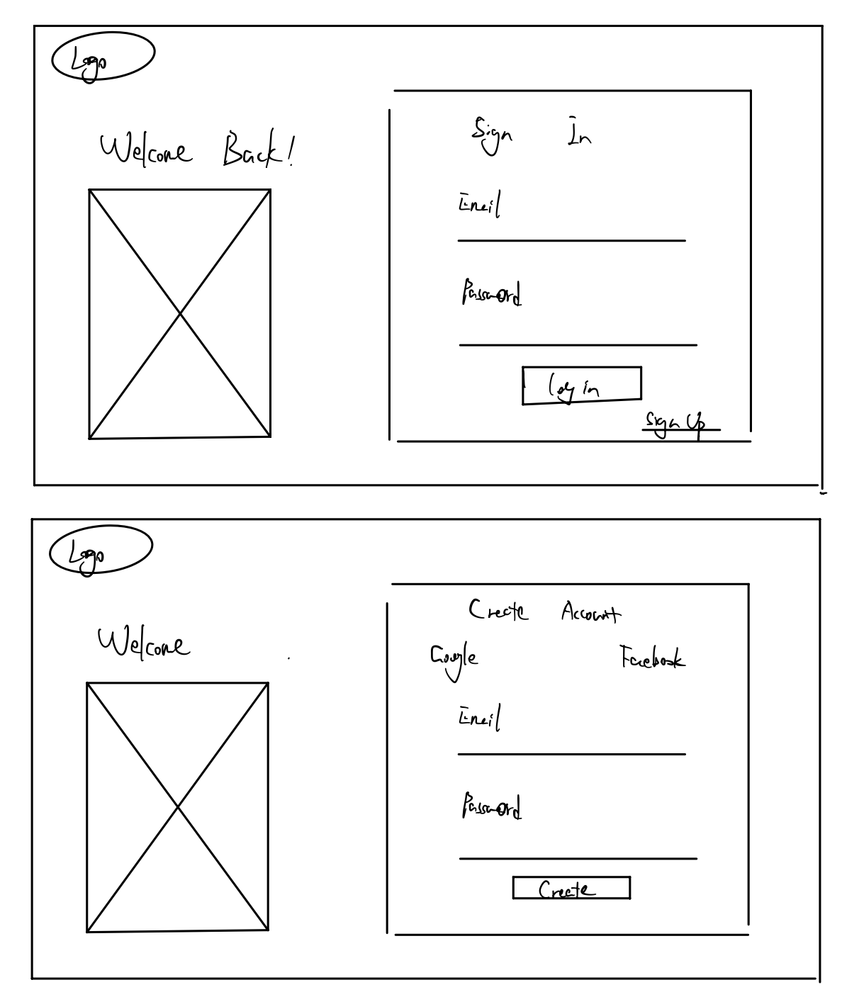
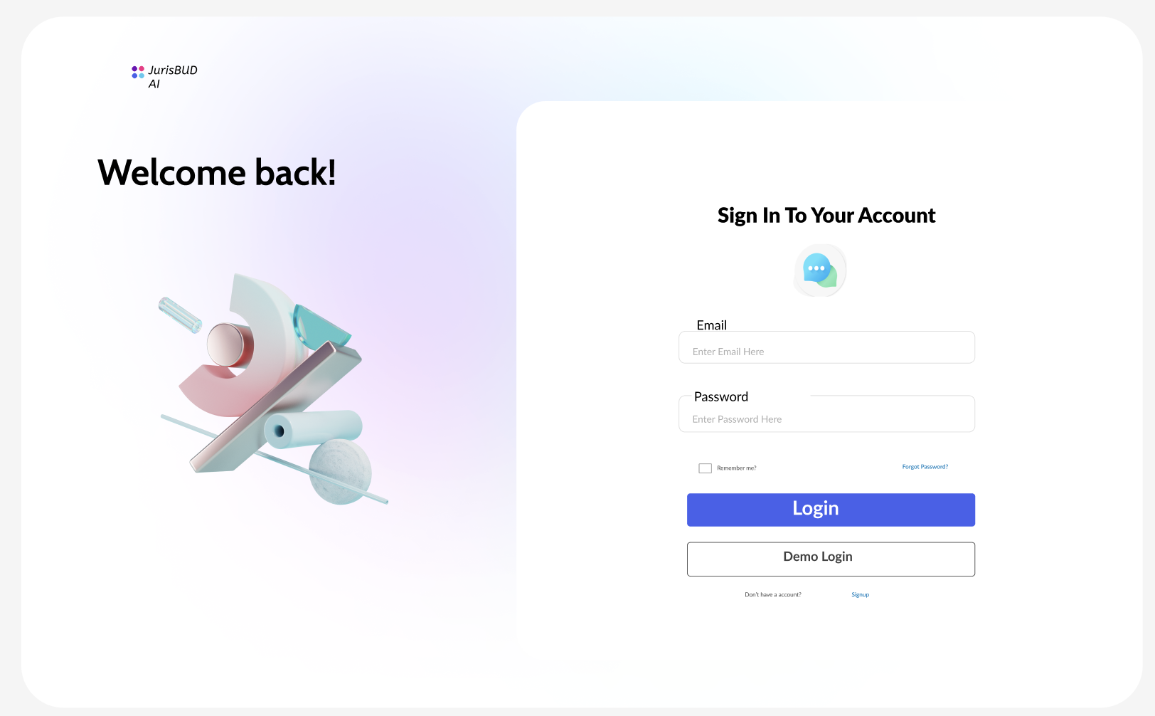
Firstly we made simple login and register pages, which are the first pages users will see when they visit our website.
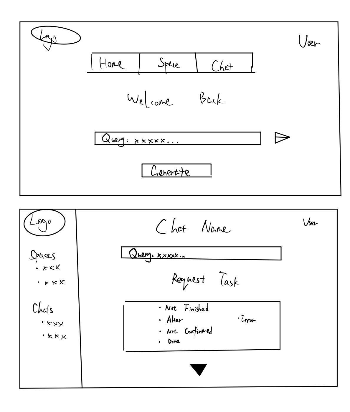
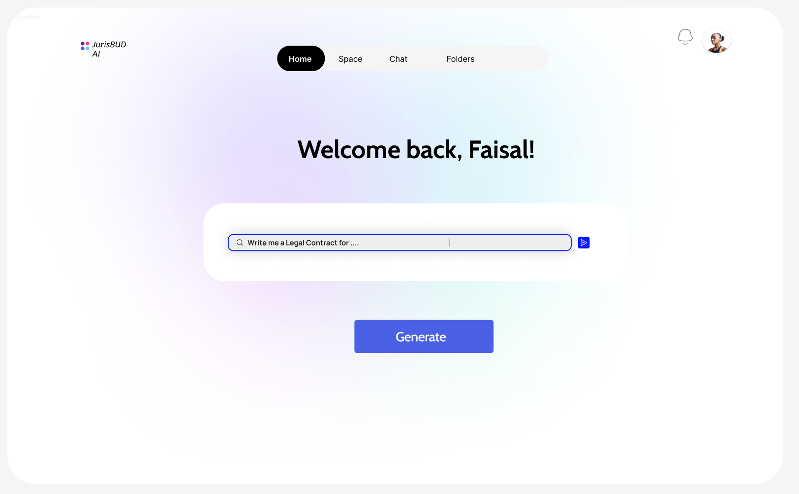
After logging into JurisBUD AI, there is a main tab with options Chats, Spaces and Folders. The input field below is for user to start a query conveniently. On the top-right corner we have user button to sign out.
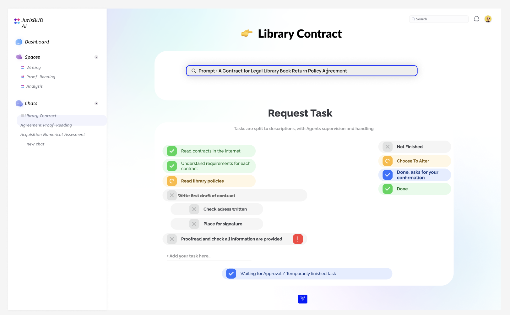
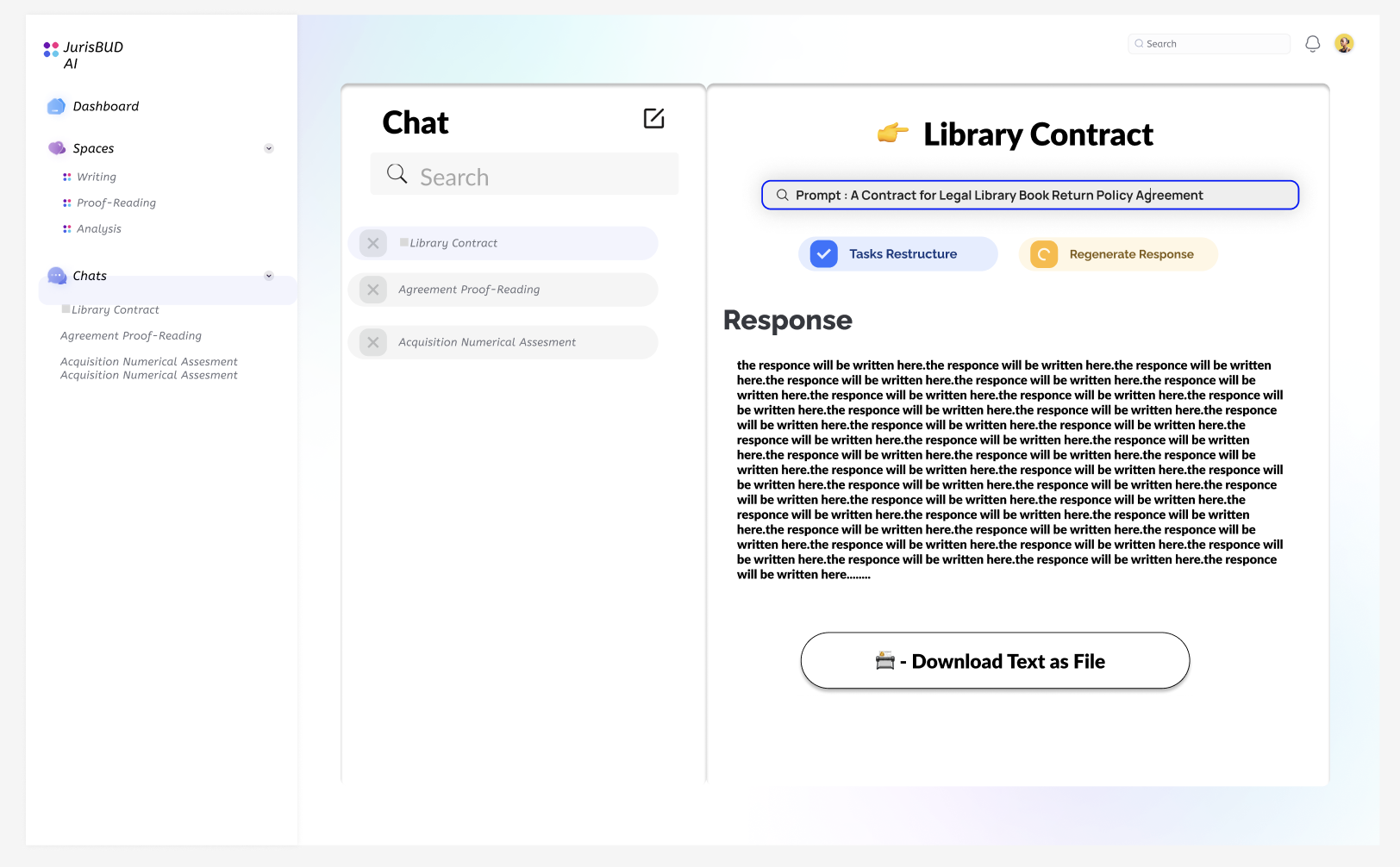
After generating a query, the AI system will split it into tasks and show the result to users to be checked/edited. Meanwhile from this page we will have a sidebar to get to the recent chats and spaces quickly.
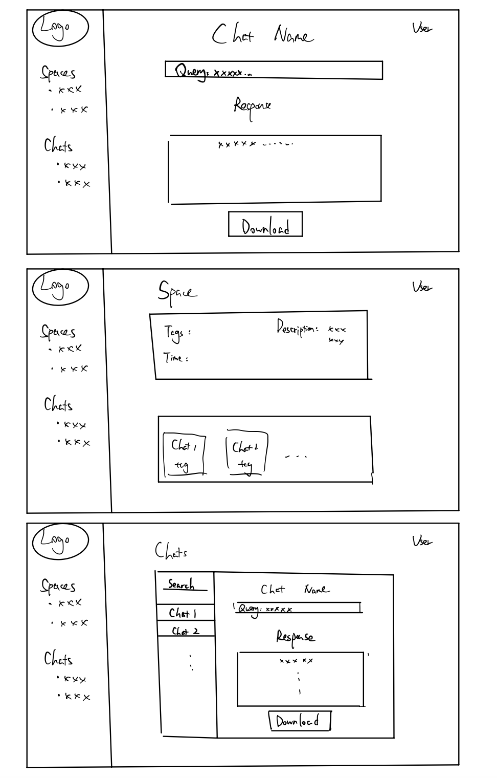
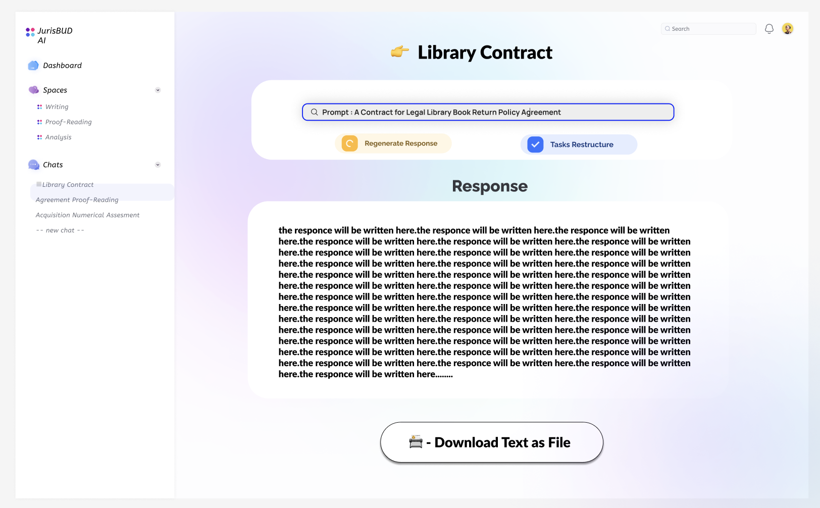
When users decide to move on, the system will work for the final result that printed out for users with one click to download it as a pdf.
When we look back to the main page, the Chats tab will bring us to a page with all chats we have made. They are able to be deleted, searched, edited and simply viewed.
Here is an example for space page, which is a place to catogerise the chats and folders with some properties like tags, descriptions etc. It is an idea for users to manage their querys and it sould be useful especially for projects when users need multiple chats to finish their job.
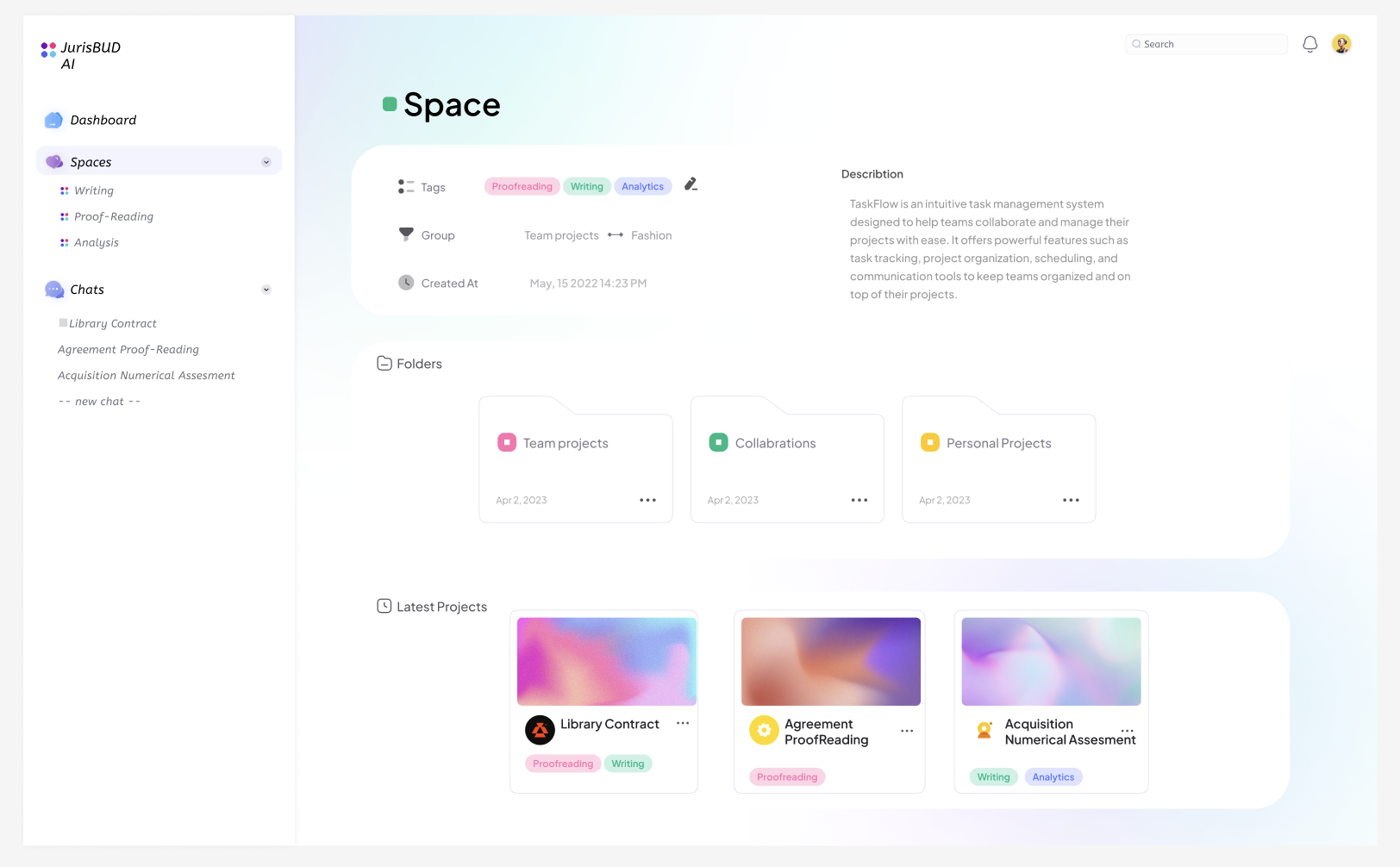
One thing to note is that the Folders are deleted in the later development so it will not be shown in the final product. The final product will be more similar to the sketches we made. The reason to delete it is that it actullay have similar concept with Spaces and we do not want it to distract users about which one should they actually use. Both of them are designed for categorisation.