User Interface and Experience Design
Design Principles
In designing Super Happy Space, we prioritised several core Human-Computer Interaction (HCI) principles to create an intuitive and accessible system for both primary user groups—children with cognitive disabilities and occupational therapists:
- Simplicity: Ensuring that both children and therapists could easily understand and operate the system without extensive technical knowledge.
- Consistency: Using consistent visual themes and interactive elements throughout the application to reduce cognitive load and provide familiarity.
- Visibility & Feedback: Making sure interactive elements provided clear visual and auditory feedback, confirming user actions.
- Tolerance & Error Prevention: Minimising errors through intuitive controls, with clear paths for undoing or preventing unintended actions.
User-Centric Requirements Gathering
Our design process began with a user-centric approach, conducting structured interviews with both children and therapists from the National Autistic Society. These conversations provided direct insights into users' emotional and practical needs:
Children expressed a strong preference for:
- Dynamic colours and lights synchronised with music.
- Interactive elements, such as snowflakes or bubbles, that respond directly to their actions.
- Music volumes carefully adjusted to avoid overstimulation .
Therapists highlighted:
- The use of music as both a calming tool and motivator in therapy sessions.
- The importance of intuitive systems that adapt easily to children's changing emotional states.
- The value of mood-based colour filters aligned with the "Zones of Regulation" framework for managing emotions.
Using this valuable feedback, we created user personas representing our primary user groups to focus our design efforts:
- Alex Bauer: A 10-year-old autistic child who uses music to better understand and regulate his emotions.
- Amelia Person: A 35-year-old occupational therapist looking to provide engaging and effective therapeutic sessions.
Initial Sketches
We started the design with hand-drawn sketches that captured our early ideas. These initial designs focused on clarity and ease of use, especially in areas such as song selection, mood adjustment, and interactive visual controls.
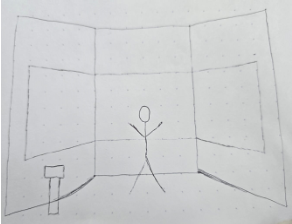
Figure 1
Presents our initial understanding of the children's experiences in the playroom, illustrating the dynamics of their surroundings.
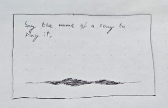
Figure 2
Depict our initial concepts for the user interface of the application. It focuses on the song selection process.
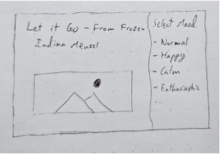
Figure 3
Additional perspective on song selection outlining the mood selection options available for the therapist.
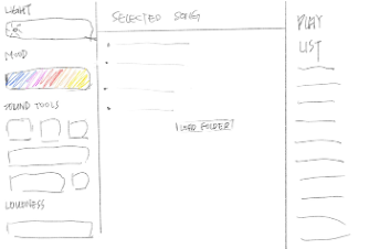
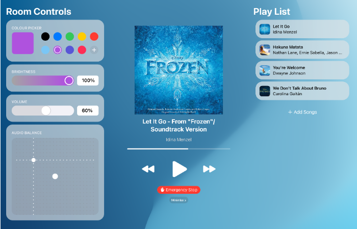
Figure 4
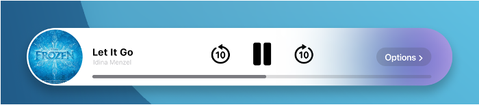
Showcases our ideal user interface settings during song playback, enabling the therapist to control various features seamlessly.
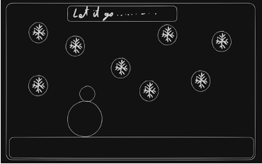
Figure 5
Illustrate our vision for the user experience from the children's perspective, highlighting the interactive elements that engage them within the generated experience.
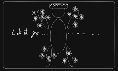
Figure 6
Illustrate our vision for the use experience and interactiion with the system.
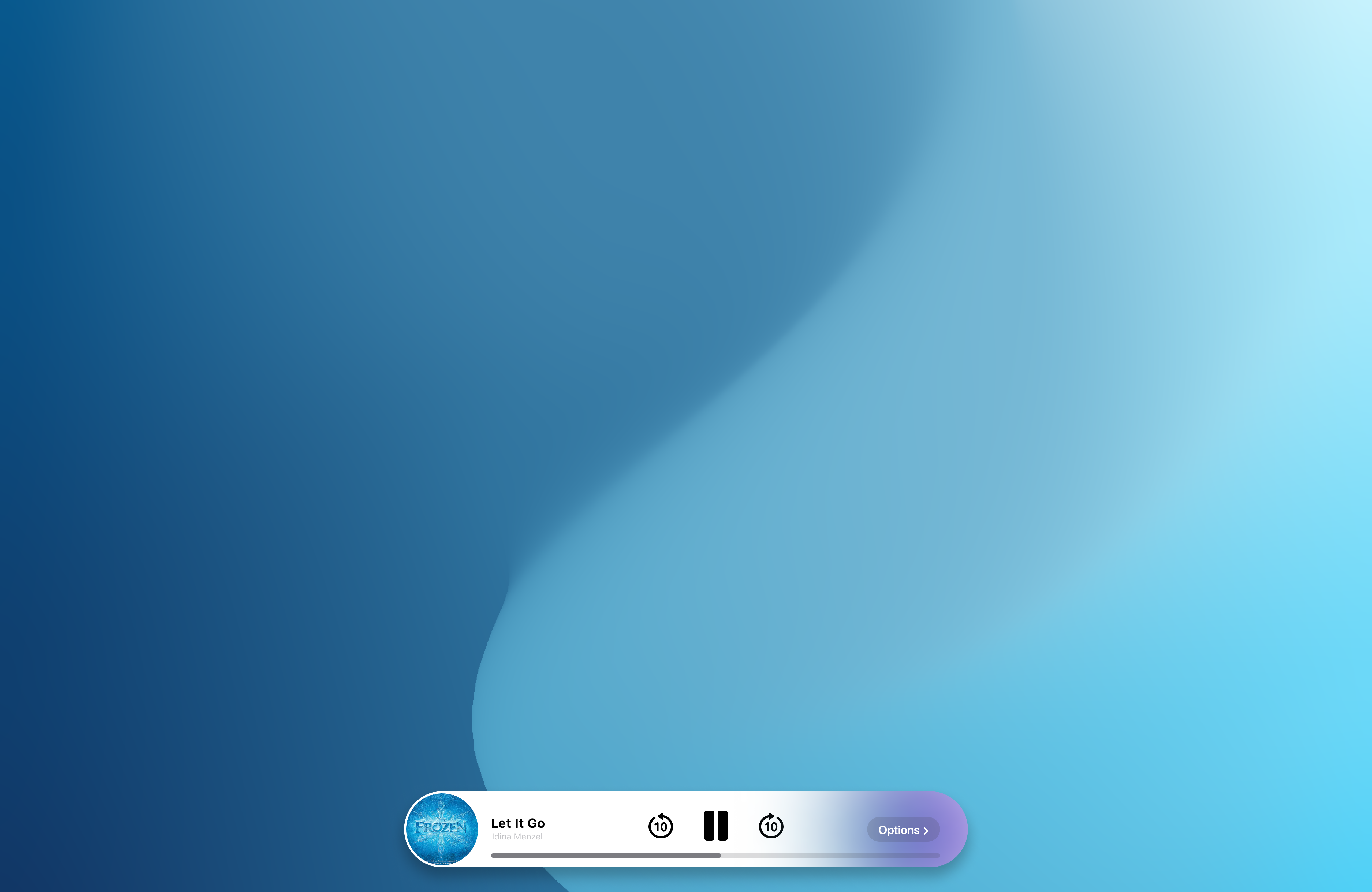
After user review sessions, feedback prompted us to introduce additional features, such as a library for previously played songs and the ability for therapists to minimise the control panel, maximising the therapeutic environment.
User Experience
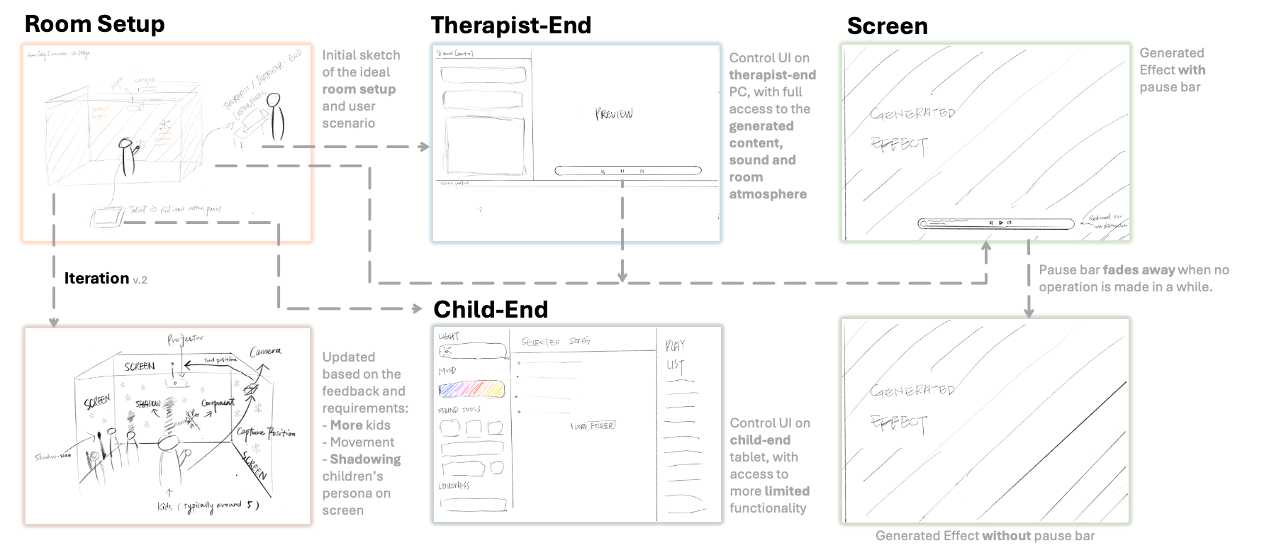
We created an initial prototype on a tablet to explore the experience from multiple perspectives. The images show the sensory room setup, including the child's immersive visual experience, the therapist's view from outside the room, and both user interfaces for the child and therapist, as well as the generated interactive elements.
Wireframes
Having discussed our hand drawn sketches with our clients, we moved onto wireframe mockups so we could better get a sense of how the system would flow.
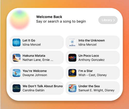
Song Selection UI
Wireframe mockup of Song Selection UI
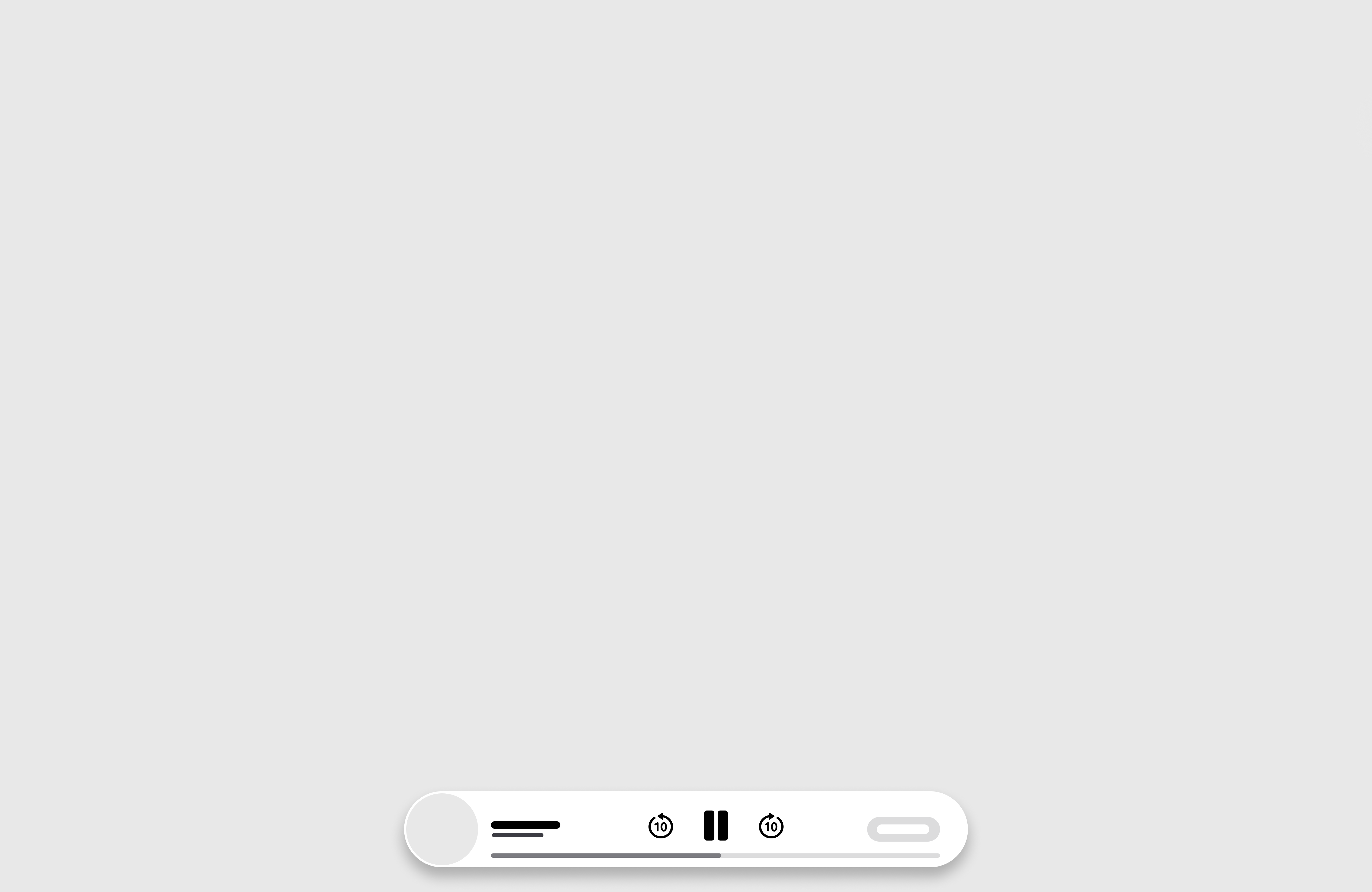
Player UI
Wireframe mockup of Player UI
Prototyping and Iterations
We developed an initial interactive prototype in Figma to simulate the experience from both the therapist's and the child's perspectives. This allowed us to test different scenarios realistically:
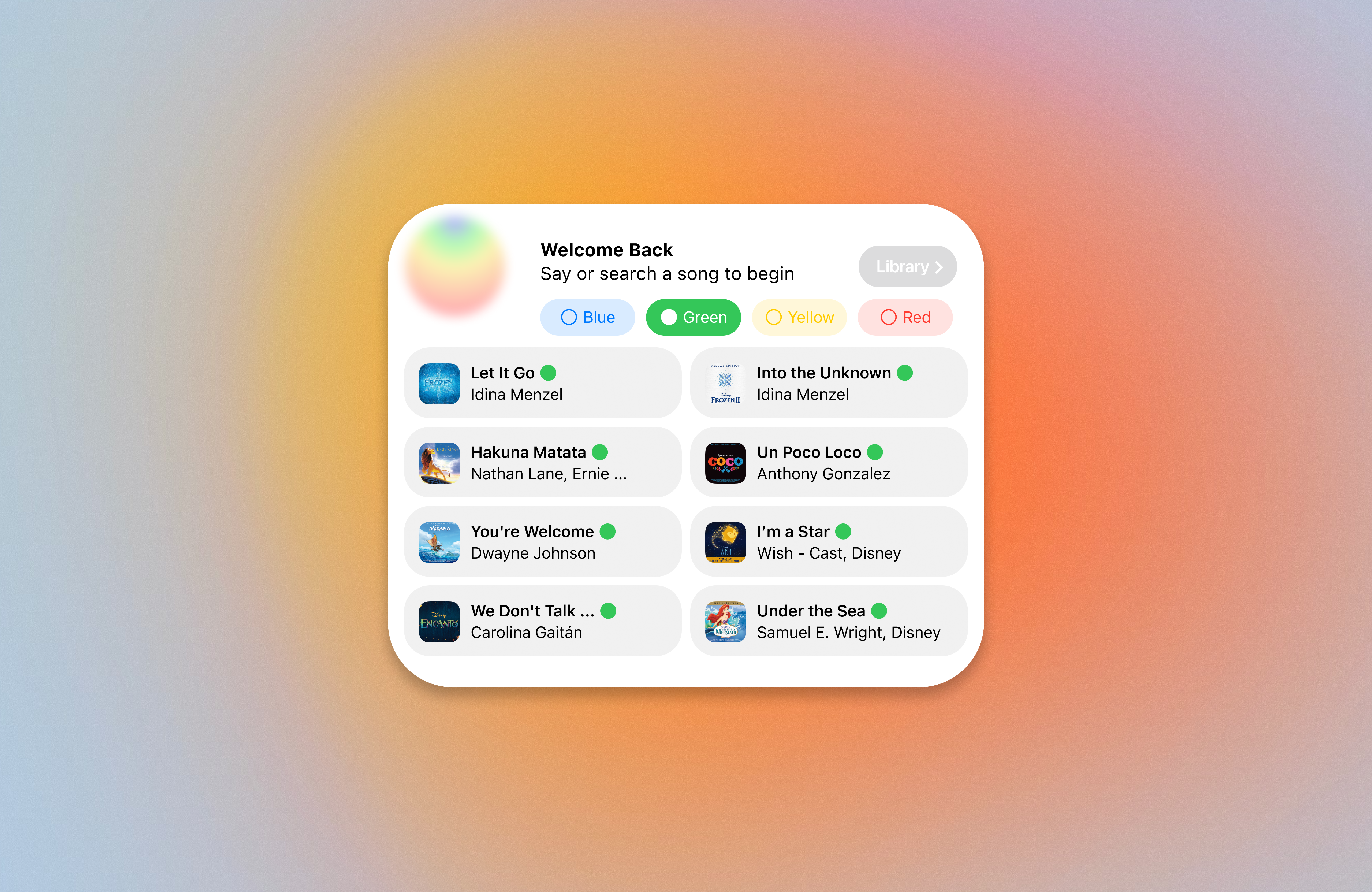
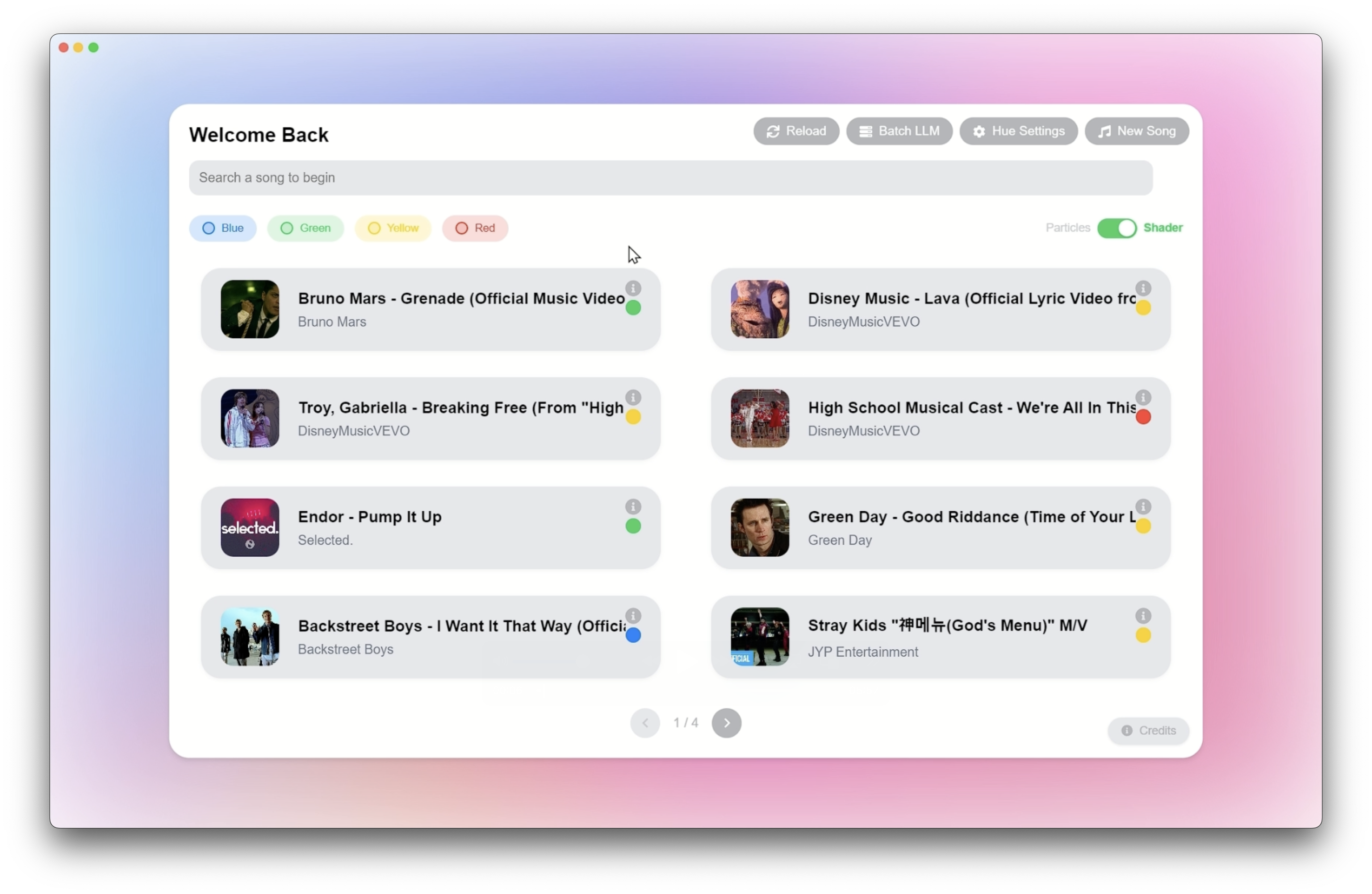
In response to further user testing and heuristic evaluations, significant improvements were implemented in our second prototype iteration. Key updates included:
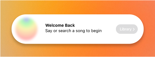
- A simplified, intuitive welcome screen designed to engage children immediately upon interaction.
- An enhanced therapist control centre, with clearly defined options to adjust room colour, brightness, and audio balance.
- Integration of the Zones of Regulation into the user interface, allowing therapists to quickly filter songs and visuals by emotional state, thus creating a highly personalised therapeutic environment.
Heuristic Evaluations and Improvements
To refine the user interface further, we conducted a structured heuristic evaluation. Below are key issues identified and our corresponding solutions:
Final UI Design
Our final UI design successfully addresses user requirements, offering an engaging, accessible, and personalised sensory experience. The interface now seamlessly aligns with the needs identified through extensive HCI research and user feedback. The final system allows children to intuitively interact with dynamically generated visual and audio elements, while occupational therapists retain precise control over the environment to ensure an optimal therapeutic outcome.
References
[1] H. Sharp, Y. Rogers, and J. Preece, Interaction Design: Beyond Human-Computer Interaction, 5th ed., Wiley, 2019.
[2] Apple Inc., "Human Interface Guidelines," 2019. [Online]. Available: https://developer.apple.com/design/human-interface-guidelines
[3] National Autistic Society, "Visual Supports," [Online]. Available: https://www.autism.org.uk/advice-and-guidance/topics/communication/communication-tools/visual-supports
[4] The Zones of Regulation, "What are the Four Zones of Regulation," 2023. [Online]. Available: https://zonesofregulation.com/what-are-the-four-zones-of-regulation/