User Interface Design
For our project, we had to design a UI for our Phase 1 project. This involved us creating sketches as well a Figma prototype to help us understand the main GUI elements.
Design Principles
- Simplicity: The UI is clean and minimal to enhance user focus. We avoided overcomplicating the UI by adding too many things that the client weren't specifically keen on. Focussing instead on the most important aspects and making sure they are clean and simple to use.
- Consistency: We used standardised fonts, colors, and layouts throughout, giving the entire GUI a complete feel as one project.
- Visibility: All the main areas and frames of the GUI are clearly labelled to avoid any confusion. We've also highlighted the important elements to be clearly highlighted throughout the GUI. For example, the conversation history displays different text colours for both the user and the AI response, helping the user to be able to clearly distinguish between the two.
- Feedback: To provide effective user feedback, we ensured that users receive updated GUI and confirmations. This might include success or error messages dependent on what the user did and how they performed the correct action. It also explains any extra steps the user may need to take if necessary, making the UI very usable.
- Tolerance: Confirmation options to ensure users don't make mistakes. For example, confirmation message asking if the user is sure to delete the database. As without this, a misclick could cost the user hours of work which would lead to lots of frustration which we wanted to avoid.
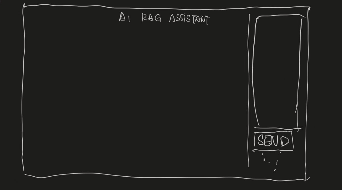
Hand-Drawn Sketches
We proceeded to draw some sketches of our initial ideas, based on the user and client requirements we gathered from both our research and meetings with our project partners at GDIHUB. Our project partners at GDIHUB were fairly pleased with this inital sketch, so we decided to not deviate too far away from this. Below is the initial sketch outlining the UI layout.
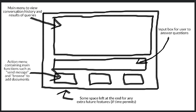
After comparing these 2 in terms of user-friendly aspects and ease of operation, The first sketch wins and is developed accordingly.
Interactive Wireframe
After reviewing our sketches with our GDIHUB project partners, we decided to implement an interactive prototype using Figma. Below is an image showcasing the flow of our Figma prototype:
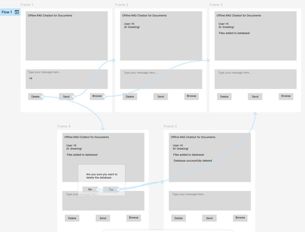
Click the link below to view our high-fidelity wireframe in Figma. We created a simple prototype outlining the key features. For example, in the first frame, you can send the already typed-in input text. Then try, and browse files. This will open up the file dialog system, which is relevant to the user's OS. Then, try and delete the database as shown in the flow above.
View WireframeIteration during design
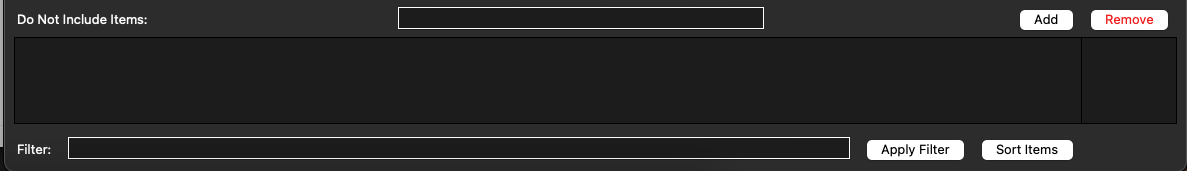
After creating the initial wireframe, we decided to make some changes to the UI to make it adapts to needs of the could have requirements: do not include and filter and sort options.
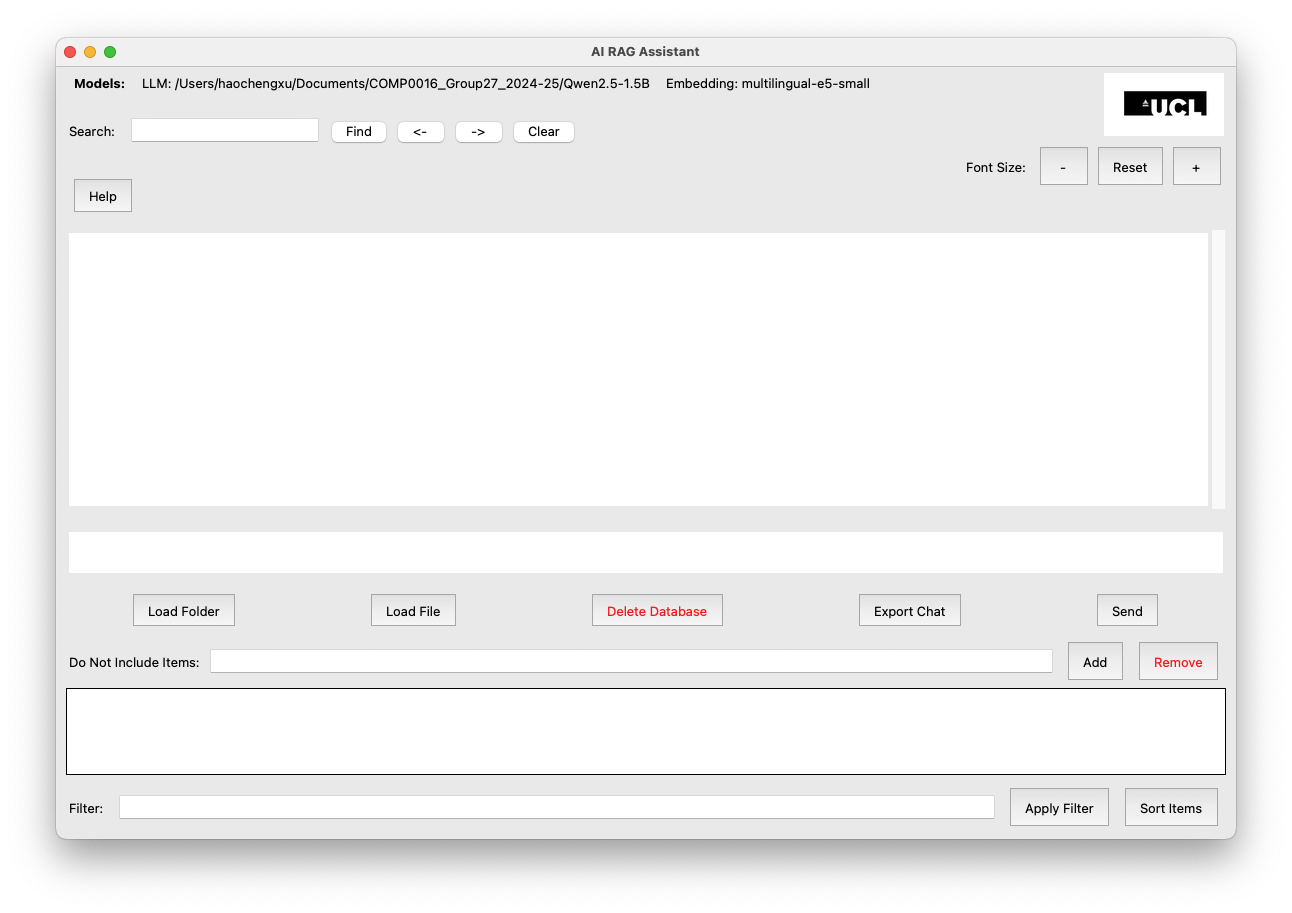
Final UI
Our final UI looks fairly similar to the initial ideas. Few changes were required but the main ones were the addition of filter and sort features directly below, as well as the addition of extra buttons to the action menu to accomodate certain extra features that we decided to add to enhance the ease of use of the project. Such as, separate buttons to select a folder or an individual file, option to export the text history and the option to delete the database contents. Here is what our final UI looked like: