
UI Design
DESIGN PROCESS
Our UI design process for Super Explorers evolved through multiple stages, ensuring that we created an interface that's both engaging and accessible for children with autism. We focused on creating a user experience that is intuitive, visually clear, and free from overwhelming stimuli.
Stage 1: Initial Hand-drawn Sketches
Menu Sketch
Season Selection Sketch

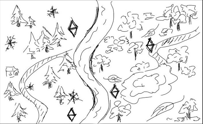
Exploration Sketch
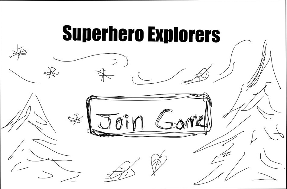
Game Entry Point Sketch
Stage 1 Evaluation
After discussing initial requirements and ideas with our clients, we created a series of hand-drawn sketches to align our vision and establish the game’s core layout and flow. In this initial sketching phase, we focused on defining key UI elements and navigation—particularly the menu, season selection, and first-person forest exploration screens, as well as how mini-games would appear before selection.
These sketches allowed us to quickly test interface concepts with our target audience in mind, prioritising simplicity, clarity, and minimal visual clutter. They laid the foundation for our design direction, emphasising natural themes, intuitive controls, and a clear visual hierarchy—especially in the menu and exploration screens, which we identified as critical for user engagement.
Stage 2: Coloured Sketches

Coloured Menu Sketch

Coloured Season Selection Sketch

Coloured Exploration Sketch
Stage 2 Evaluation
Since the game is intended for children, we developed colourful sketches to better visualise how engaging and approachable each component would be. Introducing colour at this stage helped us define the game’s visual tone and emotional atmosphere. We chose a nature-inspired palette, with calming greens as the base, complemented by warm accent tones—ensuring visual interest without overwhelming users with sensory sensitivities.
This process also helped us explore how colour could support usability by differentiating interactive elements and establishing visual hierarchy. Additionally, we began experimenting with seasonal shifts in colour to reflect Spring and Autumn themes while maintaining a cohesive and accessible interface throughout.
Stage 3: AI Generated Visuals by ShutterStock

Spring Exploration Visual

Winter Exploration Visual

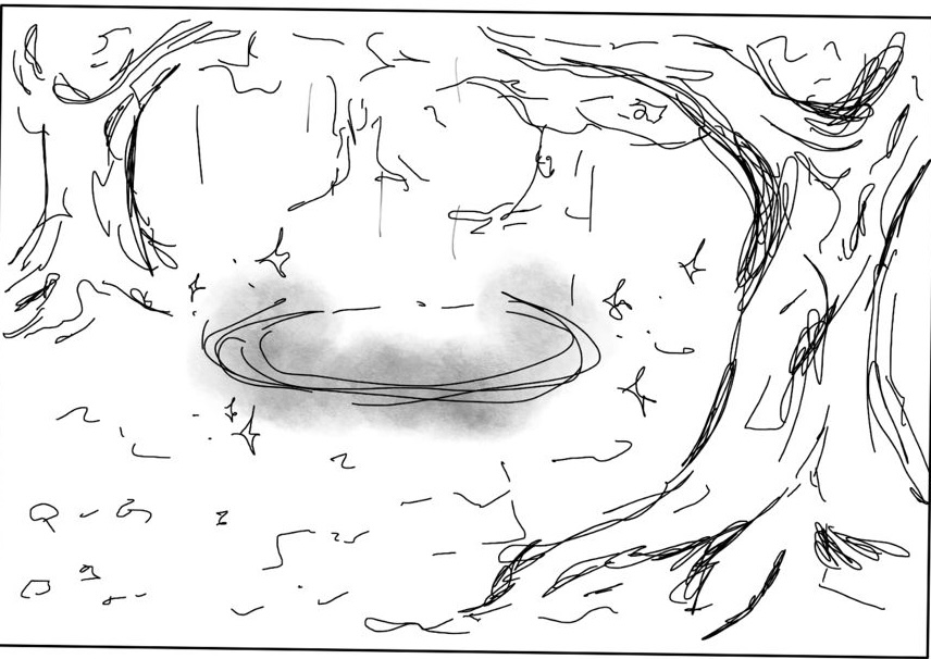
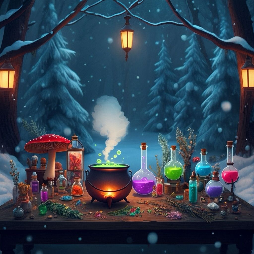
Potion Brewing Visual 1
Potion Brewing Visual 2
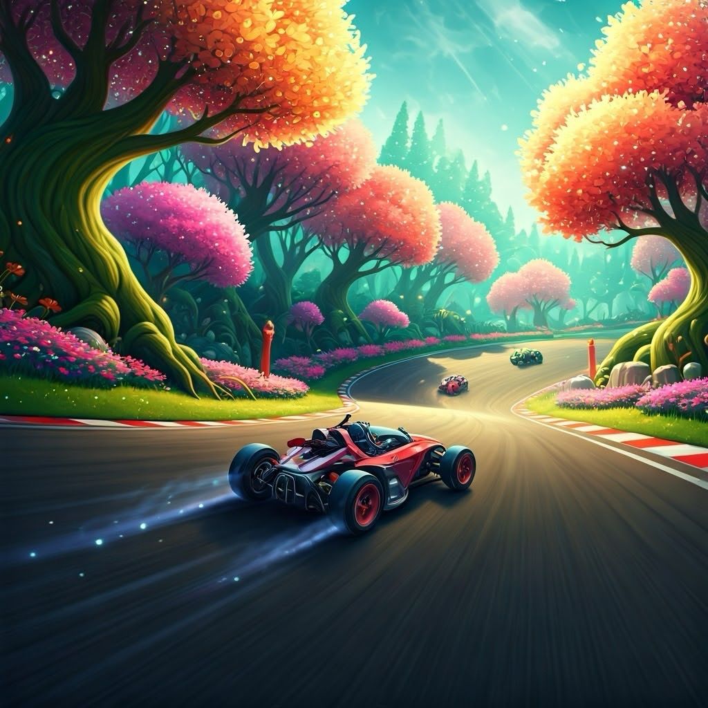
Spring Racing Visual
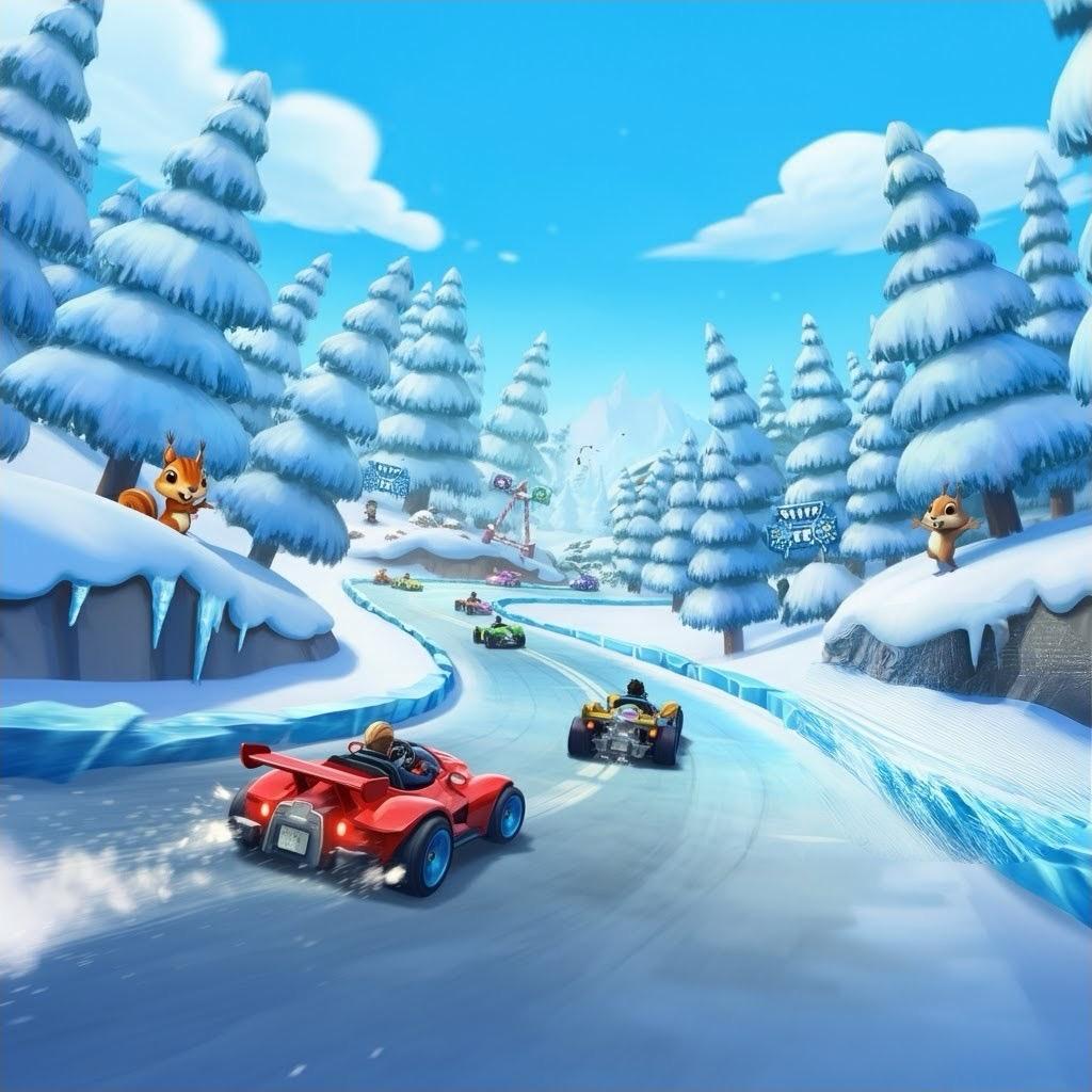
Winter Racing Visual

Golf Visual
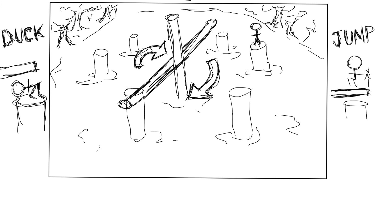
Wipeout Challenge Sketch
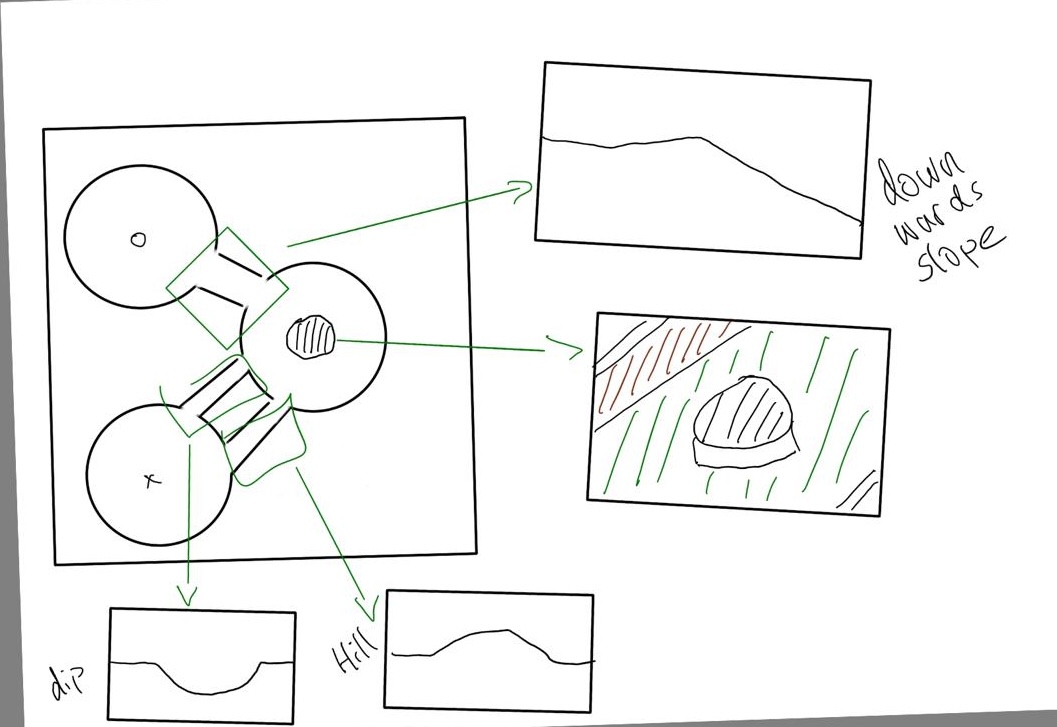
Golf Map Sketch 1
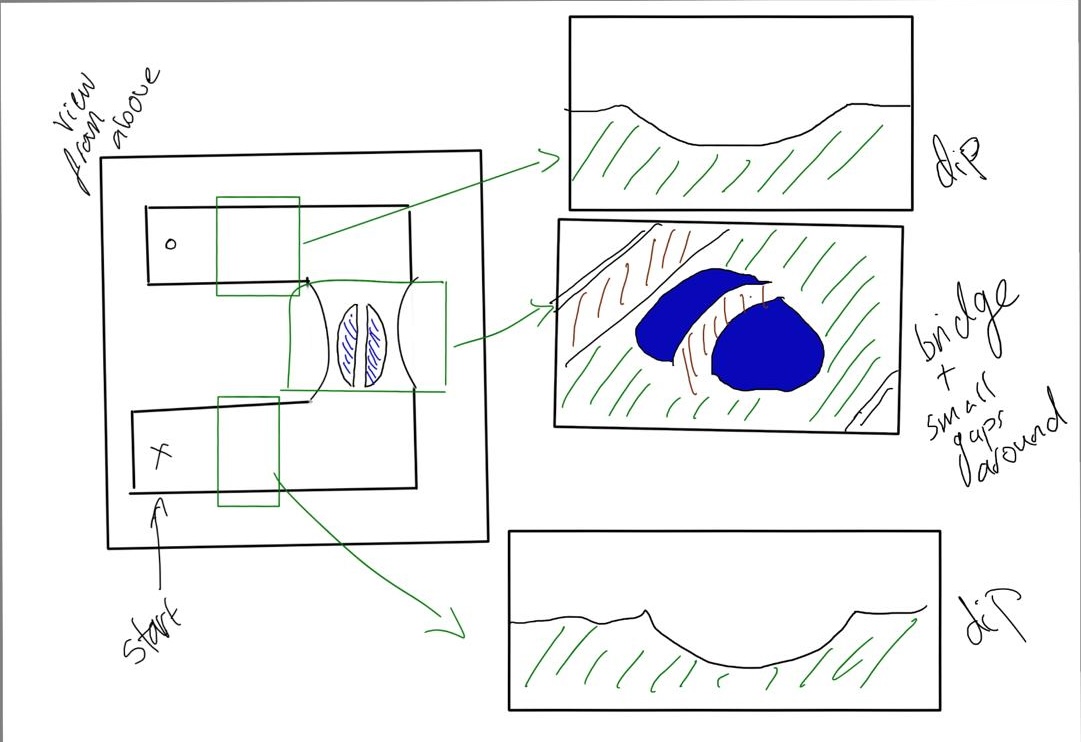
Golf Map Sketch 2
Stage 3 Evaluation
To expand our visual design, we combined AI-generated imagery created by ShutterStock with additional sketches, covering all four planned mini-games. This allowed us to explore how the overall aesthetic would carry across different gameplay elements while maintaining a unified, nature-inspired style. Seasonal variations were also considered—particularly in the exploration and racing components—to support replay-ability and visual interest.
The AI concepts were especially useful for experimenting with detailed environments and lighting, helping us set clear visual goals for the prototyping phase. These visuals ensured that everyone on the team shared a consistent understanding of the game’s intended atmosphere and tone.
As we refined the visual direction, we focused on giving each mini-game a distinct identity while staying aligned with our accessibility and sensory-friendly principles. After reviewing our ideas with the client, we finalised four mini-games: Golf, Potion Mixing, Racing, and Wipe Out. We also began sketching possible golf map layouts to explore how level design could support replay-ability and keep players engaged across multiple sessions.
Stage 4: Unity Development Prototypes

Menu Prototype

Season Selection Prototype
Spring Exploration Prototype
Autumn Exploration Prototype

Potion Brewing Prototype

Racing Prototype

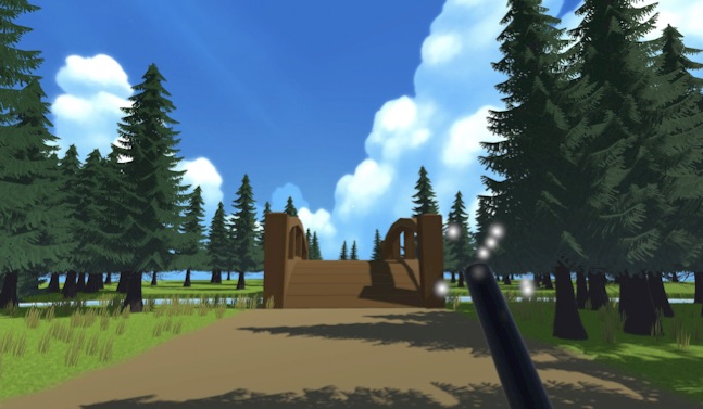
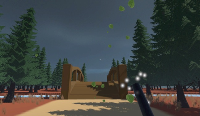
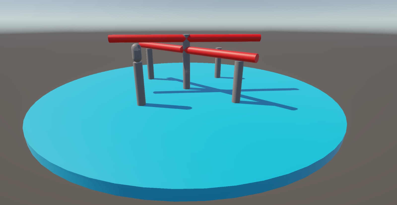
Golf Prototype
Wipeout Prototype
Stage 4 Evaluation
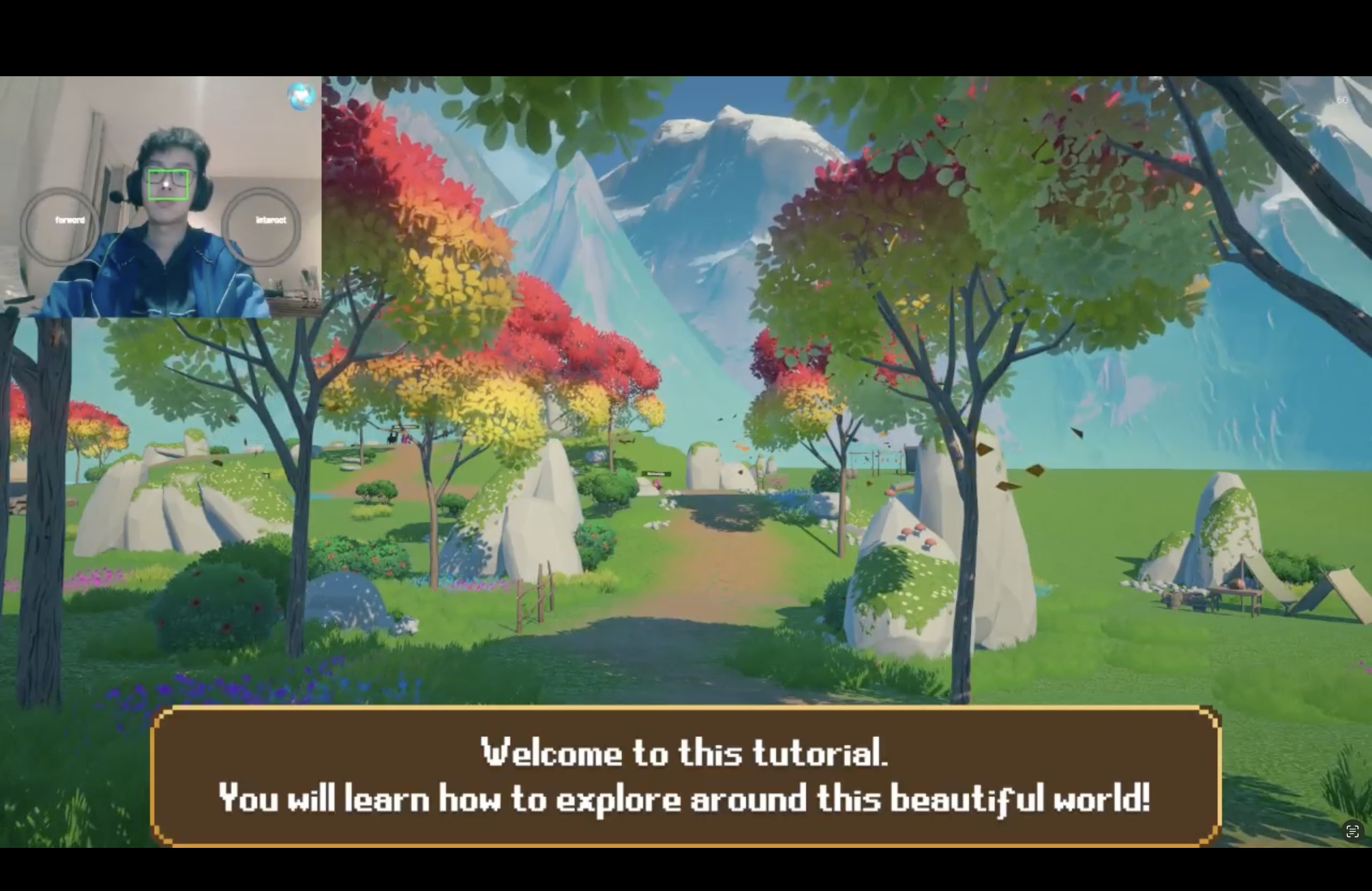
In this critical stage, we began translating our visual concepts into functional interfaces within Unity. This allowed us to move beyond static sketches and test real user interactions, helping us identify and refine usability issues that weren't initially apparent. We began by applying the fundamental visual elements, ensuring the interface was both responsive and intuitive. We also changed our winter season to autumn as another team is exploring the winter visuals for their successor game.
Through hands-on testing, several areas for improvement emerged:
- Background music was needed to enhance immersion and atmosphere
- Existing Unity assets had overly muted colours, reducing visual appeal for our younger audience
- Mini-games required more natural elements to align with the exploration theme
- Additional NPC dialogue and text panels were needed to better guide players and support accessibility
These prototypes not only brought our visual designs to life, but also allowed us to evaluate interaction flows and overall user experience—providing key insights to shape the next stage of development.
Stage 5: Final Versions
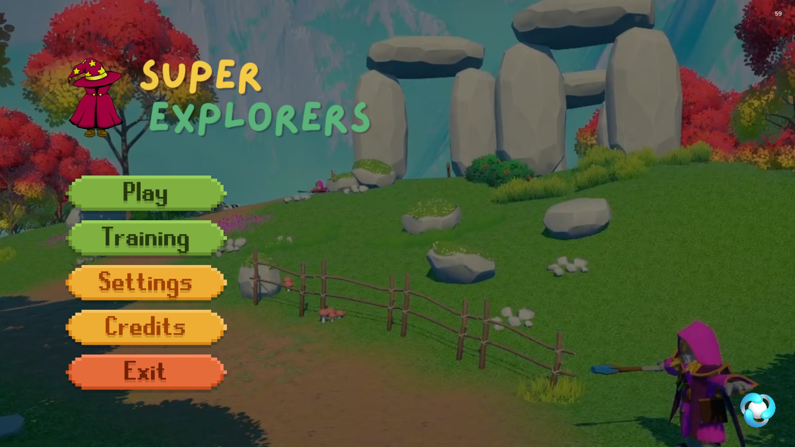
Final Menu
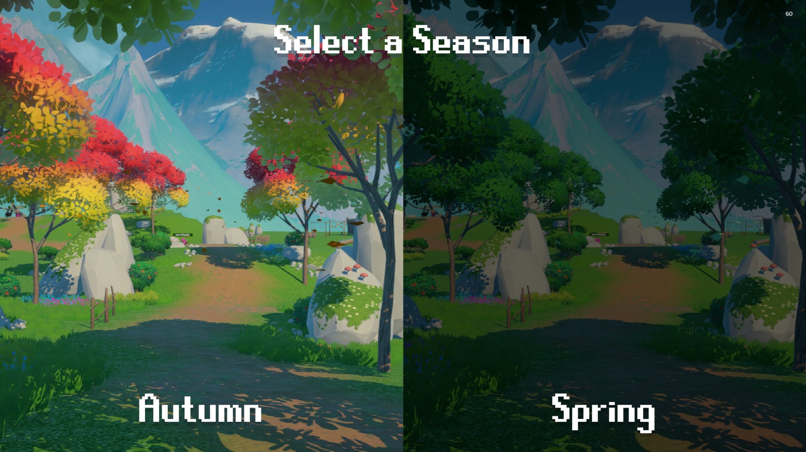
Final Season Selection
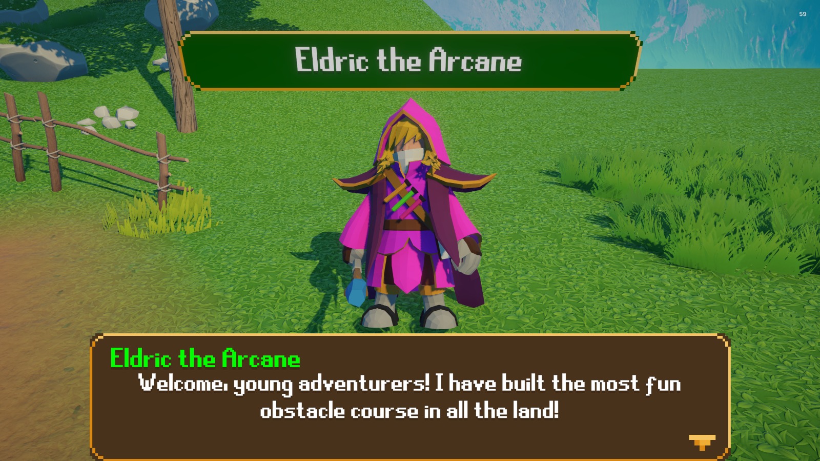
Final Game Entry Point (NPC Dialogue)

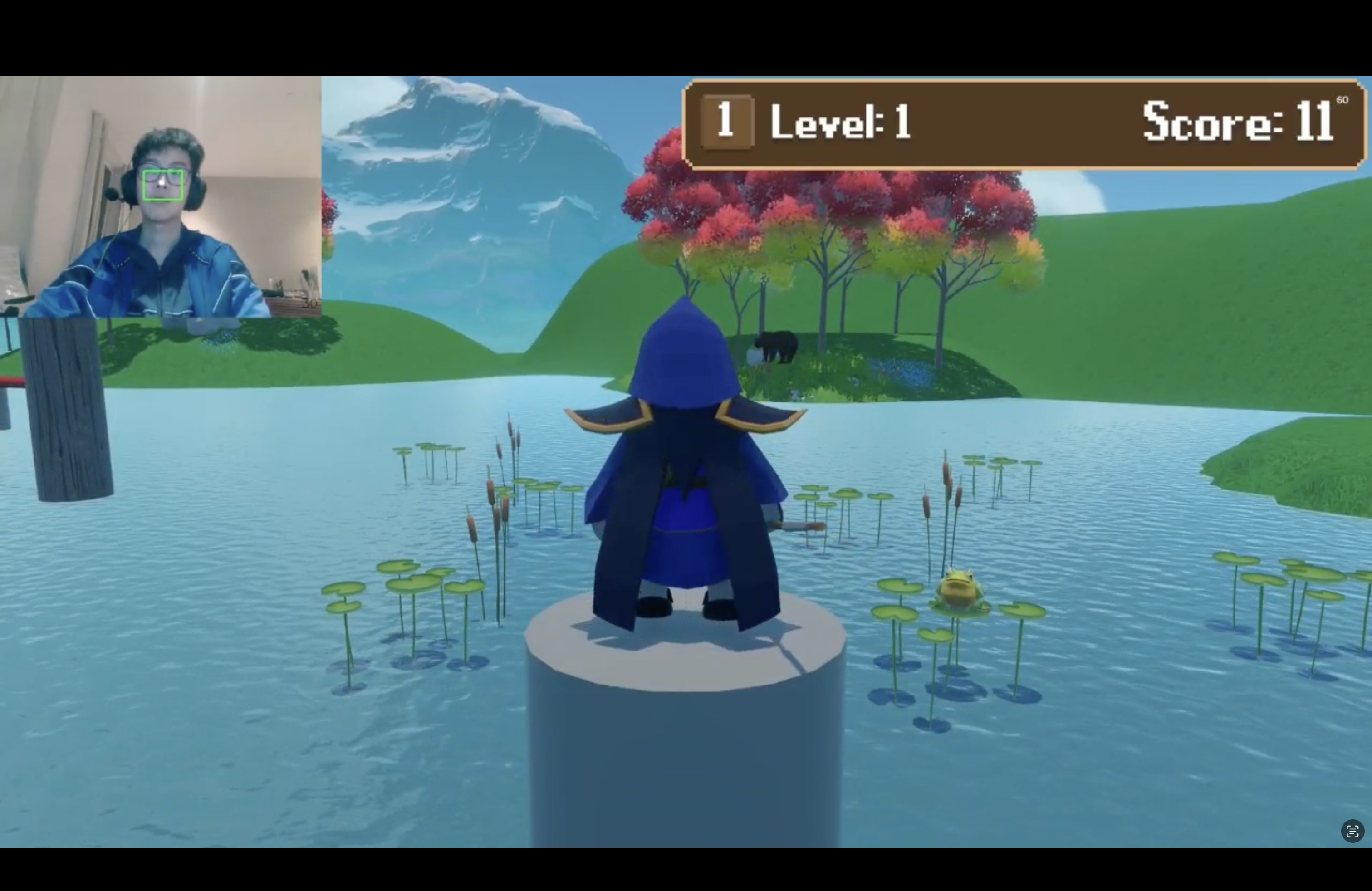
Final Spring Exploration
Final Autumn Exploration
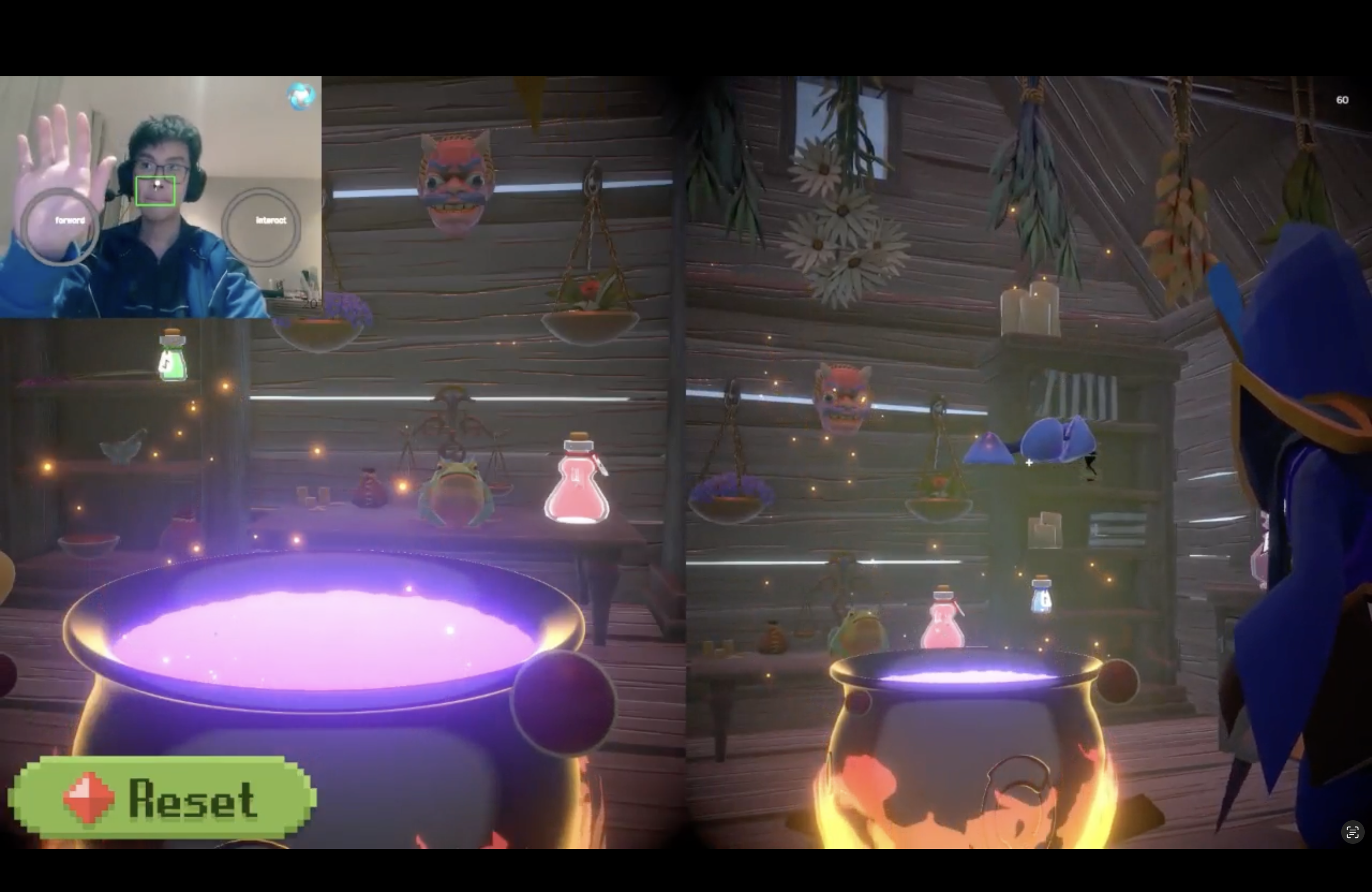
Final Potion Brewing Game
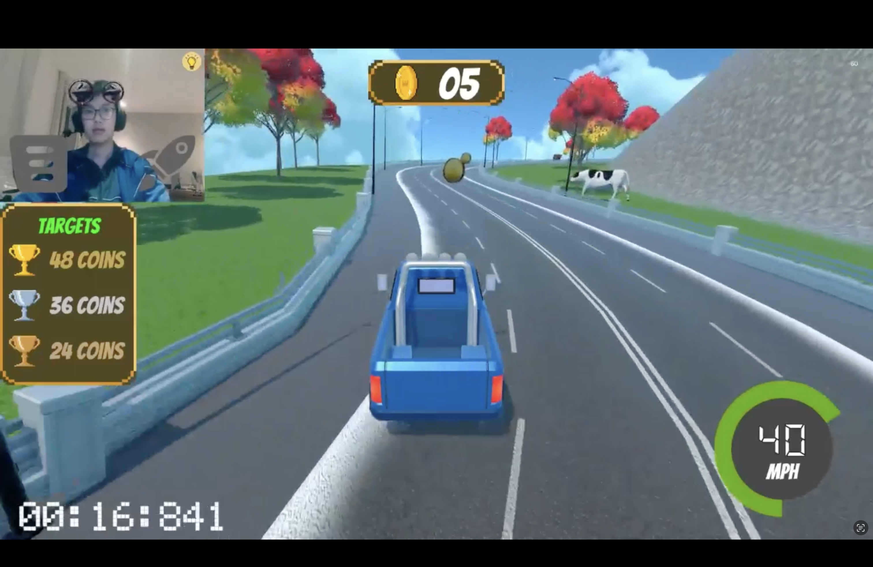
Final Racing Game
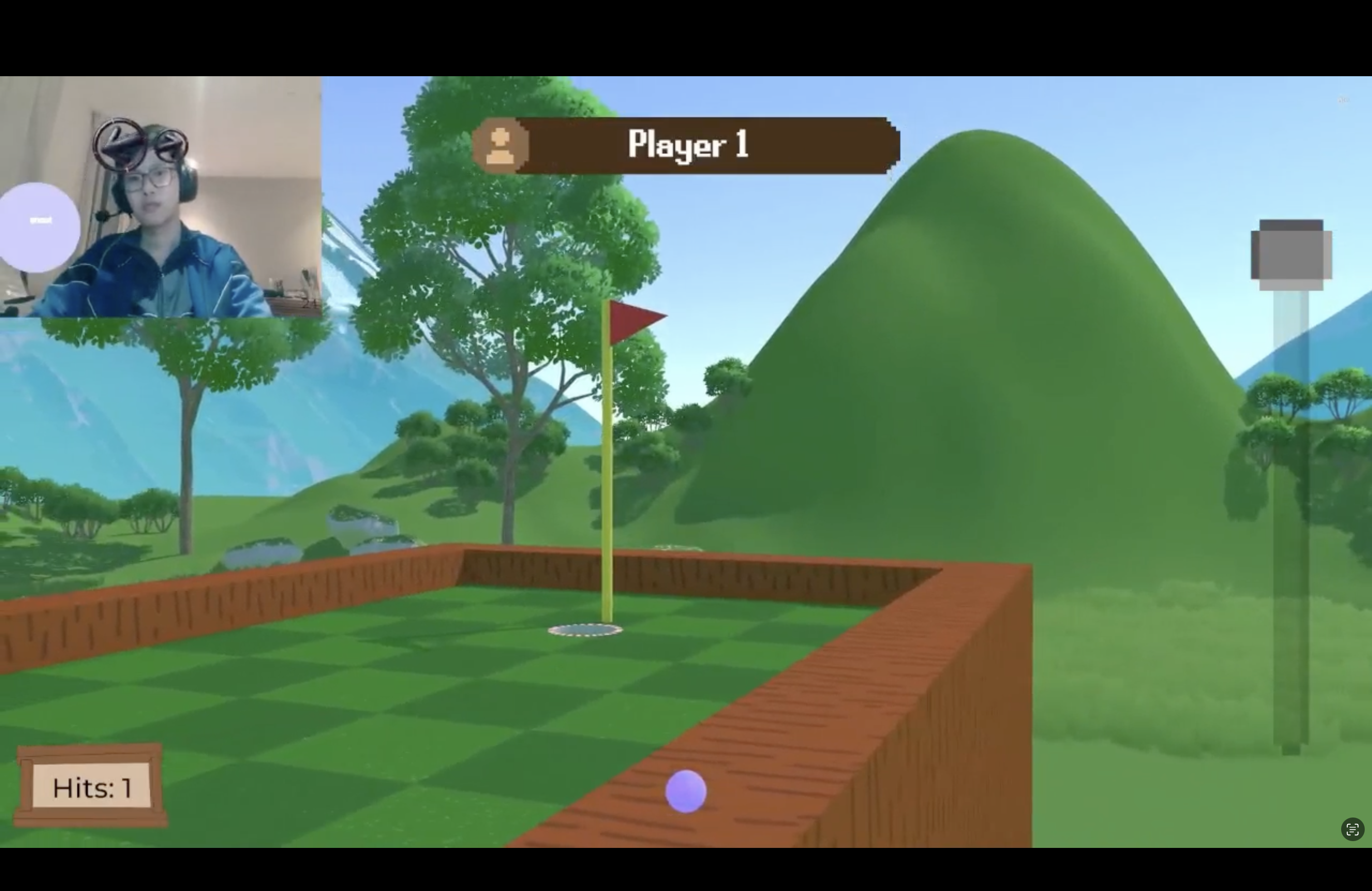
Final Golf Game
Final Wipeout Game
Final Evaluation
Our final UI designs are the result of an iterative, user-informed process, integrating feedback and insights from every development stage. The completed interfaces prioritise both accessibility and engagement, tailored specifically for our target audience. Key features include:
- A calming, nature-inspired colour palette with accessible contrast levels
- Clear visual hierarchy to guide users through intuitive interaction flows
- Music and ambient audio effects to enhance immersion across the game
- Optimised button sizes and interactive elements for both standard input and MotionInput controls
- Seasonal variations that add visual richness without disrupting the core UI structure
- Subtle animations and transitions that provide user feedback without triggering sensory overload
- Expanded replay-ability through features like multiple golf map variations and 12 unique potion recipes
- Consistent support for two-player cooperative play across all mini-games
- Encourages physical activity through Motion Input controls
These designs successfully balance visual appeal with the accessibility needs of children on the autism spectrum. By maintaining a consistent and recognisable visual language across different game components, we’ve created an interface that supports our central goal: delivering a calming, collaborative, and engaging experience.
Game Flow Diagram
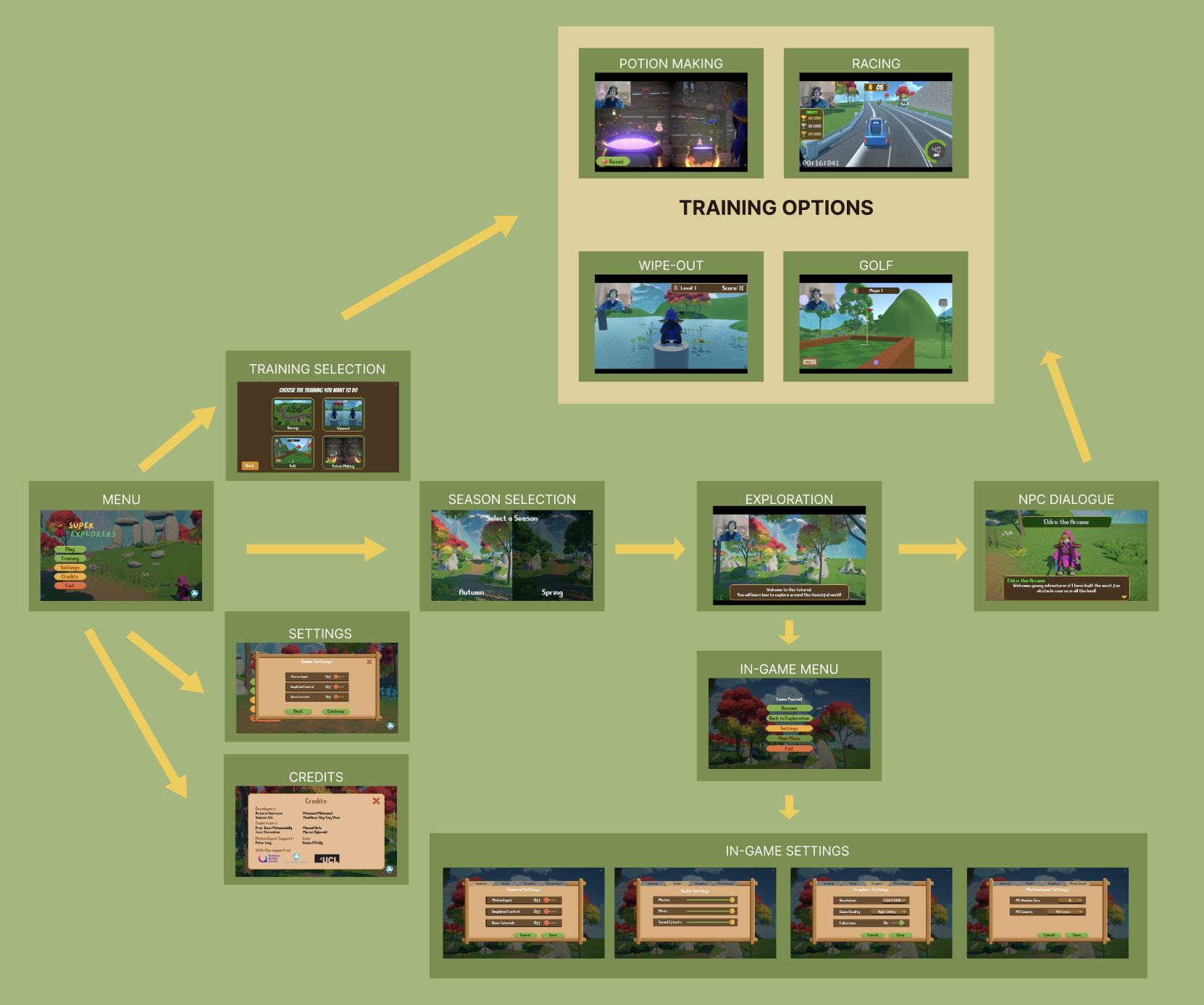
Complete Game Flow Diagram (Click to enlarge)
Flow Diagram Explanation
This comprehensive flow diagram illustrates the complete user journey through Super Explorers, from the main menu through season selection, exploration environments, and all mini-games. The diagram demonstrates how users can navigate between different game components and highlights the interconnected nature of the game's interface.
Key navigation paths include:
- Main menu to season selection, settings, and credits
- Season selection to exploration environments
- Exploration to mini-games through training selection
- In-game menu and settings accessible during gameplay
- NPC dialogue integration within the exploration environment
This structured approach ensures players can intuitively navigate through the game while maintaining a consistent and accessible user experience across all components.
DESIGN PRINCIPLES
Our UI design follows principles specifically tailored for children with autism, ensuring a positive and accessible experience:
Calming Aesthetics
Natural colour palettes and gentle transitions to prevent sensory overload, with consistent visual hierarchy across screens.
Accessibility
Clear, high-contrast visual elements with intuitive iconography that communicates function without relying heavily on text.
Child-Friendly
Engaging but not overstimulating, with consistent navigation patterns and clear feedback for all interactions.
Collaborative Focus
UI elements designed to encourage cooperation between players, with visual cues for turn-taking and shared activities.
Sensory Consideration
Visual and audio elements calibrated to be engaging without overwhelming sensitive users, with options for reduced effects.
Nature-Inspired
Interface elements that reflect the calming natural world themes, reinforcing the game's connection to exploration and discovery.