Development
Implementation Methodology
At the beginning of the project, we had several interviews with our client, James Baker (digital curator of the British Library), in order to make sure that we understood the problem thoroughly before beginning implementation. Once we understood the problem, we broke it down and discussed priorities of the proposed system [The requirements and their priorities can be seen in the requirements section]. Throughout the project, we used an AGILE approach because we split the development of the project into many iterations. In the beginning of each iteration, we discussed the progress of the project and what needed to be done next. This approach was good for the project because it guaranteed that our project implemented the client’s requirements successfully. Our client changed his requirements many times during the course of the project which is another reason why an AGILE approach was useful. If the traditional waterfall model was used, then we would have delivered a project that the client may not like. An example of a changing requirement is the design of the system, since we had to modify the user interface many times before he was satisfied.
Technologies Used
NodeJS
Node.js is an asynchronous framework that is event-driven. We used this as the back-end for the main part of our project. There were many reasons why we chose NodeJS as our back-end framework, some of these include:
- JavaScript is used which is a dynamic language. Web development that are made using a dynamic language on a virtual machine is very fast. It is quicker than the other alternatives such as Python or Ruby.
- Node.js allows us to use JavaScript on the browser as well as the web server. This allows code to be shared between the client and the server, so duplicate code is not used.
- Our project is event-driven - Many of the features rely on certain events being triggered and Node.js is an event-driven language. Therefore, it is useful for our project.
- Node.js can handle many connections happening at the same time within a single process - Our project relies on handling thousands of concurrent connections, so it is useful to have a framework that can handle many concurrent connections.
- Our team already knows JavaScript, so it is easier for us to use Node.js. As a result, we were able to deliver the project more efficiently than if we had used a different language.
Heroku
Our client, James Baker, wanted us to deploy the application to a URL so that it becomes accessible to the British Library. In order to do this, we used Heroku.Our team used Heroku because:
- It is free - the British Library did not have a budget for us to spent for this project.
- No time trial limit - many of the other alternatives have a specific time trial limit, whereas Heroku does not have a free trial (with a time limit).
- Very easy to deploy Heroku applications - there is extensive support online for using the Heroku platform for deployment.
Bootstrap
Bootstrap is very powerful framework for front-end development. Bootstrap has built-in features which improved our user interface for the website as well as the user experience. Bootstrap allowed our project to have responsive design and to have consistent user interface elements. This was crucial to the development of our project.
jQuery
jQuery is a JavaScript library that was used in order to run the Bootstrap framework for our project.

MongoDB
All of the images that we have processed throughout the project are stored in Flickr. However we had to tag each image (and store the tags associated with each image). We used MongoDB to store all of the tags of the images that we dealt with. One of the main reasons why we used MongoDB over alternatives such as MySQL is that the data-set that we dealt with during this project is very large (we have data that stores information about thousands of images). MongoDB uses NoSQL which can more efficient than MySQL at dealing with big data-sets.
AlchemyAPI
AlchemyAPI is a company that was founded in 2005. Their API uses machine learning in order to allow users to do tasks such as image tagging. After conducting research on various machine learning APIs that do image tagging, we found that AlchemyAPI is one of the most accurate and it is compatible with Node.js.

ImaggaAPI
Our team used two APIs for image tagging, AlchemyAPI and Imagga API, in case one of the APIs correctly tags images using tags that the other one did not use. Imagga API was used because it provides more tags than AlchemyAPI and the tags are generally quite different.
Testing Utilities for NodeJs
Mocha is a JavaScript framework that runs on the browser as well as on Node.JS. There is a lot of support available for Mocha since it is well-tested and maintained. It was used to run and evaluate specific parts of the application using unit-testing.
Should.js and Supertest are libraries that are used to compliment Mocha in testing the different features of the project. Both of them have different purposes though:
- Supertest was used to test the router.
- Should.js is an assertion library that is used to make assert statements easier during the testing phase.

Python
There were two main parts that were implemented during this project. The part of the project that was dedicated to machine learning was written in Python. This is because:
- Python is powerful, so the processing for the machine learning algorithms is quick.
- Many of the libraries that we needed at the beginning of the project relies on Python. Therefore, we were able to take advantage of these features.
- There is a lot of support available for potential problems that occur in Python.
Numpy and SciPy
Numpy is the successor to other libraries such as Numeric and NumArray. This library was used for functions that utilised numerical analysis. The library was essential because numerical analysis needed to be done in order to do the image processing correctly. SciPy is open-source software that is mainly used for scientific calculations. It is similar to Numpy, but most of the scientific numerical calculations were performed using SciPy.
OpenCV
OpenCV is another library that we utilised for the implementation of the project. OpenCV is a very popular library that includes functionality to handle image processing. The specific features that we used for OpenCV are:
- Inputting and outputting images appropriately so that they are handled by Python.
- The use of Gabor filters - these Gabor filters were mainly used to detect edges.
WEKA
Weka is a machine learning library that was utilised throughout the implementation of the project. The main purpose of using Weka is to include feature vectors that were required for each image stored on Flickr (in order to classify each image with a particular tag).
Flickrpy
All of the images that we had to process and tag during this project were stored in Flickr. Therefore, we needed to access information about all of the images using the Flickr API. The following information was extracted using the API:
- The URL of each image
- The author of the book (that the image is contained in)
- The date of publication of the book (that the image is contained in)
- The number of pages of the book (that the image is contained in).
Collaboration
Git and Github
We used Git to allow us to share and collaborate our code during the project. We used GitHub as the host as well. There were several reasons why we decided to use GitHub:
- It is simple to revert back to previous versions of the code.
- Everybody in the team wanted their own branch in order to code different parts of the application separately.
- GitHub is widely used so there is extensive support available online if issues did arise.
- We did not have to set up a Git server because it was hosted on GitHub.
Prototype Design - Development of User Interface
First Prototype
The following image is for the search by tags page:
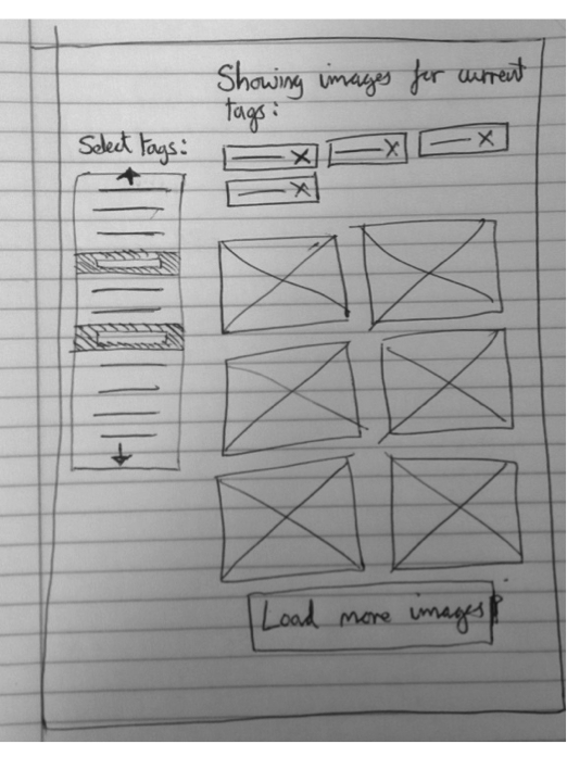 Description of first screen for the prototype:
- Initially, the user would see no tags selected and no images would be displayed.
- As there user clicks on tags from the list at the left hand side, they become selected and are shown at the top of the screen.
- Underneath the selected tags, all the images that have a combination of these tags are displayed.
- Depending on the number of tags given, there may be more images than fit on the screen and so the user can click to load more images.
The second screen for the same prototype is browsing the data-set:
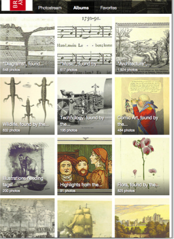 Description for browsing page of the first prototype:
- On Flickr – where the British Library has already uploaded the full dataset of 1 million images – there is a way to browse large collections of images and our interface would behave similarly.
- Each image on Flickr can be a part of one or more albums and the user can easily browse through images this way.
- This is essentially a special case of our tag-based system where the user browses all images with a single tag. However, it would be useful to also give the user the option of this more visual layout for when they are simply browsing and not looking for a specific or narrowly defined image.
The last page for our first prototype is the “Similar Images” page where users can view images that are similar to the one that they selected:
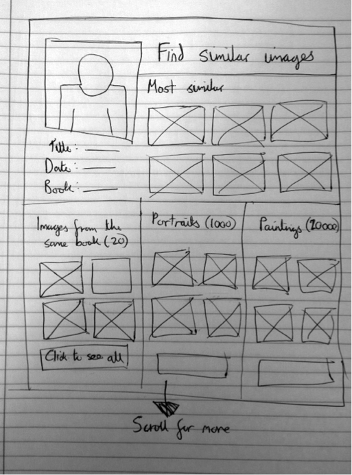 Description for this page:
- As with browsing through the images, this can be considered a special case of the search-by-tags functionality where the tags are defined by an image rather than the user.
- However it is slightly different since the user does not necessarily want to match all the tags exactly.
- The best way to handle it is to show the user a set of images most similar (as many tags as possible in common) as well as a number of sets that have a particular aspect in common with the image. This grouping may represent more than one tag.
- This helps as the user may not know exactly what they are looking for, but if they see a group of images that all have that aspect in common, then it is a lot more helpful than a list of tags (for example, if the user is looking for Cubist style paintings but isn’t aware that that is what they are called).
Evaluation of First Prototype
When this prototype was tested on users, we received the following feedback:- Positive Finding: The evaluation suggested that the similar-image layout could be very useful as it allows users to search in a very visual way and they can look for things that they may not be able to articulate. It was mentioned that perhaps multiple images could be used in conjunction to search, which seems like an interesting idea but may be out of the scope of the project.
- Positive Finding: The users liked that a lot of the space seemed to be given to the images since the system is ultimately about the images and their appearance. This is important to note as if we added more search features it may be tempting to reduce the area given to images in the layout in order to fit everything in.
- Issue: One user felt that when searching by tags that they would like to be able to sort or filter the results or give higher weight to certain tags.
- Issue: Beforehand I had assumed that just tags would be sufficient by themselves. However, even if the back end uses tags, it could be useful to give more intuitive control to the user. For instance, when looking for images from books from a certain time period, the user could specify a date range and then this would be converted to a set of appropriate tags behind-the-scenes.
- Issue: The other aspect was varying the importance of tags. Doing the lo-fi evaluation it was made clear, in fact more clear than if the user had the actual system to evaluate, that many users may not be familiar with the collection of images they are searching and what kind of data it contains. For this reason they may attempt to make very specific searches for which no match exists. In order to prevent such a hit-and-miss approach it would make sense to have some tags as necessary and some as preferred such that the user can see some results even if they don’t match the selected tags exactly.
- Issue: There are only a limited number of tags for the user to choose from, so users may not be able to filter images by the tag they want. This is a difficult problem as on one hand, there is only a finite number of tags that have been assigned, but the user may feel as though they are sacrificing accuracy by having to choose one of the given categories. This could be helped by letting the user type in their own searches and then using a thesaurus type system to convert those words into tags that do exist in our database. This may make the user feel like they have more control – though it is possible that they would have less as their input may be incorrectly mapped to our pre-defined tags. It would require further evaluation to see if this is preferable or not.
Second Prototype
We made another design prototype, the first page for this prototype is the main page where we can search for images. The following image is the design for this page:
 The reasons for this choice are:
- Simple and clear interface gives clarity as to what the application does.
- Close resemblance to popular search engines gives the user an idea of what the application is about from the first glance.
- Responsive feedback interface – the search box ‘lights up’ as you type.
- The second page of this design is the results page. This page displays all of the images that are appropriate based on the searching criteria entered by the user. The following is the design for this page:
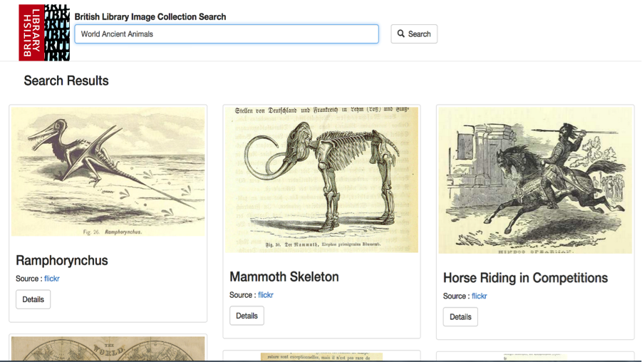 The reasons for this choice of UI design for this page (results page) are because:
- It contains certain visual clues such as the ‘Details’ button and the magnifying glass icon and the ‘Search’ keyword helps user to identify the function of UI entity.
- The images are at least 250x250 pixel to ensure maximum visibility.
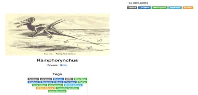 The reasons for choosing this UI design for the image details page are:
- Colour coded tags that maps to different types of classification.
- Tag categories which explain what each colour maps to.
- These features result in enhanced visibility and ease of grouping of tags.
Evaluation of Second Prototype
We evaluated this design prototype and we received the following feedback:- Positive finding: Easy to navigation between the pages – The visual elements are clear and the labels on them aid the user to use the app properly. Furthermore, the layout of the pages followed a well-known UI design pattern for search engine that is very familiar to anyone who have used a search engine before.
- Positive finding: The app function is very clear from the first glance. The features are self-explanatory features and the pages are not cluttered with visual element that are unnecessary.
- Issue: Insufficient information about the image in the specific image page. The user assumed that there would be more information such as a more detailed description of the image. This issue undermines the chief objective as the user may not get enough information they need for their research.
- Issue: There are empty white regions on the sides in the specific image page – this makes the page look empty. It undermines the aesthetic quality of the design.
Third Prototype
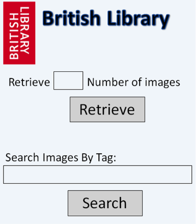
There was one more design prototype made. The first page of this prototype is similar to the previous two, but there is also a feature which allows users to retrieve unknown images and to tag them automatically. The first page is the main page which allows users to search for images and to retrieve untagged images:
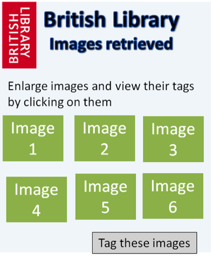
 The second page of this prototype is to retrieve unknown images. This page appears when the user clicks on the button labelled “Retrieve”, it returns a set of images that have not yet been tagged:
 The third page of this prototype is the search page, when the user types in search criteria in the main page and clicks on “Search”, this page is triggered:
 The last page of this prototype is used to view an individual image. When any image is clicked on the “Search Images” page, the user is redirected to this page:

Evaluation of Third Prototype
- Positive finding – the functions of the application are simple and intuitive. Each button is quite large and the text size is large, so the user can see clearly what to do next based on their intentions. I will definitely keep the buttons and the text size relatively large in the real version so that the user knows exactly what to do next.
- Positive finding - the User Design elements (like the images) are clear to the user, so the user can view the images in an easy way. These elements include the text boxes that the user has to fill in and the images.
- Issue – There is not much information about each individual image in page 4 (individual image view), there should be more information written about it such as the book that the image came from and the date of publishing.
- Issue – there is not much scope for users to change settings. Perhaps, there should be filters for the user to choose from in order to search for image more effectively.
Heuristic Evaluation
We combined our UI ideas into a single UI prototype for our application. Afterwards, we did a heuristic evaluation on the prototype to improve its design and usability before producing the fourth prototype.
The 10 usability heuristics are outlined below:
- Visibility of system status - The system should always keep users informed about what is going on, through appropriate feedback within reasonable time.
- Match between system and the real world - The system should speak the users' language, with words, phrases and concepts familiar to the user, rather than system-oriented terms. Follow real-world conventions, making information appear in a natural and logical order.
- User control and freedom - Users often choose system functions by mistake and will need a clearly marked "emergency exit" to leave the unwanted state without having to go through an extended dialogue. Support undo and redo.
- Consistency and standards - Users should not have to wonder whether different words, situations, or actions mean the same thing. Follow platform conventions.
- Error prevention - Even better than good error messages is a careful design which prevents a problem from occurring in the first place. Either eliminate error-prone conditions or check for them and present users with a confirmation option before they commit to the action.
- Recognition rather than recall - Minimize the user's memory load by making objects, actions, and options visible. The user should not have to remember information from one part of the dialogue to another. Instructions for use of the system should be visible or easily retrievable whenever appropriate.
- Flexibility and efficiency of use - Accelerators -- unseen by the novice user -- may often speed up the interaction for the expert user such that the system can cater to both inexperienced and experienced users. Allow users to tailor frequent actions.
- Aesthetic and minimalist design - Dialogues should not contain information which is irrelevant or rarely needed. Every extra unit of information in a dialogue competes with the relevant units of information and diminishes their relative visibility.
- Help users recognize, diagnose, and recover from errors - Error messages should be expressed in plain language (no codes), precisely indicate the problem, and constructively suggest a solution.
- Help and documentation - Even though it is better if the system can be used without documentation, it may be necessary to provide help and documentation. Any such information should be easy to search, focused on the user's task, list concrete steps to be carried out, and not be too large.
The heuristic evaluation of our combined prototype is outlined below:
|
Interface |
Issue |
Heuristic(s) |
|
Search box on the main page of the UI. |
Initially, the search button was removed to make the search box neater. But as a result, the UI loses usability as the user is trying to proceed to the results page. |
Visibility of system status and Help users recognize, diagnose, and recover from errors. |
|
British Library logo that goes back to the home page |
The British Library logo that appears to the corner does not redirect user to the homepage, unlike what many search engines do. User has to go back several pages to go back to the home page. |
Recognition rather than recall and flexibility and efficiency of use |
|
Individual image page |
The page looks really empty as there are two massive white region on the sides that has contains no UI entities. |
Aesthetic and minimalist design |
|
Tags on Individual image |
The words on the tags and tag categories are really small and hard too see |
Aesthetic and minimalist design and Visibility of system status |
|
Tag categories on individual result page |
User found it hard to categorise the tags. |
Recognition rather than recall and Match between system and the real world |
|
Individual image page |
User could not find the button to find similar images, forcing them to go back to the results page each time. |
Visibility of system status and flexibility and efficiency of use |
|
Similar image page |
User could not find the button to find the tags for the particular image he selected, forcing them to go back to the results page each time. |
Visibility of system status and flexibility and efficiency of use |
Fourth Prototype
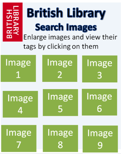
After we have done the evaluation on the combined prototype, we came up with the final design prototype. It has a clean search feature which allows a user to search for images based on a tag as well as having a feature to find images that are similar to a specific one. The index page (main page) for this prototype is:
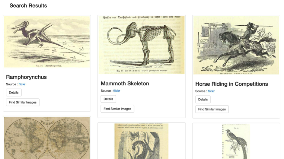
When the search button is clicked from the home page, the user will be presented with a list of images based on the search query that has been typed. The design for that page is a very familiar layout as it is similar to the Google Images Search page, this makes the user experience more enjoyable more user-friendly. The following image is a screenshot of what the list of images would look like:
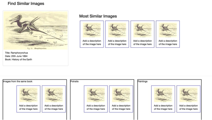
 There is also a feature to find similar images to each individual image. So if a user wants to find a similar image, “Find Similar Images” is clicked and the user is then presented with the following page:
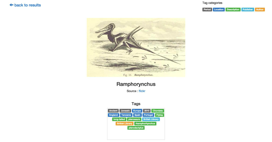
 If an individual image is selected, then the user will be redirected to a page where all they see is that image.The following is a screenshot of it:
 The reason for choosing this final design prototype is because it combines the clear interface of the second prototype and has the “similar images” feature of the first prototype. Therefore, it makes the user experience better.
To view the fully working implementation of our prototype, please refer to the implementation page or visit the app at http://blbigdata.herokuapp.com.