
Critical Evaluation
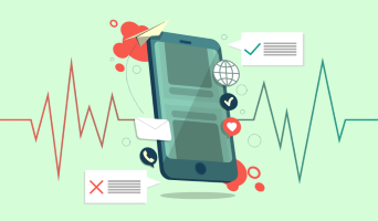
User Interface/user experience:
 Since user-interface is a very important part of our project, during our design process, we consulted the users in terms of what they wanted from the app. After coming up with a design, we then showed the design to the users and got feedback from them. Based on the feedback, we updated our user interface (which can be seen on the HCI page). Our app development is a user centred approach.
The user experience of our app is very smooth, aesthetically pleasing and intuitive. There are pictures to identify the purpose of a certain button, for example the call and message buttons, and we have very simple ways to navigate to different pages. We also made sure that the users new exactly what they were doing within the app by having clear explanations as to what each page was doing and by having appropriate headings for each page. As well as that, the intended user experience for the user is that they will set up the app with a profession doctor or therapist …etc. Therefore, they will have someone to talk to if they do encounter a problem.
Another aspect of this which is extremely important is the fact that there is another team working on the same app but for the android phone. We worked together to ensure that the users have the same user experience regardless of what phone they are using.
Functionality:
 Our application provides a lot of different functionalities for the user. Functionalities include tracking the user’s data and calculating a well-being score, sending the well-being score to a remote server, nudging the user to contact their core network through the app or doing some physical activity (walking), if certain conditions haven’t been met. (Look at MoSCoW list on requirements page), graph their progress.
Our app has promised to deliver on many different functionalities, and it has done so successfully. Although there are many different functionalities, these functionalities are there to ensure that the purpose of the app is fulfilled: to increase their well-being over a period of time. The multiple functionalities that are provided by the app have been very clearly separated neatly in a way for users to easily understand what is happening through the User Interfaces the functionalities have been grouped together based on their similarities.
Stability:
 The stability of the app is strong. We have been testing the application over the period of developing and therefore have had the ability to test the functionalities that require gathering of data over a couple of weeks such as the graphing of data. This has worked without the app crashing.
The other things that contribute to the stability of the app would be the fact that there is very little data being stored and therefore, cache memory is not likely to overflow.
Efficiency:
Memory: In terms of the amount of memory the application consumes, it is very efficient. Our app only collects information on the users that it requires, no more. For example, the app only asks for the first 3 or 4 characters of the postcode because that is all it needs. It collects weekly data on the number of steps taken and the number of calls. However, our app does not accumulate all this data since the beginning of the app, it only keeps the last 9 weeks of data because that is all it needs.
Download/upload rates: Our app is efficient in terms of the amount of data it consumes. It consumes very little data as this is because a lot of the data collection is happening on the phone itself as the user themselves are collecting the data. Download rates exist within the app because there are app links that allow them to open up pages to find out more about their well-being. Upload rates exist because the app has to connect to a server to export the data that is collected on the phone. Once again, we are only sending 5 pieces of data, therefore the size of the packet that is leaving the phone is extremely small ensuring that the upload rates are extremely small.
 CPU & time: This application is something that the user is expected to use frequently, but not for long periods of times. They would use the application at least once a week to be able to update their weekly well-being scores and they could then quickly view their well-being diary. They would also use it to contact their friends. These are actions that don’t require a long time to be spent and they are functionalities that require very little CPU power.
In the original design, we had a functionality that required accessing the users location at all time to keep track of how far they travelled, however, this is something that would have been very power consuming, therefore, this was removed from the functionality to ensure the efficiency of the app.
Files: The application creates images (screenshots) of their well-being diary. This is something that only happens if the user wants to share their progress to their core network. Images don’t take up a lot of space and since it is only being created if they choose to share, our app is efficient in the way it creates files. However, it could be argued that our app doesn’t allow a user to send a message to multiple people, only one person at a time and this can result in the same file being generated multiple times.
Code: 3rd part libraries that have already been written efficiently have been used to carry out certain purposes, such as drawing graphs. These are libraries that have been tried and tested many times and have been updated to fix any bugs and is therefore more efficient than writing up that code from scratch.
We have made our own code efficient by putting that is repeatedly used into functions and classes. This also allows us to have tidier code and have the app require less memory space.
Compatibility
We tested the functionality of the app on a variety of different iPhones that were released at different times, such as the iPhone SE, iPhone 6 and the iPhone 7+. By testing on these different phones, we could ensure that the functionality works on all.
Our application is compatible from iPhones 4 to the iPhone 11. X-code allows us to be able to simulate the app within it on different screens. By exhaustively testing the application on each screen and testing whether the UI is smooth and that there are no inconsistencies, we made sure that there were no problems with the user interface.
Maintainability
 Our app is maintainable because of the way we have documented out the development process.
We have kept records of the research that we have done for our requirements analysis, our research, our learning of a new programming language …etc. We have diagrams of our designs such as the System Architecture Diagram. We have also commented our code that we have done, and as recommended by our client commented it in a way so that someone who has never seen the code before, or someone who has never learnt Swift will be able to understand. We have also started doing a code review which will explain what the code is doing in even more detail.
By having the above ready and in place, this means that our project is extremely maintainable as a developer who was not part of this process will be able to review our documents and continue on our project.
Project Management:
During the beginning, the way our project was managed was the fact that all 3 members worked on the same amount of work, i.e. we divided any work in 3 ways. However, upon review near the middle of the project, we realised that we were not being efficient, and therefore decided to split the project up into parts that each member could specialise in. By having deadlines to finish things by ensured that we were on track and that we finished what we needed to on time and with time to test on different devices.
We also have had continuous contact with our client by having weekly meetings where we update our client on our progress and discuss any setbacks we have had, and where our client updates us on any new requirements. By keeping in touch with our clients, we were able to show changes in our prototypes and get feedback and were able to continuously improve on our project.