We wanted to ensure that our designs are: Intuitive: : i.e. simple design. This would ensure that they can use the app without needing to learn how to. Common: When we say common, this leads on intuition. The app will have symbols that are usually used elsewhere so that the new app feels more familiar. Aesthetically pleasing:This is important as it will ensure that the user continues to use the app Consistent: This ensures that the app is aesthetically pleasing, and will ensure that the user is not confused.
User Experience
Before drawing up potential designs and prototypes, it is important to understand the potential user experience which leads to them using app and also the context in which they will be using the app to ensure that the design that we come up with is suitable and best ensures that we find a solution to the problem.
Potential Scenario
User meets someone, a doctor, at the GP
They are suggested to download the CarerCare app
They are walk through the set up of the app
They are then encouraged to put in 3 meaningful contacts, contacts who they wish to inform their well-being about
Encouraged to share Local Differential Private data
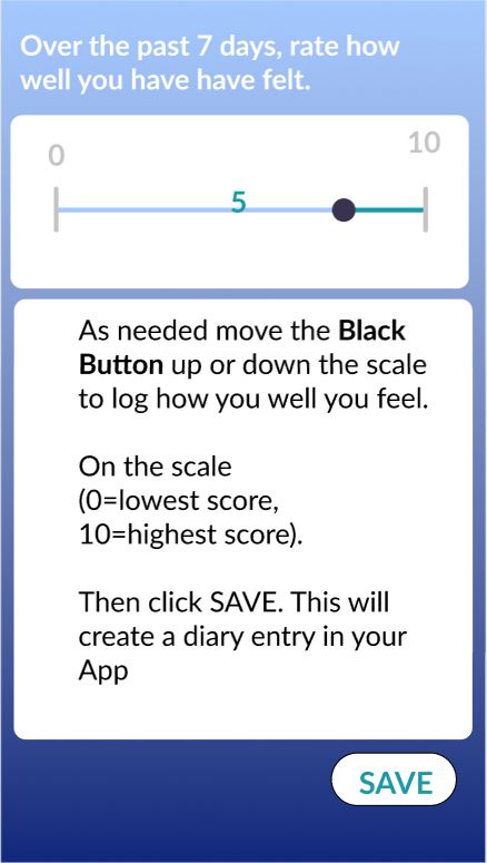
Once a week, a well-being score pops up to the user on the app. They reflect about how the past week has been and change the well-being score to a higher value, which is what they believe the true value to be.
Over 2 days, they haven't moved around because they were feeling quite ill: the app then prompts the user to contact their friends and meet up
While contacting friends, the app suggests they go meet their friend for coffee, a walk in the park or football. To them, they like the idea of coffee.
They meet their friend and when they arrive home, they feel much happier
After a few months, they view their well-being score progress and see that their well-being score has improved
They are now more physically active, and keep in contact with their core network often
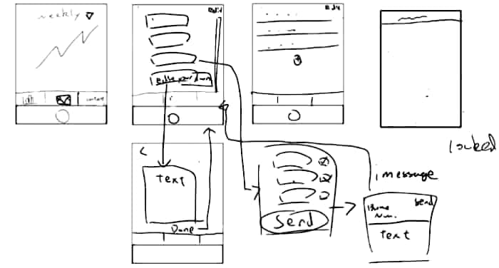
Hand-drawn sketches
The above design is the first ideas that we jotted down. It shows our initial and rough ideas as to what our app should look like.
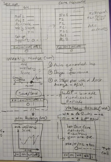
This design was then shown to us by our client. This design more closely reflects what the client wants
This design was then shown to us by our client, a design that had been drawn up after meeting with potential users of the app. This idea reflects more what the users need from the app.
Prototypes
We have then made a prototype which will be shown to the users for them to get an idea of what the app would do.
This prototype was made on figma. This allows the user to interact with the prototype and see the flow of the user journey on the app
We chose to make our prototypes on figma because figma allows users to collaborate on the prototype making process, this meant that it was much easier to work remotely and still work on this as a team. Another reason we used figma was that we needed to make a prototype that the team who was working on the android version (UCL team 28), would also be able to see. This was vital in ensuring that the users have the same user experience.
We made an initial prototype, which was then showed to the users.
After showing it to the users and our client, we got feed-back on the proto-type. Based on the feedback that we received from the potential users of the app and our client, the prototype was then edited to better suit the needs of the users. Below is the set of pictures showing what the users wanted.
The feedback that we received from our client was to make sure that it looked like the previous version of the app, which the above prototype currently does not.
Our product is in many ways very different to the previous project, in terms of the solution it is solving, however, it is a project that is branching off the fundamental functionality of the WellWellWell app.
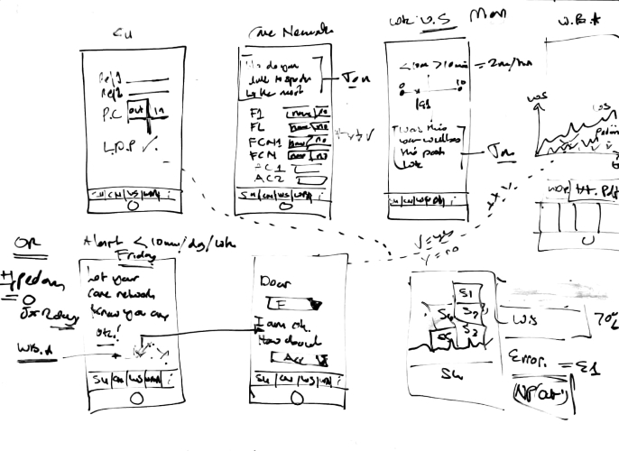
Our 2nd Prototype
The above prototype was shown to potential users. After this, our client had suggestions as to how to make the app more user friendly. The above prototype does not really explain the purpose of the app really well to the users. It would help for them to know what the app is doing. And therefore, the main difference between this prototype and the final prototype is the set-up pages.
Our final product is based on the prototype screenshots that you see below.
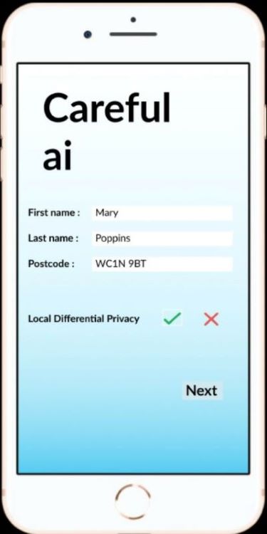
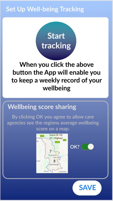
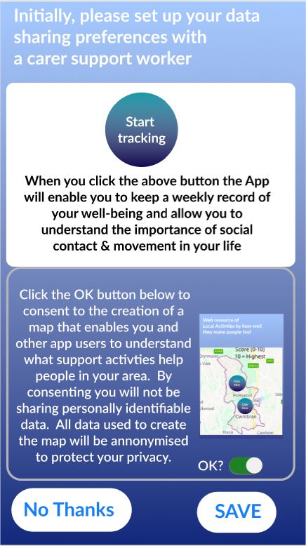
Set up 1
Set up 2
Set up 3
Set up 4
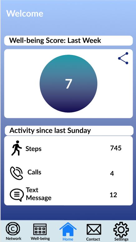
Home 1
Home 2
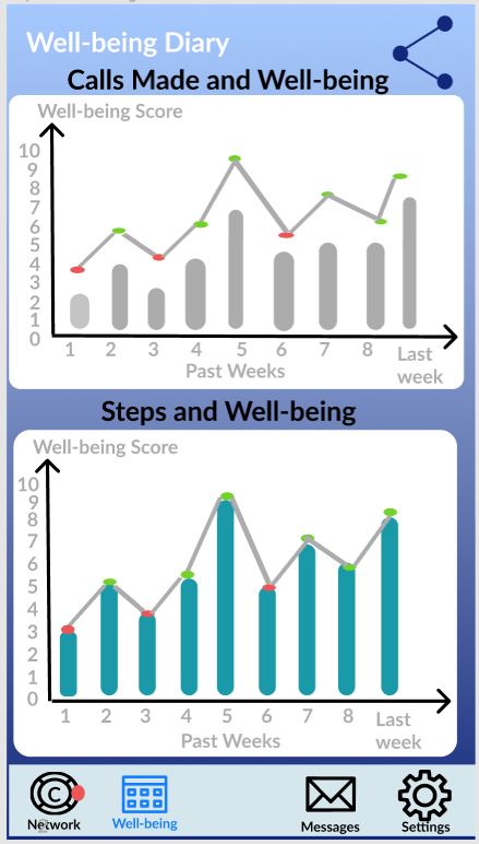
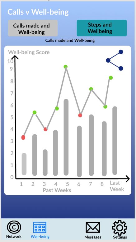
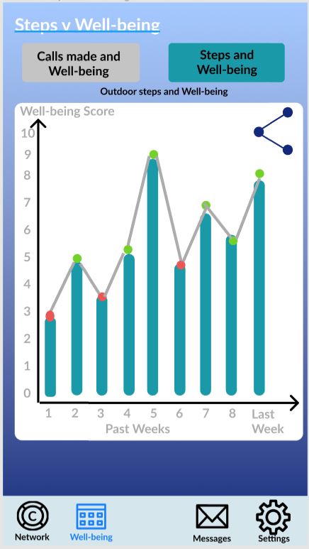
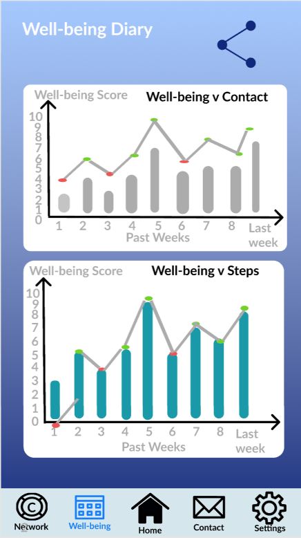
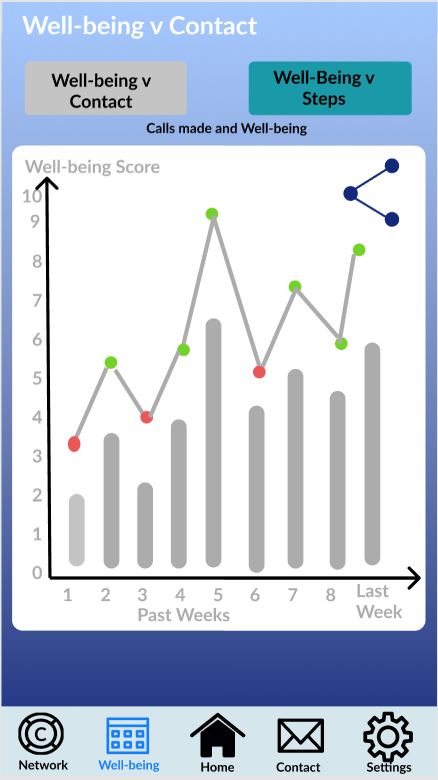
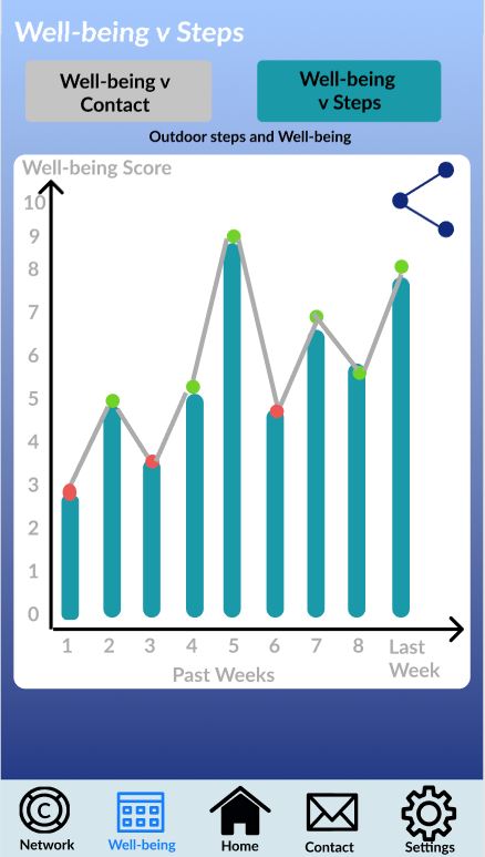
Well-being diary 1
Well-being diary 2
Well-being diary 3
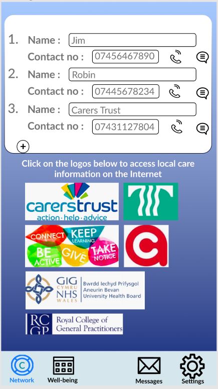
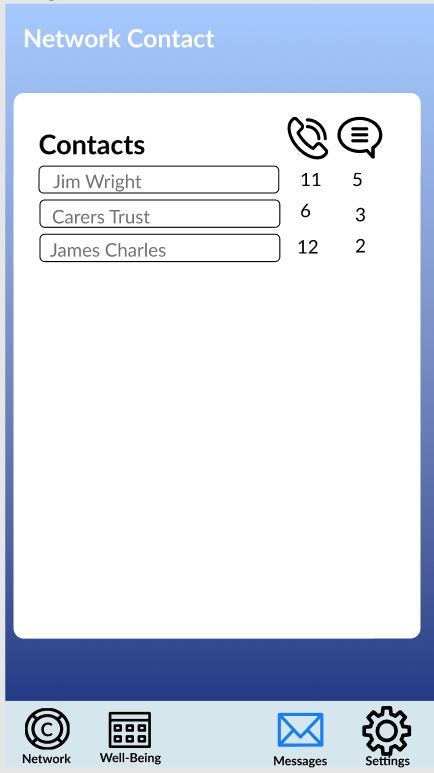
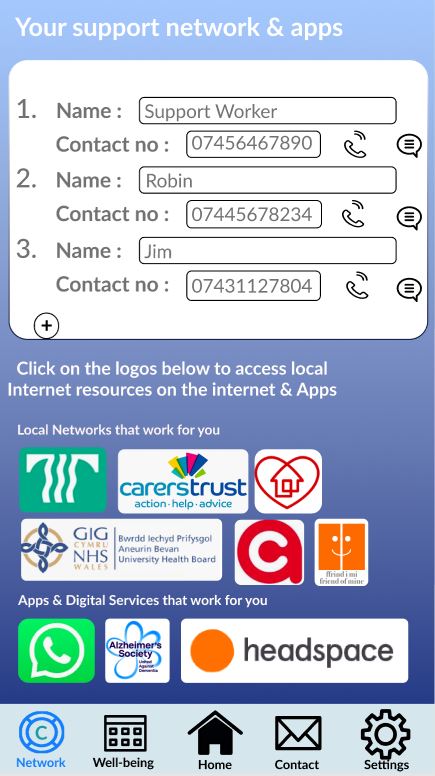
Contacts Display Page
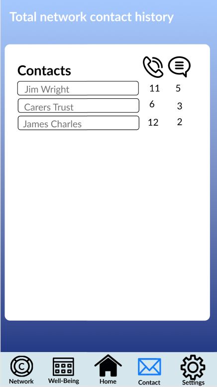
Contacts History Page
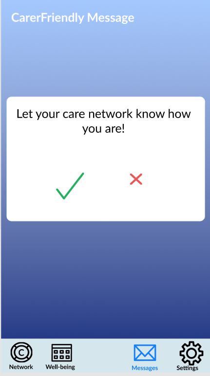
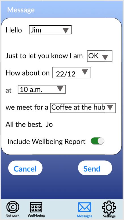
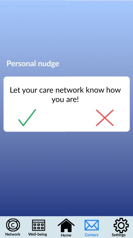
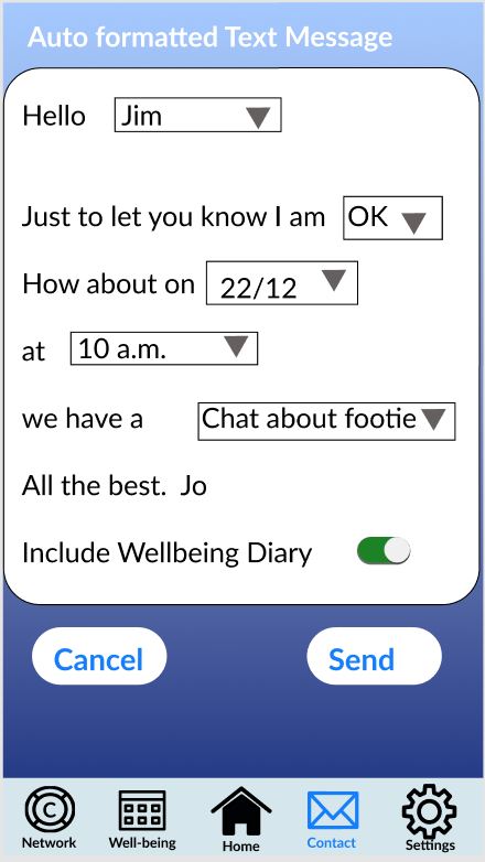
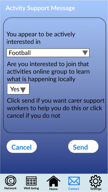
Messages Page 1
Messages Page 2
Messages Page 3
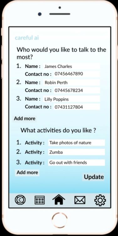
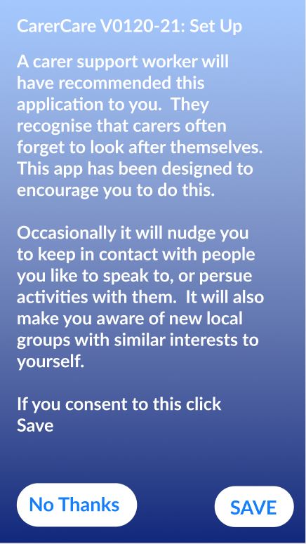
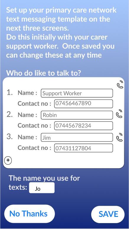
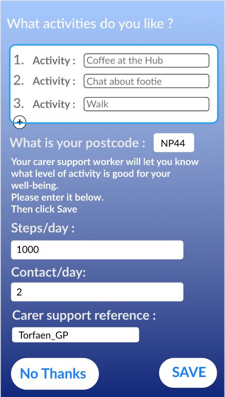
Set-up Pages:
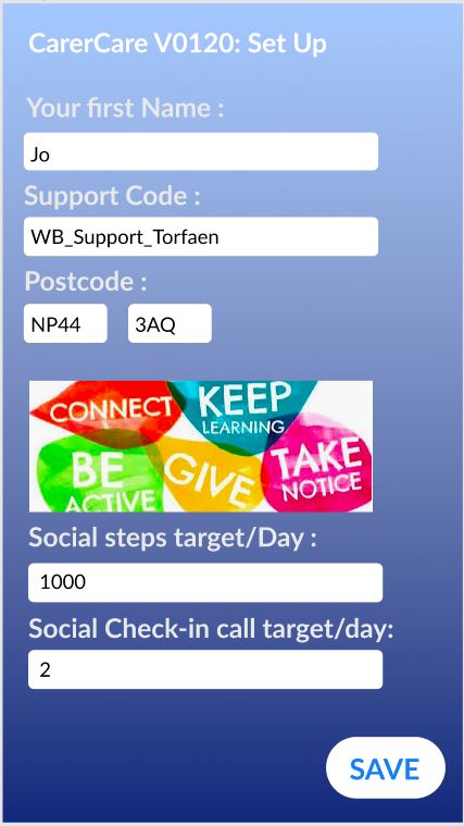
The set up pages explain the purpose of the app to the user and get their information. These pages only collect the most necessary data and does not collect anything that it does not need.
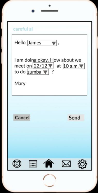
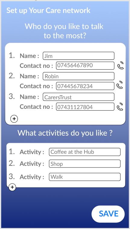
It collects the contacts that users would like to be in contact with: to share their progress with, to contact with if they aren’t feeling well, to meet up with to do an activity together, and to make calls and send messages to through the app
It collects their name, which is used in the pre-constructed messages when the user wishes to send out a message
It asks for the activities that they wish to do with their friends
The number of steps/day and contacts/day is used in the algorithm to calculate their well-being score
It asks for the carer support reference so that when the data is exported to the linode server and mapped onto a heatmap, we know where they were referred from
Most importantly, it asks for permission to export their data. If they do not want to, they can still use the app.
They can then start tracking by pressing the start tracking button and then save: this will track the number of steps and the number of calls
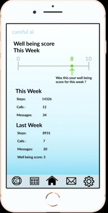
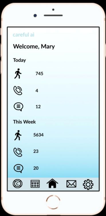
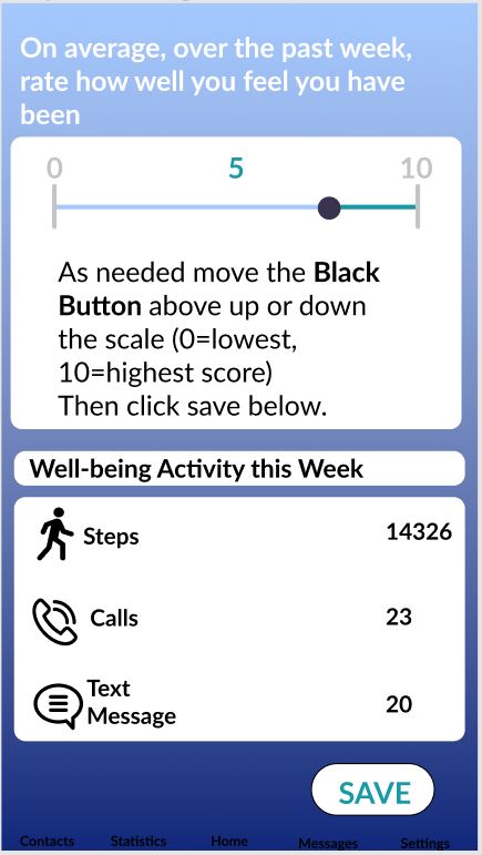
Home Pages:
Home Page 1 appears weekly and allows the user to edit the apps calculated value of their well-being score to reflect how they truly feel. The home page displays the information that the app has been tracking.
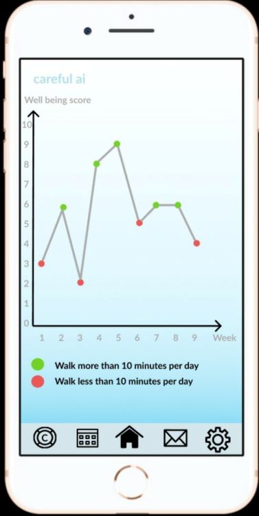
Well-being diary Pages:
These pages show the progress that the user has been making in the last 9 weeks. They will be able to view the correlation between the number of steps they make and their well-being, and the number of calls they make and their well-being. The share button allows them to be able to send these to there core network.
Contacts display and history Pages:
The contacts display page allows the user to add more contacts if they wish to. It also has a lot of links to websites that they can click on for more support, to find out about more about well-being …etc. It also has links to apps which are there to help improve their well-being. The history page displays the number of texts and calls they’ve sent/had with each person in their contacts.
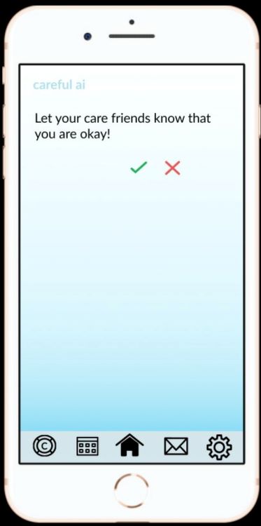
Messages pages:
These pages appear when they would like to share their progress to their core network, or when they are being nudged because they haven’t met certain conditions such as not having contacted anyone via the app in the last week and if the app hasn’t noticed that they have moved in the last 2 days.
Video of our Prototype 1
Below is the video showing a demonstration of the prototype we had made by January 24th