
UI DESIGN
- Home
- UI Design
Design Principles
Place the User at the Center
As always, the first UI design principle is to focus on
people (or, the “user” as we all say). A good user interface
is easy and natural to use, avoids confusing the user, and
does what the user needs. You need to understand who your
users are as well as understand what they want to do. Are
they experts? The best way to do this is to talk to them.
Creating and structuring interviews is beyond the scope of
this post, but interview your audience, learn who they are,
and develop UI designs for them. Learning about
human-centered design will help you achieve the right
mindset and focus on people first, design second.
Strive for Clarity
The purpose of the user interface is to allow the user to
interact with the website or application (or, more generally
in broader design, any product). Avoid anything that
confuses people or doesn’t help them interact.
Simplicity
Classics exist for a reason; they’re timeless and never go
out of style, though they do benefit from modern touches.
Think of the little black cocktail dress or the tuxedo; each
are fashion style staples. They’re simple, elegant, and add
a touch of class to the wearer. A user interface should be
simple and elegant.
Provide Useful Feedback
Feedback can be visual, audio (the ding of a new message
alert), or sense of touch (useful in gaming or the “buzz”
alert for a new email or phone call when your phone is set
to “silent”). Every action should have feedback to indicate
that the action was successful or not.
Reduce Cognitive Load
Many of these UI design principles serve to reduce cognitive
load for users. Basically, don’t make users think (also a
useful UX design principle as well). There are a few common
ways to reduce cognitive load and make using your website or
app easier:
Chunk actions and information – Most people can
handle seven-plus-or-minus two chunks of information when
processing it. For instance, breaking up telephone numbers
in the usual 3-3-4 way rather than a 10 digit sequence
results in fewer errors.
Remember the 3-click rule – it
shouldn’t take more than three clicks to find any
information
Minimize recall in favor of recognition – common
images and icons in context help users identify
functionality, think of the trash can and the bell icons
(commonly used for notifications) and other commonly used
icons that trigger pre-existing memory. This also means
don’t take a commonly used icon that most people understand
and then use it to represent something else, you’ll just
confuse people.
Reference: The Basic Principles of User Interface Design
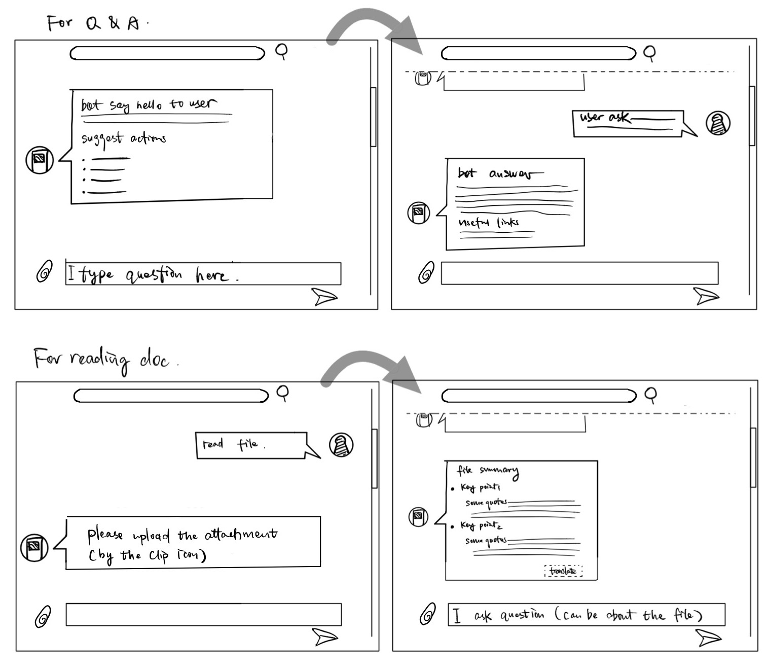
Sketches
After gathering the user requirements and using personas to better understand them, we drew up the sketches to explore ideas on the chatbot UI. The sketching was done based on our design principles.
Prototype
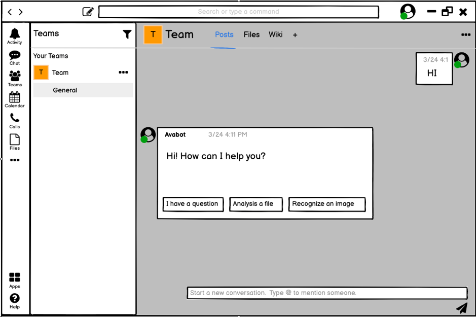
We then came up with the prototype based on the sketches and users’ requirements, so as to explore further the feasibility and usability of the bot.
We use preset waterfall dialogue to guide users through a
series of steps, such as uploading files and asking
questions. Hence the instructions are decided to be straight
and clear. We provide option buttons to help user decide
what is the next step, user can clearly understand what is
going to happen when they click a button.
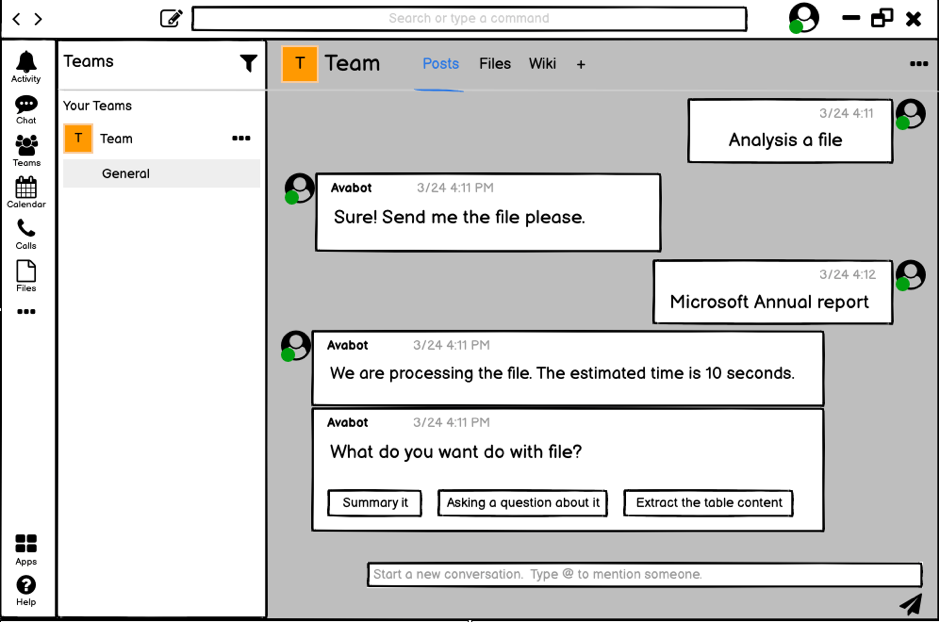
When users upload files, we estimate the time needed for
processing based on the file sizes and send back to users.
This let users know we are handling the files though it
might take some time. Also, users are aware that there might
be a bug when the waiting is much longer than the estimated
time.
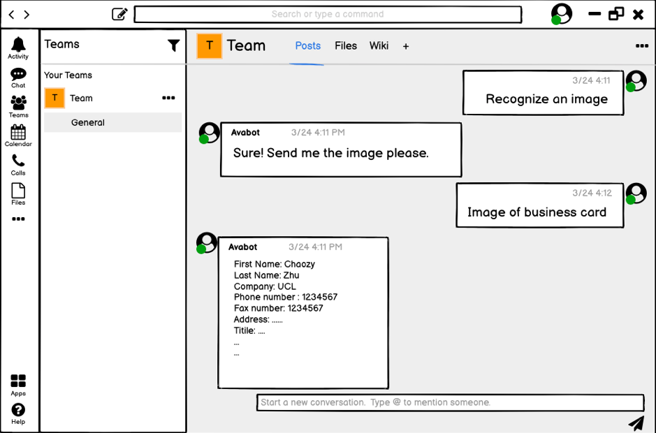
When the user asks for recognizing an image, the output is
displayed in a common key-value pair layout.
We also made the interactive demo for AvaBot, which can be found in the User Manual in appendices.