User Interface Design
Design Principles
Simplicity
Simplicity is a design principle that considers the user's goals and achieves them in the most basic and easy to understand way. Keeping our design simple was important for us and simple doesn't just mean a lot of white space and minimum functionality. We still prioritised functionality but we managed to achieve this functionality by not overcomplicating the design. Our design provides the simplicity required for the user to enjoy the process of navigating through our web app.
Consistency
Consistency is key to a good design. We don't want the user to look around for a button in our web app. The location of a button should not be different on every page and should be consistent on every page. So, the user will not feel like they are on a different website when navigating our web app. It simply provides a better user experience and makes it easier for the user to navigate around.
Visibility
The more visible the element is, the more likely users will know about them and how to use them. The ultimate challenge is to make everything visible but most of the time that causes a lot of clutter and the best way to go is to prioritise what to keep visible and what to hide behind a menu tab. In our case, there aren't many options so making everything visible does not cause any cluster. Therefore we used colours that will give us a nice contrast to make elements with functionality more visible.
Feedback
Feedback is all about making it clear to the user the consequences of their actions. For example, the user should be able to figure out when they click profile they will be directed to the profile page or the login page if they are not logged in. There are many forms of feedback but we chose to use visual feedback and try to keep the interface intuitive so that the user would not have to think before taking action.
Sketches
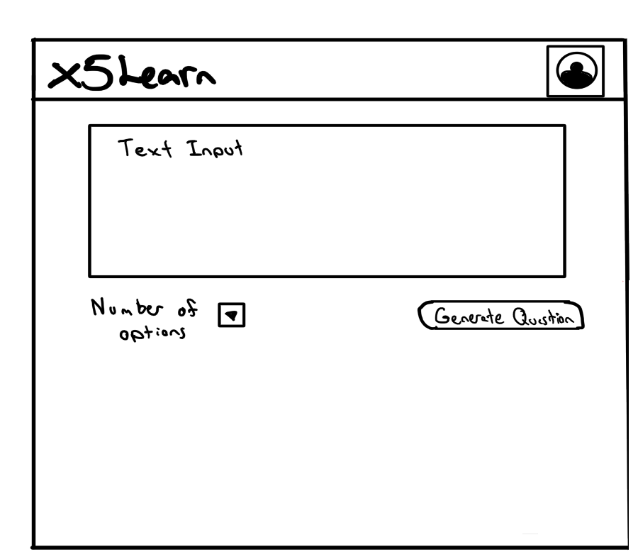
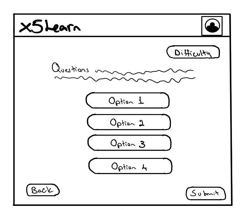
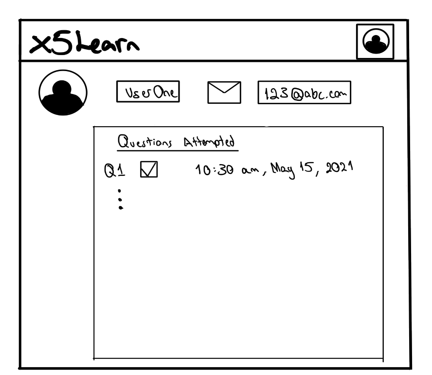
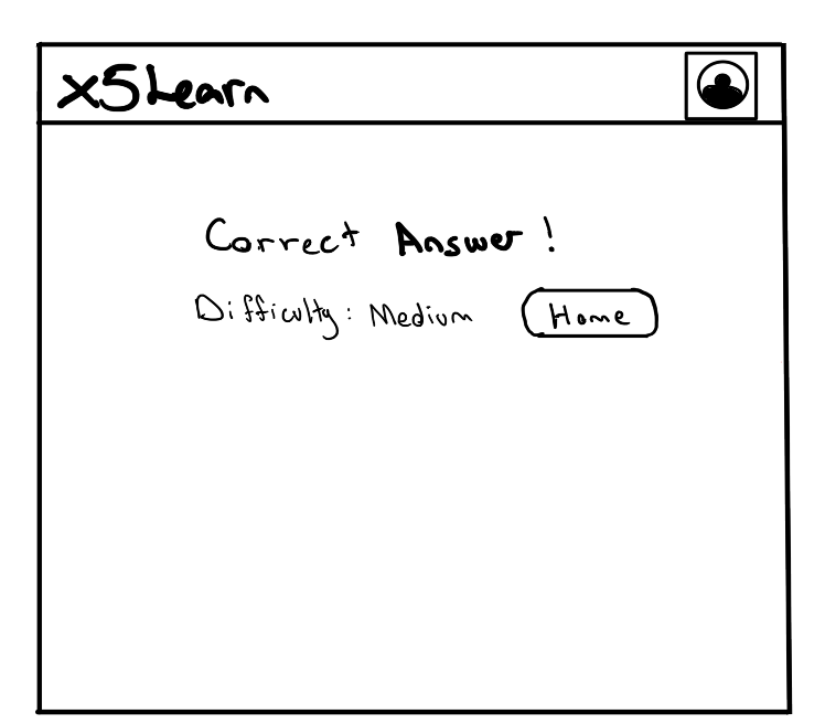
After gathering the user requirements and using personas to better understand them, we drew up the sketches to explore ideas on the website. The sketching was done based on our simplistic design principles.
Prototype
We then came up with the prototype based on the sketches and users’ requirements, to explore further the feasibility and usability of the website. We set up the landing page to be as simple as possible where it is very clear how the user can generate questions move on to the next stage of the user experience.
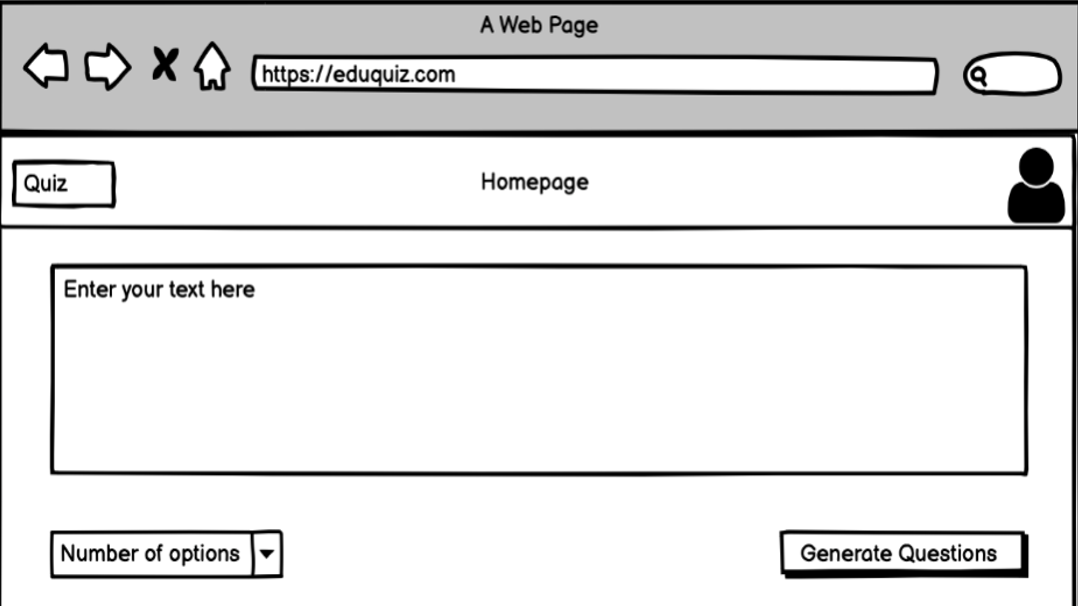
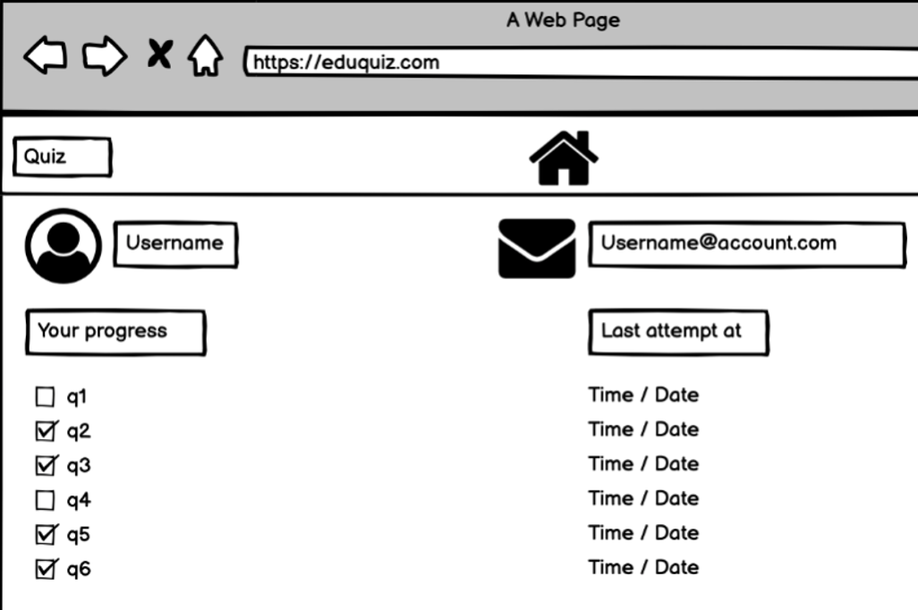
From the landing page, the user can access the profile page where they can track their progress or input a text and choose the type of question they want to generate. When the user clicks on the generate question button the backend will generate questions from the information entered by the user and direct the user to the page where the questions will be displayed.
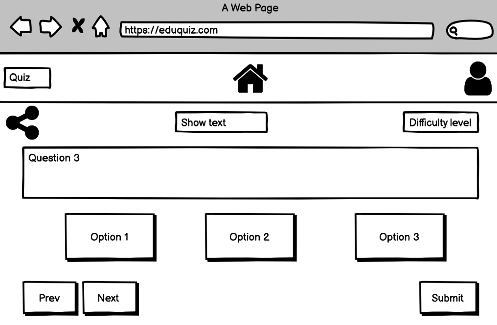
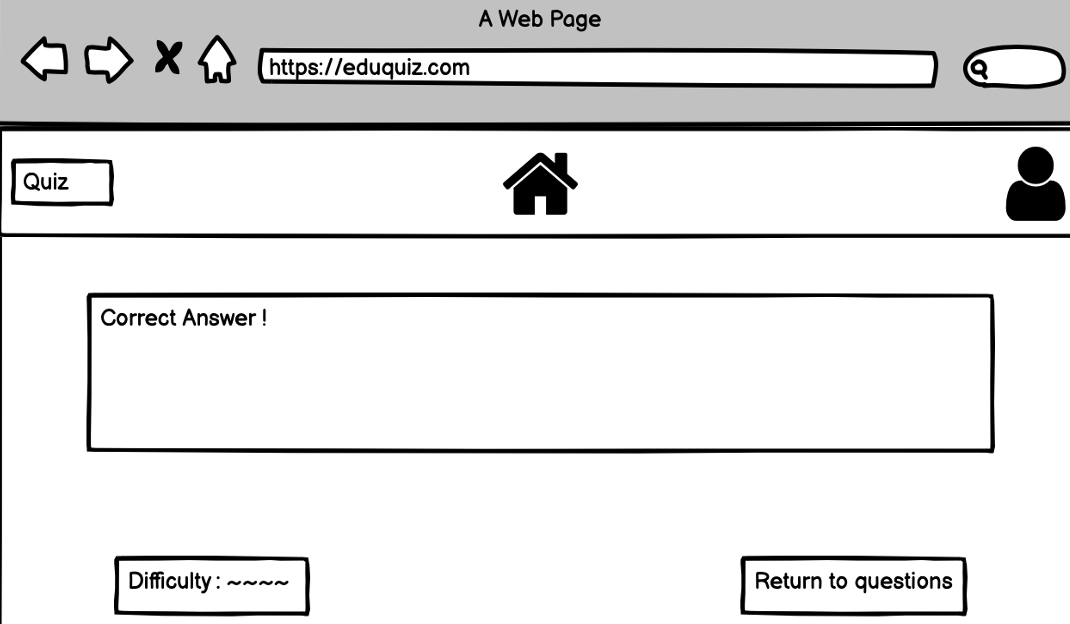
When the user answers the generated question it will direct them to the results page and they will find out if they got the right answer and it will give them the option to return to the questions or the landing page.
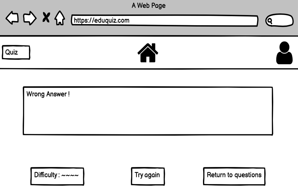
At the time of drawing the prototypes, the requirements were not fully finalised therefore there are some differences between the prototype and the final product. Even though there are some differences our dynamic requirements allowed us to adapt the final product to tick off all the requirements requested from our clients.
References:
- 1. Don Norman’s Principles of Interaction Design Available at: https://medium.com/@sachinrekhi/don-normans-principles-of-interaction-design-51025a2c0f33#:~:text=Visibility%20is%20the%20basic%20principle,to%20know%20about%20and%20use [Accessed 15th March 2022]